Category: Graphics

General tips on how to create graphics for your app

  • Splash screen | vendrux Docs

    Splash screen | vendrux Docs

    The splash screen is displayed as soon as you open your app, while the content is loading.

    Below you can see some examples:

    Notion Image

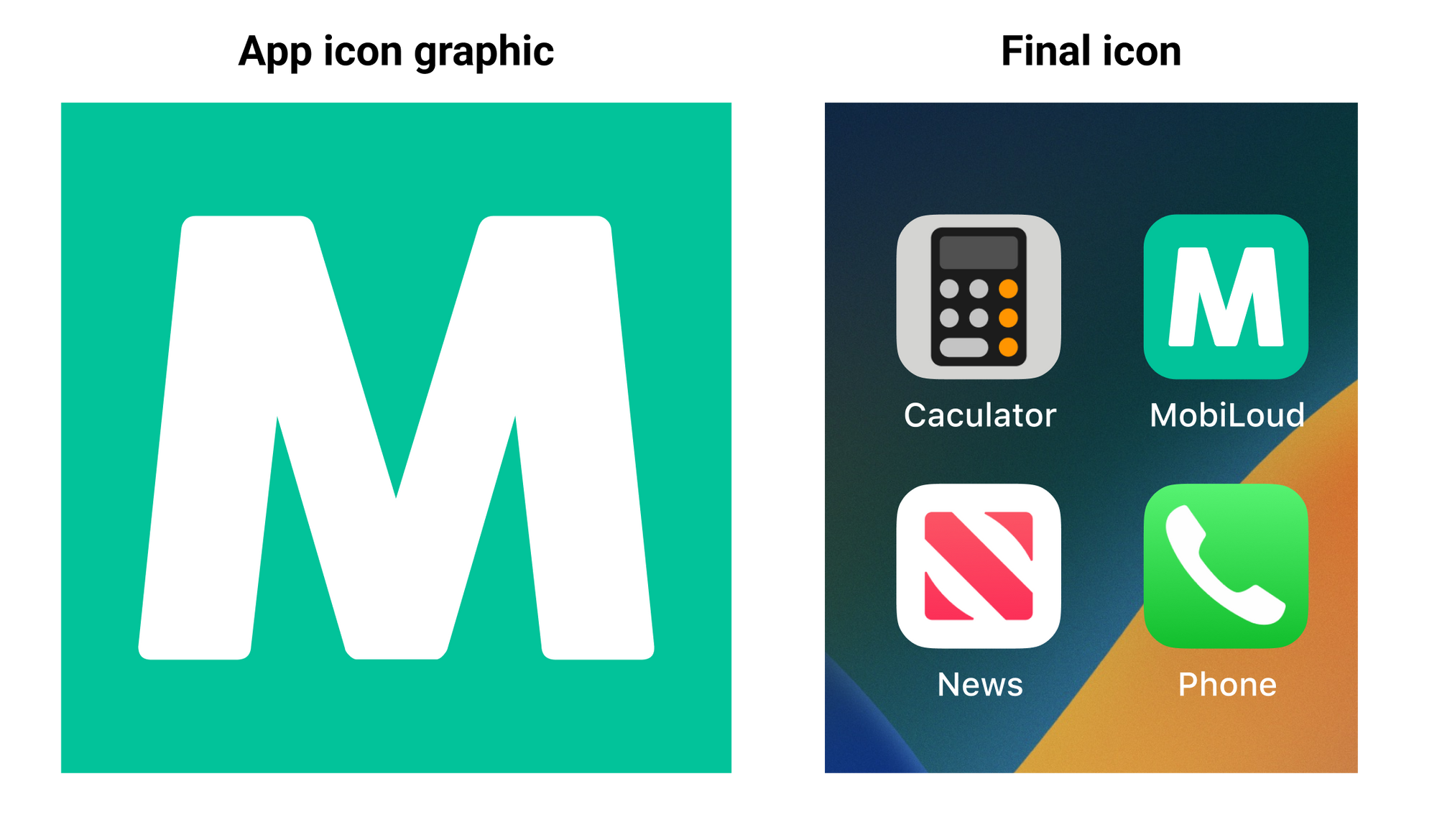
    The final splash screen is built based on two different graphics, with the following specs:

    1. Logo: PNG file with 1000x1000px and your logo in the center
    1. Background: PNG file with 2248x2248px, no transparencies

    The graphics are merged, with the logo being placed over the background, as you can see below:

    Notion Image

    Here are a few tips on how to make your splash screen look great:

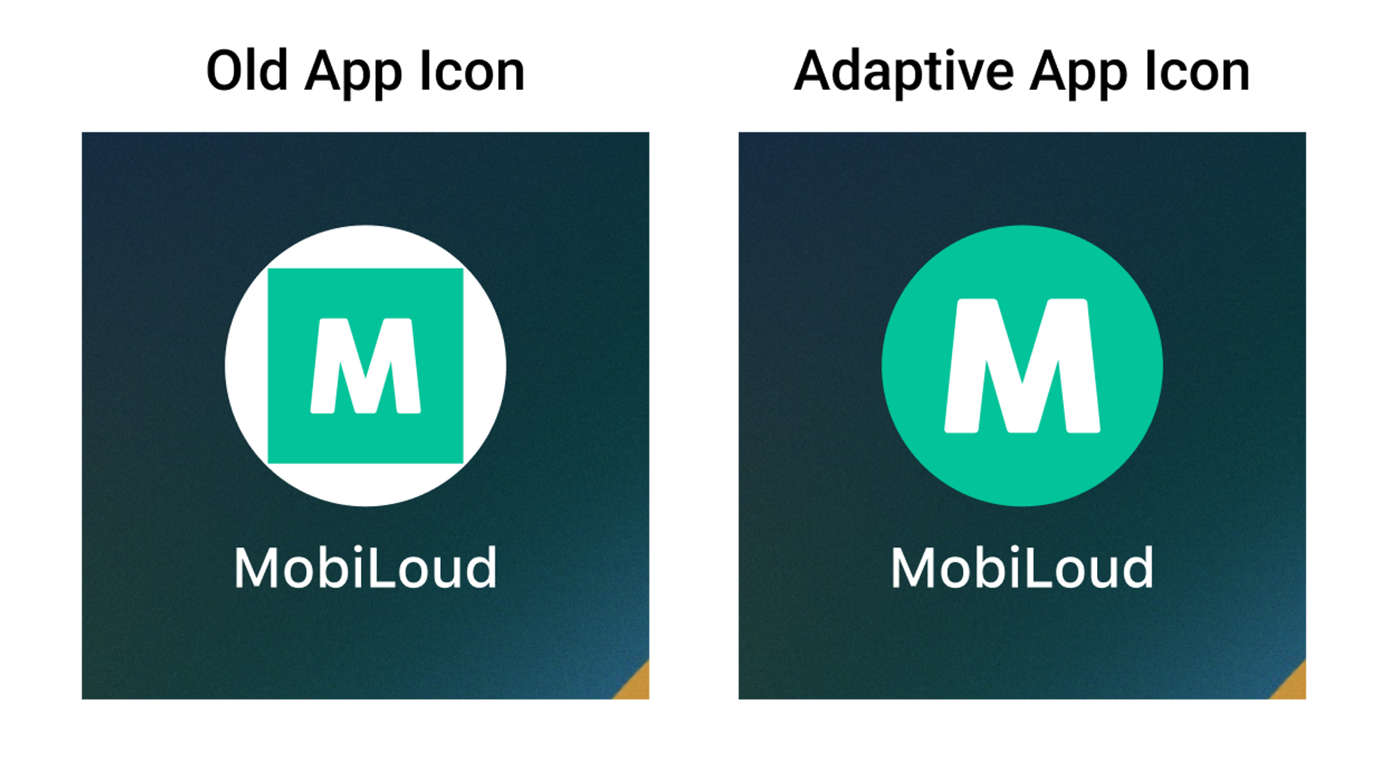
    1 – Leave space around your logo

    When preparing your graphic for the logo, make sure to keep some spacing on the sides of your logo. We recommend adjusting the width of your logo to 700px, so there is enough spacing on the sides, see below:

    Notion Image

    The final result will be much better if you leave space on the sides, as you can see below:

    Notion Image

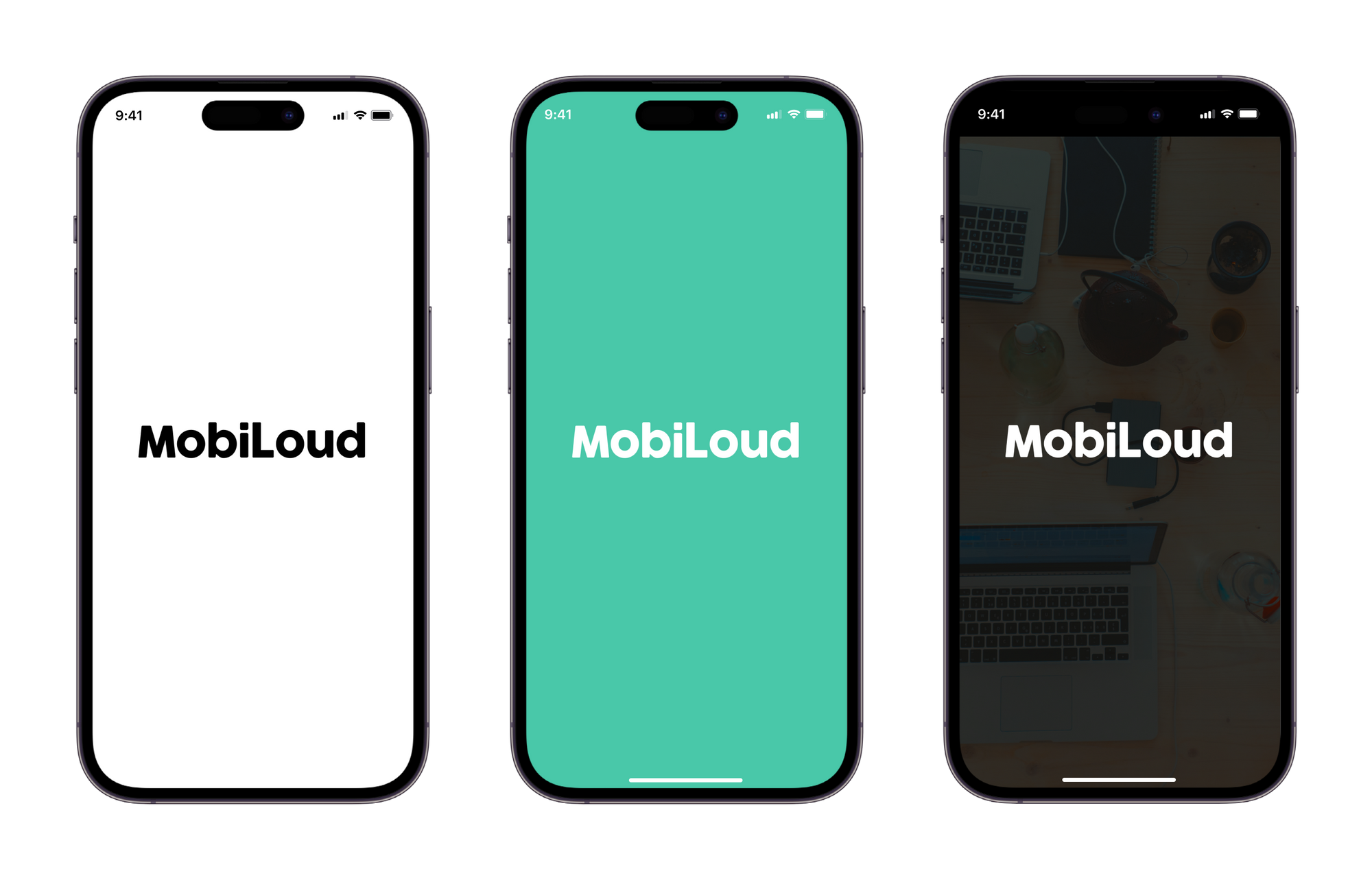
    2 – Don’t use text in your background

    The splash screen background will get cropped depending on the size of the device where the app is being used. An iPad will display more elements of your background, while an iPhone will display fewer elements.

    With that in mind, we highly recommend that you avoid using text and other elements that must be fully visible in order to look good or to make sense to the user.

    3 – Keep it simple

    Keeping your splash screen simple is key to achieving a good-looking final result, in most cases, a solid color background will do the job, but if you would like to use an image, make sure that there is enough contrast with your logo.

    Templates

    We have prepared a few template files to help you with preparing your app graphics, you can find them below:

  • iOS App icon | vendrux Docs

    iOS App icon | vendrux Docs

    Creating an app icon for an iOS app can be a daunting task. Fortunately, with the right tools and tips, the process can be much easier.

    The iOS app icon consists of a single file, with the following specifications:

    This is how the graphic you provide looks when converted into an app icon on iOS devices:

    Notion Image

    Here are some tips on how to make a great iOS app icon:

    1 – Make it unique

    The app icon is the first element of your app that users will see after installing it, make sure you have something unique that allows the user to easily recognize your brand.

    2 – Keep it simple

    App icons should be simple because they will be seen quickly by users, and the simpler the icon, the easier it is to recognize and remember. Also, the simpler the design, the less likely it is to confuse users. A simple icon is more likely to fit within the design of the operating system in which it is included.

    3 – No words or complex images

    You have minimal space to work with inside your app icon, avoid using words or complex images as these will not look good when displayed in a small element.

    Even for your logo, you might want to use a smaller version or simply a piece of it, something that allows users to easily recognize it.

    4 – Space

    Make sure to leave some space around your app icon to make sure it will be displayed properly. Keep in mind that the borders will be rounded automatically, so you don’t want to have any elements too close to the edges.

    Templates

    Here you can find templates for the iOS app icon:

    If you’d like to learn more about how to design the perfect icon for your app, check the guidelines from Apple, here: https://developer.apple.com/design/human-interface-guidelines/foundations/app-icons/

  • Android App icon | vendrux Docs

    Android App icon | vendrux Docs

    Creating an app icon is an important aspect of developing an Android app. A well-designed icon can make your app stand out and attract users.

    Before we move forward with this guide, it is important for you to know that we are going to use an “adaptive app icon” for your Android app.

    This is important because even though there is a bit more work into the creation of that icon, the final result looks way better, as you can see below:

    Notion Image

    The Adaptive App Icon for Android consists of two files:

    1 – Foreground Image

    The foreground image should contain your logo or whatever element you want to be presented in the center of your logo. We recommend using something simple that allows users to recognize your company name or brand.

    2 – Background Image

    For the background image, you should use something simple, without text or any important information as this part of your icon might get cropped to fit into different icon shapes and sizes.

    The files will be placed over each other on your final icon, something like this:

    Notion Image

    Note that you should also provide a HEX color code to be used as the background of your logo in some special situations. We recommend using the same color, or the main color, of your background file.

    Here are some tips on how to make a great iOS app icon:

    1 – Make it unique

    The app icon is the first element of your app that users will see after installing it, make sure you have something unique that allows the user to easily recognize your brand.

    2 – Keep it simple

    App icons should be simple because they will be seen quickly by users, and the simpler the icon, the easier it is to recognize and remember. Also, the simpler the design, the less likely it is to confuse users. A simple icon is more likely to fit within the design of the operating system in which it is included.

    3 – No words or complex images

    You have minimal space to work with inside your app icon, avoid using words or complex images as these will not look good when displayed in a small element.

    Even for your logo, you might want to use a smaller version or simply a piece of it, something that allows users to easily recognize it.

    4 – Space

    Make sure to leave some space around your app icon foreground to make sure it will be displayed properly.

    Templates

    Here you can find templates for the iOS app icon:

    If you’d like to learn more about how to design the perfect icon for your app, check the guidelines from Google, here: https://developer.android.com/develop/ui/views/launch/icon_design_adaptive