Once you have installed the extension, set it up as follows:
Step 1
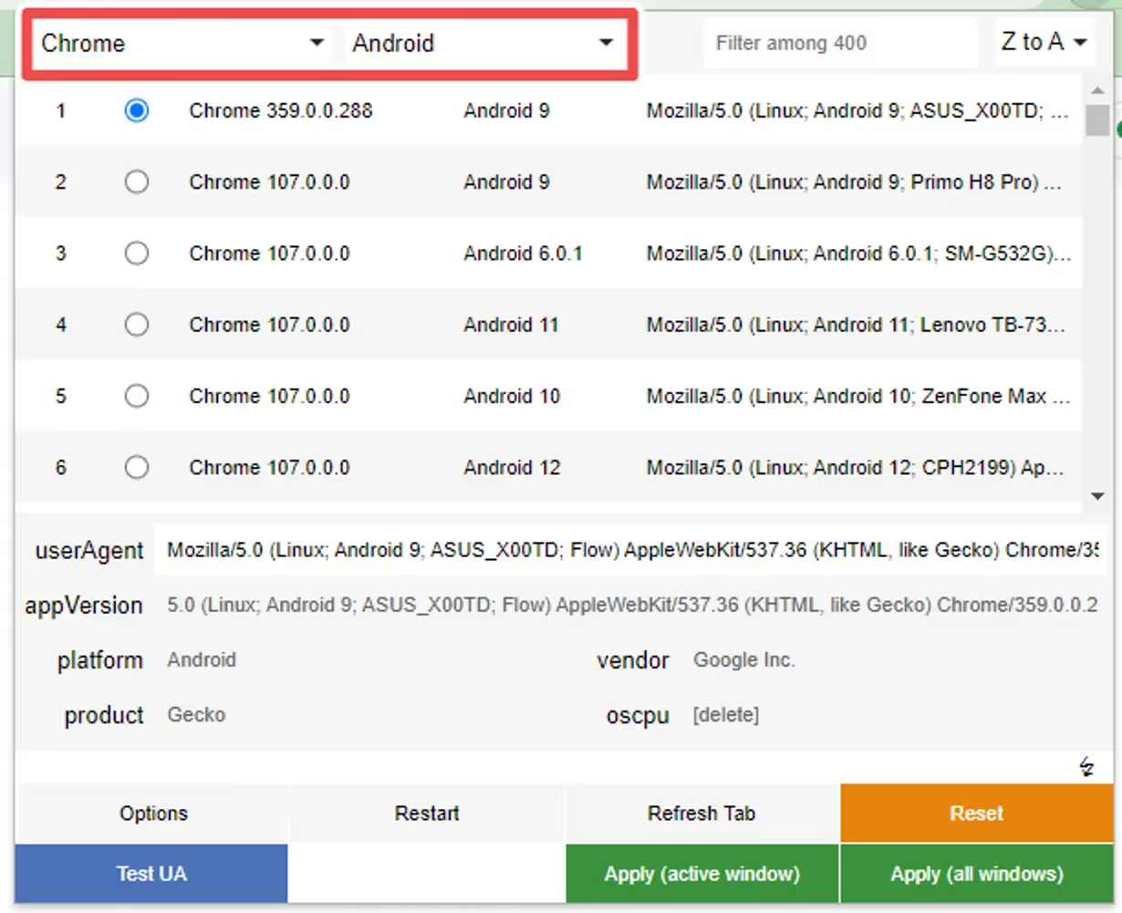
Select “Chrome” as the browser and “Android” as the platform if you want to test the Android version of the Button, or “Safari” and “iOS” in case you want to test the iOS version:
Step 2
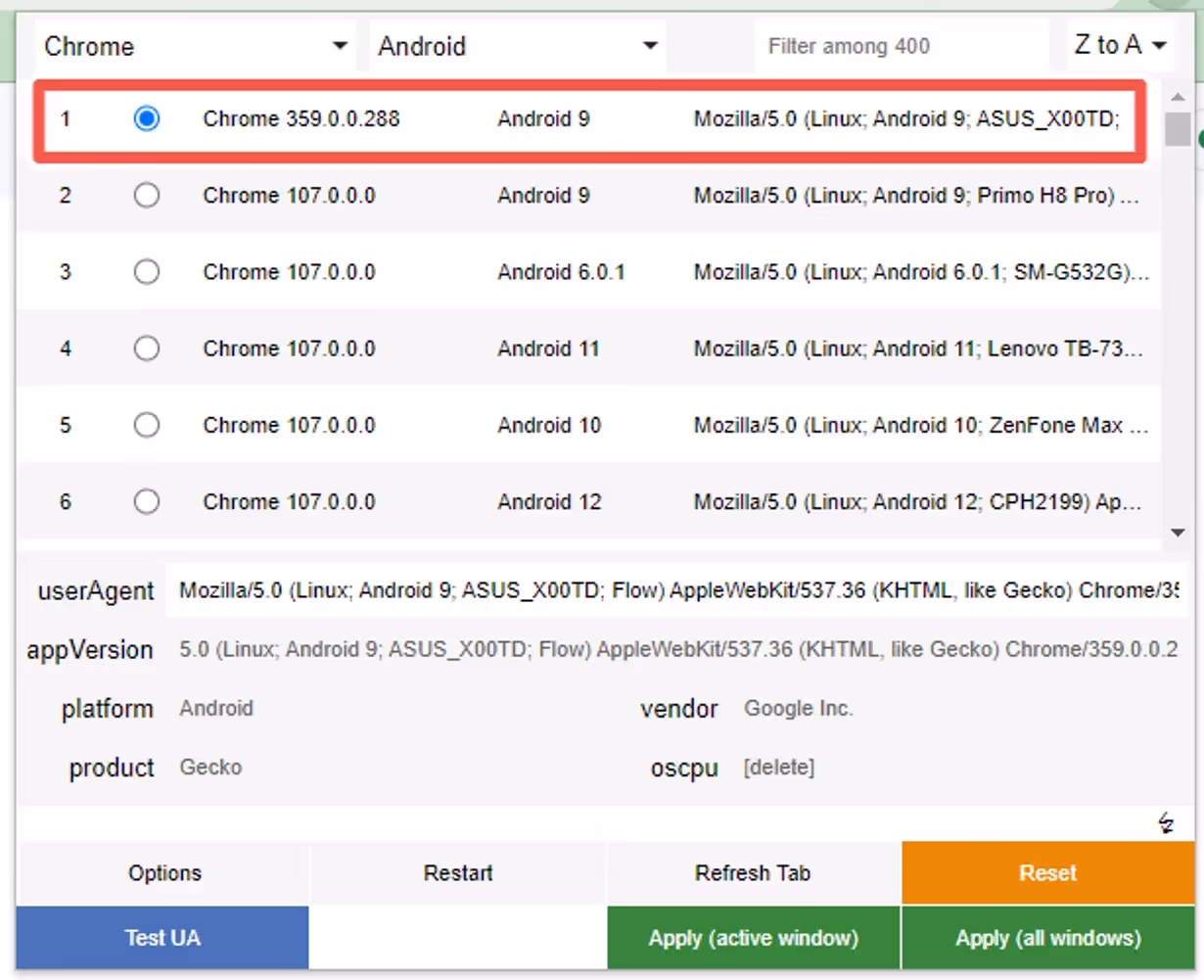
Select one of the options that will appear, any will work:
Step 3
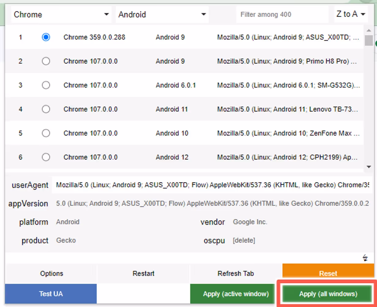
Click “Apply” to make sure the user agent is properly set up on your browser:
Step 4
You can now press “F5” while viewing your website to refresh the browser window with the updated user agent.
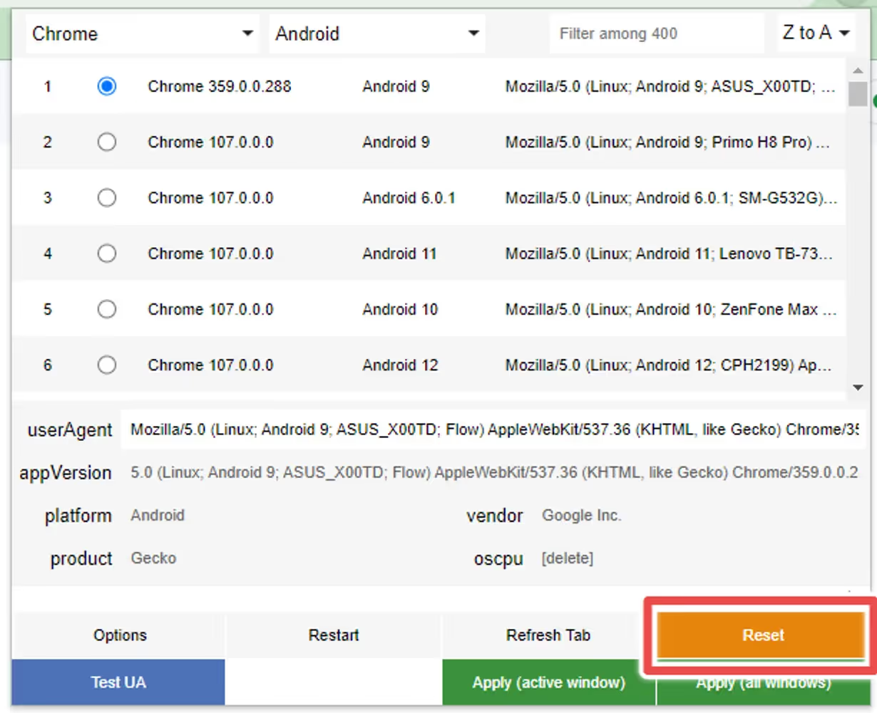
Reset
If you want to revert the changes to the user agent, as some websites might start behaving differently after doing so, you can click the “Reset” button:
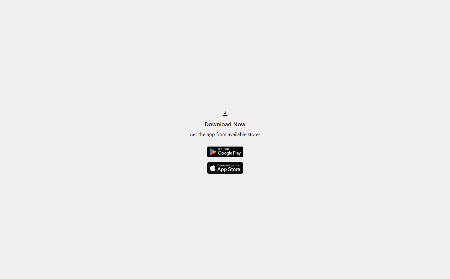
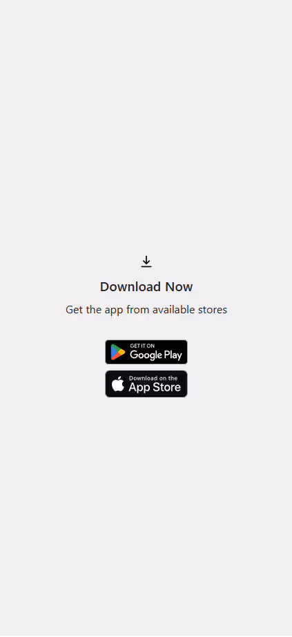
We highly recommend promoting your app using smart app banners – with these you’ll show a banner suggesting to install your app only to your website visitors using either an iOS or an Android device.
Read on to learn more about smart banners, and how to implement a smart app banner on your site.
What Are Smart App Banners?
‘Smart App Banners’ are banners that show up when someone lands on your mobile website, prompting them to get your app.
“Smart App Banners vastly improve users’ browsing experience compared to other promotional methods. Users will trust that tapping the banner will take them to the App Store and not a third-party advertisement. They will appreciate that banners are presented unobtrusively at the top of a webpage, instead of as a full-screen ad interrupting the web content. And with a large and prominent close button, a banner is easy for users to dismiss. When the user returns to the webpage, the banner won’t reappear.”
Features
ML Smart Banner features:
Configuration options:
Banner position
Banner delay
Texts fonts
Texts color
Banner BG
Text content (for button and heading/description)
App icon (the same for Android and Ios)
Entering animation
Display options: On load or when user scrolls up/down
Android and iOS links
Native Apple Smart App Banner support on iOS Safari when the page already includes the required apple-itunes-app meta tag. If the tag exists, the custom banner is suppressed automatically
Button Link applies automatically depending on user agent: If Android, it uses the provided android link if iOS, uses the provided ios link.
deviceData method available: its a function that can be called to get the current browser OS, useful for triggering external functions’. It returns a string containing “android” | “ios” | “windows”
Fallback App Icon option –> If the provided icon link is invalid / or image can not be displayed, an icon is generated using the App Name Param and Button colors
Default options set (if not texts, images or colors provided, it shows placeholder info, useful for catching errors or for testing while implementing the banner)
Banner can be used as a module or used directly in an html / script tag
Code written in Typescript and minified/bundled with Vite
How to use
Smart Banner can be used importing the JS code via CDN or as a module using NPM
With CDN
Just copy & paste this code at the end of the tag in your site. Modify the values accordingly. You probably want to change the values for:
appName: 2 initials from your brand, this is a fallback for the app logo
buttonColor: An HEX value, a good idea is to use your brand’s primary color
iconUrl: Your app’s logo, you can go to the store page and right click in the logo and copy that image URL
textHeading/ textDescription: Banner text content
linkIos / linkAndroid: the stores links, the banner will redirect the user to the correct store depending on their device
scripttype="module"src="https://cdn.jsdelivr.net/npm/@vendrux/ml-smart-banner@latest/dist/ml-smart-banner.min.js">script>script>const SBoptions = {
fontFamily: `"Source Sans Pro", "Arial", sans-serif`, // (string) Font family for banner texts, defaults to system safe fontsfallbackFontFamily: 'sans-serif', // (string) Font family for fallback icon, safe options are serif and sans-serifappName: 'ML', // (string) Initials for fallback icon. Recommended 2 characters. Fallback Image uses button text and bg colortextColor: '#222', // (string) Banner texts color (any color property value)buttonColor: '#000000', // (string) Button color (any background property value)buttonText: 'Download', // (string) Button textbuttonTextColor: '#fff', // (string) Button Text Color (any color property value)iconUrl: 'https://is1-ssl.mzstatic.com/image/thumb/Purple113/v4/c4/a1/70/c4a1704e-ed21-abde-cc5b-20c33be2c6a7/AppIcon-0-0-1x_U007emarketing-0-0-0-7-0-0-sRGB-0-0-0-GLES2_U002c0-512MB-85-220-0-0.png/230x0w.webp', // (string) Icon url, defaults to avatar with appName. You can use the app logo in the appstore/playstoretextHeading: 'Download our App!', // (string) Heading TexttextDescription: 'Get it now, download today', // (string) Description textbannerColor: '#fff', // (string) Banner BG colorlinkIos: 'https://apps.apple.com', // (string) Link for iOS linkAndroid: 'https://play.google.com', // (string) Link for Android position: 'bottom', // (string) Position of the banner, default 'top'. 'top' | 'bottom'animation: 'fadeIn', // (string) Banner animation, default 'fadeIn'. 'fadeIn' | 'scaleUp' | 'slideBottom' | 'slideTop' | 'slideLeft' | 'slideRight' | null,display: 'onLoad', // (string) Display options, default 'onLoad'. 'onLoad' | 'onScrollDown' | 'onScrollUp'radius: '0', // (string) Banner radius with unitsdelay: 0, // (number) defines how much time to wait until the element shows upshadow: true, // (boolean) If true applies soft shadow, true | falseuseSession: true, // (boolean) If true, after closed, Banner is not shown upon page reload. Default: truezindex: 999999// (number) Sets the z-index of the element }
functionaddSmartBanner() {
// only shows the banner in mobile devices & if not the appif(!deviceData.isMobile || deviceData.isCanvas ){
return }
new SmartBanner(SBoptions).init();
}
window.addEventListener('load', addSmartBanner);
script>
const options = {
fontFamily: `"Source Sans Pro", "Arial", sans-serif`, // (string) Font family for banner texts, defaults to system safe fontsfallbackFontFamily: 'sans-serif', // (string) Font family for fallback icon, safe options are serif and sans-serifappName: 'ML', // (string) Initials for fallback icon. Recommended 2 characters. Fallback Image uses button text and bg colortextColor: '#222', // (string) Banner texts color (any color property value)buttonColor: '#222', // (string) Button color (any background property value)buttonText: 'Download', // (string) Button textbuttonTextColor: '#fff', // (string) Button Text Color (any color property value)iconUrl: '', // (string) Icon url, defaults to avatar with appNametextHeading: 'Download now!', // (string) Heading TexttextDescription: 'Try it now, download today', // (string) Description textbannerColor: '#fff', // (string) Banner BG colorlinkIos: 'https://itunes.apple.com/', // (string) Link for iOS linkAndroid: 'https://play.google.com/', // (string) Link for Android position: 'bottom', // (string) Position of the banner, default 'top'. 'top' | 'bottom'animation: 'fadeIn', // (string) Banner animation, default 'fadeIn'. 'fadeIn' | 'scaleUp' | 'slideBottom' | 'slideTop' | 'slideLeft' | 'slideRight' | null,display: 'onLoad', // (string) Display options, default 'onLoad'. 'onLoad' | 'onScrollDown' | 'onScrollUp'radius: '0', // (string) Banner radius with unitsdelay: 0, // (number) defines how much time to wait until the element shows upshadow: true, // (boolean) If true applies soft shadow, true | falseuseSession: true, // (boolean) If true, after closed, Banner is not shown upon page reload. Default: truezindex: 999999// (number) Sets the z-index of the element}
const smartBanner = new SmartBanner(options);
Methods 💡
deviceData.os // returns current os "android" | "ios" | "windows" | "desktop"deviceData.isCanvas // returns true or falsedeviceData.isMobile // returns true or falsedeviceData.browser // returns "safari" | "chrome" | "firefox" | "other"deviceData.isIosSafari // returns true only for Safari on iPhone/iPad/iPod
Apple native banner on iOS Safari, custom banner elsewhere
If your page already includes Apple’s required meta tag in the server-rendered , the library automatically suppresses the custom banner on iOS Safari while still showing the custom banner on Android and non-Safari iOS browsers.
const options = {
linkIos: 'https://apps.apple.com/app/id123456789',
linkAndroid: 'https://play.google.com/store/apps/details?id=com.example.app'}
if (deviceData.isMobile && !deviceData.isCanvas) {
new SmartBanner(options).init();
}
Behavior:
iOS Safari + meta tag present: native Apple banner handles the experience and the custom banner is suppressed
iOS Safari + meta tag missing: custom banner is shown as a fallback
Android: custom banner is shown as usual
iOS Chrome/Firefox/other: custom banner is shown as usual
Important note:
Apple documents Smart App Banners as a meta tag in the page head. For the most reliable results, render the meta tag in the original HTML when possible.
Recipes 🍳
This are useful ways to implement the widget. We always recommend using an Event Listener to trigger the code when the document is loaded window.addEventListener('load', fnName)
Oops! Something went wrong while submitting the form.
This snippet detects if a visitor is on iOS or Android and automatically redirects them to the correct app store.
How it Works
This guide will help you create a smart redirect page that automatically sends your visitors to the correct app store (Google Play or Apple App Store), depending on their device.
You do not need to be a developer to use this, we’ve written this guide to walk you through the steps, even if you have very limited experience editing code.
Creating a custom redirect page on your own website gives you full control over the download experience — and unlocks key benefits for your marketing and analytics efforts.
What Is This For?
Many platforms and ad tools limit your visibility when you send users directly to the App Store or Play Store. By creating a simple redirect page on your own domain, you solve two major problems:
Branded Experience You own the page (e.g. yourdomain.com/stores-redirect), so users see your domain in all marketing materials — not a third-party link. This builds trust and improves click-through rates, especially on QR codes and paid ads.
Track Everything Since the redirect page lives on your website, you can add Google Analytics, Meta Pixel, UTM tags, or any other tracking tool — giving you complete visibility into how users are arriving and where they go next. This is essential for campaign measurement and A/B testing.
This approach is ideal for customers who want more control, deeper insights, and a seamless experience across web and app.
The URL should look like this, where the app store links are passed as URL parameters:
If you’re using a CMS (like Shopify, Webflow, Squarespace, or WordPress), look for a way to add a new page and edit the HTML content directly. You should be able to paste in the code provided below.
You’ll find specific guides for each at the bottom of this page
Option 1: Automatic Redirect (JavaScript Only)
Best for: Users should be taken to the correct store instantly, without seeing any message or UI.
How to use:
Paste the JavaScript snippet (see below) right before
on your page.
That’s it — users are redirected as soon as they land on the page.
Click the “Show HTML” button () in the editor toolbar
Paste the full HTML + JavaScript code provided (Option 1 or 2)
Click Save
Your redirect page will be available at a URL like https://yourstore.com/pages/stores-redirect
WordPress (Classic Editor or Gutenberg)
Option A: Using a Custom Page
In WordPress admin, go to Pages > Add New
Title your page: stores-edirect
In the editor, switch to Text/HTML view (Classic Editor) or use a Custom HTML block (Gutenberg)
Paste the full code (Option 1 or 2)
Click Publish
Option B: Using a Plugin (for advanced users)
You can use plugins like Insert Headers and Footers or WPCode to insert JavaScript into your site if needed.
Webflow
In your Webflow Dashboard, open your project
Go to Pages and click “+ New Page”
Name it something like stores-redirect
Open the Page Settings
Scroll to Before tag and paste the JavaScript snippet
Use a Custom Code Embed block at the top of your page to paste the HTML + CSS (for Option 2)
Save and publish
✅ Make sure “Custom Code” is enabled in your site settings (requires paid plan).
Squarespace
Squarespace doesn’t support full JavaScript execution in content blocks on all plans, so Option 2 (with fallback UI) is recommended only if your plan supports code injection.
Go to Pages > Add a new Blank Page
Name it something like stores-redirect
Open the Edit mode
Click “+” and choose “Code”
In the Code Block, paste the full HTML + JavaScript
Check “Display Source” OFF
Save the page
✅ Note: Full code blocks only work on Business or Commerce plans.
The QR Code Widget allows you to promote app-specific features, and discounts, followed by a QR code that can be scanned to open your app install page on mobile devices.
What Are QR Widgets?
QR widgets are modals/popups that show up when someone lands on your desktop website, prompting them to get your app.
Here’s an example:
Features ✨
ML QR Widget features:
Configuration options:
Widget position
Widget delay
Texts fonts
Texts color
Widget BG
QR colors
QR with images
Text content
Entering animation
Display options: On load or when user scrolls up/down
Fallback options –> If the provided icon link is invalid / or image can not be displayed, an icon is generated using the App Name Param and Button colors
Default options set (if not texts, images or colors provided, it shows placeholder info, useful for catching errors or for testing while implementing the widgets)
Widget can be used as a module or used directly in an html / script tag
The library uses QuickChart’s QR Library, methods from their API are available to use within the widget
Code written in Typescript and minified/bundled with Vite
How to use 📖
QR Widget can be used importing the JS code via CDN or as a module using NPM
With CDN 🚀
In order to install the QR Code Widget you will want to add the following piece of code into your website, before closing tags:
scripttype="module"src="https://cdn.jsdelivr.net/npm/@vendrux/ml-qr-widget@latest/dist/ml-qr-widget.min.js">script>script>functionaddQrWidget() {
new QrWidget().init();
}
window.addEventListener('load', addQrWidget);
script>
const options = {
fontFamily: `"Source Sans Pro", "Arial", sans-serif`, // (string) Font family for widgets texts, defaults to system safe fontstextColor: '#222', // (string) Widget texts color (any color property value)textHeading: 'Get 10% OFF using Vendrux app', // (string) Heading TexttextDescription: 'Scan our QR to download the app on your device and unlock the discount', // (string) Description textwidgetsColor: '#fff', // (string) Widget BG colorbackDrop: true,// (boolean) if true, adds a backdop in front of the pagebackDropZIndex: 888888, // (number) z-index of the backdrop, should be lower than widgets z-indexqrOptions: { // Params for the QR Generation, uses params from this docs: https://quickchart.io/documentation/qr-codes/text: "https://redirect.vendrux.com/?ios=https://itunes.apple.com/",
size: 150,
margin: 0 },
position: 'center', // (string) Position of the widgets, default 'center'. 'center' | 'top-right' | 'top-left' | 'bottom-left' | 'bottom-right'animation: 'fadeIn', // (string) Widget animation, default 'fadeIn'. 'fadeIn' | 'scaleUp' | 'slideBottom' | 'slideTop' | 'slideLeft' | 'slideRight' | null,display: 'onLoad', // (string) Display options, default 'onLoad'. 'onLoad' | 'onScrollDown' | 'onScrollUp'radius: '10px', // (string) Widget radius with CSS unitsdelay: 0, // (number) defines how much time to wait until the element shows upshadow: true, // (boolean) If true applies soft shadow, true | falseuseSession: false, // (boolean) If true, after widgets is closed, it creates a session registry to hide widgets on page reloads until the end of user's sessionzindex: 999999, // (number) Widget z-indexmaxWidth: "400px", // (string) Max Width of the widgets with CSS unitssessionExpire: 1440// (number) time for banner to show again in minutes starting from the time the banner is shown, defualt: 1440 (1 day) };
const qrWidget = new QrWidget(options);
Methods 💡
deviceData.os // returns current os "android" | "ios" | "windows" | "desktop"deviceData.isCanvas // returns true or falsedeviceData.isMobile // returns true or false
Recipes 🍳
This are useful ways to implement the widget. We always recommend using an Event Listener to trigger the code when the document is loaded window.addEventListener('load', fnName)
const options = {
// Set params here}
// Insert widgets only in our Canvas platformif(deviceData.isCanvas) {
const qrWidget = new QrWidget(options);
}
// Apply specific configs based on OSif(deviceData.os === "android" || deviceData.os === "windows") {
const qrWidget = new QrWidget(options1); // different options sets can be passed for different platforms}
if(deviceData.os === "desktop" || deviceData.os === "ios") {
const qrWidget = new QrWidget(options2);
}
// Insert widgets only in Mobile userAgentif(deviceData.isMobile) {
const qrWidget = new QrWidget(options3);
}
How Banner Session works
When ‘useSession’ parameter is set to true, the banners appears once until the banner is closed, after closed, the banner won’t appear until the next day (default) or until the time configured in the ‘sessionExpire’ parameter, this parameter should have the time in minutes.
1. If user closes the modal, it creates a LocalStorage key called “widgetClosed” with a date value (for example if we set up the sessionExpire value to 1440 (minutes), it would hide until tomorrow)
2. On widget init(), the library checks if the param exists and if the date is bigger than current date
3. If the expiration date already passed, the key is removed from storage and widget is shown again
Redirect URL 🔗
We provide a custom redirect URL that sends users to the correct app store using a single link.
Our Promotions Banner widget will allow you to display a message when your website gets displayed inside the apps, so you can provide exclusive app offers to your users.
Here’s an example:
Features ✨
ML Promotions Banner features:
Configuration options:
Banner position
Banner delay
Texts fonts
Texts color
Banner BG
Text content
Entering animation
Display options: On load or when user scrolls up/down
Android and iOS links
Button Link applies automatically depending on user agent: If Android, it uses the provided android link if iOS, uses the provided ios link.
deviceData method available: its a function that can be called to get the current browser OS, useful for triggering external functions’. It returns a string containing “android” | “ios” | “windows”
Default options set (if not texts, images or colors provided, it shows placeholder info, useful for catching errors or for testing while implementing the banner)
Banner can be used as a module or used directly in an html / script tag
Code written in Typescript and minified/bundled with Vite
How to use 📖
Promotions Banner can be used importing the JS code via CDN or as a module using NPM
With CDN 🚀
scripttype="module"src="https://cdn.jsdelivr.net/npm/@vendrux/ml-promotions-banner@latest/dist/ml-promotions-banner.min.js">script>script>functionaddPromotionsBanner() {
new PromotionsBanner().init();
}
window.addEventListener('load', addPromotionsBanner);
script>
const options = {
fontFamily: `"Source Sans Pro", "Arial", sans-serif`, // Font family for banner texts, defaults to system safe fontstextColor: '#222', // Banner texts color (any color property value),textHeading: 'Get a discount on your first purchase', // Heading TexttextDescription: 'Use coupon 10OFF', // Description textbannerColor: 'white', // Banner BG colorlink: '#', // Link for buttonposition: 'top', // Position of the banner, default 'top'. 'top' | 'bottom'animation: 'fadeIn', // Banner animation, default 'fadeIn'. 'fadeIn' | 'scaleUp' | 'slideBottom' | 'slideTop' | 'slideLeft' | 'slideRight' | null,display: 'onLoad', // Display options, default 'onLoad'. 'onLoad' | 'onScrollDown' | 'onScrollUp'radius: '0', // Banner radius with unitsdelay: 0, // defines how much time to wait until the element shows up in msshadow: true, // If true applies soft shadow, true | falseuseSession: false,
zindex: 9999999}
const promotionsBanner = new PromotionsBanner(options);
Methods 💡
deviceData.os // returns current os "android" | "ios" | "windows" | "desktop"deviceData.isCanvas // returns true or falsedeviceData.isMobile // returns true or false
Recipes 🍳
This are useful ways to implement the widget
const options = {
fontFamily: `"Source Sans Pro", "Arial", sans-serif`, // Font family for banner texts, defaults to system safe fontstextColor: '#222', // Banner texts color (any color property value),textHeading: 'Get a discount on your first purchase', // Heading TexttextDescription: 'Use coupon 10OFF', // Description textbannerColor: 'white', // Banner BG colorlink: '#', // Link for buttonposition: 'top', // Position of the banner, default 'top'. 'top' | 'bottom'animation: 'fadeIn', // Banner animation, default 'fadeIn'. 'fadeIn' | 'scaleUp' | 'slideBottom' | 'slideTop' | 'slideLeft' | 'slideRight' | null,display: 'onLoad', // Display options, default 'onLoad'. 'onLoad' | 'onScrollDown' | 'onScrollUp'radius: '0', // Banner radius with unitsdelay: 0, // defines how much time to wait until the element shows up in msshadow: true, // If true applies soft shadow, true | falseuseSession: false,
zindex: 9999999}
// Insert banner only in our Canvas platformif(deviceData.isCanvas) {
const promotionsBanner = new PromotionsBanner(options);
}
// Apply specific configs based on OSif(deviceData.os === "android" || deviceData.os === "windows") {
const promotionsBanner = new PromotionsBanner({link: 'https://linkOne.com'});
}
if(deviceData.os === "desktop" || deviceData.os === "ios") {
const promotionsBanner = new PromotionsBanner({link: 'https://linkTwo.com'});
}
// Insert banner only in Mobile userAgentif(deviceData.isMobile) {
const promotionsBanner = new PromotionsBanner(options);
}
Using a “copy text” function for coupons
// Set banner text with an onclick function in itconst options = {
textDescription: `Please use code 10OFF for 10% off in your next order!`}
// Create the copyBannerText function that is linked to the description text, it copies the text, displays a "Copied!" message in that place and then shows the passed text again functioncopyBannerText(e, text){
navigator.clipboard.writeText(text);
e.textContent = "Copied!"setTimeout( function() {
e.textContent = text
}, 3000);
}
functionaddPromotionsBanner() {
// Here we can use the deviceData method to display the banner only on desired devicesnew PromotionsBanner(options).init();
}
window.addEventListener('load', addPromotionsBanner);
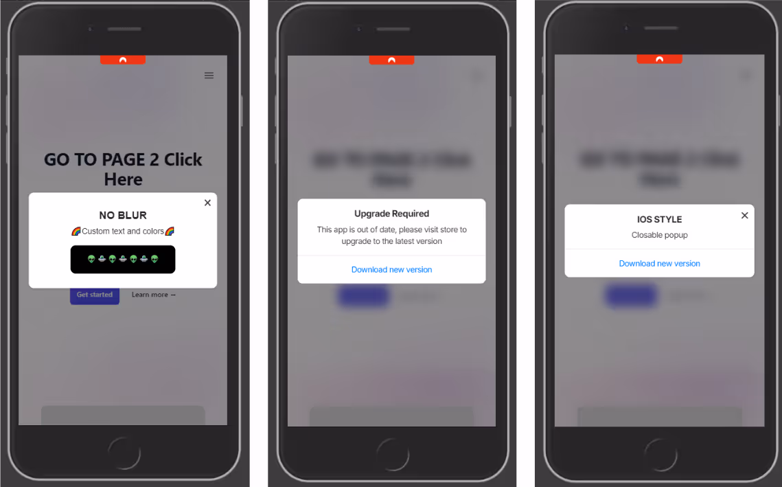
The ML Popup Widget makes it easy to prompt users with a native-style popup when their app version is outdated. This keeps your user base on the latest, most secure version of your app.
By effectively utilizing update popups, you can drive app engagement, improve user satisfaction, and ultimately increase your app’s success.
This element can also be used as a normal popup to add a custom UI ele
ment and a different experience in your app.
What This Widget Does
The widget checks the user’s app version and displays a popup only if it’s older than your defined minimum version. This works inside mobile apps or webviews, and uses native-feeling styling that resembles iOS or Android prompts.
It also works as a normal popup to provide your users a nice User Experience.
The popup includes:
A custom heading, description, and CTA button
Links to the relevant App Store / Play Store
Optional blurred backdrop, animations, and more
Conditional display based on app version
Copy Directly Into Your Site 📄
Paste the following code at the end of your page’s . This popup will show only when the user’s app version is older than your defined minimum version (minVersion), in this code we set the closable param to false, ensuring the popup is not dismissable. Full list of options at the end of this guide:
src="">
script>const popupOptions = {
popupStyle: 'ios',
fontFamily: `"Source Sans Pro", "Arial", sans-serif`,
textColor: '#222',
textHeading: 'Upgrade required',
textDescription: 'This app is out of date, please visit store to upgrade to the latest version',
buttonText: 'Download new version',
buttonColor: '#000000',
buttonTextColor: "#ffffff",
widgetColor: '#fff',
backDrop: true,
backDropBlur: true,
backDropZIndex: 888888,
zIndex: 999999,
position: 'center',
animation: 'fadeIn',
display: 'onLoad',
radius: '10px',
delay: 0,
shadow: true,
useSession: false,
maxWidth: "700px",
closable: false,
padding: '20px',
linkIos: 'https://itunes.apple.com/?PATH-TO-YOUR-APP',
linkAndroid: '',
};
functionaddPopupWidget() {
// Checks if current device is a phone (deviceData.isMobile) and if its the app (deviceData.isCanvas)if (deviceData.isMobile || deviceData.isCanvas) {
const minVersion = 1.0;
// Gets current app versionconst appVersion = nativeFunctions.getDeviceInfo().appVersion;
// Compares the minimum required version with the current app version// if appVersion const isOutdated = deviceData.compareAppVersion(minVersion, appVersion);
if (isOutdated) {
// Triggers the widgetnew PopupWidget(popupOptions).init();
}
}
}
window.addEventListener('load', addPopupWidget);
script>
Widget Methods
The widget have the following methods to compare the current app version and to enable the widget in the app only:
// returns true if its an ios or anroid devicedeviceData.isMobile
// returns 'ios', 'android' or 'windows'deviceData.os
// Returns true if using the appdeviceData.isCanvas
// Accepts two params (numbers)// if appVersion deviceData.compareAppVersion(minVersion, appVersion)
// CANVAS PLATFORM METHODS// Returns an object with app metadata and infonativeFunctions.getDeviceInfo()
/*
mobiloudAppInfo = {
appId = string,
appVersion = string,
brand = string,
hardware = string,
manufacturer = string,
model = string,
nameos = string,
osVersion = string,
platform = string,
pushSubscribed = bool,
pushToken = string,
pushUserId = string,
timeZone = string
}
*/
This function returns true if the current version is lower than the required minimum. It enables developers to show the popup only when needed, avoiding unnecessary prompts.
Customization Options
You can modify any value in popupOptions to match your app’s tone and design:
linkIos, linkAndroid: Deep link or store URL for each platform
popupStyle : This accepts ‘ios’ for default ios styles or ‘android’ for custom CSS styles
position, animation, shadow, radius: Look and feel
closable: false: Disables the close (X) button to make the popup mandatory
useSession: false: Ensures popup shows every time until the app is updated
Key points
Set a meaningful minimum version number whenever a critical update is released.
Always include store links for both platforms or ensure the popup is shown only in the desired platforms (this can be done using deviceData.os for getting the current device)
Match styling to your app’s branding for a consistent experience.
Make the popup non-dismissible (closable: false) if the update is required.
The Web-App Style Injector is a lightweight JavaScript library that simplifies the process of tailoring your website for web and app versions. By adding a few lines of code, you can apply distinct styles to elements visible only on the app version or hidden entirely on it. No advanced technical knowledge is required; it’s as simple as copy-pasting two script tags!
Key Features
Effortless Integration: Just copy and paste the provided script tags to get started.
Dynamic Styling: Automatically adds a is-app class to the , enabling custom styles for app and web versions.
App-Specific Classes:
app-hide: Hides elements exclusively on the app version.
app-exclusive: Displays elements only on the app version.
Customizable Options: Use optional parameters for further flexibility, such as hiding predefined sections or disabling logs.
Helper Logs: By default, helpful console logs guide you during setup and usage.
Advanced Classes Injection: A developer-oriented feature that allows regex-based CSS injection for specific pages.
How to Use It
1. Basic Implementation
For the simplest setup, follow these steps:
Copy the following code and paste it right before the closing tag of your document
hide-wp-adminbar: Hides WordPress adminbar, this usually shows after users sign in in a WordPress site
hide-back-to-top: This hides some floating back to top arrows/buttons
hide-popups-and-consents: This includes: cookie consent in bottom drawers, promotional popups, and enables overflow in the body, sometimes popups locks page scroll
hide-banners: This hides some promotional bars / banners that are above the site's header
hide-fabs: This hides Floating buttons (a lot of them added with plugins, so we include some common plugin selectors), this also hide some floating captcha elements
By customizing the parameters, you can fine-tune the appearance of your app version with minimal effort.
3. Advanced Classes Injection
For developers, the library provides a powerful feature to inject CSS globally or selectively based on URL patterns using regular expressions. This allows precise control over styles for specific pages.
You can define styles and target specific pages by passing a regex pattern. Here are some examples of how to use the configuration options:
// Define styles as a stringlet style = `
a {
color: green;
background-color: yellow;
}
.className {
font-size: 2rem;
}
`;
// Use regex to target specific pageslet regex = /.*\/login/;
// Name the style block (optional)let name = "Login Styles";
// Enable logs for debugging (optional)addStyle({css: style, regex: regex, name: name, logs: true});
// Apply global styles without regexaddStyle({css: `color: red !important`});
css: The CSS rules as a string.
regex: A regular expression to target specific pages.
name: A name for the style block (optional).
logs: Enable or disable logs for debugging (optional).
Device-Specific Methods
deviceData.os: Returns the current OS ("android", "ios", "windows", "desktop").
deviceData.isCanvas: Returns true or false.
deviceData.isMobile: Returns true or false.
By combining these advanced features, you can achieve highly customized styling for specific scenarios.
Mixing Methods
The library allows you to combine the styleTemplate and addStyle methods for even greater flexibility. For example, you can use styleTemplate to apply predefined styles globally and then customize specific pages with addStyle:
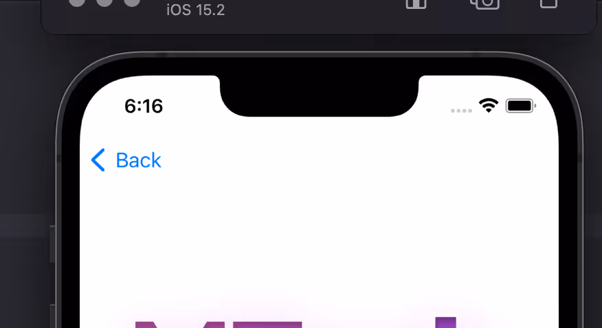
A ‘Back Button’ in your app is essential for user experience, providing a quick and intuitive way to backtrack through a series of actions or views. Without a back button, users might feel disoriented or frustrated trying to navigate within the app.
This library provides a web based widget that replicates the native look and feel provided by the iOS and Android SDKs. The purpose is to add navigation options to a web app when running in a native app container, like what Vendrux provides.
Here’s an example:
Features ✨
ML Back Button features:
Configuration options:
Button text/label
Button colors
Position and animation
Display options: when user scrolls screen, on page load
Basic style settings, extensible with CSS
Options to replace elements and attach button to a container
Regex / url filtering, to avoid displaying the button in certain pages
deviceData method available: its a function that can be called to get the current browser OS, useful for triggering external functions’. It returns a string containing “android” | “ios” | “windows”
Default options set (if not texts, images or colors provided, it shows placeholder info, useful for catching errors or for testing while implementing the Button)
Button can be used as a module or used directly in an html / script tag
Code written in Typescript and minified/bundled with Vite
How to use 📖
ml-back-button can be used importing the JS code via CDN or as a module using NPM
With CDN 🚀
scripttype="module"src="https://cdn.jsdelivr.net/npm/@vendrux/ml-back-button@latest/dist/ml-back-button.min.js">script>script>functionaddBackButton() {
new BackButton().init();
}
window.addEventListener('load', addBackButton);
script>
const options = {
/** Sets the button text color (if string is used in label); Example '#fff'*/textColor: string,
/** Sets the button fill color (if svg is used in label); Example '#000'*/fillColor: string,
/** Sets the button background color (if svg is used in label); Example '#000'*/buttonColorPrimary: string,
/** Sets the button label; Example 'Back', ''*/label: string,
/** Sets the button position when floating: 'top-right' | 'top-left' | 'bottom-left' | 'bottom-right' */position: 'top-right' | 'top-left' | 'bottom-left' | 'bottom-right',
/** Sets the button entrance animation: 'fadeIn' | 'scaleUp' | 'slideBottom' | 'slideTop' | 'slideLeft' | 'slideRight' | null */animation: 'fadeIn' | 'scaleUp' | 'slideBottom' | 'slideTop' | 'slideLeft' | 'slideRight' | null,
/** Sets the button display type: 'onLoad' | 'onScrollDown' | 'onScrollUp' */display: 'onLoad' | 'onScrollDown' | 'onScrollUp',
/** Sets the button radius: css unit, 50% gives a rounded btn if same height/width; Example '50%' */radius: string,
/** Sets the button width: css unit; Example '20px' */width: string,
/** Sets the button inner padding: css unit; Example '1em' */padding: string,
/** Defines how much time to wait until the element shows up (in ms); Example 1000 */delay: number,
/** If not null, button is injected into a container, it uses any html selectors; Example '.class', '#id', null */containerSelector: string | null,
/** If container selector activated, it places the button before or after other elements; Example 'first' | 'last' | null */containerOrder: 'first' | 'last' | null,
/** Sets text alignment, button has a flex container; Example 'center' | 'start' | 'end' */textAlign: 'center' | 'start' | 'end',
/** If true applies soft shadow; Boolean */shadow: boolean,
/** if a selector is placed here, this element would be replaced with the back button; Example '.className' '#idName' */replaceElement: string | null,
/** uses regex to avoid injecting button in certain pages; Example /(?:\/|\/home|\/someUrl|\/about|\/categories\/clothing)/ */regex: string | null,
/** Display or not logs, useful when developing; Boolean */logs: boolean
}
const BackButton = new BackButton(options);
Methods 💡
deviceData.os // returns current os "android" | "ios" | "windows" | "desktop"deviceData.isCanvas // returns true or falsedeviceData.isMobile // returns true or false
Recipes 🍳
This are useful ways to implement the widget. We always recommend using an Event Listener to trigger the code when the document is loaded window.addEventListener('load', fnName)


.avif)


.avif)


.avif)
