
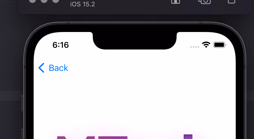
A ‘Back Button’ in your app is essential for user experience, providing a quick and intuitive way to backtrack through a series of actions or views. Without a back button, users might feel disoriented or frustrated trying to navigate within the app.
This library provides a web based widget that replicates the native look and feel provided by the iOS and Android SDKs. The purpose is to add navigation options to a web app when running in a native app container, like what Vendrux provides.
Here’s an example:
Features ✨
ML Back Button features:
- Configuration options:
- Button text/label
- Button colors
- Position and animation
- Display options: when user scrolls screen, on page load
- Basic style settings, extensible with CSS
- Options to replace elements and attach button to a container
- Regex / url filtering, to avoid displaying the button in certain pages
- deviceData method available: its a function that can be called to get the current browser OS, useful for triggering external functions’. It returns a string containing “android” | “ios” | “windows”
- Default options set (if not texts, images or colors provided, it shows placeholder info, useful for catching errors or for testing while implementing the Button)
- Button can be used as a module or used directly in an html / script tag
- Code written in Typescript and minified/bundled with Vite
How to use 📖
ml-back-button can be used importing the JS code via CDN or as a module using NPM
With CDN 🚀
script type="module" src="https://cdn.jsdelivr.net/npm/@vendrux/ml-back-button@latest/dist/ml-back-button.min.js">script>
script>
  function addBackButton() {
  	new BackButton().init();
  }
  window.addEventListener('load', addBackButton);
script>
NPM 📦
npm i @vendrux/ml-back-buttonConfiguration options ⚙️
const options = {
/** Sets the button text color (if string is used in label); Example '#fff'*/
textColor: string,
/** Sets the button fill color (if svg is used in label); Example '#000'*/
fillColor: string,
/** Sets the button background color (if svg is used in label); Example '#000'*/
buttonColorPrimary: string,
/** Sets the button label; Example 'Back', ''*/
label: string,
/** Sets the button position when floating: 'top-right' | 'top-left' | 'bottom-left' | 'bottom-right' */
position: 'top-right' | 'top-left' | 'bottom-left' | 'bottom-right',
/** Sets the button entrance animation: 'fadeIn' | 'scaleUp' | 'slideBottom' | 'slideTop' | 'slideLeft' | 'slideRight' | null */
animation: 'fadeIn' | 'scaleUp' | 'slideBottom' | 'slideTop' | 'slideLeft' | 'slideRight' | null,
/** Sets the button display type: 'onLoad' | 'onScrollDown' | 'onScrollUp' */
display: 'onLoad' | 'onScrollDown' | 'onScrollUp',
/** Sets the button radius: css unit, 50% gives a rounded btn if same height/width; Example '50%' */
radius: string,
/** Sets the button width: css unit; Example '20px' */
width: string,
/** Sets the button inner padding: css unit; Example '1em' */
padding: string,
/** Defines how much time to wait until the element shows up (in ms); Example 1000 */
delay: number,
/** If not null, button is injected into a container, it uses any html selectors; Example '.class', '#id', null */
containerSelector: string | null,
/** If container selector activated, it places the button before or after other elements; Example 'first' | 'last' | null */
containerOrder: 'first' | 'last' | null,
/** Sets text alignment, button has a flex container; Example 'center' | 'start' | 'end' */
textAlign: 'center' | 'start' | 'end',
/** If true applies soft shadow; Boolean */
shadow: boolean,
/** if a selector is placed here, this element would be replaced with the back button; Example '.className' '#idName' */
replaceElement: string | null,
/** uses regex to avoid injecting button in certain pages; Example /(?:\/|\/home|\/someUrl|\/about|\/categories\/clothing)/ */
regex: string | null,
/** Display or not logs, useful when developing; Boolean */
logs: boolean
}
const BackButton = new BackButton(options);Methods 💡
deviceData.os // returns current os "android" | "ios" | "windows" | "desktop"
deviceData.isCanvas // returns true or false
deviceData.isMobile // returns true or false
Recipes 🍳
This are useful ways to implement the widget. We always recommend using an Event Listener to trigger the code when the document is loaded window.addEventListener('load', fnName)
Insert Back Button – desktop only
function addBackButton() {
	if(deviceData.isMobile || deviceData.isCanvas ){
		return
	}
    new BackButton(options).init();
  }
window.addEventListener('load', addBackButton);
Using deviceData method to filter devices
const options = {
  // Set params here
}

// Insert widgets only in our Canvas platform
if(deviceData.isCanvas) {
	const backButton = new BackButton(options);
}

// Apply specific configs based on OS
if(deviceData.os === "android" || deviceData.os === "windows") {
  const backButton = new BackButton(options1);
}
if(deviceData.os === "desktop" || deviceData.os === "ios") {
  const backButton = new BackButton(options2);
}

// Insert widgets only in Mobile userAgent
if(deviceData.isMobile) {
	const backButton = new BackButton(options3);
}
Leave a Reply