If you are using Google Tag Manager (GTM) on your website, check our Google Analytics with Google Tag Manager guide instead.
Tracking the performance of your app is key to make sure your goals are achieved, in this guide you will learn how to adjust your website Google Analytics integration to allow you to track your app separately from your website.
Configure Google Analytics Tracking Code
Your existing Google Analytics tracking code should look like this:
    window.dataLayer = window.dataLayer || [];
    function gtag(){dataLayer.push(arguments);}
    gtag('js', new Date());
    gtag('config', 'G-XXXXXXXXX');
We will add a few lines of code that will add an extra user property to users who view your website through the Vendrux app.
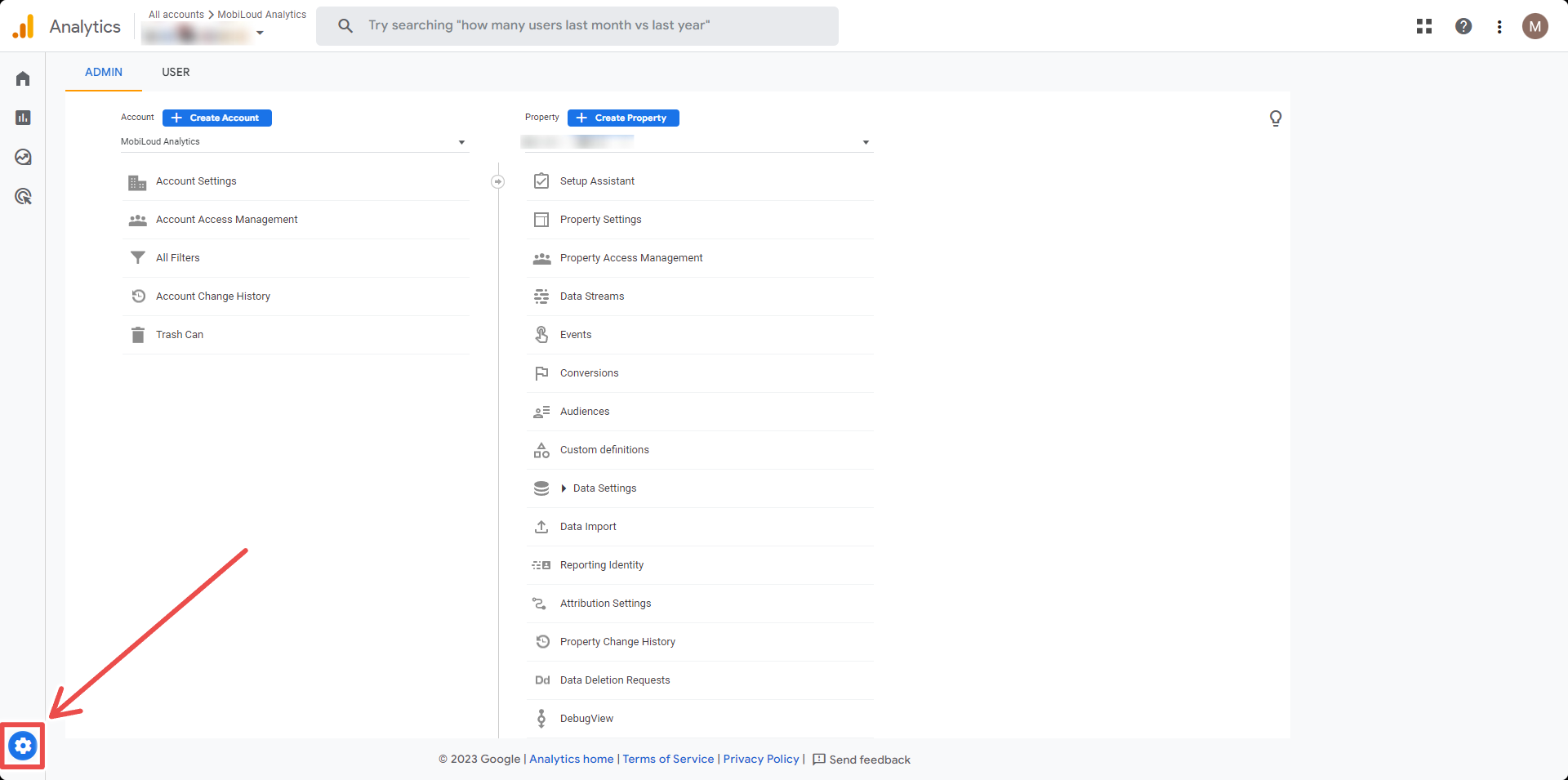
Click the “Gear” icon located on the bottom left area of your screen:
Click “Custom definitions” in the “Property” column:
Click the “Create custom dimension” button:
Fill the details as follows:
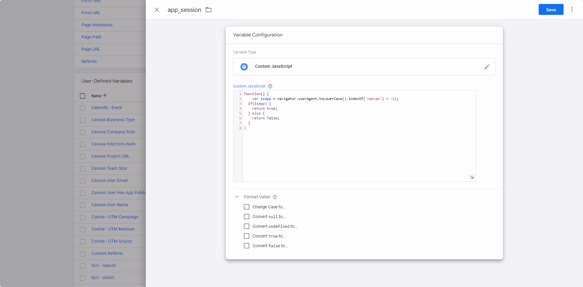
Dimension name: app_session
Scope: user
Description: Determines if the user is viewing the website on the browser or through the app
User property: app_session
Save your custom dimension, and you are done!
You Need to Wait
Once you have created the custom dimension you will need to wait until a few users have opened your app, and for the data to be processed by Google Analytics, which usually takes 24 hours at least.
To clarify, you will not be able to see segment your users immediately, you will need to wait 24 hours before doing so.
You can track your app users via Google Analytics and Google Tag manager.
In order to do this, you will need to create a custom dimension in Google Analytics, a variable to detect the “canvas” string in the user agent, and a tag to track app users.
Even though this sounds simple enough, there are quite a few things you need to do on both platforms to achieve the desired result.
If you have a popular website, with many users, we’d recommend asking a developer to help you with this, to avoid issues with your Analytics metrics.
Before we start, keep in mind that Vendrux relies on your website for all the content, when a page of your website is displayed in the app, we are simply performing an HTTPS request to it. For that reason, we are going to use the same Google Analytics Property that you use for your website, and it should look like this:
Let’s get started!
Step 1 – Create a custom dimension in Google Analytics
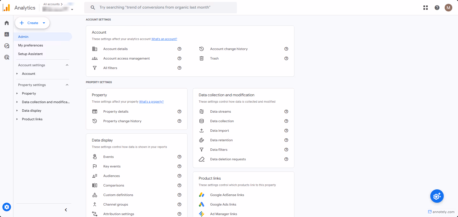
On the left sidebar, open the “Admin” area by clicking the “Gear” icon on the very bottom:
Now select “Custom Definitions” under the “Property” column:
Click the “Create custom dimensions” button on the right side of the screen:
A form will appear on the right side of your screen, and you must fill the fields as follows:
Dimension name: app_session
Description: can be empty
User property: app_session – you will have to type this in
It is important to use the values above, for consistency and to make it easy for our team to help you with troubleshooting. Your form should look like this:
Step 2 – Copy your Web Steam Measurement ID
Before leaving your Google Analytics Dashboard, go to “Admin” on the left sidebar:
Select “Data Streams”:
Select your website’s data stream:
Click the “Copy” button on your Measurement ID, and save the number somewhere on your computer, you will need it later:
Step 3 – Setup your variable in Google Tag Manager
Note: Please ignore the variable name in the screenshot. Use “Vendrux – Mobile App Tracking” for consistency and easy troubleshooting for our team.
Step 4 – Create your tag in Google Tag Manager
With your variable created, it is time to create your tag.
For this guide we consider that you have already configured your Google Analytics account into GTM, this is a requirement in order for the next steps described in this guide to work correclty.
To get started click “Tags” on the left sidebar:
Click the “New” button on the right side:
Name your tag the following: “Vendrux – Mobile App Tracking Tag” then click the “Tag configuration” block:
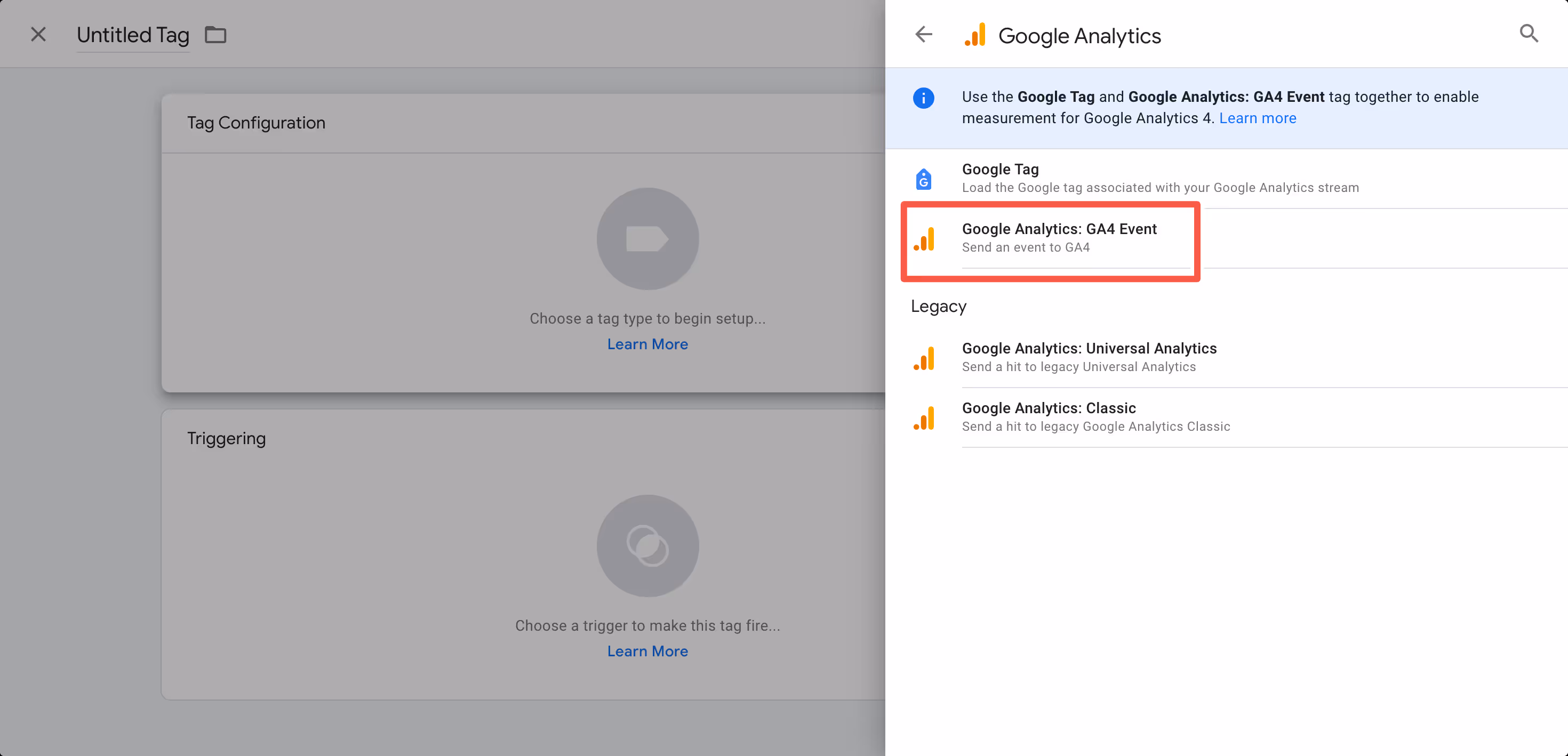
Select “Google Analytics” in the list of “Featured” tag types:
Select the “Google Analytics: GA4 Event”:
Fill in the “Measurement ID” field with the value you previously copied from your Google Analytics account:
Expand the “User Properties” area and fill the “Property Name” field with “app_session”:
On the “Value” field, click the small brick icon and pick the variable you created in the previous step:
Now click the “Triggering” block:
Select “All pages”:
Click “Save”:
Step 5 – Submit your tags and install Google Tag Manager on your website
The first step now is to submit everything you created, so it goes live into production, you can do that by clicking the “Submit” button on the right side of the screen:
Google will ask you for a few confirmations, but just click the “Publish” button until your changes are submitted.
If you never used Google Tag Manager before, you might need to add its code to your website, you can find all the details on how to implement the code to your website by clicking on your Tag Manager ID, here:
Congratulations, if you followed all steps until this point, you should now be tracking all users that are viewing your website through the app.
When talking about building apps using a single codebase, It’s not merely about maintaining the website as-is and calling it an app; rather, it’s a strategic approach that empowers clients to utilize the same resources and development team for both platforms.
✅ one of the strong points in vendrux apps is the possibility to have the same codebase for both your app and website.
Defining the Single Codebase Approach
At its core, the single codebase approach signifies the ability to take advantage of development efforts by reusing existing resources for both website and app creation. This sounds like a lot of work beforehand, but when comparing this to what creating a native app from scratch and having to deal with different developer teams/languages, this is a really good option for leveraging your app.
Strategies for differentiation used by our clients
Creating Dedicated App Pages: While it may seem labor-intensive, the process of developing new pages specifically tailored for the app can often be simplified.This can be accomplished creating app-exclusive pages/urls, for example, having: yourwebsite.com , the app page would be yourwebsite.com/app . Some clients opt to have a different subdomain for it like: app.yourwebsite.com.
Dynamic Content Rendering: Leveraging the capabilities of dynamic platforms such as WordPress, Shopify, or JavaScript frameworks, this is a versatile solution for displaying content dynamically based on the platform.An approach some clients use for this is detecting the user’s user-agent/platform (Vendrux’s platform uses a special user-agent name called ‘’canvas’’), and based on that, rendering different content into the website.
Selective Element Targeting: Assigning unique classes to elements and selectively targeting them within our platform or usign our CSS Injector plugin into inject styles based on certain conditions
Utilizing Style Injectors: We offer two ways to inject styles into your site to modify its appearance within the app.
Inserting styles through our Canvas platform → This is a good way to insert styles in a non-invasive way, useful for cases where you dont want to mess with your site code
Using our CSS Injector plugin → With this tool you can insert styles into your site based on conditions such as pages where the code should or not be applied (with regex rules) or based on user platform using the methods provided in the library
Hiding/showing sections
To hide specific sections in your site, we inject CSS into the app directly or using our CSS Injector plugin for dynamically doing it client-side.
An easy and fast way to do this, is adding classes to elements in your site and then target them with css, our suggested ClassNames would be:
.ml-app-exclusive → These are elements that should be displayed in the app only
.ml-app-hide → These are elements that should be hidden in the app
❓ The Class Names could be named whatever you want, and then the code should be adapted to those classnames
Here is an example on how to implement this classes using our CSS Injector plugin
html>head>head>body>divclass="ml-app-exclusive"> THIS IS HIDDEN IN THE BROWSER, BUT VISIBLE IN APP
div>divclass=".ml-app-hide"> THIS IS HIDDEN IN THE APP, BUT VISIBLE IN BROWSER
div>scriptsrc="https://cdn.jsdelivr.net/npm/@vendrux/ml-css-injector@latest/dist/ml-css-injector.min.js">script>script>// deviceData is a dynamic way to check the user's deviceif(!deviceData.isCanvas){
// any classes that should apply if it's NOT the app, would be here addStyle({css: `.ml-app-exclusive{display: none !important}`});
} else{
// any classes that should apply to the app, would be here addStyle({css: `.ml-app-exclusive{display: block !important}`});
addStyle({css: `.ml-app-hide{display: none !important}`});
addStyle({css: `footer{display: none !important}`});
}
script>body>html>
Our app publishing process consists of seven key stages, designed to get your app live within 30 days while ensuring it meets both your requirements and app store standards.
1. Kickoff & Setup
After signing up, you’ll receive a welcome email with a link to our onboarding form. You’ll need to provide:
Your website URL
Brand assets (logos, color schemes)
App icons
Any specific preferences for your mobile app
Timeline: We’ll confirm receipt of your materials within one business day.
2. App Configuration
Our technical team begins building your app, focusing on:
Replicating your website’s navigation structure
Setting up core functionality
Implementing necessary backend connections
Configuring all required integrations
This phase often involves multiple iterations as we refine the app based on your feedback. We handle all technical complexities while keeping you informed of our progress.
3. Customer Testing
Once the initial build is complete, you’ll receive:
Preview versions of your app
Test links for both phones and tablets
Instructions for testing different features
We encourage you to:
Test all functionality thoroughly
Navigate through every section
Try out all features
Provide detailed feedback on your experience
Testing can continue even after store submission, allowing us to make improvements while the app is under review.
4. Quality Assurance
Our QA team performs comprehensive testing, including:
Functionality checks across different devices
Testing of all interactive elements
Verification of forms and user inputs
Edge case scenarios
Performance testing
Any issues identified during QA are immediately addressed and resolved.
5. Store Submission
We submit your app to both the Apple App Store and Google Play Store early in the process, with a delayed release option. This approach:
Allows us to get early feedback from app store review teams
Gives us time to make necessary adjustments
Enables continued testing and improvements while under review
Provides flexibility in choosing the final release date
During submission, we handle:
Creating compelling screenshots
Writing optimized store descriptions
Selecting effective keywords
Managing all technical requirements
Communicating with store review teams
Multiple submission iterations may be needed to meet all store requirements while incorporating your ongoing feedback.
6. Final Optimization
During the store review period, we:
Actively monitor your app’s status
Address feedback from store reviewers
Continue implementing your requested changes
Make necessary adjustments quickly
Ensure all requirements are met
7. Launch & Growth
Once you’re satisfied with the app and store approvals are received, we:
Coordinate the release on your preferred timeline
Provide promotional materials for your app launch
Offer guidance on app marketing strategies
Help set up:
Push notifications
App promotion banners
User engagement tools
Timeline Expectations
Our target is to get your app live within 30 days. However, the actual timeline can vary based on:
Complexity of required features
Number of iterations needed
App store review processes
Your feedback and requested changes
It’s not unusual to go through multiple rounds of configuration and approval until both you and the app stores are completely satisfied with the result.
Communication & Support
Throughout the entire process, you can expect:
Regular status updates
Clear communication channels
Quick responses to your questions
Guidance at every stage
Technical support as needed
Need Help?
If you have questions about the process or want to discuss your specific needs:
Our team is here to ensure your app launch is successful and meets your business objectives.
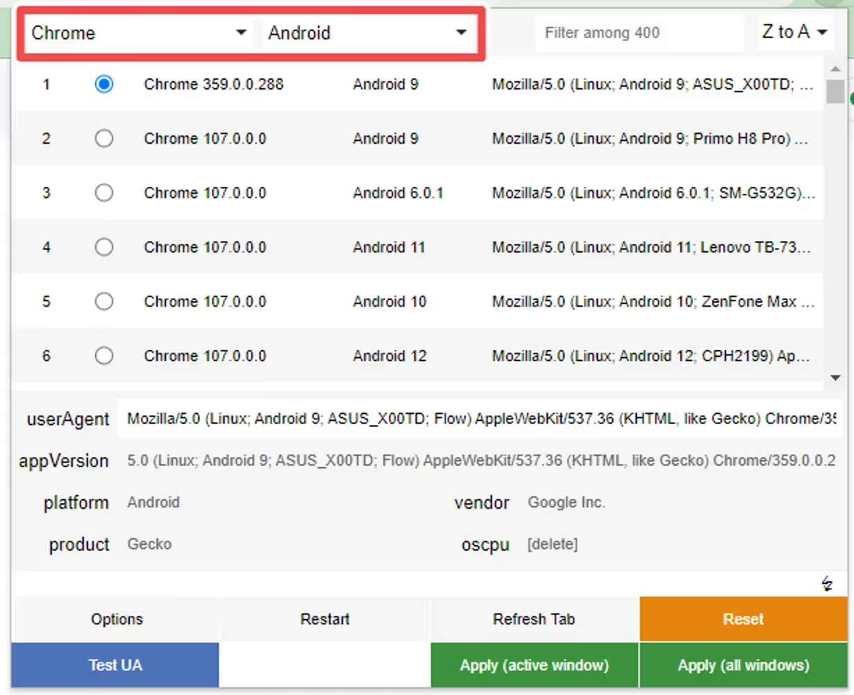
Once you have installed the extension, set it up as follows:
Step 1
Select “Chrome” as the browser and “Android” as the platform if you want to test the Android version of the Button, or “Safari” and “iOS” in case you want to test the iOS version:
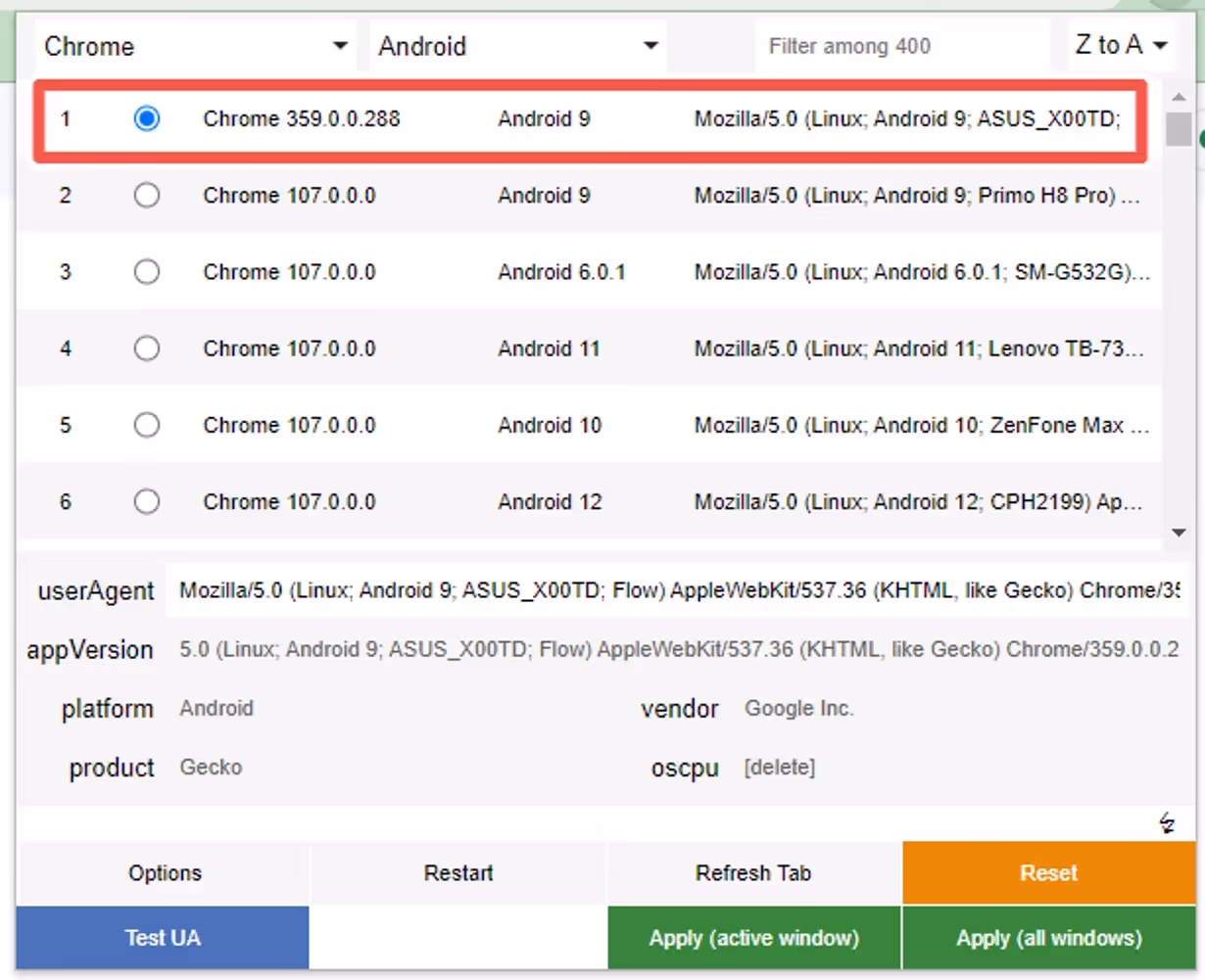
Step 2
Select one of the options that will appear, any will work:
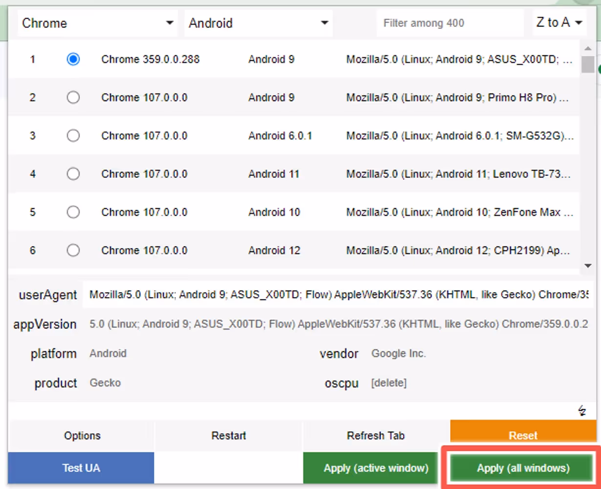
Step 3
Click “Apply” to make sure the user agent is properly set up on your browser:
Step 4
You can now press “F5” while viewing your website to refresh the browser window with the updated user agent.
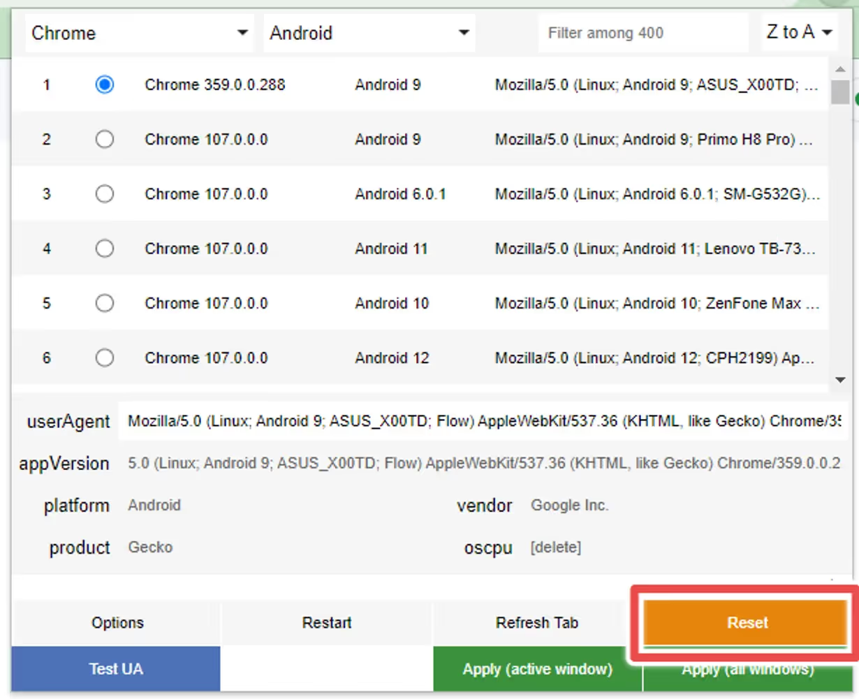
Reset
If you want to revert the changes to the user agent, as some websites might start behaving differently after doing so, you can click the “Reset” button:
If you have a “Cart” tab in your app, you might want to refresh it in the background when the user adds or removes a product to the cart, so the next time the user goes to that tab it will be up-to-date with the latest products.
To do this, you will need to trigger a nativeFunction when a product gets added or removed from the cart.
The nativeFunction that we will use looks like this:
// Updates all tabs in the app, except the current onenativeFunctions.updateTabs()
// Updates the tab(s) in the declared position(s)// In this example we are updating the 2nd and the 3rd tab in the bottom navigationnativeFunctions.updateTab([2, 3])
The first step is to determine the best way to identify that action on your website.
If your website has a cart icon that displays the number of products in it, that would be a smart way to do it.
You can use Javascript code to monitor that icon and identify changes in the number of items.
Imagine that your cart icon HTML code looks like this:\
We could use the following Javascript snippet to update the cart tab when the number of products in the cart changes:
// Check if the user agent contains 'canvas' (case insensitive)if (navigator.userAgent.toLowerCase().indexOf('canvas') !== -1) {
// Select the element that displays the number of products in the cart.var cartCountElement = document.querySelector('.product-count');
// Define the function that triggers when there is a change in the cart.functionhandleCartChange() {
nativeFunctions.updateTab([2]);
}
// Check if the cart count element exists to avoid errorsif (cartCountElement) {
// Create a new MutationObserver instance and provide a callback function that will be executed when mutations are observed.var observer = new MutationObserver(function(mutations) {
mutations.forEach(function(mutation) {
if (mutation.type === 'childList' || mutation.type === 'characterData') {
handleCartChange();
}
});
});
// Start observing the target element for configured mutations. Observe for changes in children (e.g., text changes) and character data. observer.observe(cartCountElement, { childList: true, characterData: true, subtree: true });
}
}
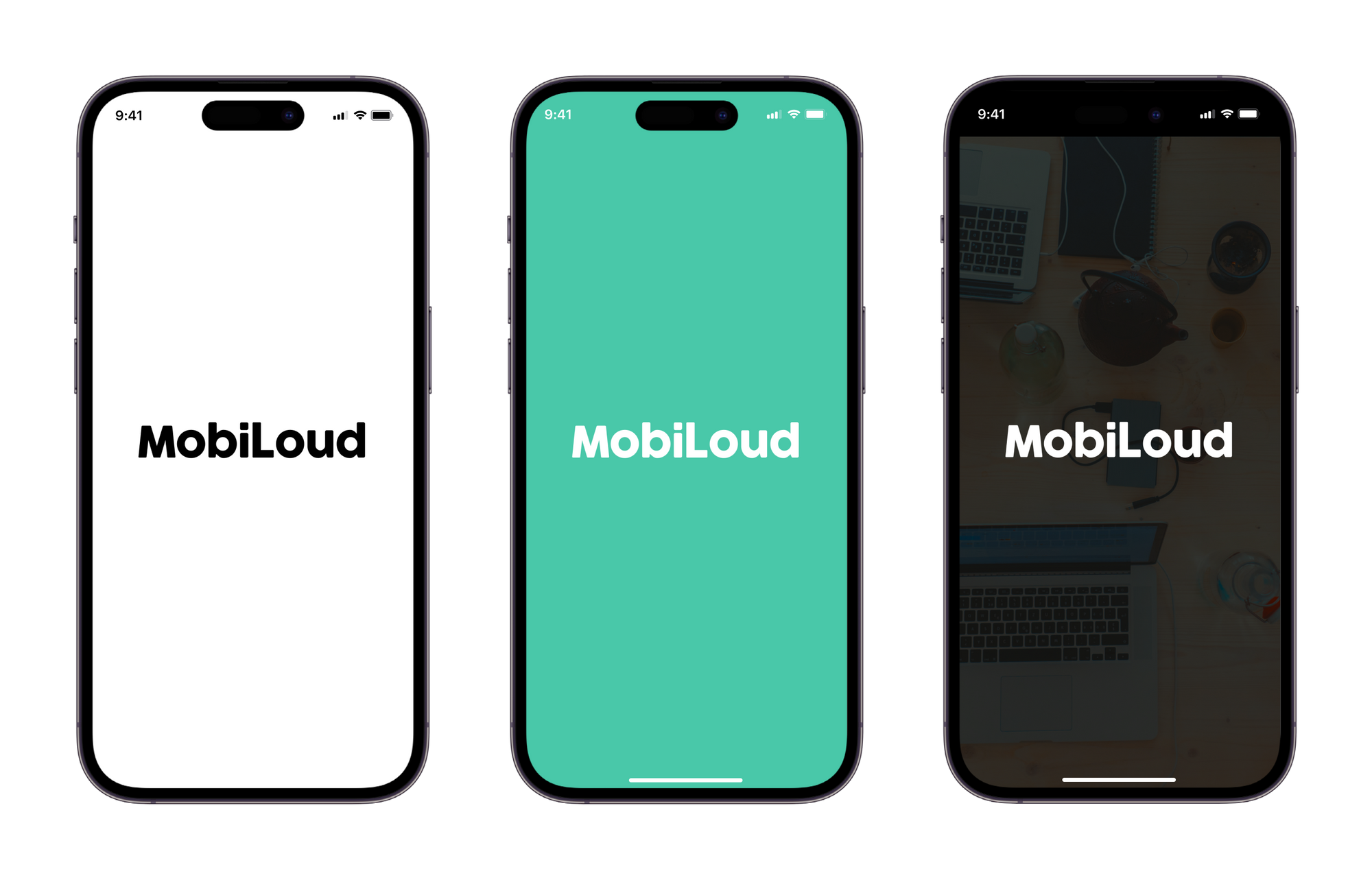
The splash screen is displayed as soon as you open your app, while the content is loading.
Below you can see some examples:
The final splash screen is built based on two different graphics, with the following specs:
Logo: PNG file with 1000x1000px and your logo in the center
Background: PNG file with 2248x2248px, no transparencies
The graphics are merged, with the logo being placed over the background, as you can see below:
Here are a few tips on how to make your splash screen look great:
1 – Leave space around your logo
When preparing your graphic for the logo, make sure to keep some spacing on the sides of your logo. We recommend adjusting the width of your logo to 700px, so there is enough spacing on the sides, see below:
The final result will be much better if you leave space on the sides, as you can see below:
2 – Don’t use text in your background
The splash screen background will get cropped depending on the size of the device where the app is being used. An iPad will display more elements of your background, while an iPhone will display fewer elements.
With that in mind, we highly recommend that you avoid using text and other elements that must be fully visible in order to look good or to make sense to the user.
3 – Keep it simple
Keeping your splash screen simple is key to achieving a good-looking final result, in most cases, a solid color background will do the job, but if you would like to use an image, make sure that there is enough contrast with your logo.
Templates
We have prepared a few template files to help you with preparing your app graphics, you can find them below:
We highly recommend promoting your app using smart app banners – with these you’ll show a banner suggesting to install your app only to your website visitors using either an iOS or an Android device.
Read on to learn more about smart banners, and how to implement a smart app banner on your site.
What Are Smart App Banners?
‘Smart App Banners’ are banners that show up when someone lands on your mobile website, prompting them to get your app.
“Smart App Banners vastly improve users’ browsing experience compared to other promotional methods. Users will trust that tapping the banner will take them to the App Store and not a third-party advertisement. They will appreciate that banners are presented unobtrusively at the top of a webpage, instead of as a full-screen ad interrupting the web content. And with a large and prominent close button, a banner is easy for users to dismiss. When the user returns to the webpage, the banner won’t reappear.”
Features
ML Smart Banner features:
Configuration options:
Banner position
Banner delay
Texts fonts
Texts color
Banner BG
Text content (for button and heading/description)
App icon (the same for Android and Ios)
Entering animation
Display options: On load or when user scrolls up/down
Android and iOS links
Native Apple Smart App Banner support on iOS Safari when the page already includes the required apple-itunes-app meta tag. If the tag exists, the custom banner is suppressed automatically
Button Link applies automatically depending on user agent: If Android, it uses the provided android link if iOS, uses the provided ios link.
deviceData method available: its a function that can be called to get the current browser OS, useful for triggering external functions’. It returns a string containing “android” | “ios” | “windows”
Fallback App Icon option –> If the provided icon link is invalid / or image can not be displayed, an icon is generated using the App Name Param and Button colors
Default options set (if not texts, images or colors provided, it shows placeholder info, useful for catching errors or for testing while implementing the banner)
Banner can be used as a module or used directly in an html / script tag
Code written in Typescript and minified/bundled with Vite
How to use
Smart Banner can be used importing the JS code via CDN or as a module using NPM
With CDN
Just copy & paste this code at the end of the tag in your site. Modify the values accordingly. You probably want to change the values for:
appName: 2 initials from your brand, this is a fallback for the app logo
buttonColor: An HEX value, a good idea is to use your brand’s primary color
iconUrl: Your app’s logo, you can go to the store page and right click in the logo and copy that image URL
textHeading/ textDescription: Banner text content
linkIos / linkAndroid: the stores links, the banner will redirect the user to the correct store depending on their device
scripttype="module"src="https://cdn.jsdelivr.net/npm/@vendrux/ml-smart-banner@latest/dist/ml-smart-banner.min.js">script>script>const SBoptions = {
fontFamily: `"Source Sans Pro", "Arial", sans-serif`, // (string) Font family for banner texts, defaults to system safe fontsfallbackFontFamily: 'sans-serif', // (string) Font family for fallback icon, safe options are serif and sans-serifappName: 'ML', // (string) Initials for fallback icon. Recommended 2 characters. Fallback Image uses button text and bg colortextColor: '#222', // (string) Banner texts color (any color property value)buttonColor: '#000000', // (string) Button color (any background property value)buttonText: 'Download', // (string) Button textbuttonTextColor: '#fff', // (string) Button Text Color (any color property value)iconUrl: 'https://is1-ssl.mzstatic.com/image/thumb/Purple113/v4/c4/a1/70/c4a1704e-ed21-abde-cc5b-20c33be2c6a7/AppIcon-0-0-1x_U007emarketing-0-0-0-7-0-0-sRGB-0-0-0-GLES2_U002c0-512MB-85-220-0-0.png/230x0w.webp', // (string) Icon url, defaults to avatar with appName. You can use the app logo in the appstore/playstoretextHeading: 'Download our App!', // (string) Heading TexttextDescription: 'Get it now, download today', // (string) Description textbannerColor: '#fff', // (string) Banner BG colorlinkIos: 'https://apps.apple.com', // (string) Link for iOS linkAndroid: 'https://play.google.com', // (string) Link for Android position: 'bottom', // (string) Position of the banner, default 'top'. 'top' | 'bottom'animation: 'fadeIn', // (string) Banner animation, default 'fadeIn'. 'fadeIn' | 'scaleUp' | 'slideBottom' | 'slideTop' | 'slideLeft' | 'slideRight' | null,display: 'onLoad', // (string) Display options, default 'onLoad'. 'onLoad' | 'onScrollDown' | 'onScrollUp'radius: '0', // (string) Banner radius with unitsdelay: 0, // (number) defines how much time to wait until the element shows upshadow: true, // (boolean) If true applies soft shadow, true | falseuseSession: true, // (boolean) If true, after closed, Banner is not shown upon page reload. Default: truezindex: 999999// (number) Sets the z-index of the element }
functionaddSmartBanner() {
// only shows the banner in mobile devices & if not the appif(!deviceData.isMobile || deviceData.isCanvas ){
return }
new SmartBanner(SBoptions).init();
}
window.addEventListener('load', addSmartBanner);
script>
const options = {
fontFamily: `"Source Sans Pro", "Arial", sans-serif`, // (string) Font family for banner texts, defaults to system safe fontsfallbackFontFamily: 'sans-serif', // (string) Font family for fallback icon, safe options are serif and sans-serifappName: 'ML', // (string) Initials for fallback icon. Recommended 2 characters. Fallback Image uses button text and bg colortextColor: '#222', // (string) Banner texts color (any color property value)buttonColor: '#222', // (string) Button color (any background property value)buttonText: 'Download', // (string) Button textbuttonTextColor: '#fff', // (string) Button Text Color (any color property value)iconUrl: '', // (string) Icon url, defaults to avatar with appNametextHeading: 'Download now!', // (string) Heading TexttextDescription: 'Try it now, download today', // (string) Description textbannerColor: '#fff', // (string) Banner BG colorlinkIos: 'https://itunes.apple.com/', // (string) Link for iOS linkAndroid: 'https://play.google.com/', // (string) Link for Android position: 'bottom', // (string) Position of the banner, default 'top'. 'top' | 'bottom'animation: 'fadeIn', // (string) Banner animation, default 'fadeIn'. 'fadeIn' | 'scaleUp' | 'slideBottom' | 'slideTop' | 'slideLeft' | 'slideRight' | null,display: 'onLoad', // (string) Display options, default 'onLoad'. 'onLoad' | 'onScrollDown' | 'onScrollUp'radius: '0', // (string) Banner radius with unitsdelay: 0, // (number) defines how much time to wait until the element shows upshadow: true, // (boolean) If true applies soft shadow, true | falseuseSession: true, // (boolean) If true, after closed, Banner is not shown upon page reload. Default: truezindex: 999999// (number) Sets the z-index of the element}
const smartBanner = new SmartBanner(options);
Methods 💡
deviceData.os // returns current os "android" | "ios" | "windows" | "desktop"deviceData.isCanvas // returns true or falsedeviceData.isMobile // returns true or falsedeviceData.browser // returns "safari" | "chrome" | "firefox" | "other"deviceData.isIosSafari // returns true only for Safari on iPhone/iPad/iPod
Apple native banner on iOS Safari, custom banner elsewhere
If your page already includes Apple’s required meta tag in the server-rendered , the library automatically suppresses the custom banner on iOS Safari while still showing the custom banner on Android and non-Safari iOS browsers.
const options = {
linkIos: 'https://apps.apple.com/app/id123456789',
linkAndroid: 'https://play.google.com/store/apps/details?id=com.example.app'}
if (deviceData.isMobile && !deviceData.isCanvas) {
new SmartBanner(options).init();
}
Behavior:
iOS Safari + meta tag present: native Apple banner handles the experience and the custom banner is suppressed
iOS Safari + meta tag missing: custom banner is shown as a fallback
Android: custom banner is shown as usual
iOS Chrome/Firefox/other: custom banner is shown as usual
Important note:
Apple documents Smart App Banners as a meta tag in the page head. For the most reliable results, render the meta tag in the original HTML when possible.
Recipes 🍳
This are useful ways to implement the widget. We always recommend using an Event Listener to trigger the code when the document is loaded window.addEventListener('load', fnName)
Corporate customers get access to a dedicated support channel in Slack.
To ensure the best support experience for everyone, please follow these guidelines when using Slack as a channel for support.
Your dedicated Slack channel is designed to provide support for issues related to our products and services, request changes and status updates for your app’s submission or updates.
We recommend you invite anyone on your team collaborating on your app project to this channel.
The goal with offering support using Slack is to give you a convenient channel to communicate with our team, while involving multiple team members from your company.
You can expect a response within the same business day. While we always try to respond promptly, our typical response time is within a few hours during business hours.
Slack is not a live chat support channel.
Raising issues
To help us address your issues effectively, please include the following information when raising a support request:
Problem Description: A clear and detailed explanation of the issue you’re experiencing. Remember, what may seem obvious to you might not be to others.
Steps to Reproduce: Provide a step-by-step description of how we can replicate the issue. Include where to click/tap, what to expect, and what actually happens.
Screenshots & Videos: Attach screenshots or videos if possible. Visual context can significantly aid in understanding and resolving your issue more quickly.
System Details: Specify the system you’re using (iOS, Android, or both) and the version number.
Device Model: Inform us of the device model you’re using (e.g., iPhone X, Galaxy S20, etc.) to help us pinpoint device-specific problems.
By including this information in your initial message, you help us minimize back-and-forth and expedite the resolution process.
Response times
Our support team will respond to your queries within a few hours. Response times may vary depending on the complexity of the issue and the volume of inquiries.
You can expect a response within the same business day. While we always try to respond promptly, our typical response time is within a few hours during business hours.
Escalation for urgent issues
If your issue is urgent or you haven’t received a response within the expected timeframe, please escalate it by sending a direct message to our support lead on Slack or by emailing support@vendrux.com.
We maintain a professional and respectful environment. Please be courteous in your interactions with support staff and other members of the Slack channel.
Thank you for reading these guidelines. We’re here to help and look forward to assisting you effectively through your Slack support channel.
The menu displayed in the “Settings” tab can be customized in a few different ways.
Its goal is to allow you to provide users with quick access to a series of options, but also help your app be compliant with all requirements from Apple and Google.


.avif)
.avif)
.avif)
.avif)
.avif)
.avif)
.avif)
.avif)
.avif)
.avif)
.avif)
.avif)
.avif)
.avif)
.avif)
.avif)
.avif)
.avif)
.avif)
.avif)
.avif)
.avif)
.avif)
.avif)
.avif)
.avif)
.avif)
.avif)

.png)
.png)
.png)


.avif)