The landscape for Direct-to-Consumer (DTC) brands is markedly different from just a few years ago.
Customer acquisition costs are surging, and traditional engagement channels are becoming harder to rely on for sales.
And on top of everything else, mobile is taking an increasingly larger share of the eCommerce market, making it essential to appeal to shoppers on smartphones.
For your brand to stay relevant in 2026, you need an approach tailored to the current day.
That means a focus on retention and lifetime value, and a mobile-first user experience.
Luckily for you, there are many brands well ahead of the curve that you can learn from.
This article will provide a deep dive into how DTC brands can leverage mobile apps to not only survive, but thrive in 2026.
We’ll explain why cheap engagement is getting harder, explain what you can do to overcome the surge in CAC, and show real examples of real brands who follow this blueprint.
So keep reading, and learn all you need to know to build a DTC eCommerce brand that lasts.
Vendrux helps successful brands boost revenue and retention by turning their websites into mobile apps. To learn more about how we can help your brand grow, without the overhead of traditional app development, get a free consultation now.
The Three Core Challenges for DTC Brands in 2026
It’s tough out there for DTC eCommerce brands.
It’s harder (and more expensive) than ever to reach your customers. Gathering data about your customers is more difficult. And consumers don’t interact with brands the same way they used to.
Your brand needs to adapt.
There are three challenges in particular you need to be aware of, that you need to build a strategy to combat.
Let’s look at these challenges now.
Traditional Engagement Channels Are Less Effective
For a decade plus, brands have been using a combination of email, paid ads and organic social media to reliably generate engagement and drive sales.
These channels are becoming harder to rely on.
Organic social media reach has collapsed to below 10%, while email open rates have dropped to 20-25%.
With organic reach dropping, brands can no longer rely on social platforms for free customer engagement.
And using paid ads to skip the queue is not as easy as it once was.
Ever since Apple’s iOS 14.5 privacy update in 2021, the reliable playbook of scaling through Facebook ads doesn’t work anymore.
It’s More Expensive to Get Customers
When engagement becomes harder, acquisition costs go up.
Nearly half of DTC brands are seeing higher costs in 2024 than 2023. The combination of lower organic reach, lower email open rates, and rising ad costs means lower profit margins for many brands.
In fact, a large number of brands are struggling to recoup the money they spend to acquire each customer.
This, obviously, is an unsustainable situation.
The brands who survive the surge in CAC are those who shift focus from acquisition to retention – devoting more resources to finding ways to increase revenue from their existing customer base.
Mobile and Social Commerce Rules
Mobile makes up 60% of all online sales, but most DTC brands are still playing catch-up.
80% of eCommerce traffic comes on smartphones. And with the average mobile conversion rate less than half of desktop, that can mean a decline in sales.
Many brands are stuck in a desktop-first mindset, when it should be the opposite.
Social commerce has changed the game even further.
Customers discover products while scrolling Instagram or watching TikToks, and they want to buy right then and there.
Scroll through Temu or Shein and you’ll see endless product feeds that feel more like TikTok than an eCommerce site.
The days of carefully browsing category pages are over. If you can’t convert that impulse into a purchase in seconds, you’ve lost them.
For your brand to survive, you need to understand how modern customers buy, and deliver an experience that meets their expectations.
Why You Should Bet on Mobile Apps
Mobile apps have shifted from a nice-to-have to a strategic necessity.
The old DTC playbook of scaling through paid social and email marketing is broken.
Privacy changes have made tracking harder and acquisition more expensive.
Anti-spam measures are making it nearly impossible to reach customers through email.
Building your own mobile app solves multiple problems at once.
- You own the customer relationship, no Meta middleman required.
- Push notifications cut through where emails get buried.
- Customers who download your app are your best customers, and they shop more often.
- Your app will convert better than your mobile website (even if the design and functionality is fundamentally the same).
In 2026, having an app isn’t about jumping on a trend or checking a box. It’s about having a direct line to your customers in a world where every other marketing channel is becoming more expensive and less reliable.
Let’s dive deeper into why every brand should have its own app.
Own Your Data and Customer Relationships
In an era where access to third-party data is disappearing and platform algorithms control customer access, mobile apps offer something invaluable: direct relationships.
Apps allow brands to:
- Build first-party data profiles without platform intermediaries.
- Track customer behavior across the entire shopping journey.
- Understand product preferences and browsing patterns.
- Own the customer relationship without platform dependence.
- Reach their users directly using push notifications.
An app lets you take ownership of your audience, rather than renting it through a third-party platform.
You should only expect these platforms to tighten their hold on customer data, making it more important every year to build an audience you actually control.
Increase Customer Lifetime Value
App users deliver more value than web-only customers.
This shows through higher purchase frequency, higher AOV, higher lifetime value, and more predictable revenue from app users.
The download itself acts as a natural filter, selecting for customers who already have a strong affinity for the brand.
Installing an app is a high-friction decision. Consumers must value the brand enough to dedicate precious phone real estate and go through the download process.
But on the other hand, shopping in an app is a lower-friction option.
It’s easier to open (with one tap from the customer’s home screen). It’s typically faster and easier to navigate, and there are less distractions to contend with.
This makes for a more pleasing shopping experience, and a higher likelihood of the customer coming back to buy from you again.
Nurturing high-LTV super-fans is crucial for DTC brands today, offsetting the increase in CAC with more steady, predictable, long-term revenue.
Reduce Your Dependency on Paid Social Media
Relying on paid social media to drive sales has become unsustainable.
It’s harder than ever for modern brands to measure and attribute their marketing efforts which, in combination with increased competition, is driving costs up.
Apps offer more efficient remarketing to existing customers, which offsets more expensive channels with a high-ROI revenue channel.
Apps have lower long-term customer acquisition costs post-install, and deliver more long-term value per customer, as discussed already.
You don’t need to quit Meta ads altogether, but in 2026, you need other, cheaper ways of getting traffic.
Unlock the Power of Push Notifications
Many brands find that push notifications, on their own, are reason enough to build an app.
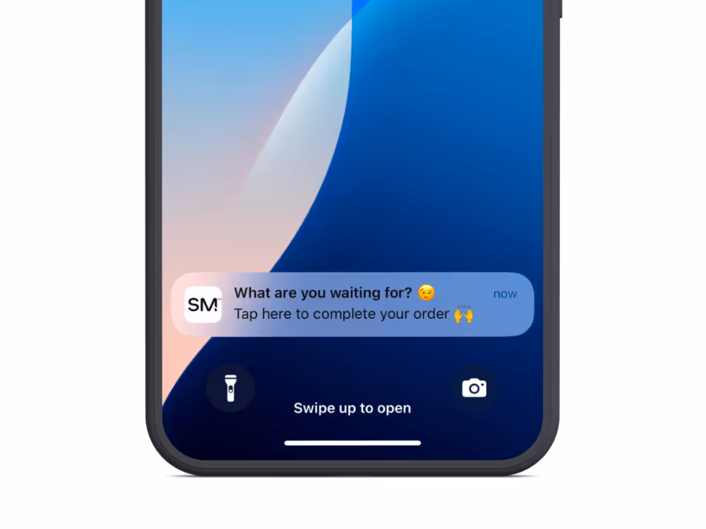
With email open rates declining to 20-25%, push notifications offer a more immediate and effective communication channel.
Unlike email or social media, where marketing messages often go unseen, push notifications cut through the noise, with direct access to your customers’ devices.
They bring customers back at the right moments – when items come back in stock, during flash sales, or when cart items are about to sell out.
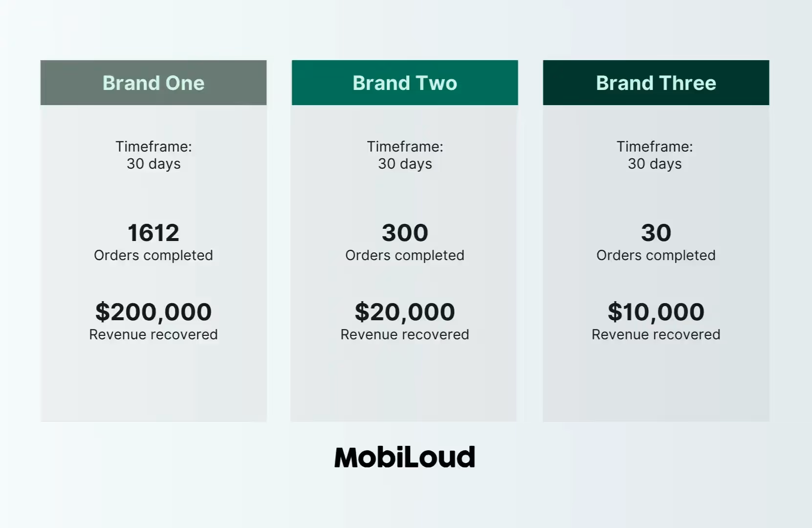
The ability to automate abandoned cart notifications alone can generate tens or hundreds of thousands in revenue, for almost no extra cost and effort.
This direct line of communication turns periodic shoppers into consistent buyers.
Push has higher engagement rates than email, and its immediacy makes it perfect for time-sensitive updates (such as order status notifications).
Native Ecommerce Apps vs PWAs
Why are DTC ecom brands building native apps over PWAs?
If you’ve heard about progressive web apps, you might think that a PWA is a better option – cheaper, faster to build, easier to maintain.
These points are all true, and PWA do deliver a lot of benefits for the mobile user experience. But they don’t offer all the benefits of a native app.
Native apps have full access to push notifications, are much easier to download, and are just better for regular mobile shoppers.
Our advice? Build both.
How Much Revenue Can a Mobile App Generate for a DTC Brand?
The amount of revenue you can get from a mobile app depends on the scale of your store, but as a percentage, brands often see around 10-30% of their total revenue coming through their apps.
Brands with higher purchase frequency/mobile usage may see more, while those with a low repeat purchase rate (and more first-time customers) can expect to come in on the lower end of the revenue scale.
Check out our eCommerce App Revenue Calculator for a quick estimate of how much your app could make.
What’s the Average ROI for a Mobile App for Ecommerce Brands?
The ROI depends on factors like business model (high-frequency vs low-frequency), how much you promote the app, and the investment you put into making it.
Brands we work with at Vendrux often see significant ROIs – as much as 53x in some cases, due to the low cost and effort required to build and maintain the app.
What’s the Best Mobile App Platform for DTC Brands?
There are a lot of great platforms for DTC ecommerce brands to launch apps, but for most, Vendrux is the best. It’s the ideal mix of flexibility, service & support, and cost, letting you go live with beautiful mobile apps that require very little work to maintain, without the limitations of traditional no-code tools.
Get a free preview of your app now to see what Vendrux is capable of.
Leading DTC Brands Who Are All In on Apps
For DTC brands, the benefits of mobile apps compound.
The combination of higher customer value, lower acquisition costs, and better engagement creates a virtuous cycle that transforms their economics.
The potential return from an app, along with the low barrier to entry made possible by website to app services like Vendrux, makes it a winning strategic choice.
If you want to discuss how Vendrux can help you launch an app for your site in the next 30 days, book a free consultation now.
Otherwise, to learn more about what’s possible, here are a few examples of major DTC brands who are having notable success through their mobile apps.
Sleefs
Category: Apparel/Fashion
Key statistics:
- 30% higher average order value in app.
- 3x more visits per app user.
- +40% conversion rate in app.
- Over 50k push notification subscribers.
The Sleefs mobile app has proven to be a game-changer for their business.
App users have 30% higher AOV compared to other platforms, highlighting the app’s ability to drive more significant and sizable purchases.
App users also shop three times as often as non-app customers.
Plus, with a higher conversion rate in the app and over 50,000 push notification subscribers, Sleefs can directly reach and convert a highly active customer base, solidifying their app as a key driver of revenue.
Read more about Sleefs’ mobile app here.
Boozebud

Category: Alcohol
Key statistics:
- 5x customer lifetime value from app users.
- 4x ARPU from app users.
- 10% of total revenue driven through their app.
The transformative results of Boozebud’s app include 5x customer lifetime value for app users, 4x higher ARPU, and one tenth of their total revenue coming via the app.
This is thanks to a more engaging customer experience, where app users spend more time, and ultimately more money, each time they visit Boozebud’s online store.
“We’re seeing that the customers who do use the app are more engaged, they’re spending more time on site, they’re spending more per transaction, they’re spending more overall. Push notifications give us a way to get in front of high-value customers within a walled environment. The app is paying for itself.”
Read more about Boozebud’s mobile app here.
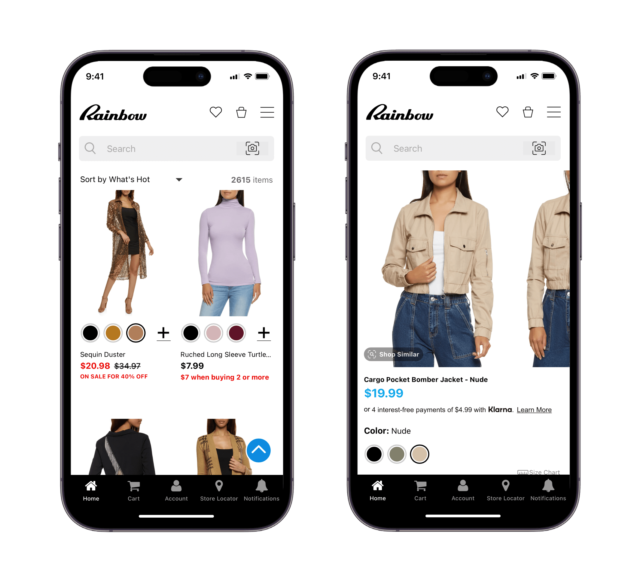
Rainbow Shops
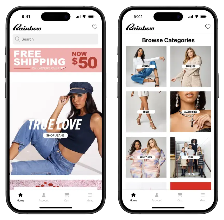
Category: Apparel/Fashion
Key statistics:
- 10% of direct-to-consumer (DTC) revenue driven by the app.
- 7x LTV growth.
- 10% higher mobile AOV.
- 2x higher mobile conversion rates.
The Rainbow Shops app is an integral part of their DTC strategy, driving 10% of their direct-to-consumer revenue.
App users have a massive 7x higher lifetime value, convert at twice the rate of those on their website, and spend 10% more in each order than shoppers on their mobile website.
The brand is also able to use push notifications to drive cheap traffic, that tends to be more engaged and higher value than customers from more expensive channels.
“Push notifications are the cheapest and most powerful communication channel we have. We find that users who prefer to interact via an app are more loyal, buy from us more often and spend more time with our content.”
Read more about Rainbow Shops’ mobile app here.
reLink Online
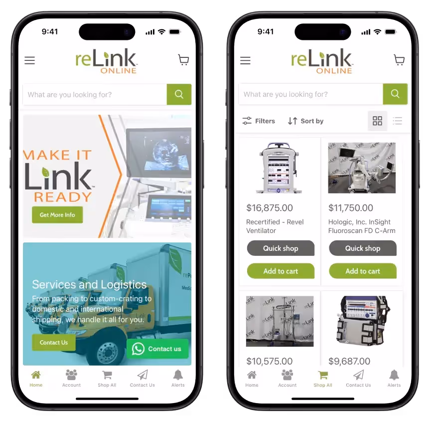
Category: Medical Equipment
Key statistics:
- 4x lifetime value from app users.
- 7x ARPU from app users.
- 20% of total revenue comes through the app.
App built with Vendrux
Medical equipment provider reLink Medical found immediate success by launching an app, which helped them pivot into a DTC model, after previously relying on rented sales channels like eBay.
The app provides for one fifth of their total B2C revenue, and customers who use the app have a 4x higher lifetime value and generate 7x higher ARPU, illustrating the ability of mobile apps to create long-term, high-value relationships with customers.
“About half our buyers on eBay are using mobile. If you’re gonna play in this world today, you need an app.”
Read more about reLink’s mobile app here.
Holy Grail Nail
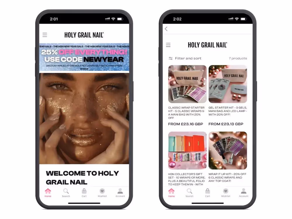
Category: Beauty
Key statistics:
- $20k increase in monthly revenue (7% increase in revenue) in the space of three months.
- 15% higher average order value in the app.
- 20% of total revenue generated through the mobile app.
Holy Grail Nail has achieved remarkable results by launching their mobile app, adding $20k in monthly revenue in only three months – a 7% overall revenue boost.
Customers through the app spend more in each transaction, and the app as a sales channel has growth to contribute one fifth of their total revenue.
BrüMate

Category: Home/Kitchen
Key statistics:
- 56% higher sales per session in their app, compared to the website.
- 43% higher conversion rate in the app.
- 10-20% of total monthly sales coming through the app.
BrüMate’s app delivers exceptional returns compared to their website, with a notable increase in conversion rate and sales per session.
Their app offers a more personalized and engaging customer experience, with the addition of push notifications as a scalable, low-cost sales channel that the brand has full control over.
The app now generates 10-20% of their total monthly revenue, with a much increased efficiency ratio compared to all their other sales channels.
Hobbiesville
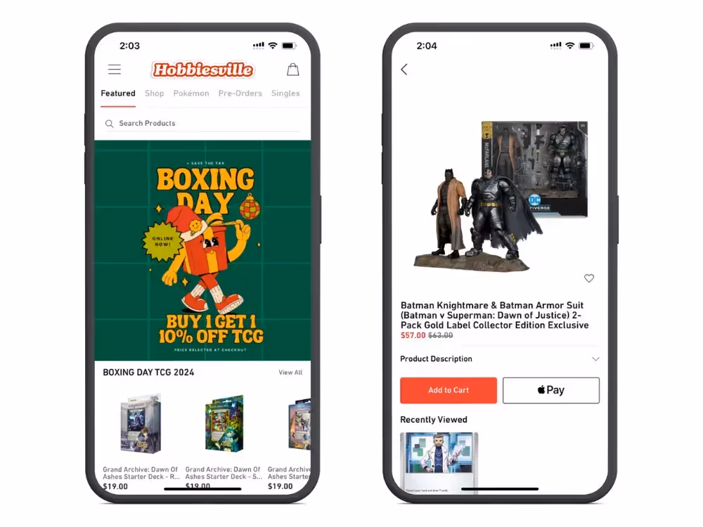
Category: Toys/Games
Key statistics:
- 10% of their customers use the app.
- App users contribute 40% of their total revenue.
- 3x higher conversion rate in the app.
- Push notifications generate 2x higher response rates than email.
Hobbiesville’s app has become a powerhouse sales channel. 10% of their customers use the app, but this segment generates 40% of the brand’s total revenue.
A large part of this is due to the effectiveness of push notifications, which generate 2x higher response rates for Hobbiesville than email, as well as the app’s CRO, which significantly outperforms their website in conversion rate.
Béis
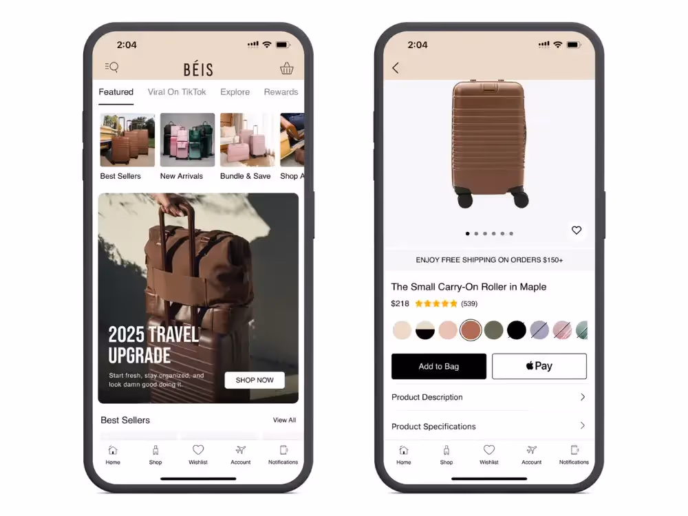
Category: Bags/Luggage
Key statistics:
- 67% higher conversion rate in the app.
- 15% higher AOV.
- 13% of total revenue comes from their mobile app.
The Béis app has quickly become an essential sales channel for their brand, driving 13% of total revenue.
Customers using the app convert at a higher rate, and spend more in each transaction, as a result of a smoother, distraction-free customer experience.
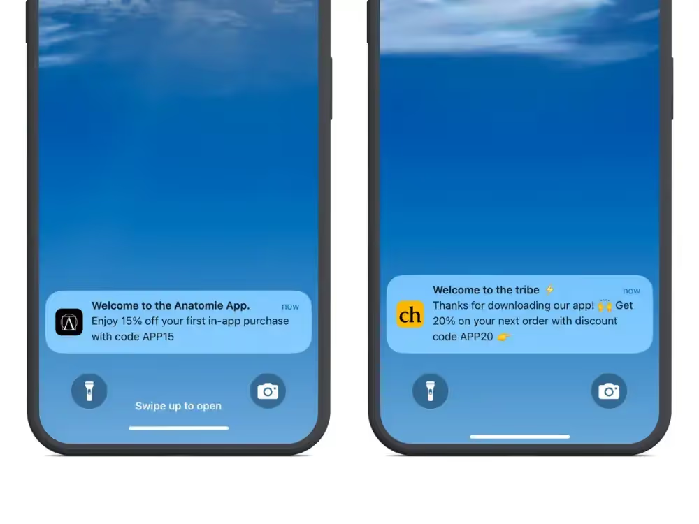
Anatomie
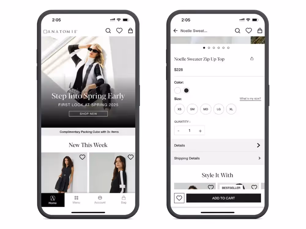
Category: Apparel/Fashion
Key statistics:
- 2.5x conversion rate in the app, compared to their mobile website.
- 5x higher lifetime value from app users.
- 1.5x average order value in the app.
For Anatomie, an app has proved to be a powerful platform for cultivating long-term customer loyalty and increasing revenue per transaction.
Customers in Anatomie’s mobile app have a 2.5x higher conversion rate compared to those on their mobile website, as well as a 1.5x higher average order value, both of which contribute to a significant increase in lifetime value from customers who shop through the app.
Obvi
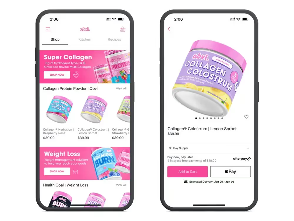
Category: Health/Nutrition
Key statistics:
- 2x higher conversion rate in the app vs the mobile website.
- 98.6% app user retention.
- 15.2% higher AOV for app users.
- Over 137k push notification subscribers.
Obvi’s app drives impressive results, with double the conversion rate compared to their mobile website, and an almost flawless retention rate of app users.
Additionally, app users spend more, with a 15.2% higher AOV, while over 137k push notification subscribers provide a direct channel for engagement.
Art of Tea

Category: Food/Beverage
Key statistics:
- 3.4x higher conversion rate in the app vs the mobile website.
- 4.6x higher order value per session in the app.
- >20k total app downloads.
Art of Tea’s app delivers a premium shopping experience, with a higher conversion rate and AOV than their mobile website. With over 20 thousand downloads, the app has successfully captured a dedicated audience and significantly elevated the brand’s online sales performance.
Recode Studios
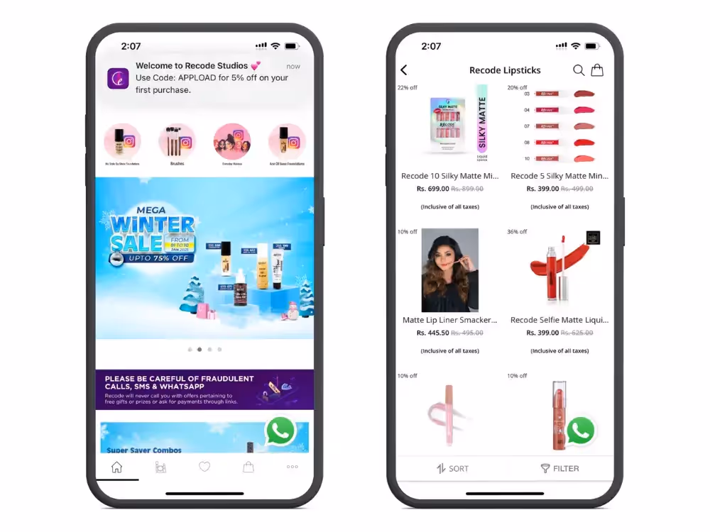
Category: Beauty
Key statistics:
- App grew their total revenue by 63%.
- 7x conversion rate in the app.
- 50% repeat purchase rate through the app (20% higher than their mobile website).
- 16.89% conversion rate on abandoned cart notifications.
- 25k monthly active app users.
- 200,000 app sessions per month.
Recode Studios’ app has revolutionized their business, growing their total revenue as a result of a 7x higher conversion rate and a 50% repeat purchase rate through the app – highlighting the effectiveness of mobile apps on CRO and retention.
Another key aspect is the app’s power to recover lost sales, with the brand generating an impressive conversion rate of nearly 17% on abandoned cart push notifications.
Want to see more brands having success with mobile apps? Check out these case studies of brands who used Vendrux to turn their website into high-converting mobile apps.
4 Steps to Make Mobile a Priority for Your DTC Brand
Mobile optimization is no longer optional for eCommerce brands. It’s the baseline.
With a growing majority of eCommerce sales happening on mobile devices, catering to these shoppers must be your top focus.
Beyond ensuring your website is responsive and functional on mobile (a given for most brands today), here are four steps to truly prioritize mobile and help your brand achieve its full revenue potential.
1. Design Mobile-First
Although most websites today are usable on mobile, many are still designed with desktop users in mind.
The result? A “shrink and fit” experience that treats mobile as an afterthought, limiting your site’s effectiveness on smaller screens.
Instead, adopt a mobile-first design approach.
Begin by crafting your site specifically for mobile users, focusing on intuitive navigation, fast loading times, and a seamless user experience.
This ensures your site feels native to mobile devices rather than forced to fit.
Learn more: check out 15 Mobile eCommerce Best Practices to maximize mobile conversions.
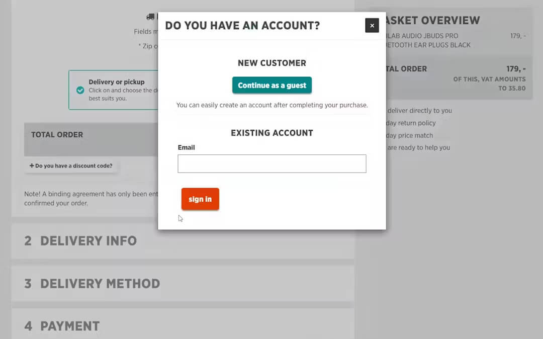
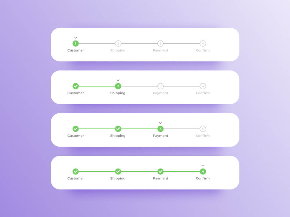
2. Streamline the Purchase Experience
Mobile shoppers demand simplicity and speed. Unlike desktop users, they’re less tolerant of extra steps or clunky processes that disrupt the buying journey.
To keep mobile users engaged and prevent drop-offs, eliminate unnecessary friction in your purchase flow.
Key optimizations include:
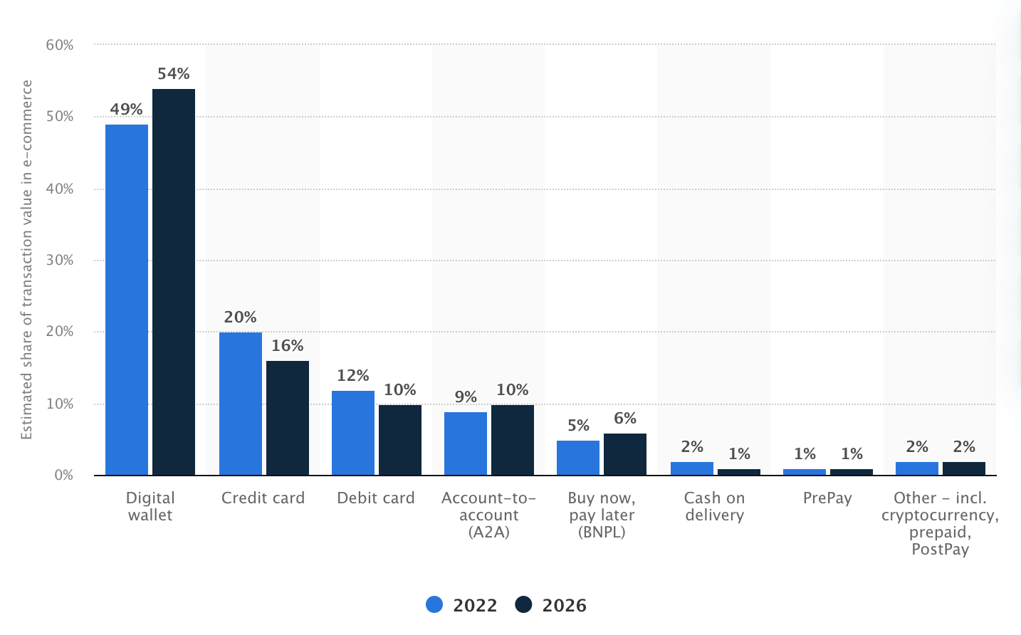
- One-click checkout and mobile wallet integrations (e.g., Apple Pay or Google Pay).
- Simplifying form fields and inputs.
- Reducing the number of checkout pages.
- Optimizing site speed to minimize delays.
These changes aren’t just nice-to-haves – they’re critical for capturing mobile shoppers’ attention and loyalty as mobile commerce continues to dominate.
3. Launch Your App
Once your mobile website is fully optimized, the next step is to launch an app.
A mobile app brings unmatched value to your brand, helping you drive more revenue from your existing traffic.
App users tend to spend more per order, shop more frequently, and exhibit greater lifetime value than mobile web users.
Apps also provide an owned channel for engaging your customers and collecting invaluable first-party data, especially as privacy regulations tighten.
One of the best parts? If you’ve done the first two steps, you’re already most of the way there.
As long as you have a mobile-optimized website, you need only minimal adjustments to repackage your website into an app that customers can download and enjoy.
This approach requires significantly less investment than you might think and is almost guaranteed to deliver a strong return on investment.
How to Launch Your App in Less than 30 Days
Vendrux is the best way for any DTC brand to launch their own apps.
No coding, no rebuilding, no massive investment required, virtually no overhead.
You’ll go live in 30 days (or less), for no risk, with an app that does everything your website does, and more.
Click here to learn more about how Vendrux works, or get a free consultation to talk it over with one of our eCommerce app experts.
4. Leverage Push Notifications
Having an app unlocks powerful opportunities, and chief among them is push notifications.
Push notifications are a game-changer for DTC brands, providing a direct, cost-effective way to engage customers.
Use them to:
- Announce promotions and new product launches.
- Recover abandoned carts with timely reminders.
- Drive repeat purchases with personalized messages and promotions.
Unlike email and SMS, which are increasingly losing their edge, push notifications show up directly on users’ lock screens, commanding immediate attention.
Despite their low cost and high impact, many brands are only beginning to explore their full potential.
Learn everything you need to know about using push notifications to drive sales and boost retention in our ultimate guide.
Wrapping Up
The brands that fully embrace mobile will be the ones to thrive in the rest of the 2020s and beyond.
As smartphone usage continues to grow, especially for eCommerce, traditional engagement channels like email and social media are becoming less reliable for driving consistent engagement and revenue.
A mobile-first, app-first strategy is the key to building a sustainable, future-proof brand.
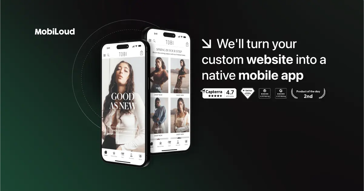
That’s where Vendrux comes in.
Vendrux makes it easy to turn your website into fully functional, revenue-generating mobile apps in less than a month.
For a fraction of the cost of custom development, you can launch apps that rival those of the world’s leading brands.

Here are just a few reasons Vendrux is the best way to build your app:
- Your app comes with native features built in, including push notifications and native navigation UI.
- Your apps sync perfectly with your website, eliminating extra management overhead.
- We handle everything, from building and publishing your apps to ongoing maintenance, so your team can stay focused on growth.
- There’s minimal cost involved, as well as a money-back guarantee, so there’s literally no risk to see what an app can do for your brand.
If you’re ready to future-proof your eCommerce business with mobile apps, we’re here to help.
Learn more about our process, and why this is the smartest way to build shopping apps in 2026, then book a free consultation to bring your app to life.