Most ecommerce brands today sell through multiple channels: a website, a mobile app, email, social commerce, maybe even physical retail.
But being present on multiple channels and actually connecting those channels are two very different things.
These terms can be wishy-washy, they can be confusing. But the distinction is important to understand, if you really want to optimize your ecommerce experience for the way consumers buy today.
This guide breaks down what each strategy actually means, how they differ in practice, and how to evaluate your brand’s approach.
What Is Multichannel Ecommerce?
Multichannel ecommerce is a strategy where a brand sells products through more than one channel.
These channels typically include a website, a mobile app, social media storefronts, email campaigns, marketplaces like Amazon, and sometimes physical stores.
The defining characteristic of multichannel is that each channel operates independently.
The website team manages the website.
A separate agency or team builds the mobile app.
Email marketing runs on its own platform with its own customer data.
The marketplace listing has its own inventory feed.
Multichannel is channel-focused: the goal is to be present wherever customers are shopping. Each channel has its own goals, its own metrics, and often its own version of the customer experience.
Multichannel Ecommerce Example
A Shopify brand sells through their website, has a separate mobile app built by a development agency, runs email campaigns through Klaviyo, and lists products on Amazon. A customer who adds an item to their cart on the website won’t see it in the app. A loyalty discount earned in-store doesn’t apply online. Each channel works, but they don’t work together.
What Is Omnichannel Ecommerce?
Omnichannel ecommerce is a strategy where all of a brand’s sales channels are integrated into a single, unified customer experience.
The customer can start shopping on one channel, continue on another, and complete their purchase on a third without losing context, data, or functionality.
The defining characteristic of omnichannel is that it’s customer-centric rather than channel-centric. Instead of optimizing each channel independently, omnichannel brands optimize the overall customer journey across all touchpoints.
Brands often cited as omnichannel leaders include Nike (unified app, website, and retail experience), Starbucks (loyalty rewards that work identically across app, web, and in-store), and Target (seamless BOPIS and same-day delivery tied to their app).
Omnichannel Ecommerce Example
A customer browses products on a brand’s mobile app during their commute, adds items to their cart, then opens the website on their laptop at home and finds the same cart waiting. They use a discount code from an email campaign, choose buy-online-pick-up-in-store (BOPIS), and receive a push notification when the order is ready. After pickup, they get a follow-up email with personalized recommendations based on their full purchase history across all channels.
What’s the Difference Between Omnichannel and Multichannel?
All omnichannel strategies are multichannel, but not all multichannel strategies are omnichannel.
The key difference is integration.
Multichannel
Omnichannel
Focus
Channel-centric
Customer-centric
Data
Siloed per channel
Unified customer profile
Experience
Varies by channel
Consistent across all touchpoints
Cart / Account
Separate per channel
Shared across devices and channels
Communication
Each channel messages independently
Coordinated across email, push, SMS
Inventory
Managed per channel
Real-time visibility across all locations
Goal
Maximize each channel’s performance
Maximize the overall customer journey
Channel Integration vs Channel Presence
Multichannel is about presence: being on multiple platforms. Omnichannel is about integration: making those platforms work as one system.
A brand with a website, an app, and an email list is multichannel. A brand where those three channels share customer data, cart state, and promotions in real time is omnichannel.
Customer Data: Unified vs Siloed
In a multichannel setup, your email platform knows what campaigns a customer clicked. Your website knows their browsing history. Your app knows their push notification preferences. But none of these systems share that information with each other.
In an omnichannel setup, every interaction feeds into a single customer profile, often managed through a customer data platform (CDP). This means your email campaigns can reference in-app behavior, your app can surface products the customer browsed on the website, and your support team can see the full customer history regardless of which channel the customer used.
Experience Consistency Across Touchpoints
73% of retail shoppers engage across multiple channels during their buying journey. In a multichannel setup, each transition is a potential friction point: pricing may differ, promotions may not carry over, and the customer may need to re-enter information.
In an omnichannel setup, the brand looks, feels, and functions the same everywhere. Product pages have the same information. Checkout flows work the same way. Loyalty points earned on one channel are immediately available on every other channel.
Why Does Omnichannel Outperform Multichannel?
The performance gap between multichannel and omnichannel brands is well documented.
For a brand doing $10M+ in annual revenue, closing even part of this gap could mean hundreds of thousands in additional revenue, driven not by acquiring new customers but by serving existing ones better across every touchpoint.
What Are the Challenges of Implementing Omnichannel Ecommerce?
Omnichannel sounds straightforward in theory. In practice, 64% of ecommerce marketers cite the need for more resources and investment as the top barrier to implementation.
Tech Stack Fragmentation
The most common barrier is technology. Many brands end up with what amounts to a fragmented stack:
Their website runs on Shopify or BigCommerce
Their app was built by a separate agency
Their email and SMS run through Klaviyo or Omnisend
Their loyalty program lives in another system
Their POS handles in-store transactions
Each tool may be excellent on its own, but getting them to share data and deliver consistent experiences requires middleware, custom integrations, and ongoing maintenance.
The irony: brands invest in multiple channels to reach customers everywhere, then spend just as much trying to make those channels talk to each other.
Maintaining Consistency Across Channels
When your website and app are separate codebases maintained by different teams, they inevitably drift apart.
A promotion goes live on the website but hasn’t been updated in the app. Product descriptions differ. The checkout flow works slightly differently.
Every inconsistency is a seam your customers can feel, and every seam is a potential drop-off point.
Organizational Silos
Technology is only part of the problem. When different teams own different channels with separate KPIs, they optimize for their channel rather than the overall customer experience.
The email team maximizes opens and clicks; the app team maximizes downloads and sessions; the web team maximizes conversion rate. Nobody owns the cross-channel journey.
How to Build an Omnichannel Ecommerce Strategy
You don’t need to overhaul everything at once. The most effective path is to reduce the number of systems powering your customer experience, so channels become different views into the same store rather than separate projects.
The Shared Infrastructure Approach
The brands that get omnichannel right tend to share one principle: every channel should be an extension of the same core experience, not a separate product with its own roadmap and codebase.
Consider what happens when your mobile app is built on top of your existing website rather than from scratch. Same product data. Same checkout. Same promotions. Same loyalty program.
The app becomes a native delivery mechanism for an experience you’re already maintaining, not a separate product that drifts further from your website with every update.
This is the approach that scales. Not more channels running independently, but fewer systems powering a consistent experience across every touchpoint.
Omnichannel Consistency Audit: 6 Questions to Ask
Before investing in new channels or technology, audit what you have. Every “no” below is a gap in your omnichannel experience:
Cart continuity: If a customer adds items on one device, do they appear on another? Test this from website to app and back.
Promotion parity: Are current sales, discount codes, and loyalty offers identical across every channel?
Account unity: Does a customer have one account that works everywhere, or separate logins for website, app, and loyalty program?
Communication coordination: Do push notifications, email, and SMS complement each other, or overlap? Would a customer feel spammed?
Support continuity: Can a support agent see a customer’s full order history across all channels without asking?
Content consistency: Open the same product page on your website and app side by side. Same images, descriptions, reviews, and price?
How Do Mobile Apps Fit Into an Omnichannel Strategy?
For most ecommerce brands, the mobile app is the channel with the highest omnichannel potential and the highest fragmentation risk.
Mobile commerce accounts for a growing majority of ecommerce traffic. And most mobile shoppers find it more convenient to shop in an app.
A native app offers push notifications, home screen presence, and faster performance, all of which drive the repeat engagement that omnichannel depends on.
But when your app is built as a separate product from the website, it becomes another silo to maintain, another source of inconsistency.
This is exactly why, at Vendrux, we take the approach of extending your existing website into a native iOS and Android app.
Instead of rebuilding your store as a separate mobile product, Vendrux delivers your full website experience as a native app. Same product catalog, same checkout, same promotions, same everything.
Your app and website stay in sync automatically because they share the same infrastructure.
The result is true omnichannel consistency between your two most important digital channels, without the integration overhead that usually makes it so difficult.
If you’re evaluating how to bring your channels into alignment, book a free demo and we’ll walk you through how it works for brands like yours.
Algolia, Searchspring, Constructor, Klevu, Bloomreach, or another enterprise search platform – whatever solution you use, site search is crucial for product discovery.
You’ve probably fine-tuned everything about your setup; autocomplete, merchandising rules, faceted filtering. All to build a high-converting shopping experience.
Search users convert at 2-3x the rate of browsers, and they account for a disproportionate share of your revenue. So when you launch a mobile app, you need to ensure your search function fully carries over to your app.
The problem? Depending on how you build your app, you’ll likely face one of the following challenges:
Your site search doesn’t work the same way in your app
Your site search doesn’t work at all in your app
Your site search works – but it costs a fortune to build the integration (and is at constant risk of breaking)
This is not a small feature. This is the core of your buyer journey.
Keep reading to learn why this is such a tricky integration, and how to ensure your ecommerce site search actually works when you launch a mobile app.
Site Search Is Probably Your Most Valuable Integration
This isn’t hyperbole. Site search might be the most important feature of your store.
Constructor analyzed 609 million searches across 113 retail sites in Q4 2024 and found that while searchers represent roughly 15-25% of traffic, they generate close to half of total revenue.
In some verticals, the numbers are even more lopsided:
Health & Beauty: Searchers are 25% of traffic but drive 57% of revenue, converting at 17% vs 6% for non-searchers
General Merchandise: 41% of traffic, 61% of revenue
Specialty & Hobby: 26% of traffic, 49% of revenue
Search is a core part of how your customers find and buy products. And if you give them a good experience, the numbers prove that they’re more likely to buy, and will spend more.
If it’s this effective on your website, it stands to reason that you want this feature working in your mobile app too.
How Your Search Tool Actually Works
To understand why search often breaks in mobile apps, it helps to understand how it works on your site in the first place.
Enterprise search tools like Algolia, Searchspring, and Constructor don’t live inside your ecommerce platform. They sit on top of it.
Here’s what typically happens:
A JavaScript SDK loads on your pages. When a customer visits your site, the search provider’s JavaScript runs in the browser. It powers the search bar, autocomplete suggestions, and results pages.
The SDK calls the search provider’s API directly. When someone types a query, the request goes to Algolia’s servers or Searchspring’s servers, not to Shopify or your ecommerce platform. That’s what makes it fast and relevant.
Custom UI components render the results. The search overlay, the faceted filters, the merchandised results, the “did you mean” suggestions, all of it is rendered by the provider’s frontend code on your website.
Merchandising rules run server-side. Your team has configured boost rules, pinned products, and category-specific sorting. Those rules live in the search provider’s dashboard and get applied to every query.
The key detail: all of this runs as JavaScript on your rendered web pages.
Your ecommerce platform provides the product data. The search tool handles everything the customer actually sees and interacts with.
This matters because of what comes next.
Why No-Code App Builders Break Your Search
Most no-code mobile app builders for Shopify (and to a lesser extent BigCommerce and other platforms) work by rebuilding your storefront from scratch.
They use the platform’s APIs, like Shopify’s Storefront API, to pull product data, and then render a new mobile-native interface.
That new interface is built by the app builder. It’s their code, their templates, their UI components. Your website’s JavaScript never runs, because your website is never loaded. The app builder has constructed an entirely different frontend.
Here’s what that means for your search feature:
Your search tool’s JavaScript SDK doesn’t execute
There’s no browser loading your website, so there’s no JavaScript environment for Algolia or Searchspring to run in.
The app builder falls back to native platform search
Instead of your tuned, AI-powered search with merchandising rules and personalized results, customers get whatever basic search the platform API provides.
For Shopify, that means the Storefront API’s built-in search, which offers a fixed set of predefined sort keys and none of your custom ranking logic.
All your merchandising rules disappear
The boost rules, pinned products, synonym mappings, and category-specific configurations you’ve built in your search provider’s dashboard? They don’t apply. The app builder’s search interface doesn’t know they exist.
Autocomplete and faceted filtering degrade
Some app builders offer their own version of filters and search suggestions, but they’re generic. They don’t reflect the custom facets, filter groups, and autocomplete behavior your search provider delivers.
Dedicated integrations with search tools
Some app builders do offer integrations with popular search tools. But integration support varies by plan (often requiring enterprise tiers), the implementation may not match what you have on web, and less common search providers may not be supported at all. If you’re running Constructor or Bloomreach, for example, your options are limited.
The result of all this is that your app’s search experience is likely to be worse than your website’s. And since searchers are your highest-intent, highest-converting visitors, that’s a meaningful revenue hit.
“Our app needs to be at least as functional as the website. It doesn’t need to be better than the website, but the user experience can’t be worse.” — David Cost, VP of Ecommerce at Rainbow Shops
The Cost of Integrating Your Search in a Custom Mobile App
The alternative is building a fully custom mobile app. Build it from the ground up, integrate everything exactly how you want it.
This gives you the ability to build a custom integration for your search function, and build it in your app to work just as it does on your website.
It works – but it also takes a long time and costs a lot.
Rebuilding a single integration like search in a custom mobile app typically takes around 150 engineering hours, plus about 300 hours per year to maintain. At typical agency rates, that’s $15,000-$30,000 just for search, before you account for the ongoing maintenance.
And there’s an ongoing problem: every time your search provider ships an update, changes their API, or adds a new feature, your mobile app needs a corresponding update.
That adds a lot of work, a lot of new development sprints.
It’s also another integration that can break, another potential point of failure. Another thing making your tech stack more complicated.
How to Ensure Your Site Search Works in Your Mobile App (Without the Double Work)
The reason search breaks in most app approaches is that your mobile app is a completely separate storefront.
Even with headless builds, your app and website are two distinct channels. That means UX features like site search operate differently on each one.
Vendrux takes a different approach. Instead of rebuilding your storefront, Vendrux extends your existing website into a native iOS and Android app.
Your actual website powers the app, which means every JavaScript-based integration that works on your site works in the app, automatically.
For your search function, that means:
Your Algolia, Searchspring, Constructor, Klevu, or Bloomreach integration works as-is. The JavaScript SDK loads. The API calls fire. The results render exactly as they do on your website.
Merchandising rules, personalization, and faceted filtering carry over. Because the search provider’s code is actually running, all your configured rules apply.
When you update search on your website, it updates in the app. Add a new synonym mapping? Change your boost rules? Redesign the search results page? It’s live in the app the next time a customer opens it.
No integration cost, no integration timeline. There’s nothing to rebuild, because there’s nothing missing.
This isn’t limited to search. It applies to every tool running on your website: reviews, loyalty programs, personalization engines, subscription management, live chat, A/B testing, analytics.
If it works on your site, it works in the app.
On top of that, you get actual native app capabilities: push notifications with deep linking, native navigation, app store presence, and a home screen icon.
Your customers get the full shopping experience they’re used to on your website, delivered through a native app that sits next to Amazon and TikTok on their home screen.
What This Means for Your Search Investment
If you’ve put time and money into getting site search right, you should be protective of it when evaluating mobile app options. Here’s a simple framework:
Ask your app builder (or development agency) these questions:
Does my specific search provider (by name, not “we support search”) work in the app?
Do all my merchandising rules, boost logic, and personalization carry over?
When I make changes to search on my website, what’s the process for updating the app?
What does the search experience look like for customers who use the app vs the website? Can you show me a side-by-side?
If the answers involve “we have our own search” or “we’d need to build that integration” or “that would require our enterprise plan,” you’re looking at either a degraded experience or a significant additional investment.
The simplest way to keep your search working is to keep your website working, and deliver it as a native app.
Ready to See It in Action?
Vendrux is the only way to ensure your existing site search feature works in your mobile app, and that it will always work in your app.
As you update your filtering rules, tweak the appearance of the search bar, or make any other improvements, these changes appear in your app automatically (without duplicate work).
We’ve built over 2,000 mobile apps, specializing in helping online brands with unique web features carry these features over to their mobile apps – without a six-figure dev cost.
You can easily see it in action, too.
Here’s how it works:
Book a strategy call. Share your website URL and book a call, and we’ll put together a personalized preview of your website as an app.
Vendrux handles the build. If you go ahead, Vendrux handles everything about the build for you. It’s a fully managed service to turn your website into an app.
Launch on the App Store and Google Play. Within 30 days, you can have your app live in the App Store and Google Play Store, ready for your customers to download.
It’s low-lift, a tiny investment compared to custom development, and ensures that everything from your website carries over to your mobile app, by default.
This makes launching your own mobile app risk-free.
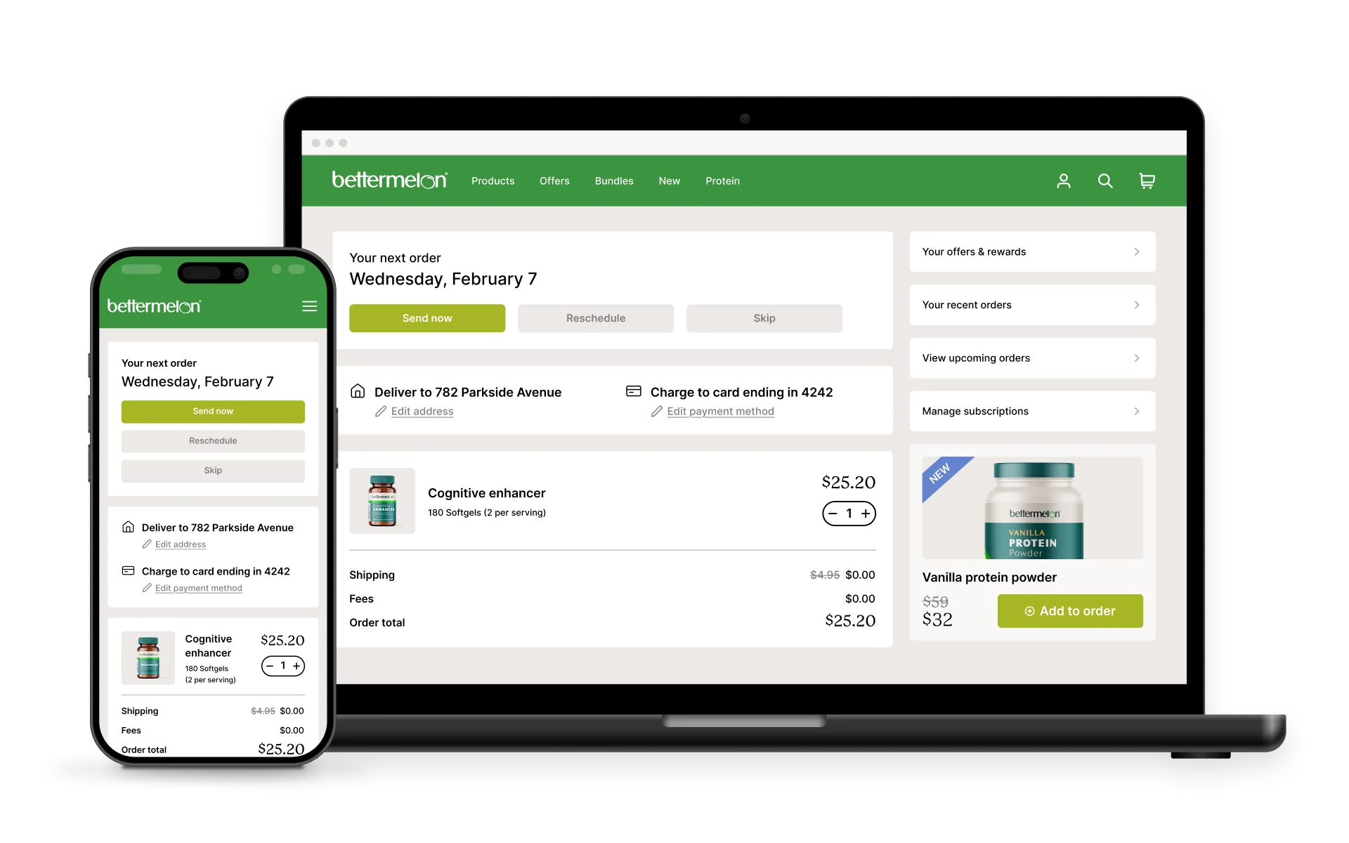
Every piece of your subscription experience, from the product page widget to the self-service portal, exists to keep those customers enrolled.
Your cancel flows have been A/B tested.
The customer portal lets subscribers skip, swap, and pause without emailing support.
The build-a-box feature drives higher AOV every cycle.
Whether you’re on Recharge, Skio, Loop, Stay AI, Smartrr, or something else, the subscription layer on your website is doing serious work.
Then the conversation about building a mobile app starts. And what you don’t realize is that your customer portal, cancel flows, build-a-box customization, payment update screens, and all the other features that make your subscription system tick over may not work in your mobile app (depending on how you build it).
But all these features have to be a part of your app. It’s not worth launching the app in the first place if they’re not.
So what’s the solution? Spend hundreds of thousands on a delicately constructed, custom native app?
Luckily no. Keep reading and we’ll explain everything.
Why Subscriptions and Mobile Apps Are a Natural Fit
Before getting into the technical problem, it’s worth understanding why subscription brands and mobile apps work so well together. The connection goes beyond general ecommerce benefits.
Your subscribers are already your most engaged customers
Subscription customers have already committed to your brand on a recurring basis. They’re exactly the kind of customer who downloads an app.
They’re checking order status, managing upcoming deliveries, browsing new products to add to their next order. An app gives them a faster, more convenient way to do all of that.
The numbers back this up. Vendrux customers consistently see 3-5x higher revenue per app user compared to mobile web. For subscription brands where repeat engagement is the entire business model, that lift compounds over time.
Subscription brands have communication needs that email handles poorly:
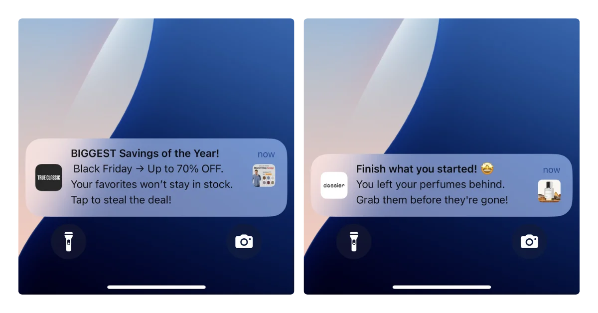
“Your payment failed.” This is the leading cause of involuntary churn. If a customer misses the email (and most do, with ~20% open rates), they churn without ever deciding to leave. A push notification lands directly on their lock screen.
“Your next order ships in 3 days. Want to swap anything?” Time-sensitive, high-value. The customer who sees this adds a product or adjusts their box. The customer who doesn’t see it gets an order they didn’t really want, and that’s how voluntary churn starts.
“You’ve earned a free product.” Loyalty and gamification features from tools like Loop and Smartrr only work if subscribers actually know about their rewards.
And unlike SMS, push notifications cost nothing to send. For a subscription brand sending multiple touchpoints per billing cycle, that adds up.
The home screen is a churn-reduction tool
A subscription brand’s biggest enemy isn’t a competitor. It’s indifference.
When your brand occupies a home screen icon next to Amazon and Instagram, you stay top-of-mind between orders. That matters, because 27% of subscribers say they’d cancel if they couldn’t easily skip or pause, and an app makes those actions feel effortless instead of buried.
How Subscription Tools Actually Work on Your Website
To understand why subscriptions break in mobile apps, you need to understand what’s running on your site in the first place.
Modern subscription platforms aren’t simple checkout add-ons. They’re multi-layered systems with at least three distinct components, each with its own technical implementation.
The subscription widget (product pages)
When a customer visits a product page, they see the option to choose between a one-time purchase and a subscription. This widget shows frequency options, discount tiers, and delivery schedules.
On Shopify, this works through the Selling Plan API. The subscription app creates selling plans that define pricing and billing policies, then renders a theme app block on the product page.
The customer selects their preference, and Shopify’s checkout handles the rest via Checkout Extensions.
Some platforms still use a JavaScript widget approach, where the subscription app’s SDK loads on the page and watches for variant or price changes to update the subscription options in real time.
The customer portal (subscription management)
This is where subscribers go to manage their active subscriptions: skip a delivery, swap a product, change frequency, update payment info, or cancel.
Hosted portal. The subscription app runs the portal on its own domain. Customers click a link and get redirected. Simple to set up, but the customer leaves your site.
Embedded portal. The hosted portal loads inside an iframe on your website. Customers stay on your domain, but the portal content comes from the subscription app’s servers.
Custom portal. Built by your development team using the subscription app’s API. Full control over branding and UX. Significant build and maintenance cost.
Each approach involves authentication, session management, and real-time data from the subscription platform.
Skio’s passwordless login sends a 4-digit code via email and SMS rather than requiring a traditional password.
Loop’s gamified subscriber journeys show progress toward milestones and rewards.
Stay AI’s cancel flows use machine learning to personalize the retention offer based on subscriber behavior.
These aren’t simple features to recreate with an API call. They’re the result of months of product development by the subscription platform, rendered as a complete web experience.
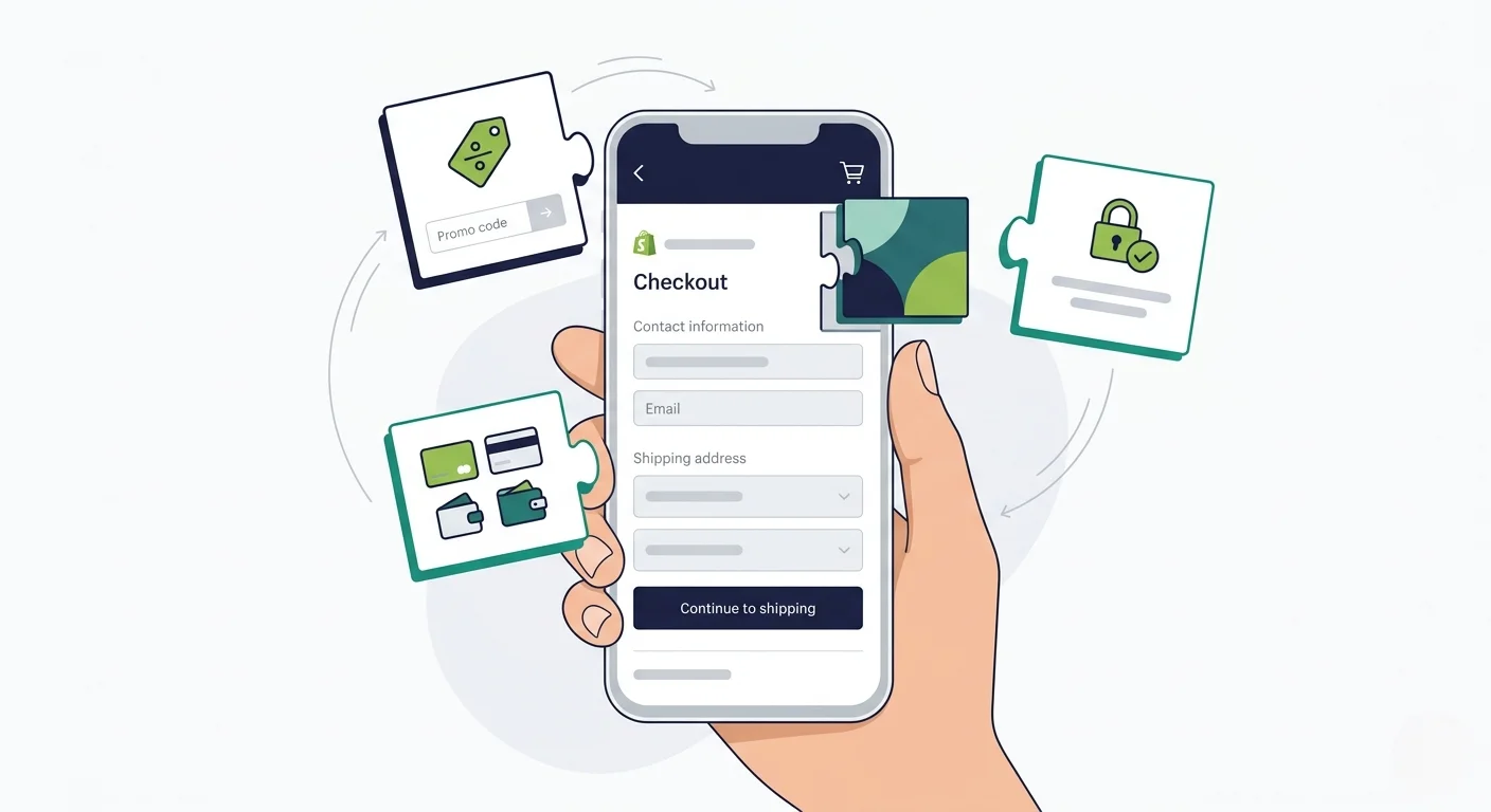
The checkout flow
When a subscriber places their initial order, Shopify creates a Subscription Contract, the formal agreement for recurring billing. The customer’s payment method gets vaulted (stored with permission), and the subscription app handles all future billing attempts through Shopify’s APIs.
This entire flow runs through Shopify’s native checkout, enhanced by Checkout Extensions from the subscription app.
Why Many App Builders Break Your Subscription Experience
Most no-code mobile app builders for Shopify work by rebuilding your storefront from scratch. They pull product data through Shopify’s APIs, mainly the Storefront API, and render their own native mobile interface.
That new interface is the app builder’s code, their templates, their UI components. Your website never loads. And that means every tool running on your website needs to be separately rebuilt within the app.
For subscriptions, this creates problems at every layer.
The subscription widget may or may not work
If your app builder has built a dedicated integration with your specific subscription platform, the basic product-page widget might function. Customers might be able to select “subscribe & save” and choose a frequency.
But integration support varies. Tapcart offers a Recharge integration, for example, but it requires Recharge Pro and Tapcart Enterprise plans. If you’re on a smaller subscription tool, your app builder may not support it at all.
The customer portal is the biggest gap
This is where the real damage happens. The self-service portal, where subscribers skip, swap, pause, update payment, and manage their subscription, is typically the hardest piece to replicate in a native app.
The app builder has two options:
Rebuild portal functionality natively. This means the app builder needs to integrate with the subscription platform’s API to recreate every portal feature: skip, swap, pause, cancel flows, payment updates, build-a-box, gamification, loyalty rewards. Most don’t go that deep. You get basic “view subscriptions” and “cancel” functionality. The advanced features your web portal offers? Gone.
Open the web portal in a browser view inside the app. The customer taps “manage subscription” and gets kicked into a mobile browser window showing your web portal. The experience feels disjointed, the styling may not match the app, and authentication can break (the customer may need to log in again inside the browser view).
Neither option gives your subscribers the experience they get on your website.
Advanced features don’t translate
The subscription features that actually reduce churn and drive AOV are precisely the ones that break.
Most app builders don’t build a 1:1 integration that works exactly as it does in the app as on the web. And they’re certainly going to be a little behind when it comes to integrating new features that come out from your subscription app.
Switching subscription platforms becomes a bigger problem
If you switch from Recharge to Skio (or to any other platform), your website updates reflect immediately. Swap the app, configure the new portal, and customers see the new experience.
With an API-based app builder, switching subscription platforms means the app builder also needs to support your new tool.
If they don’t, you’re stuck with broken subscription management in your app until they build the integration, if they ever do.
And even if the tool is supported, it means a significant update is needed for your mobile app, which adds a lot of staff hours and complexity.
Custom App Development Has the Same Problem, at Higher Cost
A custom-built mobile app can theoretically integrate with any subscription platform. You have full control over the code.
But “can integrate” and “will integrate well” are different things. Rebuilding a subscription portal in a custom app means:
Building API integrations with your subscription platform’s backend
Handling authentication flows (including passwordless options if your portal offers them)
Maintaining parity as the subscription platform ships updates and new features
At typical agency rates, rebuilding a complex integration like a subscription portal runs $15,000-$30,000, with ongoing maintenance of roughly 300 hours per year. And that’s one integration. Your site likely runs 20+ customer-facing tools.
Every time your subscription platform ships a new feature, like Loop adding a new gamification mechanic or Stay AI improving their cancel flow algorithm, your custom app needs a corresponding development sprint.
That gets expensive.
How to Keep Your Subscription Experience Intact
The reason subscriptions break in most app approaches is that they don’t run your website. They rebuild the frontend, which means every third-party tool that renders on your site needs to be separately integrated.
Vendrux takes a different approach. Instead of rebuilding your storefront, Vendrux extends your existing website into native iOS and Android apps.
Your website powers the app, so every subscription feature that works on your site works in the app, automatically.
For subscription brands, this means:
Your Recharge, Skio, Loop, Stay AI, Smartrr, or Bold portal works as-is. The JavaScript loads. The portal renders. The authentication flows function. The full self-service experience carries over.
Build-a-box, gamified journeys, loyalty rewards, AI cancel flows all carry over. Because the subscription platform’s code is actually running, every advanced feature works exactly as it does on your website.
When your subscription platform ships an update, it’s live in the app. New gamification milestone? Updated cancel flow? Redesigned portal? It appears in the app the next time a customer opens it.
If you switch subscription platforms, the app doesn’t need changes. Move from Recharge to Skio? The app just renders whatever’s on your website. No integration to rebuild, no app builder compatibility to verify.
“We wanted everything to reflect on the mobile app. We have a lot of features and a lot of apps right now installed on our website, and all of them are reflecting seamlessly to the mobile app as well.” — Zawar Kamal, CEO, NumberC
This approach isn’t limited to subscriptions. It works for every tool on your site: reviews, loyalty programs, site search, personalization engines, quiz funnels, live chat. If it works on your website, it works in the app.
On top of that, you get native app capabilities that directly benefit subscription businesses: push notifications with deep linking (tap a “your payment failed” notification and land directly on the payment update screen), a home screen icon that keeps your brand visible between orders, and the performance and engagement benefits that come with a dedicated app experience.
All this, while you just manage one platform: your website. Your app stays in sync automatically.
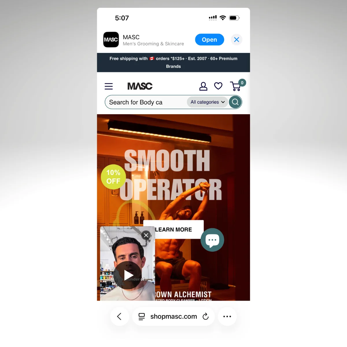
“It’s great to have an app, but realistically, you can’t really be managing your website and your app separately.” — Patrick Levesque, Co-Founder, MASC
Questions to Ask Before You Build
If you’re evaluating mobile app options for your subscription brand, here’s what to ask:
Does my specific subscription platform work in the app? Not “we support subscriptions” in general. Does Skio’s passwordless portal work? Does Loop’s gamification render? Does Stay AI’s cancel flow function?
What happens to the customer portal? Can subscribers skip, swap, pause, update payment, and manage build-a-box in the app, with the same experience they get on the website?
What plan do I need for subscription support? Some app builders gate subscription integrations behind enterprise-tier pricing. You could launch an app for $100 a month, but not with all the features you need. Find out before you commit.
What happens when I update my subscription setup? If you change subscription platforms, redesign your portal, or add new features, does the app update automatically or does it require a separate build?
Can you show me a side-by-side? The subscription portal on the website vs. in the app. If they look and function differently, your subscribers will notice.
If the answers involve “we’d need to build that” or “that feature isn’t supported yet” or “you’d need our enterprise plan,” you’re looking at either a degraded experience or a bigger project than anticipated.
The simplest way to keep your subscription experience working is to keep your website working, and deliver it as a native app.
Ready to See Your Subscription Experience in an App?
If you want to see exactly how your subscription portal, your checkout flow, and your full customer experience looks inside a native app, Vendrux will build you a free preview using your actual website.
Here’s how it works:
Book a strategy call. Share your website URL, walk through your subscription setup, and discuss your goals. No commitment.
Get a custom app preview. The Vendrux team builds a personalized preview so you can see your store, your subscription portal, and your integrations running in a native app.
Launch on the App Store and Google Play. Vendrux handles the build, submission, and launch. Most brands go live within 30 days.
We’ve built 2,000+ apps, including numerous apps for ecommerce brands that had custom web experiences that didn’t fit with the limitations of traditional app builders.
With Vendrux, you get predictable pricing, no revenue share, and no rebuilding the subscription experience you’ve already invested in.
Ready to see what’s possible? Get your free strategy call and see how Vendrux helps you build and launch the perfect mobile app.
That’s rarely because the vendor was incompetent. More often, it’s a mismatch: the vendor’s strengths didn’t align with the buyer’s actual needs, or the evaluation process focused on features and demos instead of fit.
78% of enterprise buyers shortlist just three vendors after self-guided research. That means the criteria you use to filter matters more than any sales pitch. If you’re going to look at just three vendors, it’s important that you’ve narrowed down to companies that align with your priorities.
We’ve helped over 2,000 businesses launch mobile apps over the last 10 years. That means we’ve been part of countless sales calls and consultations, and we’ve heard every concern, objection, every non-negotiable handed down from the board of directors or the CEO. So we know what’s important when it comes to looking for an app vendor.
This guide walks through what enterprise ecommerce teams should evaluate before shortlisting, what questions to ask, and what to look for along the way.
Start with Your Requirements, Not Vendor Demos
The mistake is booking a round of demo calls, without actually being clear on your requirements and specifications.
Before you look at a single vendor, get clear on what you actually need. Most evaluation processes go sideways because the requirements are vague, and every vendor can claim to meet vague requirements.
Map your existing stack
What commerce platform are you on? Salesforce Commerce Cloud, SAP, Adobe Commerce, Shopify Plus, something else?
What integrations are non-negotiable: your ERP, OMS, PIM, loyalty platform, payment gateway, POS system?
The vendor needs to work with what you have; you shouldn’t be adapting your tech stack to fit their capabilities.
Be honest about your team’s capacity
Can your team staff an ongoing mobile app project with dedicated developers, QA, and product management? Or do you need a vendor that handles everything?
This is the single most important question, and the answer determines which type of vendor you should even be evaluating.
Your team is already managing website updates, promotions, inventory, and analytics. Adding app management to that workload is a harder sell than most vendors acknowledge.
As Kenneth Chan, Founder and CEO of Tobi, put it: “When you develop an app you can’t just have one person. When we built the app in 2014, the maintenance became very heavy. You also have to maintain a good user experience. To keep a platform like this in-house I feel like you’d probably need around six people.”
Set your timeline and budget constraints
The app development process typically takes a long time (as long as 9-12 months, depending on how complex your project is).
Some approaches can get you live faster. But it’s best to do the research into whether this is possible before getting onto a sales call – because there will always be some vendors who say “yes” to everything you need, whether it can be done or not.
If you need to be in the App Store before the holiday season, that narrows your options significantly.
Same thing with budget. Be clear on how much you’re ready to spend on the app from the start.
Define your success metrics
What does “working” look like for your organization? Conversion lift? Retention improvement? Push notification reach? Reduced customer acquisition cost?
Define this before vendor conversations, not after. Vague goals lead to vague evaluations and, eventually, to projects that nobody can call a success or a failure.
The Five Evaluation Criteria That Actually Matter
Enterprise procurement teams typically weight their RFP evaluations across five core categories. Here’s what to look for in each.
Technical Fit (Weight: 30-35%)
This is where most evaluations go wrong. A vendor’s feature list tells you what they built. Technical fit tells you whether it works with what you already have.
Integration architecture. Does the solution work with your existing commerce platform and tech stack, or does it require building and maintaining a separate codebase? Will it work with all the third-party tools your business uses?
Update workflow. When your team updates the website, a promotion, a product page, a banner, does the app reflect those changes automatically? Or does every change require a separate deployment? This is the difference between a tool your team can live with and one that doubles their workload.
Performance standards. Ask for specific benchmarks: load times, crash rates, App Store compliance track record. Every vendor will say their app is “fast.” Ask for numbers.
Scalability. Can the solution handle your traffic during peak periods (Black Friday, flash sales, seasonal spikes) without degradation? Ask what happens when traffic doubles.
Total Cost of Ownership (Weight: 25-40%)
The biggest mistake when looking for a mobile app solution is looking at the upfront costs, and assuming that’s all you’re going to pay.
You’re looking at maintenance costs, scope creep, sometimes your own team’s labor as well.
By year three, cumulative maintenance costs can exceed the initial build investment.
Your TCO calculation should include:
Development costs (initial build or setup)
Infrastructure (hosting, CDN, monitoring)
Ongoing maintenance (bug fixes, OS updates, App Store compliance changes)
App Store fees ($99/year Apple, $25 one-time Google, plus any additional fees like in-app purchase fees)
QA and testing (regression testing across devices and OS versions)
Team time (how many hours per week does your team spend managing the app?)
Compliance updates (Apple and Google regularly change requirements, forcing vendors and teams to adapt)
Ask every vendor for a 3-year TCO projection that includes all of these. If they can’t provide one, that tells you something.
As a benchmark: custom enterprise app builds typically cost $350K-$500K+ upfront with $100K+ in annual maintenance. Managed services offer more predictable monthly pricing with maintenance included.
Delivery Capability (Weight: 20-25%)
A vendor’s ability to deliver on schedule matters as much as what they deliver.
Track record. How many apps have they launched for businesses at your scale? On your commerce platform? Ask for specifics, not aggregate numbers.
Implementation timeline. Get a contractual timeline, not an aspirational one. “Typically 4-6 weeks” is marketing. “We’ll be live in the App Store by [date], per our agreement” is a commitment.
Post-launch support model. What happens after launch? Do you get a dedicated account manager or a support ticket queue? Do they offer SLAs? Who handles App Store submissions, OS updates, and compliance changes? You need a named point of contact, not self-service documentation.
App Store management. Apple and Google regularly update their requirements, review guidelines, and APIs. Ask who is responsible for keeping your app compliant. If the answer is “your team,” factor that into your resource planning and TCO.
Ask for businesses your size. A case study from a $5M DTC brand doesn’t tell a $200M retailer much. Ask for references from businesses with similar revenue, similar traffic volume, and similar stack complexity.
Request reference calls. Testimonials on a website are curated. A phone call with a current customer at your scale is the highest-trust action a vendor can offer. If they won’t arrange one, ask why.
Check their existing client apps. Download a few from the App Store. Read the reviews. Look at the ratings. Check when the app was last updated. An app that hasn’t been updated in months tells you something about post-launch support.
Look for specific metrics. “Our clients love us” is not proof. Conversion lift, session time, push notification engagement rates, revenue per user compared to mobile web, these are proof.
Want to see how Vendrux fits your evaluation criteria?
Vendrux is a fully managed service that extends your existing website into native iOS and Android apps. Your integrations, checkout flow, and content carry over automatically.
Book a free strategy call and we’ll walk through how it works with your specific platform. No commitment.
“When we update our website, does the app update automatically, or is it a separate process?”
“What’s your approach to app performance monitoring and crash reporting?”
“How do you handle Apple and Google OS updates and policy changes?”
For your CFO and finance team
“What’s the full 3-year TCO, including maintenance, updates, and compliance?”
“Are there usage-based fees that could scale unexpectedly with traffic or transactions?”
“What are the contract terms? Is there a minimum commitment?”
“What happens to our investment if we decide to switch vendors?”
For your ecommerce and marketing team
“How much ongoing work does this create for our team on a weekly basis?”
“Do we need to manage a separate content pipeline, or does the app mirror our website?”
“How are push notifications managed? Can our existing marketing team handle it?”
“What analytics and reporting are available natively?”
For legal and procurement
“What are the contract exit terms and switching costs?”
“How portable is our data if we leave?”
“What are your SLA terms, uptime guarantees, and penalties for breach?”
“Do you carry cybersecurity insurance?”
For IT security
“How do you handle PCI DSS compliance for payment flows?”
“Where is user data stored, and how is it encrypted at rest and in transit?”
“Can you share your most recent penetration testing report?”
Signs a Vendor Might Not Be the Right Fit
None of these are automatic disqualifiers. A vendor might be excellent at what they do but simply not aligned with what your team needs. Here are the patterns worth paying attention to.
Pricing isn’t clear upfront
Enterprise teams need budget predictability. If a vendor can’t share a clear pricing model early in the conversation, it’s harder to build an accurate business case internally.
Their reference customers don’t look like you
A vendor with great case studies from small DTC brands may be genuinely strong in that segment. But if your team is running a complex tech stack with enterprise-grade integrations, you want to see proof they’ve delivered at that level of complexity.
Integration details come after the contract
The strongest vendors can walk you through how their solution works with your specific commerce platform before you commit. If that conversation is deferred to “onboarding,” it introduces uncertainty.
The app requires a separate codebase or content pipeline
This is a fit question more than a quality question. Some vendors build apps that require your team to manage separate content, navigation, or creative alongside your website. That model works well for some organizations. But if your team is already stretched, it’s worth understanding the operational commitment before you sign.
“Every time you try to do something that doesn’t take the website and now has a separate code base, you run into issues. All of a sudden, something that works perfectly well on your website now doesn’t function in the app.” — David Cost, VP of Ecommerce, Rainbow Shops
OS and compliance updates aren’t clearly owned
Apple and Google regularly update their requirements. It’s worth clarifying who is responsible for keeping your app compliant, your team or the vendor, so there are no surprises down the line.
Vendor Evaluation Scorecard
Use this as a quick reference when comparing vendors side by side.
Criteria
Weight
Ask the Vendor
Technical Fit
30-35%
How does your solution work with our platform? Do website updates sync to the app automatically?
TCO
25-40%
What’s the full 3-year cost, including maintenance, compliance, and team time?
Delivery Capability
20-25%
What’s your contractual timeline? Who handles App Store compliance post-launch?
References & Proof
10-15%
Can we speak with a customer on our platform, at our scale?
Finding the Right Fit
The goal of this evaluation process isn’t to find the “best” vendor in the abstract. It’s to find the one that fits your specific situation: your commerce platform, your integration requirements, your team’s capacity, and your timeline.
Start by defining what you need. Use the five evaluation criteria to compare vendors on what actually matters for your organization. Ask the questions that surface real alignment, not just feature parity. And pay attention to how vendors respond to those questions; the conversation itself tells you a lot about what the partnership will look like.
The right vendor is one that can prove, with reference customers who look like you, that they can deliver what you need, support you after launch, and grow with you over time.
How Vendrux Works
Vendrux is a fully managed service that turns your existing ecommerce website into native iOS and Android apps.
We typically work with mid-market and enterprise ecommerce brands, particularly those with custom ecommerce stacks that other vendors can’t support.
Some of the live apps we’ve shipped
Our approach is different to many others. Instead of building you a new app that needs to be managed separately from your website, we directly convert your existing site into an app.
This means:
Your website powers the app. Your product pages, checkout flow, promotions, loyalty program, and every third-party integration you already use carry over to the app automatically. When you update your website, the app reflects those changes in real time. There’s no separate codebase, no duplicate content pipeline, and no additional workload for your team.
We handle everything. Vendrux’s team builds your app, submits it to the App Store and Google Play, and manages ongoing maintenance, OS updates, and compliance changes. Your team doesn’t need mobile development experience.
Native app features, without the native app project. Your app gets push notifications, a home screen icon, native navigation, and full App Store presence. Customers get the fast, familiar experience they expect from an app, powered by the website you’ve already built.
Predictable pricing. A flat monthly fee with maintenance and updates included. No usage-based fees that scale unexpectedly, no hidden costs, no surprise invoices.
Live in weeks, not months. Most brands go from first conversation to App Store in about 30 days.
Vendrux works with Shopify Plus, Salesforce Commerce Cloud, Adobe Commerce, Shopware, WooCommerce, BigCommerce, and custom platforms.
We’ve built over 2,000 apps for brands including Tadashi Shoji, John Varvatos, buybuyBaby, PetShop.co.uk, and Jack & Jones.
If you’re evaluating vendors and want to see how Vendrux would work with your specific stack, you’re in the right place.
If you’re ready to talk to us about whether Vendrux is the right fit for your project, get in touch and Book a Free Consultation. We’ll explain whether our approach is the best way for you to go live with your mobile app.
You know a mobile app should drive revenue for your ecommerce brand. But when your CEO or board asks “what’s the actual return on this?”, you need more than “apps are good for engagement.”
You need a framework that separates direct revenue impact from indirect value, and numbers you can put into a finance deck.
Mobile apps can (and usually do) drive a meaningful lift in revenue for ecommerce businesses. Real revenue – incremental revenue – revenue that would not have existed otherwise.
But you’ve got to have a way to show the ROI; to show the business case for investing in your app. This article breaks down how.
The Direct ROI Metrics That Show Up in Your P&L
These are the numbers that translate directly to revenue and can be tracked in your analytics platform. They’re the foundation of any ROI conversation because they’re hard to argue with.
Revenue Per User
This is one of the clearest ROI metrics for showing the value of your app.
“Something we’ve noticed is that users who use the app are better customers. Either they spend more or they spend more often.” – Svend Hansen, Bestseller
We consistently find that app users are significantly more valuable (spend more) on a user for user basis.
Here are some examples:
Some of these customers are just higher-value customers to begin with. It makes sense that these customers congregate in your mobile app. But it’s still valuable to be keeping these buyers closer, in a channel where it’s easier to get in touch, easier for the customer to come back, and naturally higher-retention.
How to measure it: Total app revenue divided by active app users, compared to total mobile web revenue divided by mobile web visitors, over the same period. Use a 90-day or 6-month window to smooth out seasonal spikes.
Average Order Value
App users typically spend 10-50% more per order than mobile web shoppers. A more focused shopping environment, faster navigation, and saved preferences all contribute to these numbers we’ve seen:
How to measure it: Segment your AOV by channel in your analytics or commerce platform. Compare app transactions against mobile web transactions. If you’re using Shopify, you can filter orders by traffic source in your reports.
Purchase Frequency
App users don’t just spend more per order; they come back more often. And every additional purchase from an existing customer is pure margin, since you’ve already paid to acquire them.
How to measure it: Track orders per customer over a 90-day window, segmented by channel. Compare the repeat purchase rate of app users against your mobile web and desktop cohorts.
Customer Lifetime Value Uplift & Revenue Contribution
App user CLV is typically 2.8-5x higher than web-only shoppers. The compounding effect drives this: more frequent visits lead to more purchases, which increase total spend, which improves your unit economics across the board.
“Only about 5% of users are on the app, but they generate around 50% of sales.” — Narasimha Pinnelli, Architect at Junior Couture
That stat from Junior Couture is worth sitting with. A small percentage of your user base, your most loyal customers, can generate an outsized share of revenue when they have a native app to shop from.
This is something we see consistently – the share of a brand’s revenue that comes on the app is significantly higher than the share of customers using it.
Kiokii: 10% of their customer base using the app, generating 35% of total online revenue.
Tadashi Shoji: 18% of total online revenue from their app.
Your app doesn’t need mass adoption to deliver meaningful ROI. It needs to reach the right customers.
Push Notification Revenue
Unlike every other metric on this list, push revenue is directly attributable. It’s not an argument of “you’re just moving sales from the website to the app”.
You send a push, a customer taps it, they buy something. That’s a clean attribution path that even your most skeptical analyst will accept.
Across brands studied in Vendrux’s ecommerce benchmark report, abandoned cart push notifications alone generate between $10K and $200K per month. Pharmazone sees a 22% conversion rate on abandoned cart pushes, recovering five figures monthly from carts that would otherwise be lost.
Push campaigns typically deliver 3-5% click-through rates, which is 3-5x higher than email. And because push notifications are a zero-cost channel after setup (no per-message fee like SMS), every dollar of push-driven revenue drops almost entirely to your bottom line. Think of it as a free version of SMS, as PetShop.co.uk’s founder puts it.
How to measure it: Use UTM parameters on all push notification links. Klaviyo, OneSignal, and most push providers offer built-in revenue attribution. Track push-attributed revenue as its own line item in your monthly reporting. For a deeper look at the economics, see our breakdown of the economics of push notifications.
The Indirect ROI (What Doesn’t Show in a Dashboard But Moves the Needle)
Not every form of value shows up in a GA4 report. These metrics are harder to attribute directly, but they matter (especially when the core of your argument comes from real, attributable revenue, as discussed above).
Avoided Acquisition Cost
You’ve already seen that app users buy more often. The indirect value of that is the acquisition cost you don’t have to spend to replace churned customers.
Think about it in concrete terms: if your customer acquisition cost is $40 and your app keeps even 500 customers from churning per year, that’s $20,000 in avoided acquisition spend, before counting the revenue those retained customers generate. Rainbow Shops sees a 7x higher mobile customer lifetime value from app users, which means each retained app user is worth seven times more than the cost of their retention.
This won’t show up as a line item in your app revenue report. But it shows up in your overall CAC efficiency and your LTV-to-CAC ratio, which are numbers your finance team is already tracking.
Reduced Dependence on Paid Channels
Every push notification you send is a message you didn’t have to pay for. There’s no per-message cost (unlike SMS at $0.01-0.05 per message), no algorithmic throttling (unlike email deliverability), and no ad spend required.
For a brand sending 100,000 SMS messages per month at $0.02 each, that’s $2,000/month or $24,000/year. If even a fraction of those messages shift to push notifications, the savings add up quickly, and the engagement rates are typically higher.
This isn’t about replacing email or SMS entirely. It’s about adding a zero-cost channel that reaches your most engaged customers with near-instant delivery and higher visibility. For more on how push compares to other channels, see our push vs email comparison.
Brand Presence and Home Screen Real Estate
This is the hardest metric to quantify, but it’s real. When your app icon sits on a customer’s home screen next to Amazon, Instagram, and their banking app, you occupy mindshare that no amount of retargeting ads can buy.
You’re making it easy for them. You’re staying present, 24/7. It’s like an always-on display ad, with one-tap entry to your store.
Part of this shows up in session frequency. But the mindshare is worth even more than that. It’s what drives long-term customer retention.
How to Present Mobile App ROI to Your Board
Having the data is one thing. Presenting it so that finance and leadership approve the investment (or the continued spend) is another. Here are the four frameworks that tend to work.
The Cohort Comparison
The simplest and most compelling approach. Take two groups of customers over the same 90-day period: app users and non-app users. Compare their behavior side by side.
Metric
Mobile Web Users
App Users
Sessions per Customer (90 days)
3.2
14.8 (4.6x)
Average Order Value
$85
$110 (+29%)
Orders per Customer (90 days)
1.2
2.1 (+75%)
Revenue per User (90 days)
$112
$692 (6.2x)
90-Day Repeat Purchase Rate
22%
48%
Sample data based on Vendrux benchmark averages. Your numbers will vary, but the direction is consistent.
This table does most of the talking for you. When a board member sees a 6x difference in revenue per user, the conversation shifts from “should we invest?” to “how fast can we scale adoption?”
The Revenue Attribution View
Show what percentage of your total online revenue flows through the app. Present it as a new revenue stream, not a redistribution.
Brands on Vendrux typically see 10-30% of total online revenue come through their app, with high-performers reaching 50-60%. Some examples:
The question your board will ask: “Is this incremental, or is it just shifting from the website?” The short answer is that it’s a mix, but the behavioral data supports real incrementality.
App users visit more often, convert at higher rates, and spend more per order. Even conservative estimates typically show that at least 25-50% of app revenue is net new.
The Payback Period
This is the slide that gets finance teams to nod. Show how quickly the app pays for itself.
Monthly app cost divided by incremental monthly revenue equals payback period. For a brand doing $10M+ in annual revenue, the payback period could be measured in weeks, not months.
Of course, that depends greatly on how much you spend on your app, too. We’ll break down the specific math in the next section.
The Opportunity Cost Frame
Sometimes the most persuasive argument isn’t what you’ll gain; it’s what you’re leaving on the table.
Only 4.56% of US ecommerce brands with $100K+ monthly revenue have a mobile app. Meanwhile, your customers are trained by Amazon, Sephora, Nike, and every other major retailer to expect an app experience. The question isn’t whether your customers want an app. It’s whether they’ll keep choosing you without one.
Pair this with a stat on mobile app engagement vs mobile web to show the gap between where your customers spend their time and where your brand currently shows up.
Want help building the business case?
If you already have GA4 or Shopify analytics set up, we can run the ROI math with your actual traffic and revenue numbers. No guesswork, no generic benchmarks.
Vendrux has built 2,000+ apps over the last 10+ years, including hundreds of high-revenue ecommerce apps. We’ve seen how the numbers play out across every vertical and revenue tier.
Here’s the part most ROI articles skip: the denominator matters as much as the numerator.
If you’re spending $250,000+ on a custom native app build with a 9-12 month timeline and an ongoing development team, the ROI bar is high. You need significant revenue just to break even.
But if your investment is a fraction of that, with no development team and no rebuild, the equation tilts dramatically in your favor.
With a service like Vendrux, your investment is insignificant, compared to the potential return.
Vendrux lets you launch custom mobile apps, built on top of your existing tech stack. Your full checkout, your loyalty program, your integrations, everything works from day one because it’s powered by the same site your customers already use. The total cost is predictable: a monthly fee (starting at $1,499/mo, or $1,274 on annual billing), which is meaningfully more affordable than the cost of mobile devs working full-time on your app.
That changes the ROI math entirely. Here’s what it looks like at different revenue levels:
$10M Brand
$20M Brand
$50M Brand
Monthly App Revenue (25% of total)
$208,333
$416,667
$1,041,667
Incremental Share (50%)
$104,167
$208,333
$520,833
Monthly Gross Profit (at 45% margin)
$46,875
$93,750
$234,375
Vendrux Monthly Cost
$1,274
$1,274
$1,274
Monthly Net Return
$45,601
$92,476
$233,101
ROI Multiple
36.8x
73.6x
184x
Assumptions: 25% of total revenue flows through the app (based on Vendrux benchmarks showing a 10-30% range). 50% of that app revenue is net incremental. Gross margin of 45%, which is typical for DTC ecommerce. Vendrux cost of $1,274/month with annual billing discount ($15,288/year).
These figures are relatively conservative, but still show the app is a no-brainer.
A $20M brand generates nearly $92,000 per month in incremental gross profit from a $1,274 monthly investment. That’s a ~74x return, every month.
Even if you cut every assumption in half, 12.5% of revenue through the app and only 25% of that being incremental, the ROI for a $20M brand is still over 18x. The math is almost impossible to break.
“The expense isn’t that big…it’s a no-brainer.” — David Cost, VP of Ecommerce, Rainbow Shops
And this doesn’t account for the indirect value: reduced SMS spend, higher retention, increased lifetime value, or the brand equity of having your icon on your customers’ home screens. Those are real economic benefits that make the actual return even higher than the table shows.
The biggest risk with a mobile app isn’t that it won’t deliver ROI. It’s waiting too long to find out. Every month without an app is another month where your most loyal customers are shopping through a mobile browser instead of a native experience that keeps them coming back.
If you want to see what the numbers look like for your brand specifically, book a free strategy call.
We’ll run the math with your actual revenue and traffic data, no commitment, no generic benchmarks. Just a clear picture of what your app could deliver.
The honest answer: it depends. A simple utility app can be live in 8 weeks. A complex enterprise platform with ERP integrations, compliance requirements, and custom features can take over a year.
Or you could launch a note-taking app with a no-code tool in a couple of hours.
But “it depends” doesn’t help you plan a budget, set expectations with stakeholders, or decide whether to build before peak season. You need real numbers.
This article breaks down realistic timelines by app type, development approach, and complexity level. We’ll cover:
General timelines for simple, moderate, and complex apps
Specific timelines for ecommerce and enterprise apps
A phase-by-phase breakdown of where the time actually goes
Why most projects run late (and by how much)
How to shorten your timeline without cutting corners
You’ll get everything you need to know to plan out your app launch timeline – and hopefully choose the most efficient way to go live.
For this article, we synthesized quoted timelines from hundreds of app development companies, combined with our own knowledge of the mobile app space from 10+ years and 2,000+ apps launched. Timelines are estimates – and are always fluid.
App Launch Timeline (By Complexity)
The single biggest factor in your timeline is how complex the app is. Here’s what the data shows across hundreds of projects:
Simple Apps: 2 to 4 Months
A simple app has limited functionality, minimal backend infrastructure, and few third-party integrations. Think: a basic catalog app, a single-purpose tool, or a content-delivery app with standard features.
What’s included at this level:
User authentication (login/signup)
Basic UI with a few screens
Simple data storage
One platform (iOS or Android, not both)
Adding a second platform typically extends the timeline by 30 to 40%, so a 3-month iOS app becomes a 4-month iOS + Android project if you’re building natively.
Moderate Apps: 4 to 9 Months
Most apps that businesses actually want to build fall here. You’re adding payment processing, user accounts with profiles, a real backend, and integrations with third-party services.
Typical features at this level:
Payment gateways
User-generated content or reviews
Admin panel or CMS
Push notifications
Analytics and tracking
API integrations (shipping, CRM, etc.)
Each integration adds time. A single payment gateway takes 1 to 2 weeks to implement. A CRM connection can take longer if the API documentation is poor (and it often is).
Complex Apps: 9 to 18+ Months
This is where timelines start stretching into uncomfortable territory. Complex apps involve real-time data processing, AI/ML features, AR/VR, multiple complex integrations, or large-scale infrastructure built for millions of users.
At this level, the development itself isn’t the only bottleneck. Architecture decisions, security reviews, compliance audits, and stakeholder alignment consume significant time before a single line of code gets written.
Complexity
Timeline
Cost Range
Example
Simple
2-4 months
$20K-$80K
Catalog app, basic utility
Moderate
4-9 months
$80K-$180K
Ecommerce app, SaaS product
Complex
9-18+ months
$200K-$1M+
Enterprise platform, fintech app
Ecommerce App Development Timeline
Ecommerce apps deserve their own section because they’re what most brands reading this are thinking about. The timeline depends heavily on whether you’re building from scratch or extending an existing online store.
Building a Custom Ecommerce App
If you’re hiring a development team (agency or in-house) to build a native ecommerce app from the ground up, here’s what the timeline typically looks like:
Basic ecommerce app (product listings, cart, checkout, user accounts): 3 to 4 months
The industry benchmark is roughly 1,200 development hours for a standard ecommerce app, which translates to about 15 weeks of pure coding. But coding is only part of the story: design, testing, integration work, and App Store review add weeks on top.
Extending a Shopify Store with a Mobile App
For Shopify merchants specifically, the timeline depends on the approach:
No-code app builder (Tapcart, Shopney, etc.): Days to a few weeks
Agency-built with customization: 4 to 8 weeks
Custom-built native app using Shopify APIs: 8 to 24+ weeks
Headless build (custom frontend, Shopify backend): 12 to 24 weeks
The more custom you go, the longer it takes. But there’s a tradeoff: highly customized apps can deliver unique experiences that off-the-shelf builders can’t match, while faster approaches let you start generating revenue from mobile sooner.
Enterprise projects carry overhead that consumer apps don’t:
Procurement and vendor selection: 4 to 12 weeks before development even starts
Security and compliance reviews: SOC 2, GDPR, HIPAA, PCI-DSS (depending on industry) can add months
Legacy system integrations: Connecting to SAP, Oracle, Salesforce, or custom ERPs is rarely straightforward
Stakeholder alignment: More decision-makers means more review cycles
QA and UAT: Enterprise testing standards are (rightly) more rigorous
Realistic Enterprise Timelines
Simple internal tool (employee-facing, limited scope): 2 to 4 months
Mid-complexity with integrations (customer-facing, connects to existing systems): 4 to 7 months
Large-scale platform (multi-region, compliance-heavy, complex integrations): 12 to 18 months
The typical enterprise mobile app development cycle, according to Brainx Tech, breaks down like this:
Requirements analysis: 2 to 3 weeks
Design: 3 to 4 weeks
Core development: 8 to 16 weeks
Testing: 4 to 6 weeks
Deployment and rollout: 2 to 3 weeks
That adds up to roughly 5 to 8 months for a mid-complexity project. But factor in procurement, compliance, and stakeholder approvals, and you’re often looking at 9 to 12 months from first conversation to live in the App Store.
Where the Time Actually Goes (Phase-by-Phase)
Understanding the full development lifecycle helps you see where time gets absorbed, and where it can be saved.
Discovery and Planning: 1 to 4 Weeks
This is where you define what you’re building. It includes market research, competitive analysis, feature prioritization, and technical architecture decisions. Skipping this phase doesn’t save time; it just shifts the cost into later rework.
UI/UX Design: 2 to 6 Weeks
Wireframes, mockups, user flows, and prototyping. For consumer-facing apps, this phase often takes longer than expected because design involves iteration and stakeholder feedback. Each round of revisions adds a week or more.
Development: 2 to 12 Months
The widest range, and the most variable. Your team size, tech stack, and architecture choices all affect this. Building for both iOS and Android simultaneously (whether natively or with a cross-platform framework like React Native or Flutter) typically takes 30 to 40% longer than building for a single platform.
Testing and QA: 2 to 6 Weeks
Unit testing, integration testing, performance testing, security testing, and user acceptance testing. Enterprise projects spend more time here (and should). A rushed QA phase is the fastest way to launch an app that gets one-star reviews.
App Store Submission and Review: 1 to 2 Weeks
Apple reviews 90% of submissions within 24 hours, but first-time submissions and major updates can take longer. Google Play typically reviews apps in 1 to 3 days.
We’ve been there many times (over 2,000, in fact). So we know it can be a drag, waiting for them to get back to you.
The real risk isn’t the review itself; it’s rejection. Apple rejected roughly 1.9 million submissions in 2024, about 25% of all apps reviewed. Each rejection-and-fix cycle adds days or weeks. Budget a 2-week buffer after QA to account for potential resubmissions.
Mobile app projects are no exception. The most common causes:
Scope Creep
Scope creep affects 52% of projects, according to PMI. A “small” feature request mid-development can easily add 2 weeks. Across a 6-month project, cumulative scope changes can extend the timeline by 3 months or more.
The antidote: lock your MVP feature set before development begins. Build a feature wishlist for v2 and resist the temptation to pull features forward.
Integration Delays
Third-party integrations (payment gateways, shipping providers, CRMs, ERPs) are consistently underestimated. Poor API documentation, rate limits, authentication quirks, and sandboxing issues can add 3 to 6 weeks to a project.
Feedback Bottlenecks
When stakeholders take a week to review a design mockup that was supposed to be approved in 2 days, those delays compound across every sprint. This is especially common in enterprise projects with multiple approval layers.
The Practical Buffer
Experienced developers recommend adding 20 to 30% contingency to any app development timeline. If your estimate is 6 months, plan for 7 to 8. You’ll rarely regret padding the schedule; you’ll always regret not doing it.
How to Speed Up Your App Launch
Not every approach to building a mobile app requires months of custom development. The right strategy depends on what you’re building and why.
Start with an MVP
An MVP (minimum viable product) approach can reduce your timeline by 40 to 60%. Instead of building every feature before launch, ship core functionality first and iterate based on real user data.
For ecommerce, an MVP might include: product browsing, cart, checkout, user accounts, and push notifications. Save AI-powered recommendations, loyalty programs, and AR try-on for later releases.
Use Cross-Platform Frameworks
React Native and Flutter let you build for iOS and Android from a single codebase, saving roughly 30% of development time compared to building two native apps separately. The tradeoff is slightly less native feel in some edge cases, but for most ecommerce and content apps, the difference is negligible.
Skip the Build Entirely (and Turn Your Website Into an App)
If you already have an ecommerce website that works well, you may not need to build a mobile app from scratch at all.
Website-to-app platforms let you extend your existing website into a native iOS and Android app. Your site’s functionality, including checkout, search, loyalty programs, and every third-party integration, works from day one. There’s no re-integration, no feature parity gap, and no months of development.
Vendrux takes this approach. Instead of rebuilding your store as a separate mobile app, Vendrux turns your existing website into a native app with push notifications, a home screen icon, and App Store listings.
Some of the apps built with Vendrux. See more examples here
The timeline difference is significant: most brands go from first call to live in the App Store in around 6 weeks, compared to 4 to 9 months for a custom ecommerce app build.
In some cases, it can be even faster.
“No one believed we’d have an app in under a month, but within two weeks, it was done.” – Ahmed Yousef, Director of Ecommerce at Pharmazone
This approach isn’t right for everyone. If you need a fundamentally different mobile experience from your website, a custom build makes sense. But if your website already delivers a strong ecommerce experience and you want to capture the retention and engagement benefits of a native app, rebuilding from scratch adds cost and delay without clear ROI.
Already have a website that drives revenue?
Your checkout, your integrations, your full catalog, all delivered as a native app. No rebuild. No months of development. Vendrux has helped 2,000+ brands launch native apps in weeks, not months.
Book a free strategy call to see a preview of your app. No commitment.
The short answer: most mobile apps take 3 to 9 months from kickoff to launch. Simple apps land closer to 2 to 4 months, moderate builds run 4 to 9 months, and complex or enterprise projects can stretch to 18 months or longer.
But the development phase is only part of the picture. Discovery, design, testing, integrations, and App Store review all add up, and scope creep alone can extend a 6-month project by 3 months or more.
The best thing you can do is be honest about your complexity level, lock your MVP scope early, and pad your timeline by 20 to 30%.
If you’re an ecommerce brand with an existing website that already works well, consider whether you need to build from scratch at all. Vendrux compresses the process from months to weeks, letting you start capturing mobile revenue while competitors are still in sprint planning.
The single biggest reason ecommerce brands hesitate to launch a mobile app isn’t cost. It isn’t technology. It’s this question:
“Is anyone actually going to download it?”
It’s a fair concern. Margins are tight, and most brands don’t have money or labor to spare on a channel that’s going to sit around and collect dust.
You might also think: “I don’t download apps. I don’t think my customers will either.”
But here’s what you need to know:
Apps aren’t for everyone; they’re for your top customers, those who want to be closer to your brand.
You don’t need a huge share of your customers on the app to drive meaningful ROI.
You also don’t need anything overly complicated to promote the app – it’s primarily just about putting it in front of the right people.
At Vendrux, we’ve helped over 2,000 brands launch mobile apps. We’ve seen the impact an app can have, with a little bit of promotion.
This guide covers what realistic download numbers look like, the strategies that actually move the needle, and how to turn a modest install base into a meaningful revenue channel.
Setting Expectations
Before we get into tactics, let’s calibrate what success looks like. Because if you’re coming in expecting 50% of your customer base to download the app, you’re going to be disappointed, and you’ll probably give up too early.
Your App Is for Your VIPs
The customers who download your app are not a random cross-section of your traffic. They’re your most loyal, highest-value customers, the ones who already buy from you repeatedly and want a faster, more convenient way to do it.
For most ecommerce brands, that’s somewhere between 5% and 20% of your customer base.
That sounds small. But look at what that segment actually does:
The pattern is consistent: a small percentage of users generating a disproportionate share of revenue. This is the math that makes mobile apps work for ecommerce brands.
You don’t need mass adoption. You need your best customers in the app.
What Adoption Rates Actually Look Like
Based on what we’ve seen across 2,000+ app launches:
First 90 days: With active promotion, you could reach 2,000-10,000 installs, depending on existing customer base size and traffic volume.
Steady state: 5-15% of your customers (not website visitors, customers) can become app users with consistent promotion. This number grows over time.
The engagement difference: App users typically generate 3-10x more revenue per user than mobile web visitors, with higher conversion rates, longer sessions, and more frequent purchases.
Some brands see faster adoption based on their vertical. Brands with high repeat purchase rates (consumables, beauty, food and beverage, fashion) tend to see faster adoption than brands with longer purchase cycles (furniture, electronics, luxury).
The key insight: you don’t need to change anyone’s behavior. You don’t need to push people who aren’t really keen on it to download the app.
Your best customers already want to buy from you frequently. The app just gives them a better way to do it.
Already have the customers. Just need the app?
You’ve built the store, the email list, and the repeat buyers. The promotion playbook above works best when you have a native app that matches your full website experience, not a stripped-down version your customers won’t bother with.
Vendrux turns your existing website into a native iOS and Android app, done for you, live in 30 days. No rebuilding, no compromises on functionality. Book a free strategy call to see how it works for your store.
Let’s start here because it’s the lowest-hanging fruit, even though it won’t be your primary download driver.
Why ASO Matters (But Not the Way You Think)
People usually don’t browse the App Store looking for shopping apps the way they browse for games or productivity tools. Nobody is searching “cool stores to buy clothes from” in the App Store.
What they do search for is your brand name.
A customer sees your email, visits your site on mobile, or hears about you from a friend. They go to the App Store, type in your brand name, and expect to find your app. If they can’t find it, or if your listing looks unprofessional, you’ve lost a download you should have had.
That’s the real purpose of ASO for ecommerce: making sure you’re findable and credible when someone comes looking for you.
The Basics to Get Right
App title and subtitle: Include your brand name and a clear descriptor. “YourBrand: Shop [Your Category]” works. Don’t stuff keywords.
Screenshots: Show your actual app experience. Product pages, collections, the checkout flow, and any standout features (loyalty rewards, push notification examples). On the Apple App Store, about 33.7% of product page views convert to an install. On Google Play, it’s about 26.4%. Good screenshots and a clear description improve those numbers.
App description: Lead with what the customer gets, not what the app does. “Shop new arrivals first, get exclusive offers, and check out in seconds” beats “Download our native mobile application for iOS.”
Ratings and reviews: Encourage happy customers to leave reviews. A 4.5+ star rating is table stakes. Yon-Ka Paris maintains a 5/5 app store rating; John Varvatos has 4.9/5. These ratings build trust for anyone who lands on your listing.
Category selection: Choose the most relevant primary category (typically Shopping). Add a secondary category if applicable.
ASO is a “set it and update it periodically” task. Spend a few hours getting it right at launch, revisit it quarterly, and move on to the channels that will actually drive volume.
Smart Banners on Your Mobile Website
This is, consistently, the single highest-converting download channel for ecommerce apps.
Think about the user flow. Someone visits your website on their phone. They’re already interested in your brand, they’re already browsing your products, and they’re on a mobile device where they can install the app immediately.
A smart banner at the top or bottom of the screen says: “Shop faster in our app. Download free.” One tap takes them to the App Store.
You’re catching people at the exact moment they’re most receptive: already engaged with your brand, already on mobile, and already browsing.
The John Varvatos Example
When John Varvatos initially launched their app, they saw slow adoption. Why? Because their customers didn’t know about it.
“If you went on johnvarvatos.com prior, you didn’t know that we had an app.” – Nick Barbarise, Director of IT at John Varvatos
The inflection point was adding smart banners and QR codes. It was that simple – no complicated paid ad funnels or huge incentives. These two tactics alone drove measurable increases in downloads, usage, session time, and spend.
The app went from “we have it but nobody knows” to an active revenue channel with 10x revenue per app user compared to mobile web.
Implementation Tips
Don’t be aggressive. A persistent but dismissable banner is better than a fullscreen interstitial that frustrates visitors. You want to invite, not interrupt.
Customize the message by page. A banner on a product page can say “Get back-in-stock alerts in our app.” A banner on the homepage can highlight the app generally. Context-specific messaging converts better.
Show it on every mobile visit. Some brands only show the banner to first-time visitors. This is a mistake. Repeat visitors are actually more likely to install, because they already know and trust you.
Test placement. Top-of-page banners are standard, but bottom-of-screen sticky banners can perform well too. Test both.
QR Codes: The Smart Banner for Desktop (and Beyond)
Smart banners work on mobile because your visitor is already on the device where they’ll install the app. But what about desktop visitors? They can’t tap through to the App Store from their laptop.
That’s where QR codes come in. A popup or slide-in on your desktop site with a QR code and a clear reason to scan (“Get 15% off your first app order”) is the desktop equivalent of a smart banner. Your visitor grabs their phone, scans, and they’re in the App Store. It’s the lowest-hanging fruit for converting desktop traffic into app installs, and most brands overlook it entirely.
Popup or slide-in with a QR code. Trigger it after a few seconds on site, on exit intent, or on specific high-value pages (product pages, post-checkout confirmation). Keep the design clean: QR code, one line of copy, and a dismiss button.
Dedicated banner or footer section. A persistent QR code in your site footer or a banner on your homepage gives desktop visitors an always-available path to the app without being intrusive.
Post-purchase confirmation page. The customer just bought something on desktop. They’re engaged, they trust you, and they’re about to wait for shipping. “Track your order and get exclusive deals in our app” with a QR code is a natural next step.
Beyond the Screen
QR codes also bridge the gap between physical touchpoints and your app.
Packaging inserts. A card inside the shipping box that says “Get 10% off your next order. Download our app.” This catches customers at a high-satisfaction moment: they just received something they bought and are excited about it.
In-store signage. Near the register, on table displays, on fitting room mirrors. John Varvatos uses QR codes on business cards and at the register in their retail locations.
Receipts. Both digital and paper receipts. Your customer just completed a purchase, so they already trust you. Low friction.
Event materials. If you sponsor an event, run a popup, or get out in the world for any other reason, use this as an opportunity to promote your app.
Tips
Make sure the QR code goes to the right store. Ideally, detect the device and route to the Apple App Store or Google Play automatically.
Track it. Use UTM parameters or unique landing pages so you can measure which placements drive the most installs.
Vendrux helps you set up all the promo material you need to drive app downloads: smart banners, QR codes and more. When you launch with us, you don’t just get an app – you get a partner, invested in your success.
Your email list is full of people who’ve already bought from you or expressed interest. They’re the exact audience most likely to download your app.
Yet still we see many brands with a great app, who are sending daily emails, but not promoting the app to their email list.
This is a huge miss. Here’s how to use your email list to drive app downloads:
Launch Campaign
When your app goes live, send a dedicated launch email to your full list. This single email will likely drive more installs than any other tactic in the first week.
Keep it simple:
Announce the app
Show 2-3 screenshots
Highlight the top benefit (usually push notifications for early access / exclusive deals)
Link directly to the App Store and Google Play
Ongoing Promotion
After the launch blast, weave app promotion into your existing email flows:
Welcome series. Add a “Download our app” step. New subscribers are at peak engagement; some percentage will install.
Post-purchase emails. “Love your order? Shop faster next time in our app.” This catches customers in a positive moment.
Email footers. Add App Store and Google Play badges to your email template footer. It’s passive but consistent; over thousands of sends, it adds up.
Win-back flows. For lapsed customers, “We’ve launched a new app with exclusive offers” gives you a fresh reason to re-engage.
What Not to Do
Don’t send weekly “download our app” emails. One strong launch email, integration into your flows, and a footer badge is enough. Repeated standalone app promotion emails will fatigue your list fast.
First-Purchase App Discounts
Offering a discount on the first purchase through the app (typically 10-15% off) is one of the most effective install drivers, and the economics behind it make more sense than most merchants realize.
Why It’s Worth the Discount
The instinct is to resist discounting. You’re already acquiring these customers through other channels; why give them a discount just to change where they shop?
Here’s why: the lifetime value math changes once someone is in the app.
App users generate 3-10x more revenue per user than mobile web visitors. They visit more often, convert at higher rates, and spend more per order. A 10% discount on one order to move a customer into a channel where they’ll spend 3-10x more over time is a strong trade.
Think of it the same way you’d think about a first-time email subscriber discount. You’re not discounting for charity. You’re investing in a higher-value relationship.
“Those app-specific promotions are very popular and they’ve been driving a solid amount of downloads…these customers are staying active on the app.” – Myracle McCoy, Lifecycle Marketing Manager at Canna River
How to Structure It
10-15% off the first app purchase is the sweet spot. High enough to motivate, low enough that it doesn’t condition customers to expect constant discounts.
Make it a one-time use code. You’re incentivizing the install, not creating a permanent discount expectation.
Promote it everywhere. The discount becomes the hook for your smart banners, QR codes, email campaigns, and social media posts. “Download our app, get 15% off your first order” is a more compelling CTA than “Download our app.”
Set an expiration. A 7-14 day window creates urgency without being too pushy.
Social Media and Paid Promotion
Most people think of running ads or social media campaigns first when they think of app marketing strategies.
But these are supplementary channels. They work, but they’re rarely the primary download driver for ecommerce apps.
Here’s how you could use them in your download strategy:
Organic Social
Announce the app launch across your channels. Pin the post for a week. After that, mention the app occasionally in relevant contexts (new product drops, flash sales, loyalty rewards) rather than posting standalone “download our app” content.
The brands that do this well tie app promotion to something the customer cares about. “New collection dropping Friday at noon. App users get early access” is infinitely more effective than “Download our app today!”
Paid App Install Campaigns
Running paid campaigns specifically for app installs (through Apple Search Ads, Google App Campaigns, or Meta) can work but isn’t necessary for most ecommerce brands.
The average cost per install in Western markets is about $4.50 on iOS and $3.20 on Android. If your average app user generates significantly more revenue than a mobile web visitor (which the data consistently shows), the math can work.
But start with the free/owned channels first. Most brands don’t need paid installs to build a profitable app user base.
If you do run paid campaigns, start with retargeting: show app install ads to people who’ve already visited your website or purchased from you. They’re far more likely to install than cold audiences.
The 90-Day App Download Playbook
If you’re launching an app (or relaunching promotion for one that’s been underperforming), here’s a practical timeline.
Week 1: Foundation
Finalize your app store listing (screenshots, description, keywords)
Set up smart banners on your mobile website
Prepare your launch email
Create a first-purchase discount code for app users
Weeks 2-3: Launch Push
Send your launch email to your full list
Post on social media (pin the announcement)
Add QR codes to packaging inserts and any physical locations
Add App Store/Google Play badges to your email footer template
Start your welcome push notification flow
Weeks 4-8: Sustained Promotion
Integrate app mentions into your email flows (welcome series, post-purchase, win-back)
Begin regular push notification campaigns (2-3 per week, mixing promotional and contextual)
Monitor install rates by channel and double down on what’s working
Adjust smart banner messaging based on performance
Weeks 9-12: Optimize and Measure
Review per-user revenue: app vs mobile web
Calculate push notification ROI
Assess which install channels drive the highest-value users (not just the most installs)
Decide whether paid install campaigns are worth testing
Share results with your team to build internal buy-in for continued app investment
You Don’t Need Everyone. You Need the Right People.
The brands that succeed with mobile apps don’t chase download counts. They focus on getting their best customers, the ones who already love their brand and buy repeatedly, into a channel where the experience is faster, the engagement is higher, and the communication is direct.
A few thousand highly engaged app users will outperform hundreds of thousands of casual mobile web visitors. That’s not a theory. It’s what we see every day across the 2,000+ apps we’ve helped launch.
We’ll help you launch your app for a minimal investment in time, effort and money – and we’ll also support you with everything you need to actually get downloads.
If you’re holding back on an app because you’re worried nobody will download it, the data says otherwise. Your best customers are waiting for a reason to get closer to your brand. Give them one.
If you run a Shopify store, your checkout is the most important page on your site. It’s where literally revenue happens. Customizing this is one of the highest-leverage improvements you can make.
In 2024, Shopify deprecated checkout.liquid, the template file that gave merchants full HTML, CSS, and JavaScript control over their checkout pages. In its place: Checkout Extensibility, a structured framework that lets you customize checkout through approved extension points, APIs, and server-side logic.
This wasn’t a minor update. It affects how you add trust badges, run discount logic, track conversions, display post-purchase upsells, and brand your checkout. Every Shopify merchant needs to understand what changed, what you can do now, and what this means if you’re planning to launch a mobile app.
This article covers all of it: the components, the capabilities, the limitations, and why checkout extensibility makes your choice of mobile app solution more important than ever.
What Is Shopify Checkout Extensibility?
For years, Shopify Plus merchants could edit checkout.liquid directly, injecting custom HTML, CSS, and JavaScript into the checkout flow. It was powerful, but it created real problems.
Merchants could (and did) break their own checkouts with bad code. Shopify couldn’t guarantee page load performance or security when arbitrary scripts were running.
Every time Shopify updated the checkout infrastructure, custom code could break. And there was no way for Shopify to roll out platform-wide improvements without risking conflicts with thousands of custom implementations.
Checkout Extensibility is Shopify’s solution. Instead of giving merchants raw access to the checkout template, Shopify now provides a set of structured extension points, APIs, and tools that let you customize checkout without touching the underlying code.
The principle is straightforward: Shopify controls the checkout infrastructure (performance, security, accessibility, payment processing), and merchants customize through sanctioned extension points that can’t break the core experience.
The Migration Timeline
The transition happened in stages:
August 13, 2024: checkout.liquid stopped working for the main checkout pages (Information, Shipping, Payment) on Shopify Plus stores
January 2025: Shopify began auto-upgrading stores that hadn’t migrated their checkout pages
August 28, 2025: Thank You and Order Status pages stop rendering legacy customizations for Plus stores; Additional Scripts stop working
August 26, 2026: Non-Plus stores must complete the migration for Thank You and Order Status pages
If you’re on Shopify Plus, the main checkout migration is already done. The Thank You and Order Status page deadline is August 2025. If you’re on a standard Shopify plan, you have until August 2026 for those pages.
The Five Pillars of Checkout Extensibility
Checkout Extensibility isn’t a single feature. It’s a framework made up of five distinct components, each handling a different aspect of checkout customization.
Checkout UI Extensions
These are custom UI components that render at specific points in the checkout flow. Think trust badges below the payment form, gift message fields in the shipping step, delivery date pickers, loyalty point displays, or upsell offers before the purchase button.
UI Extensions run in Shopify’s secure sandbox. You build them using Shopify’s component library (not arbitrary HTML), which means they’re consistent with the rest of the checkout experience and can’t break the page. Extensions on the Information, Shipping, and Payment steps require a Shopify Plus plan.
You can also add custom banners, customize headers with branded imagery, update footers with store policies, add address autocomplete providers, and build client-side validation that controls whether a customer can proceed to the next step.
Checkout Branding API
The Branding API gives you control over the visual identity of your checkout: colors, typography, logos, button styles, form field appearance, corner radius, and spacing. You can access it through the GraphQL Admin API or through the visual checkout editor in your Shopify admin.
The goal is to make your checkout look like your storefront, not like a generic Shopify page. You can match your brand colors, use your custom fonts, and create a checkout that feels like a seamless extension of your shopping experience.
Shopify Functions
This is where the server-side logic lives. Shopify Functions replace the old Shopify Scripts (which were limited to Plus merchants) with a more powerful, more flexible system.
Functions run on Shopify’s infrastructure and handle backend checkout logic:
Discount Functions – order discounts (e.g., $10 off the entire cart), product discounts (e.g., 15% off specific items), and shipping discounts (e.g., free shipping over $100)
Payment Customization – reorder, rename, or hide payment methods based on cart contents, customer tags, or order value
Cart and Checkout Validation – enforce minimum order quantities, validate product combinations, verify address formats
Delivery Customization – modify shipping rate names, descriptions, and sort order
Cart Transform – create bundles by merging line items, override prices, titles, or product images
Order Routing – control which fulfillment location handles each line item based on custom logic
Functions are compiled to WebAssembly and execute in microseconds on Shopify’s edge infrastructure. They’re fast, and they scale without any performance cost to the merchant.
Web Pixels
Web Pixels are Shopify’s replacement for the old Additional Scripts approach to conversion tracking. They let you subscribe to checkout events (like checkout_completed, payment_info_submitted, checkout_address_info_submitted) and run tracking code for GA4, Meta Pixel, TikTok, Microsoft Ads, and other platforms.
The key difference from the old system: Pixels run in a sandboxed environment. They can fire tracking events, but they can’t manipulate the checkout DOM or read page content.
This is a deliberate trade-off: merchants get reliable, privacy-compliant tracking without the risk of scripts interfering with the checkout experience.
Post-Purchase Extensions
These let you add upsell and cross-sell offers to the page between checkout completion and the Thank You page. The customer has already entered their payment information, so accepting an additional offer is a one-click action with no re-entry of payment details.
Post-purchase extensions are built using Shopify’s UI components and can display product recommendations, bundle offers, or limited-time discounts based on what the customer just purchased.
What Can You Actually Customize?
Here’s what a fully customized Shopify checkout looks like with Extensibility:
Visual branding. Your checkout matches your storefront, with your colors, fonts, logo, button styles, and form field appearance. A customer shouldn’t feel like they’ve left your store when they hit checkout.
Trust and conversion elements. Trust badges, security seals, satisfaction guarantees, countdown timers, and free shipping thresholds displayed at strategic points in the checkout flow.
Custom input fields. Delivery instructions, gift messages, gift wrapping options, company purchase order numbers, or any other information you need to collect during checkout.
Dynamic discounts and pricing. BOGO deals, tiered pricing (spend $200, get 20% off), automatic bundle discounts, and conditional free shipping, all powered by Shopify Functions and applied automatically at checkout.
Payment method logic. Hide COD for orders over a certain value, show installment options only for high-value carts, rename payment methods for clarity, or reorder them based on customer location.
Custom validation. Enforce minimum order values, restrict certain product combinations, validate addresses against a shipping provider’s database, or block checkout for out-of-service-area addresses.
Post-purchase upsells. One-click upsell offers after payment, personalized to the order the customer just placed.
Conversion tracking. GA4, Meta, TikTok, Pinterest, and other pixels firing reliably in Shopify’s sandboxed environment, without conflicts or script errors.
Already customized your Shopify checkout?
If you’ve invested in Checkout UI Extensions, custom branding, Shopify Functions, and post-purchase upsells, your mobile app should reflect all of that work, not rebuild it from scratch.
Vendrux extends your Shopify storefront into a native iOS and Android app. Your checkout customizations carry over automatically.
Checkout Extensibility is more structured than checkout.liquid, and that means some things are no longer possible:
No arbitrary JavaScript. You can’t inject custom scripts that manipulate the checkout DOM. If checkout.liquid let you rewrite how the payment form looked or behaved, that’s gone. Customizations now go through Shopify’s approved extension points.
No moving core elements. You can’t reposition the payment form, rearrange the checkout steps, or restructure the page layout. Shopify controls the placement of core checkout components.
Limited to designated extension points. You can add UI elements at specific locations (before/after the order summary, in the shipping step, etc.), but you can’t add them anywhere you want on the page.
Tracking is sandboxed. Your pixels can fire events, but they can’t read the DOM, access cookies directly, or run code that interacts with the checkout page itself.
These restrictions exist for good reasons. Shopify’s checkout processes billions of dollars in transactions. Letting merchants inject arbitrary code into that flow created security vulnerabilities, performance issues, and broken checkouts that cost merchants revenue.
The new system is more constrained, but the checkout it produces is faster, more secure, and more reliable.
For most merchants, Checkout Extensibility provides enough flexibility to build the checkout experience they need. The merchants who feel the limitation most are those with highly custom loyalty integrations or complex multi-step flows that went beyond what a standard checkout should do.
Your Web Checkout is Sorted… How About Your App?
Here’s where checkout extensibility gets directly relevant to your mobile strategy.
If you’ve invested time and money customizing your Shopify checkout (branding, UI extensions, discount functions, post-purchase upsells, conversion tracking), you need that to carry over when you launch a mobile app.
But unfortunately it’s not always the case.
The Rebuild Problem
Many Shopify mobile app builders construct a separate storefront using Shopify’s Storefront API. The product catalog and cart sync over, but the checkout experience is rebuilt from the API up.
That means your Checkout UI Extensions, your Branding API customizations, your Shopify Functions logic, and your post-purchase extensions may not render the same way in the app, or at all.
You end up with two checkouts: the one on your website (with all your customizations) and the one in your app (with whatever the app builder could replicate). That’s two experiences to test, two flows to maintain, and a gap between what your web customers see and what your app customers see.
For brands that have invested heavily in checkout optimization, that gap is a real problem.
How Vendrux Handles Your Checkout Optimizations
Vendrux takes a different approach. Instead of rebuilding your storefront from an API, Vendrux extends your existing Shopify store into a native iOS and Android app.
Your website powers the app experience, which means your checkout, with every customization you’ve made through Checkout Extensibility, works exactly as it does on the web.
Your Checkout UI Extensions render. Your Branding API styles apply. Your Shopify Functions run. Your post-purchase upsells display. Your Web Pixels fire. There’s nothing to rebuild, nothing to re-test, and no gap between your web and app checkout.
When Shopify updates the Extensibility framework or you add new checkout customizations, those changes appear in your app automatically. No app update required, no coordination with a development team.
“Vendrux made a lot of sense because it literally uses Shopify. When Shopify updates…the app is updated.” – Eric Lowe, Director of Ecommerce at XCVI
This is particularly important for brands running sophisticated checkout setups: custom discount logic, conditional payment methods, address validation, branded visual identity. The more you’ve customized your checkout, the more you stand to lose when an app builder can’t replicate it.
What This Means in Practice
When you launch a mobile app with Vendrux, your checkout is the same checkout your web customers use. Specifically:
Checkout UI Extensions (trust badges, custom fields, upsell blocks) display in the app exactly as they do on web
Checkout Branding (colors, fonts, button styles) carries over with no additional configuration
Shopify Functions (discounts, payment rules, cart validation) execute identically because the checkout is the same
Web Pixels (GA4, Meta, TikTok) fire the same events, in the same sandbox, with the same data
Post-Purchase Extensions display between checkout and the Thank You page, just like on web
There’s no second checkout to build. No feature parity to chase. No testing two separate flows every time you make a change.
Your Checkout Is Already Built. Your App Should Use It.
You’ve already done the work. You’ve migrated from checkout.liquid. You’ve set up your UI Extensions, configured your branding, written your discount functions, and connected your tracking pixels. Your checkout converts.
Your mobile app should reflect all of that, not start over.
Here’s how to get started with Vendrux:
Book your strategy call. We’ll walk through your current Shopify setup, your checkout customizations, and how they’ll work in your app. No commitment. Book a free 30-minute strategy call.
Get your custom app preview. We’ll build a personalized preview of your native app so you can see your store, your checkout, and your brand experience on a real device.
Launch in 30 days. We handle everything: App Store submission, Google Play submission, configuration, and QA. Your checkout customizations carry over from day one.
We’ve built 2,000+ apps for brands like yours. From first call to App Store in weeks, not months. Predictable pricing, no revenue share.
If you’ve invested in making your Shopify checkout great, why would your app offer anything less?
Most ecommerce operators will boast about their ROAS, their revenue, perhaps even gross margins or LTV.
But there’s one metric that matters more than anything; one that tells you whether you’re actually making money, or just sprinting on a treadmill
Contribution margin.
Revenue can grow while profits shrink. It happens all the time. A brand scales ad spend, acquires more customers, hits new revenue milestones, and somehow ends the quarter with less cash than the last one.
The reason is almost always hiding in contribution margin – specifically in the layers below gross margin that most operators don’t track closely enough.
This guide covers the full picture:
What contribution margin is and how the CM1/CM2/CM3 framework works
Where most brands leak margin (and which layer to focus on at your stage)
Specific levers to improve each layer
The channel mix problem that almost nobody talks about
If you already know the basics, use the sidebar to skip ahead to How to Improve Contribution Margin at Every Layer or The Channel Mix Lever Most Brands Overlook, where we’ll share some proven business strategies to boost contribution margin.
Otherwise, keep reading and get the full picture of possibly the most important metric in your business.
What Is Ecommerce Contribution Margin?
Contribution margin is the revenue left over after you subtract all the variable costs associated with producing and selling a product. It tells you how much each sale “contributes” toward covering your fixed costs (rent, salaries, software) and generating profit.
That leaves $13.80 in contribution margin, or 34.5%.
That $13.80 is what’s available to cover your warehouse lease, your Shopify subscription, your team’s salaries, and ultimately, profit.
Notice how a product with 70% gross margins ($40 – $12 = $28) ends up with only 34.5% contribution margin once you account for everything it actually costs to sell and deliver it.
Contribution Margin vs Gross Margin
People mix these up constantly. Gross margin only subtracts the direct cost of goods (COGS) from revenue.
Contribution margin goes further, it includes all variable costs tied to selling that unit: shipping, fulfillment fees, payment processing, packaging, even the marketing spend to acquire that specific customer.
Gross margin tells you whether your product is fundamentally viable. Contribution margin tells you whether selling it is actually profitable once everything is accounted for.
A brand with 65% gross margins can still have negative contribution margin if fulfillment and acquisition costs eat the rest. This happens more often than you’d think, especially for brands scaling aggressively through paid channels.
The CM1, CM2, CM3 Framework
The single contribution margin number is useful, but it hides where margin is actually being lost. That’s why DTC operators increasingly use a layered framework that breaks contribution margin into three levels:
CM1: Product Economics
CM1 = Net Revenue – COGS – Discounts – Returns
This is your product-level margin. It answers a straightforward question: is this product fundamentally profitable before you ship it or market it?
CM1 includes:
Raw materials and manufacturing
Product packaging
Discounts and promotions applied at checkout
Returns and refunds (the cost of goods you sold but got back)
If CM1 is weak, no amount of marketing efficiency or fulfillment optimization will save you. The product economics have to work first.
CM3 is the most important number for scaling brands, and the one most operators track too loosely. It tells you whether your growth engine is creating profit or consuming it.
This layer subtracts:
Paid advertising spend allocated per order
Influencer and affiliate costs
Retargeting and remarketing spend
Any variable marketing cost tied to driving that specific sale
CM3 is where the whole story comes together. A brand can have strong CM1 (good product margins), decent CM2 (efficient fulfillment), and still be unprofitable because customer acquisition costs are eating everything that’s left.
In fact, this is becoming more and more common these days, as brands built on cheap acquisition begin to struggle as the paid ads game gets harder and harder.
A Working Example
Here’s what this looks like for a mid-market DTC apparel brand selling a $75 shirt:
Layer
Line Item
Amount
Revenue
Selling price
$75.00
Discount (10% promo)
-$7.50
Net Revenue
$67.50
CM1
COGS (fabric, manufacturing, packaging)
-$20.25
Returns allowance (8%)
-$5.40
CM1
$41.85 (62%)
CM2
Fulfillment (pick/pack)
-$4.50
Shipping
-$6.00
Payment processing (2.9% + $0.30)
-$2.26
Platform fees
-$1.00
CM2
$28.09 (42%)
CM3
Paid acquisition (blended CAC)
-$18.00
CM3
$10.09 (15%)
That $10.09 is what’s left to cover fixed costs and generate profit. And for a first-time customer acquired through paid ads, $18 in acquisition cost per order is conservative. The median paid CPA across ecommerce hit $32.74 in 2025, up nearly 9% year over year.
Now imagine that same customer comes back and buys again from a push notification or an email. The second order looks completely different:
First Order
Second Order (Owned Channel)
Net Revenue
$67.50
$67.50
CM1
$41.85 (62%)
$41.85 (62%)
CM2
$28.09 (42%)
$28.09 (42%)
Acquisition cost
-$18.00
$0.00
CM3
$10.09 (15%)
$29.10 (43%)
Same product, same fulfillment cost, nearly 3x the contribution margin. The difference is entirely in how the customer arrived.
This is why CM3 is the metric that matters most for scaling brands, and why the channel through which a sale happens changes everything.
Why CM3 Is the Metric That Matters for Scaling Brands
Some brands track gross margin carefully and call it a day. The problem is that gross margin doesn’t capture the two biggest cost categories in ecommerce: fulfillment and customer acquisition.
A decade ago, you could acquire customers cheaply through Facebook and Google, and your gross margin was a reasonable proxy for overall health. That world is gone.
The CAC Problem Is Structural
Customer acquisition costs have risen roughly 222% since 2013. The average ecommerce brand now loses $29 on each newly acquired customer when you factor in returns and acquisition costs, up from $9 a decade ago.
Here are the main drivers (they’re not temporary):
iOS 14.5 gutted attribution and made paid targeting less efficient
Ad auction inflation from mega-retailers like Temu and Shein has driven up CPMs across Meta and Google
Channel saturation means diminishing returns on every incremental dollar spent
As order volumes increase, renegotiate with suppliers. Even 2-3 percentage points on COGS drops straight to margin. Consolidate SKUs to increase volume per supplier and negotiate better unit pricing.
Optimize your product mix
Not all products carry the same margin. Identify which SKUs contribute the most margin per order (not just the most revenue) and prioritize them in merchandising, ads, and homepage placement. A $30 product with 70% CM1 contributes more than a $50 product with 35% CM1.
Rethink discounting
A 10% discount on a product with 60% CM1 cuts your margin by 17%. Shift from percentage-off discounts to value-adds (free gift with purchase, loyalty points, early access) that don’t directly compress margin. Or if you discount, model the impact on CM1 before launching the promotion.
Reduce returns
Returns don’t just cost you the refund. They cost processing, shipping, and often the product itself (restocking isn’t always possible). Better product descriptions, size guides, and post-purchase confirmation flows can reduce return rates by several percentage points.
Improving CM2: Delivery Economics
CM2 is where operational efficiency matters. Small per-order savings compound fast at scale.
Audit fulfillment costs
Whether you use a 3PL or fulfill in-house, break down cost per order by each step: pick, pack, materials, and labor. Compare 3PL providers annually. A $0.50 per-order reduction across 100,000 annual orders is $50,000 in margin.
Optimize shipping strategy
Negotiate carrier rates based on volume. Consider zone-based pricing to reduce average shipping distance. Use regional fulfillment centers if your order volume justifies it. Test whether flat-rate shipping thresholds (free shipping at $75+) increase average order value enough to offset the cost.
Reduce packaging costs
Right-size your packaging to avoid dimensional weight surcharges. Standardize box sizes where possible. Every ounce of unnecessary packaging inflates shipping cost.
Minimize platform and processing fees
Payment processing is relatively fixed (2.9% + $0.30 is standard), but platform fees vary. If you’re selling through marketplaces alongside DTC, understand the true CM2 difference per channel. An order through your own Shopify store has a very different CM2 profile than the same order through Amazon.
Improving CM3: Growth Economics
This is the biggest margin opportunity for most scaling brands.
CM3 is driven by two forces: how efficiently you acquire customers and how cheaply you can get them to buy again.
Here’s what to focus on to improve your contribution margin at the deepest level.
Shift acquisition spend toward higher-LTV channels and segments
Not all acquisition channels produce the same customer lifetime value – nor each customer segment.
A customer acquired through a referral program or organic content typically has higher LTV than one acquired through a flash sale retargeting ad. And some customer demographics spend more than others.
By shifting more of your focus towards the channels and customer archetypes that typically deliver more revenue, you’ll see a rise in your overall CM3 as well.
Increase the ratio of owned-channel revenue
Every repeat purchase driven through email, SMS, or push notifications has zero acquisition cost. It makes sense – adding revenue without adding acquisition cost will boost your overall contribution margin.
And almost all repeat purchases come with higher contribution margin than a first-time sale.
Manage retargeting spend carefully
Retargeting feels efficient because conversion rates are high, but it still has a real cost.
Facebook retargeting CPMs run $15-25 for custom audiences. If you’re retargeting customers who would have purchased anyway (through email or organic return visits), you’re paying for conversions you would have gotten for free.
This is a hidden CM3 leak that’s difficult to measure but important to monitor.
Your repeat customers are your highest-margin customers
If you’re looking for ways to drive more owned-channel revenue, a native mobile app gives your best customers a direct line to your store, with push notifications, one-tap purchasing, and no acquisition cost on repeat visits.
Vendrux turns your existing website into a native iOS and Android app, with full parity and no rebuild required. We’ve built 2,000+ apps for brands like yours.
Here’s the contribution margin conversation that almost nobody is having: the channel through which a sale happens fundamentally changes its CM3. Not by a few points. By multiples.
Most margin optimization advice focuses on making each layer more efficient: negotiate better COGS, reduce shipping costs, improve ROAS.
All of that matters. But the single biggest variable in CM3 isn’t how efficiently you run any one channel. It’s the mix of channels driving your revenue.
Three Channel Profiles
Let’s walk through how the same $75 shirt performs across three different sales channels. We’ll keep CM1 and CM2 roughly constant (same product, similar fulfillment) to isolate the channel economics:
Marketplace (Amazon)
Your product has high visibility. You didn’t have to build the audience. But the economics are punishing:
Better margins than marketplace. You own the customer relationship, which is crucial. But you paid to get them there:
No marketplace fees
Shopify processing: ~3% (-$2.25)
Paid acquisition cost: ~$18-33 per order
CM3 is positive but thin, typically 10-20% depending on your CAC and product margins. This is the reality for most DTC brands: first-order profitability is marginal at best.
Owned Channel (Returning Customer via Push/Email/App)
The customer already exists. They come back through a push notification, an email, or by opening your app:
No marketplace fees
No acquisition cost
Shopify processing: ~3% (-$2.25)
Cost of message: effectively $0 (push) to $0.01 (email) to $0.01-0.015 (SMS)
CM3 on this order is essentially CM2. All the margin that was being consumed by acquisition costs is now contribution toward fixed costs and profit.
The Numbers Side by Side
Marketplace
DTC (New Customer)
Owned Channel (Repeat)
Net Revenue
$67.50
$67.50
$67.50
COGS + Returns
-$25.65
-$25.65
-$25.65
CM1
$41.85
$41.85
$41.85
Fulfillment + Shipping
-$10.50
-$10.50
-$10.50
Platform / Processing
-$11.25
-$2.25
-$2.25
CM2
$20.10 (30%)
$29.10 (43%)
$29.10 (43%)
Marketplace Ads/Fees
-$13.50
—
—
Paid Acquisition
—
-$18.00
$0.00
Re-engagement Cost
—
—
~$0.00
CM3
$6.60 (10%)
$11.10 (16%)
$29.10 (43%)
The owned-channel repeat order generates 4.4x the CM3 of a marketplace sale and 2.6x the CM3 of a paid-acquisition DTC sale. Same product, same price, same fulfillment, radically different profitability.
Why This Matters More Than Tweaking Ad Spend
When you optimize ROAS or negotiate a 5% reduction in shipping costs, you’re improving CM3 by a few percentage points.
When you shift 10% of revenue from paid acquisition to owned-channel repeat purchases, you’re moving CM3 by multiples.
That’s the math behind retention marketing versus acquisition spending. It’s not just that retention is “cheaper.” It’s that repeat purchases through owned channels have a structurally different cost basis.
The secret to increasing contribution margin (CM3) is really not a secret at all, and it’s not that complicated either.
Just drive a higher % of sales through channels you own.
So what channels actually deliver zero-acquisition-cost repeat purchases?
Email is your foundation. You can reach the most people, and cost per email is roughly $0.001-0.002.
At scale, platform costs add up (Klaviyo charges $850/month at 50,000 profiles), but the per-message cost is negligible compared to paid ads.
It may be getting harder to capture visibility in the inbox, but it’s still the go-to for low-cost repeat sales.
SMS is higher-engagement but higher-cost. At $0.009-0.015 per message, reaching 50,000 subscribers three times a week runs $10,000-36,000 per month.
It’s effective, but the cost scales linearly with volume.
Push notifications through a mobile app are the most margin-friendly re-engagement channel.
The cost structure is in your favor: push notification platforms charge a flat monthly fee regardless of how many messages you send.
Reaching the same 50,000 subscribers three times a week costs $14-620/month for push versus $10,000-36,000 for SMS. And push CTRs run 3-5%, several times higher than email.
Push notifications are the only high-engagement re-engagement channel with near-zero marginal cost. Doubling your send frequency doubles your reach without doubling your cost. That makes it uniquely powerful as a CM3 lever.
The Mobile App Impact on Contribution Margin
The benefits don’t only apply to push notifications: having a mobile app, with an engaged group of users, is one of the strongest assets for contribution margin.
Almost all the sales you get through a mobile app are $0 CAC – whether it came from a push notification, or just from your customer opening the app and browsing on their own accord.
App users convert 3x higher than mobile web on average
Average order value is 10-50% higher on apps ($95 vs. $73 on mobile web)
App users visit 3-7x more often per month
Customer LTV is 2.8-5x higher for app users versus web-only shoppers
60% of first-time app buyers make at least one additional purchase
These numbers make sense through the contribution margin lens. App users are high-frequency repeat buyers who arrive through zero-cost channels (app open, push notification).
Every visit after the first has zero acquisition cost, which means every repeat order lands at CM2-level margins rather than CM3.
“The app’s been invaluable to us. The cost we’re paying versus what we’re getting back is tenfold.” — Nick Barbarise, Director of IT at John Varvatos
“Only about 5% of users are on the app, but they generate around 50% of sales.” — Junior Couture team
How to Think About Your Channel Economics
The balance between different channels plays a huge part in your overall contribution margin.
That doesn’t mean you need to necessarily rethink your entire channel mix. But making a small shift here could mean the difference you need to turn your financials around.
The right focus depends on where your brand is:
If You’re Under $1M in Revenue
Focus on CM1. Your product economics need to work before anything else matters. Get gross margins to a sustainable level (50%+ for most DTC categories), validate product-market fit, and build a repeat purchase baseline. Channel optimization is premature at this stage.
If You’re $1M-$10M
CM2 and early CM3 become important. You’re likely spending meaningfully on paid acquisition and need to understand your blended CAC and first-order profitability. Start tracking CM3 by channel (organic, paid social, email, etc.) even if the data is imperfect. Build your email list aggressively; it’s the lowest-cost owned channel to start with.
If You’re $10M+
CM3 optimization is where the leverage lives. At this scale, you likely have enough repeat customers that the channel mix question becomes critical. Small shifts in the ratio of paid vs. owned-channel revenue have outsized impact on blended CM3.
This is also the stage where a mobile app starts to make financial sense. The fixed cost of maintaining an app ($500-1,000/month) is justified when even a small percentage of your customer base shifts to higher-margin app-driven repeat purchases. If 5% of your customers become app users with 3-5x higher LTV, the ROI math works clearly.
Questions to Ask
Look at your current revenue breakdown:
What percentage comes from first-time customers vs. repeat customers?
What percentage of repeat revenue comes through paid channels (retargeting, paid social) vs. owned channels (email, SMS, push, app)?
What’s your CM3 on each?
Most brands discover that their repeat customer rate is lower than they assumed, and that a surprising amount of “repeat” revenue still flows through paid channels. Closing both of those gaps is the fastest path to improving contribution margin.
Moving Forward
Contribution margin isn’t a number you check once. It’s a framework for making better decisions about pricing, product mix, fulfillment, and, most importantly, where your revenue comes from.
To grow profitably, it’s typically not about leveling up your creative, or getting better deals on shipping and fulfillment (though those help).
It’s building owned channels, email lists, SMS subscribers, and mobile app users, that generate repeat revenue at structurally higher margins.
Start by mapping your CM1, CM2, and CM3 for your top-selling products. Then look at where your repeat revenue comes from and what it costs. The gap between your paid-acquisition CM3 and your owned-channel CM3 is the opportunity.
Ready to See What a Mobile App Could Do for Your Margins?
Vendrux turns your existing ecommerce website into native iOS and Android apps, with full feature parity with your site, push notifications, and zero additional development work.
Your customers get a direct-to-brand experience on their home screen. You get a zero-acquisition-cost channel for your highest-value repeat buyers.
You could be live in the App Stores, getting downloads, in as little as 30 days.
Most Shopify merchants don’t think much about their checkout.
Why would you? Shopify Checkout works out of the box. It’s fast, optimized, and trusted by millions of buyers.
So the focus usually stays on product pages, ads, and traffic.
But what many brands don’t realize is this:
Your checkout and post-purchase pages are some of the highest-leverage opportunities to increase revenue.
This guide breaks down why customization matters, who it’s best for, and how to actually implement it without unnecessary complexity.
Why Your Checkout Deserves More Attention
Every customer who converts passes through checkout.
You’ve already done the hard work:
Acquired the customer
Built trust
Got them to add to cart
Now it comes down to execution.
Even small improvements at this stage can lead to:
Higher conversion rates
Increased average order value (AOV)
Fewer abandoned checkouts
Unlike acquisition, these gains apply to every order.
This is exactly why more brands are starting to invest in tools like Checkout Plus to optimize what happens after the add-to-cart moment.
Customers Are Still Deciding at Checkout
A common misconception is that, when a customer reaches checkout, their buying decision is already made.
In reality, customers are still evaluating, and asking questions:
Is this brand trustworthy?
Are there any surprises?
Is this worth it?
This is where thoughtful customization can make a meaningful difference.
Adding elements like trust badges, clear messaging, delivery expectations and highlighting benefits can reinforce confidence and reduce hesitation at the final step.
It doesn’t take a lot of work – certain Shopify apps allow merchants to introduce these elements without needing to rebuild their checkout experience.
Increasing AOV Without Increasing Traffic
Increasing revenue doesn’t always require more traffic.
Often, the biggest opportunity is increasing how much each customer spends – which leads to more revenue, from the same traffic.
Checkout and post-purchase moments are uniquely effective for this because:
Purchase intent is already high
Friction is minimal
Attention is focused
This is where specific tactics can have a measurable impact, like:
Product recommendations
Free gift thresholds
Cart value messaging
Using an app for this is a great way to be able to test and iterate quickly.
The Untapped Potential of Post-Purchase
The thank you page is one of the most overlooked assets in ecommerce.
At this point:
The customer has already purchased
Trust is at its peak
Engagement is still high
Yet most stores leave this page untouched.
With a few thoughtful additions, this page can be used to:
Introduce additional offers
Encourage repeat purchases
Collect customer insights
Strengthen brand connection
Extend your checkout strategy into post-purchase can turn this page into a meaningful revenue driver.
Customization Is More Accessible Than Ever
Historically, customizing checkout was limited to Shopify Plus or required custom development. That’s no longer the case.
An app like Checkout Plus makes it easy for Shopify merchants to customize both their checkout and post-purchase experience, without needing a developer or a large budget. It works within Shopify’s existing checkout framework, so there’s nothing to rebuild.
With Checkout Plus, you can:
Add messaging, banners, and trust badges at checkout
Introduce upsells and post-purchase offers
Customize shipping and payment options
Set order rules and validations
Turn your thank you page into a revenue driver
All of this while working within Shopify’s existing checkout framework.
If you’re already generating consistent traffic and looking to get more from every order, this is worth exploring.
Who Should Focus on Checkout Customization
Not every store needs to prioritize this immediately.
Putting resources into improving your checkout has the biggest impact when:
You’re generating consistent traffic and orders
You want to improve AOV and conversion rate
You’re focusing on retention and customer experience
You’re looking for growth without increasing ad spend
For many growing brands, this becomes the next logical step after acquisition.
When It Might Not Be the Priority
In some cases, it makes sense to focus elsewhere first:
Very early-stage stores with limited traffic
Brands still validating product-market fit
Stores with major issues earlier in the funnel
In those situations, acquisition and product experience should come first.
What to Expect After Making Changes
Most brands don’t need a complete overhaul to see results.
Incremental improvements tend to compound over time.
Short-term, expect:
Small increases in conversion rate
Immediate AOV improvements
In the mid-term:
Clear insights into what messaging and offers perform best
More consistent revenue per visitor
And the long-term impact:
Stronger retention
Higher lifetime value
More efficient growth
Measuring the Impact
To understand the effect of these changes, focus on:
Conversion rate
Average order value (AOV)
Revenue per visitor
Repeat purchase rate
Even modest improvements in these metrics can significantly impact overall revenue.
The Bottom Line
Your checkout isn’t just a functional step.
It’s a critical part of your revenue strategy.
And your post-purchase page isn’t just a confirmation screen – it’s an opportunity to extend the customer journey.
Most Shopify stores leave both largely untouched.
The ones that invest in these moments tend to see stronger performance, better customer experiences, and more efficient growth.
As tools like Checkout Plus continue to make customization more accessible, there are fewer reasons not to put the work into optimizing the most crucial part of your site.
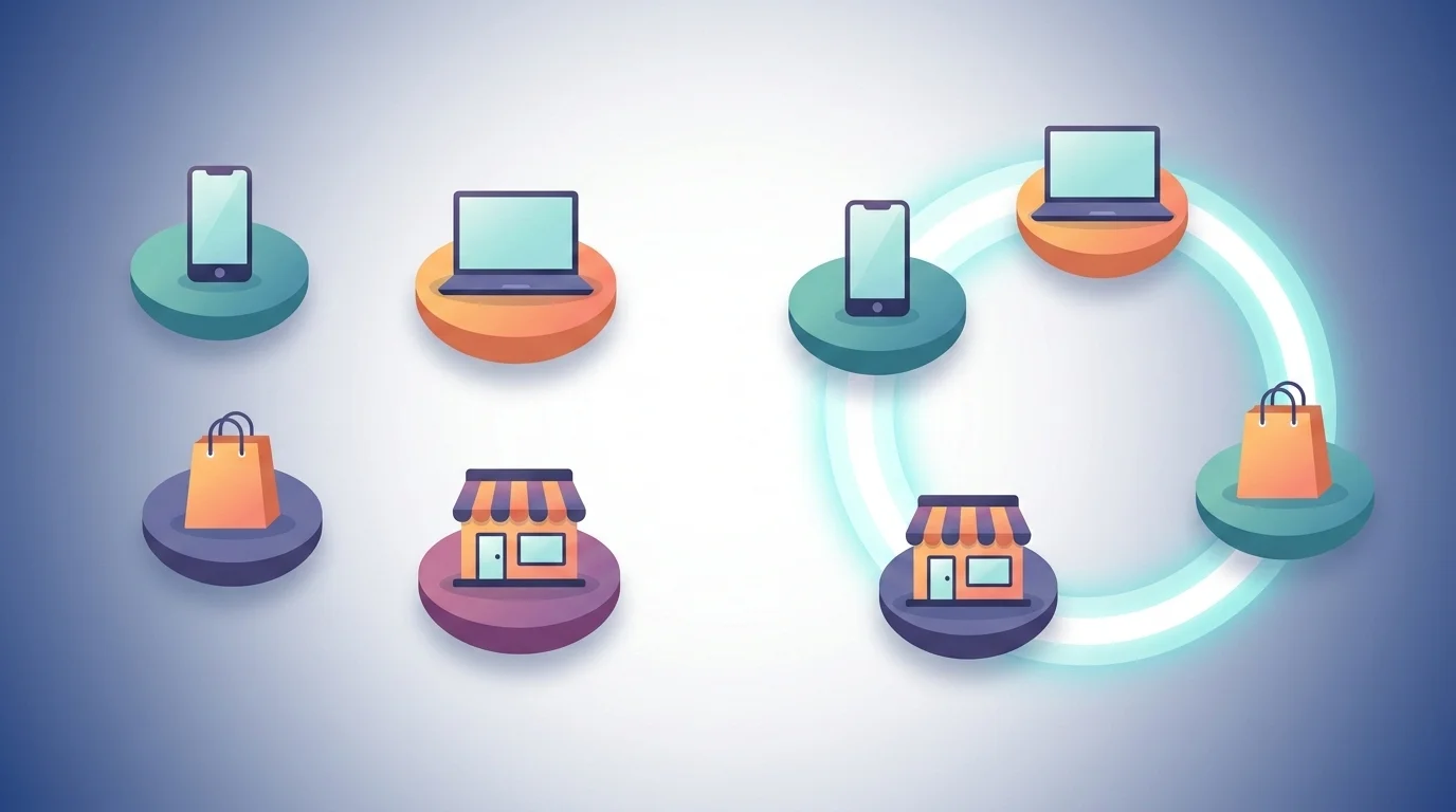
.webp)
.webp)