The ML Popup Widget makes it easy to prompt users with a native-style popup when their app version is outdated. This keeps your user base on the latest, most secure version of your app.
By effectively utilizing update popups, you can drive app engagement, improve user satisfaction, and ultimately increase your app’s success.
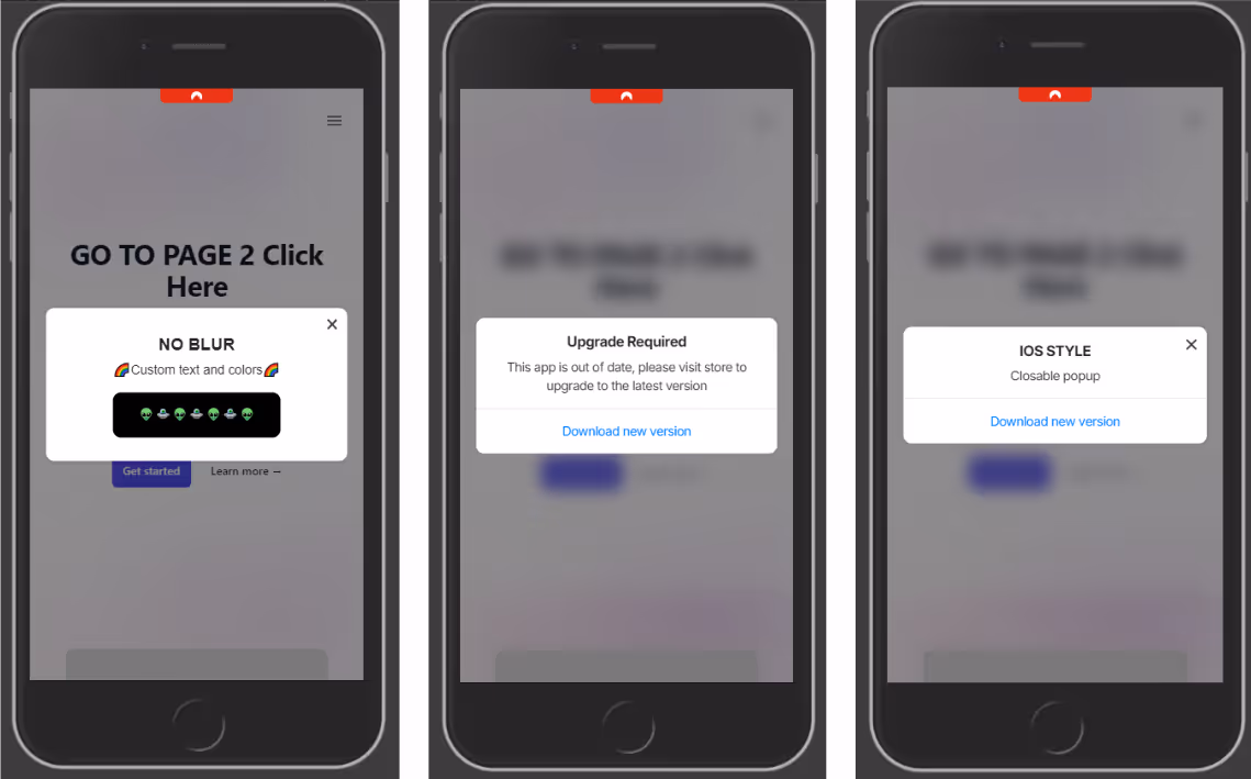
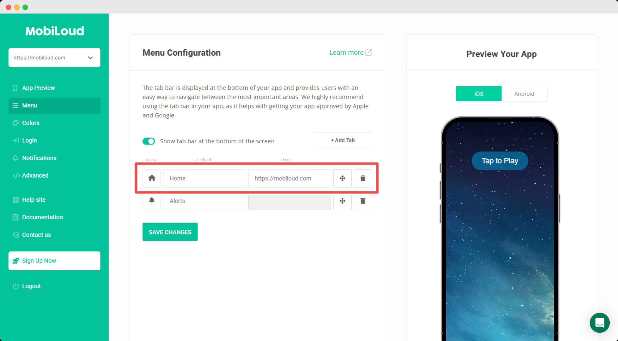
This element can also be used as a normal popup to add a custom UI ele
ment and a different experience in your app.
.avif)
What This Widget Does
The widget checks the user’s app version and displays a popup only if it’s older than your defined minimum version. This works inside mobile apps or webviews, and uses native-feeling styling that resembles iOS or Android prompts.
It also works as a normal popup to provide your users a nice User Experience.
The popup includes:
- A custom heading, description, and CTA button
- Links to the relevant App Store / Play Store
- Optional blurred backdrop, animations, and more
- Conditional display based on app version
Copy Directly Into Your Site 📄
Paste the following code at the end of your page’s . This popup will show only when the user’s app version is older than your defined minimum version (minVersion), in this code we set the closable param to false, ensuring the popup is not dismissable. Full list of options at the end of this guide:
src="" >
script>
const popupOptions = {
popupStyle: 'ios',
fontFamily: `"Source Sans Pro", "Arial", sans-serif`,
textColor: '#222',
textHeading: 'Upgrade required',
textDescription: 'This app is out of date, please visit store to upgrade to the latest version',
buttonText: 'Download new version',
buttonColor: '#000000',
buttonTextColor: "#ffffff",
widgetColor: '#fff',
backDrop: true,
backDropBlur: true,
backDropZIndex: 888888,
zIndex: 999999,
position: 'center',
animation: 'fadeIn',
display: 'onLoad',
radius: '10px',
delay: 0,
shadow: true,
useSession: false,
maxWidth: "700px",
closable: false,
padding: '20px',
linkIos: 'https://itunes.apple.com/?PATH-TO-YOUR-APP',
linkAndroid: '' ,
};
function addPopupWidget() {
// Checks if current device is a phone (deviceData.isMobile) and if its the app (deviceData.isCanvas)
if (deviceData.isMobile || deviceData.isCanvas) {
const minVersion = 1.0;
// Gets current app version
const appVersion = nativeFunctions.getDeviceInfo().appVersion;
// Compares the minimum required version with the current app version
// if appVersion
const isOutdated = deviceData.compareAppVersion(minVersion, appVersion);
if (isOutdated) {
// Triggers the widget
new PopupWidget(popupOptions).init();
}
}
}
window.addEventListener('load', addPopupWidget);
script>
Widget Methods
The widget have the following methods to compare the current app version and to enable the widget in the app only:
// returns true if its an ios or anroid device
deviceData.isMobile

// returns 'ios', 'android' or 'windows'
deviceData.os

// Returns true if using the app
deviceData.isCanvas

// Accepts two params (numbers)
// if appVersion

deviceData.compareAppVersion(minVersion, appVersion)

// CANVAS PLATFORM METHODS

// Returns an object with app metadata and info
nativeFunctions.getDeviceInfo()

/*
mobiloudAppInfo = {
	appId = string,
	appVersion = string,
	brand = string,
	hardware = string,
	manufacturer = string,
	model = string,
	nameos = string,
	osVersion = string,
	platform = string,
	pushSubscribed = bool,
	pushToken = string,
	pushUserId = string,
	timeZone = string
}
*/
This function returns true if the current version is lower than the required minimum. It enables developers to show the popup only when needed, avoiding unnecessary prompts.
Customization Options
You can modify any value in popupOptions to match your app’s tone and design:
textHeading,textDescription,buttonText: Popup contentlinkIos,linkAndroid: Deep link or store URL for each platformpopupStyle: This accepts ‘ios’ for default ios styles or ‘android’ for custom CSS stylesposition,animation,shadow,radius: Look and feelclosable: false: Disables the close (X) button to make the popup mandatoryuseSession: false: Ensures popup shows every time until the app is updated
Key points
- Set a meaningful minimum version number whenever a critical update is released.
- Always include store links for both platforms or ensure the popup is shown only in the desired platforms (this can be done using
deviceData.osfor getting the current device) - Match styling to your app’s branding for a consistent experience.
- Make the popup non-dismissible (
closable: false) if the update is required.
Widget Options
.avif)
.png)
.png)
.png)
.png)
.png)
.png)
.png)
.png)