Category: Ecommerce

  • Native vs Hybrid eCommerce Apps: Choosing the Right Option for Your Business

    Native vs Hybrid eCommerce Apps: Choosing the Right Option for Your Business

    Launching your own ecommerce mobile app is a great brand-building and retention move.

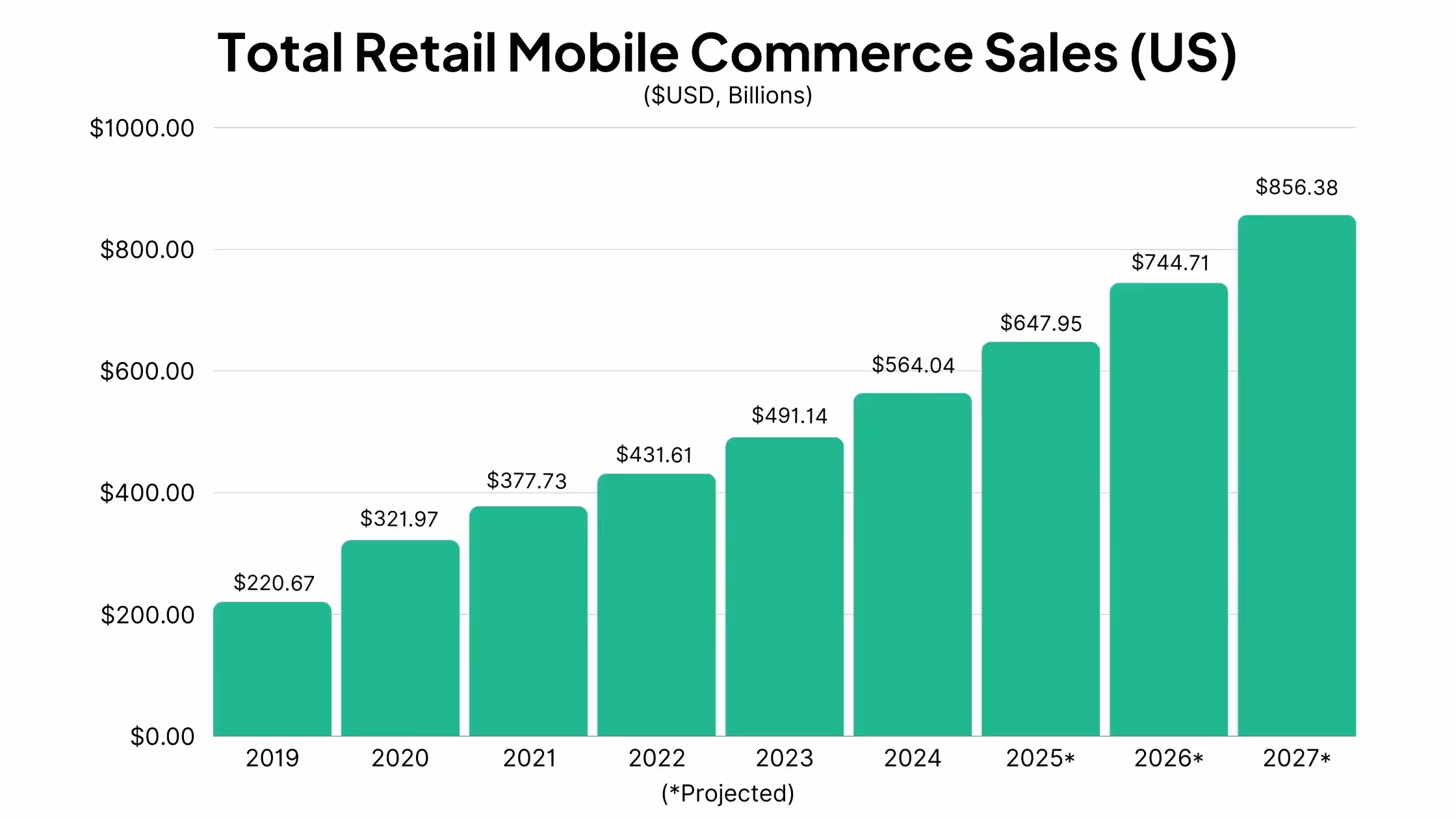
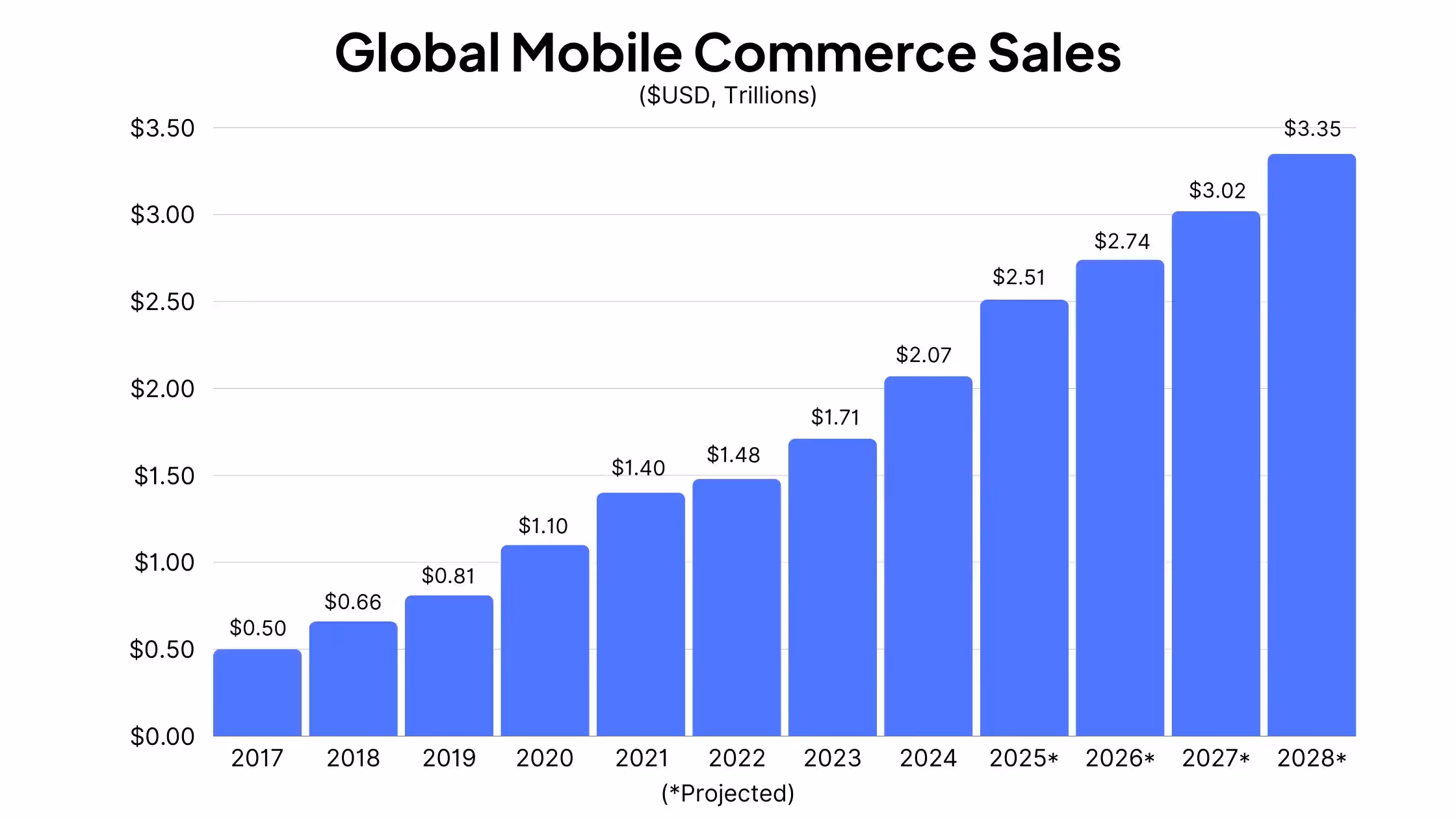
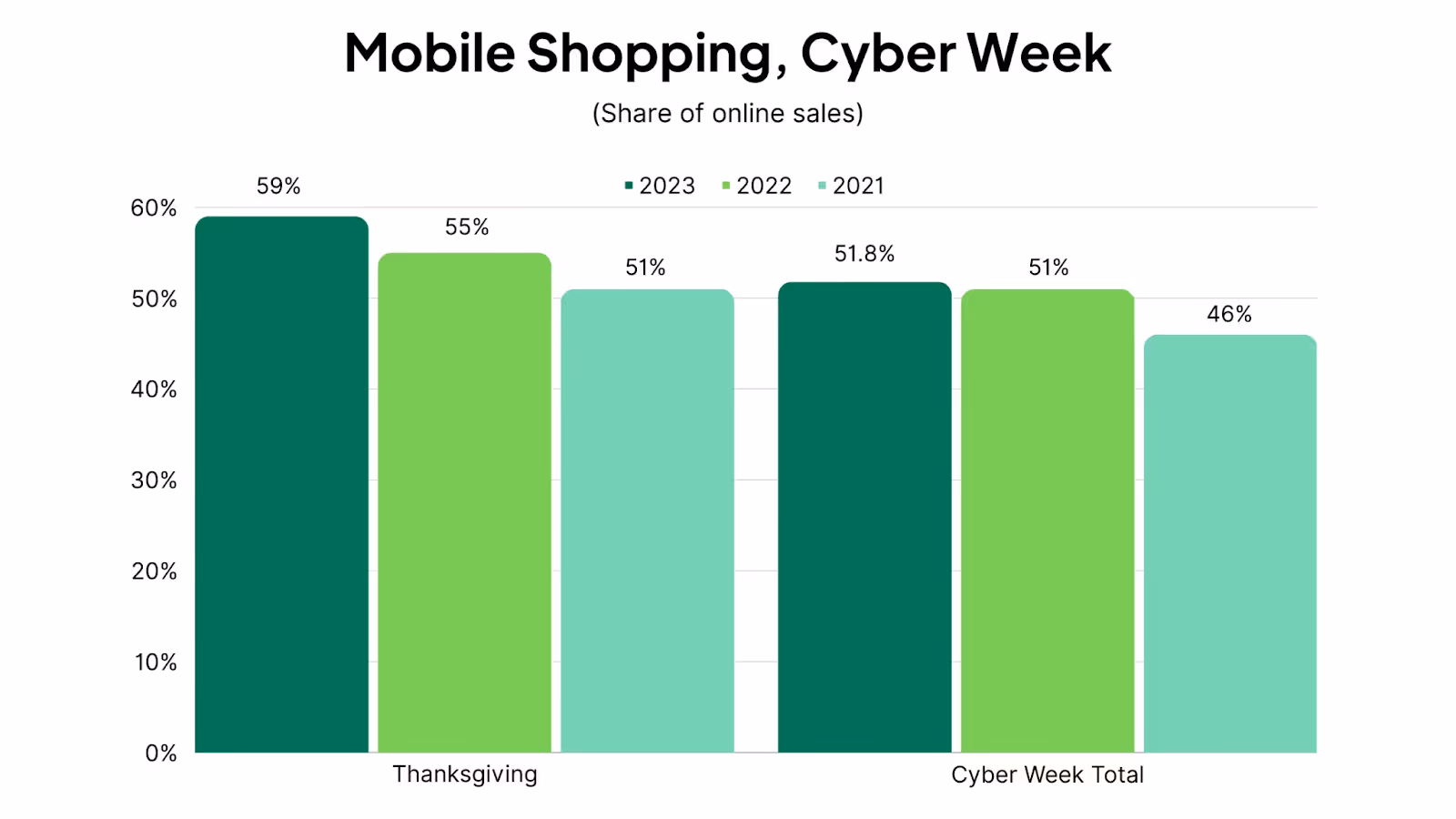
    With mobile commerce making up more than 50% of all eCommerce sales worldwide, launching an app is an opportunity to provide a better user experience for mobile shoppers, and boost conversion rates and AOV as a result.

    Then there are the long-term benefits you get when someone downloads your app, as the stickiness of an app and access to mobile push notifications leads to much higher lifetime value.

    Add in the authority and trust having an app gives your brand, and there are many reasons why you’d want to have an app.

    The biggest issue for most brands is how to launch an app. Most eCommerce businesses are versed in web development, not mobile app development, and you might not be aware of the different avenues available to launch an app (and that you can save hundreds of thousands of dollars and months of development time depending on which option you choose).

    Keep reading to get a deeper understanding between native and hybrid eCommerce apps.

    What is Native vs Hybrid Development?

    Let’s start by helping you understand what native development and hybrid development means.

    Native development means building apps written in the native code of mobile operating systems (namely iOS and Android).

    Generally, iOS (aka iPhone) apps are written in Swift or Objective-C code, and can only run on Apple operating systems.

    Android apps are usually written in Kotlin and/or Java code, and can only run on Android phones.

    This means you need to develop separate apps for each mobile operating system, as an iPhone app won’t work on an Android phone, and vice versa.

    And, most importantly, these apps are completely separate from your website, which is likely written in HTML, CSS and JavaScript, coding languages that require the browser to work.

    So what are hybrid apps?

    Hybrid apps are apps that combine web code (i.e. HTML, CSS, JavaScript) with mobile code.

    Hybrid development takes elements of both web and mobile, to allow you to share part of your website code with your mobile app.

    People can still download the app and open it on their phone, but some of the functionality and design works the same as it does on your website.

    Hybrid means you don’t need to build your entire app from scratch, instead you can reuse the parts of your website that work well on mobile already, to significantly decrease development time, as well as the workload required to maintain your app and website.

    Today, many high-profile apps are made with hybrid development, as companies look to maximize efficiency in their tech stack.

    Pros and Cons of Native eCommerce App Development

    Now we’ll take a look at what native and hybrid development means in terms of pros and cons, to help you start to understand why a brand might opt for one development approach over another.

    Let’s start with the pros and cons of building native eCommerce apps.

    Pros

    • Native apps generally perform better, and are faster and smoother to use.
    • The user experience is better due to code being written specifically for the user’s device.
    • No limits as to what the app can do; full access to device features and native APIs.
    • Native apps can be built to work offline.
    • Native apps generally have a higher level of security.

    Cons

    • The cost of native development is significantly higher; you can expect to pay around $50,000 at a minimum (multiplied by two, for separate Android and iOS apps).
    • Native apps come with a high cost of maintenance as well (potentially five or six figures per year).
    • Development can take months to complete (expect 6-9 months for an average native eCommerce app).
    • You need to juggle multiple codebases (web, Android, iOS).
    • It takes extra work and extra development to make sure your web and mobile platforms are connected (your developers will need to build custom APIs to sync data across each platform).
    • You probably don’t have anyone with native development experience on your team; introducing the risk and expense that comes with hiring new staff or dealing with outside development agencies.

    Pros and Cons of Hybrid eCommerce App Development

    Now let’s dive into the advantages and disadvantages of hybrid app development for eCommerce stores.

    Pros

    • Significantly lower cost to build and launch your app.
    • Much shorter development timeframe (you may be able to launch an app in less than a month).
    • Cheaper and easier to maintain, with less unique code to manage.
    • User experience and branding is easy to keep consistent across all your platforms.
    • Since it’s quicker and more affordable to launch, you can gather feedback from users faster and accelerate the process of iterating and improving on the first version of your app.

    Cons

    • Hybrid apps’ performance can suffer compared to native apps.
    • User experience may not be 100% optimal on each platform.
    • You may not be able to use all device features (though hybrid apps can generally use some hardware features, such as camera, microphone and GPS, and hybrid technology is constantly improving).
    • Bugs can show up on certain platforms, since code is not customized for each environment.

    Choosing the Best Option for Your Store

    Above, we ran through a summary of the pros and cons of native app development for eCommerce, as well as hybrid development.

    So which is the best way to build an app for your store?

    The answer might be different from brand to brand, since each business is unique, and certain pros or cons might hold different weight for your business, compared to another.

    So it’s important to consider how important each area is for you. 

    Is cost and time a priority? Do you need extensive use of native device features? Do you already have mobile developers on staff?

    Though choosing your tech stack is certainly a complex decision, the most significant pros and cons of native vs hybrid app development center around the lower cost of hybrid vs the higher level of performance from native apps.

    Just How Big Are the Differences in Cost and Performance?

    So how significant is the gap in performance between native and hybrid apps? And how about the difference in cost?

    Let’s examine this now.

    Cost

    Building native apps costs a lot of money.

    This is because app development is time-intensive, and all this time, you need to pay high rates for specialized developers.

    The average salary for mobile app developers is between $95,000 to $115,000 per year. With a six-month development timeframe (which is conservative), you could estimate that it will cost approximately $50,000.

    Yet it’s likely to be more than that; you’ll likely need more than one developer to work on your project, as well as designers, project managers and QA testers, and a six month timeframe is really a best case scenario.

    So don’t be surprised if building a native app costs $100,000+.

    The cost of a hybrid app can vary as well, depending on how native you go, and the level of native features you build into your app.

    But you can easily build high-quality hybrid apps (like high-revenue brands Tobi and Sleefs did) for around $1,000.

    That’s a big difference – and there’s also the difference in recurring maintenance costs, which is even steeper considering native apps require more work to keep up to date and in sync with your website.

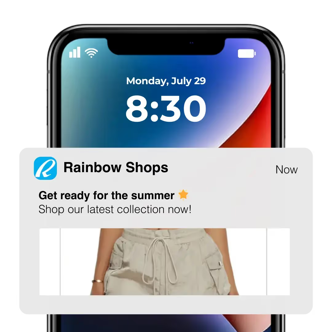
    “If we had unlimited time and money, we would probably go for a custom native app, but that is half a million to a million a year to maintain.”

    – David Cost, Rainbow Shops

    Learn more about the cost of building an app here.

    Performance

    The area in which native apps have the edge is performance.

    Native apps are faster, smoother, generally easier to use, and have a more natural integration with the user’s device.

    It’s easier for native apps to tap into device features, such as the GPS and biometric features.

    It’s difficult to quantify just how large the difference in performance is. But we can say that hybrid technology has improved greatly over the last ten years, and depending on the type of app, the difference can be negligible.

    For apps with a high level of interactivity – like TikTok, Snapchat, for example – there may be a noticeable difference in using native or hybrid technology.

    But for an eCommerce app, the difference will be a lot less significant.

    Shopping apps generally don’t need any overly complex features, or even anything drastically different to what the website does.

    There may be incremental improvements in load speed, and the UI and UX may be slightly more optimized with a native app.

    You will need to decide whether this difference is enough to justify the difference in cost, time to market, and ongoing complexity from building native apps.

    Other Options (PWA, Cross-Platform)

    Briefly, before we give our verdict on how we recommend you build your app, we’ll touch on two other ways to build an ecommerce app: Progressive Web Apps (PWAs) and cross-platform mobile apps.

    Progressive Web Apps

    Progressive Web Apps are mobile websites that are “supercharged” to provide something closer to an app-like experience.

    They still run via the browser, but users can download an icon to their home screen and launch your site with one tap, rather than by typing in the URL.

    The user experience inside of the PWA is designed to feel more like using an app, though it’s not quite the same level (you’ll notice the difference if you switch between a PWA and a native app).

    Ultimately, PWAs are much cheaper and easier to build than either hybrid or native apps, but they’re not a worthy replacement for actual mobile apps. The user experience is not as good, you can’t get your PWA into the app store, and it doesn’t carry the same authority for your brand.

    Learn more about the difference between Progressive Web Apps and Native Apps here.

    Cross-Platform Mobile Apps

    Cross-platform apps are apps built with frameworks like React Native or Flutter, which can use much of the same code to run on multiple operating systems (iOS and Android).

    They’re a lot closer to native apps. Indeed, there’s not too much difference these days between a cross-platform app built with React Native, for example, and fully native apps.

    The advantage with cross-platform is that it’s cheaper and more straightforward than building natively, as you don’t have so much unique code to juggle.

    However, cross-platform development is still expensive. You might save 20-50% of the cost of native development, but you’re still looking at a $50,000+ price tag to build an eCommerce app.

    Learn more about cross-platform mobile apps here.

    Why We Recommend Hybrid eCommerce Apps

    In most cases, we recommend eCommerce brands to build hybrid mobile apps over native (or cross-platform).

    It comes down to the lopsided differences in cost and performance, and what you ultimately want from an eCommerce mobile app.

    All eCommerce brands today should know the importance of having a mobile-optimized website, and if you’re generating steady revenue, you’ve probably already put work into making your mobile UX as good as it can be.

    You just need to translate that same experience into the app, with a few app-specific additions, such as a tab menu, native navigation, and mobile push notifications, all of which you can do with hybrid apps.

    Any flashy or complicated features, which are only possible with native development, are likely overkill for an eCommerce store.

    It’s just not worth paying tens or hundreds of thousands more for a complicated, expensive, native app, just for minor improvements that most customers won’t notice.

    Hybrid development lets you launch an app that’s 99% as good as what a native app would be, for less than 5% of the cost, and even less hassle moving forward.

    How to Build a Hybrid App with Vendrux

    __wf_reserved_inherit

    Vendrux lets you launch amazing eCommerce apps, for a manageable cost, without the stress of hiring new staff or managing developers.

    Vendrux is a full-service platform that does all the heavy lifting to turn your eCommerce store into a mobile app.

    We’ll take everything from your website and have it work just as well in the apps – all the plugins, integrations and custom features and optimizations you’ve made to your website will work the same.

    And everything is fully synchronized between your website and apps.

    It doesn’t matter what platform your site is built on, such as Shopify, WooCommerce, Magento, BigCommerce, and even custom-built websites.

    __wf_reserved_inherit
    eCommerce apps built with Vendrux. View more examples here

    All this happens with zero work on your part. We build your apps, test them, submit them to the app stores for publishing, and handle technical maintenance and updates after launch, for a fraction of the cost of paying developers to do it.

    This is the easiest and most effective way to get your store into the app stores, and sell more and grow your brand with mobile apps.

    Learn more about building eCommerce apps with Vendrux here, or to dive deeper and get a personalized look at what the process and end result will look like, book a free demo now.

    Ready to Launch Your App?

    Start now, and you could enter the app stores and start getting app users in less than a month.

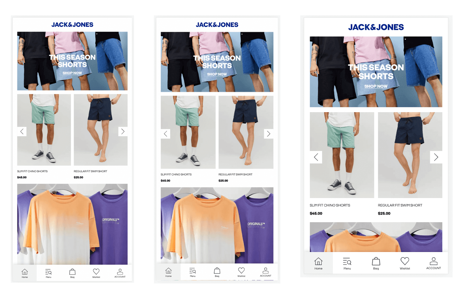
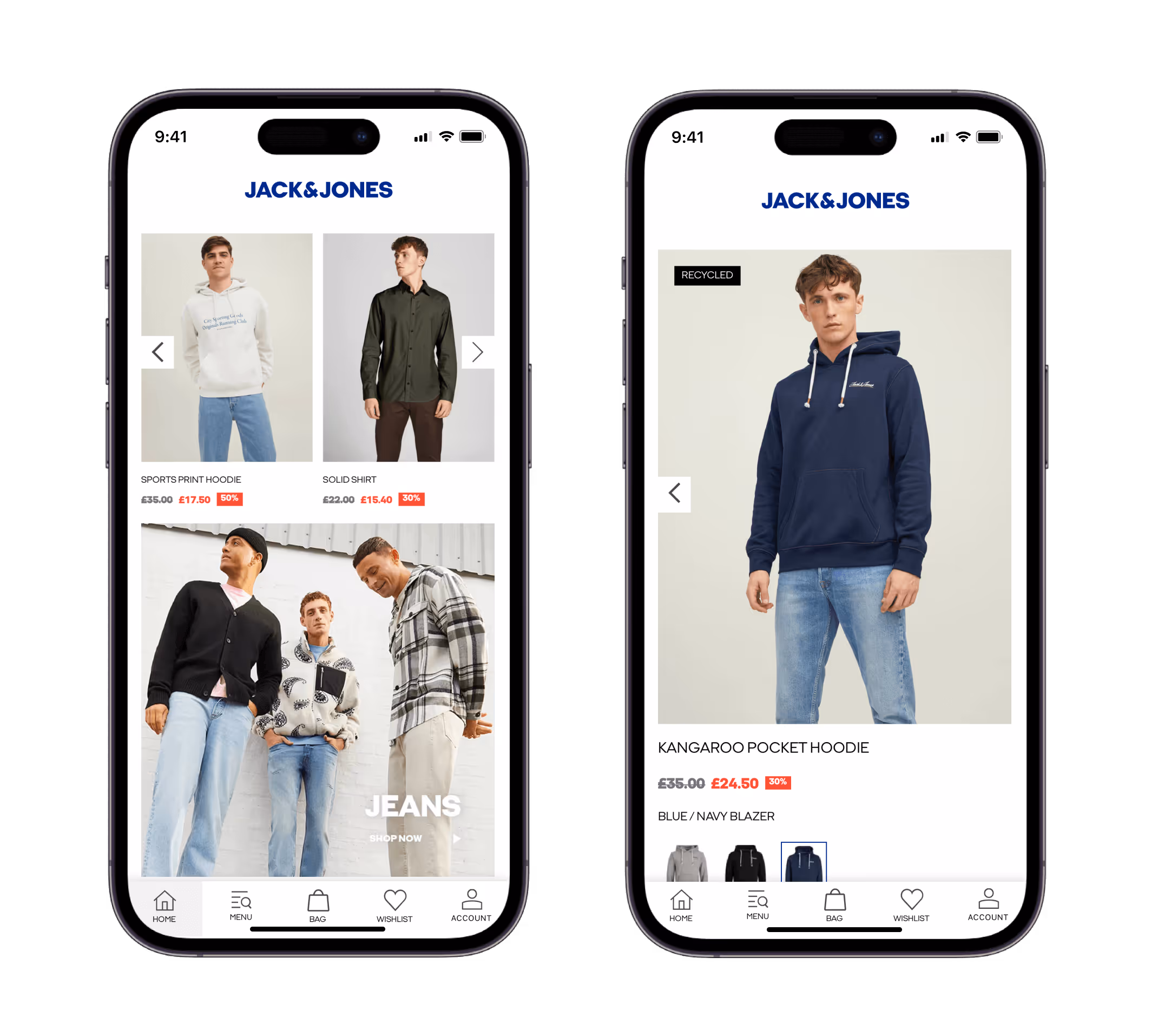
    We’ve helped huge brands launch mobile apps, including Rainbow Shops, John Varvatos and Jack & Jones, and all have raved at how much easier and more affordable it is than native development, without sacrificing anything important from their apps.

    “We couldn’t find another company that could offer the same features at the same price point, same time to market, and make it as easy as Vendrux could.”

    – Svend Hansen, Bestseller

    “I expected the app to be somewhat functional, but I thought it wouldn’t be as high quality as some of the apps I’ve seen that have been built from scratch. But I was incredibly surprised. I saw no difference in terms of quality or functionality in our app and an app that could have cost us hundreds of thousands of dollars.”

    – Gavin McGarry, Gear2Go

    As long as you already have a working, mobile-optimized website, it takes virtually nothing at all for us to turn it into amazing mobile apps, which your customers will think you spend hundreds of thousands to build.

    Just book a free demo now to get started, or simply to learn more about what’s possible with Vendrux.

  • Mobile Marketing for eCommerce Brands

    Mobile Marketing for eCommerce Brands

    The eCommerce landscape is vastly different than it was even just a few years ago.

    Attention spans are shorter, convenience is more important than ever, and any brand with an online presence needs to be all-in on mobile.

    This guide explores the essentials of mobile marketing for eCommerce brands in 2026, detailing the significance of mobile commerce and key strategies to help your brand get ahead and make more revenue from mobile shoppers.

    Want to boost key metrics such as CVR, AOV and LTV on mobile? Try launching an app. Check out these brands who successfully converted their websites into mobile apps to generate higher customer engagement and retention on mobile.

    Introduction to Mobile Marketing for eCommerce

    With the rise in smartphone adoption and mobile internet usage, mobile marketing has become a non-negotiable area of focus for eCommerce businesses.

    Your mobile marketing strategy is how you use various platforms, tools and tactics to specifically connect with mobile shoppers, and drive higher conversion rates and more sales on mobile devices.

    Why Your Mobile Marketing Strategy Matters

    Here are the top reasons why prioritizing mobile marketing is crucial for eCommerce brands today:

    • As of 2024, over 60% of global eCommerce traffic comes from mobile devices.
    • Many customers now prefer shopping on mobile due to convenience and the availability of seamless mobile payment solutions.
    • Mobile marketing allows brands to engage users anytime, anywhere.
    • A well-executed mobile marketing strategy can lead to higher conversion rates due to personalized and timely interactions.
    • Many brands still provide a sub-optimal mobile user experience, leaving significant upside for brands who do it well.

    The Rise of Mobile Commerce

    Each year, more and more customers are choosing mobile first as their preferred way to shop online (and for some, to shop in general).

    Retail mobile commerce sales in the US are rising steadily each year, and are projected to reach more than $850 billion by 2027.

    Globally, mobile commerce accounts for over $2 trillion in sales each year, and nearly 60% of all eCommerce sales.

    People prefer shopping on mobile because it’s faster, more convenient, and better aligned with modern lifestyles, which revolve heavily around smartphones.

    They’re also being driven towards mobile by retailers, who understand that mobile presents more opportunities to engage customers, generate impulse buys, and retain their attention (and business) for longer.

    See more key mobile commerce statistics here.

    5 Core Elements of Your Mobile Marketing Strategy

    Let’s look at the various parts of a well-optimized mobile eCommerce marketing strategy, and what your brand needs to get right to maximize mobile revenue.

    Responsive, Mobile-Friendly Website

    A mobile-friendly website is table stakes for any business today.

    Approximately 60% of all internet traffic worldwide comes on mobile devices. And as we shared earlier, mobile eCommerce has overtaken desktop as the most popular way to shop online.

    Your website absolutely must be mobile-friendly. That means it should load fast on mobile, content and layout should adjust for smaller screen sizes, and navigation and other interactive elements (e.g. buttons, input fields) should be easy to use on touch screens.

    You could even argue that, in 2026, brands should be designing for mobile first, then adapting this design for desktop, as opposed to the other way around, which makes mobile almost an afterthought.

    Checkout Process Optimized for Mobile

    Part of building a mobile-friendly website is ensuring your checkout flow is optimized for mobile. But this is so important that it warrants a section for itself.

    Your checkout process needs to be fast and mobile-friendly, with minimal friction.

    Mobile shoppers value speed and convenience more, so any inefficiencies are more likely to cause a dropoff in conversions.

    This is why the average mobile conversion rate for eCommerce stores is less than half of the average conversion rate on desktop.

    Here are some things to consider for a well-optimized, mobile-friendly checkout process:

    • Minimize steps in your checkout flow.
    • Offer guest checkout options.
    • Enable autofill for payment details and addresses.
    • Display secure payment badges to build trust.
    • Integrate with mobile payment solutions, such as Apple Pay, Google Pay, etc.

    As your mobile customer base grows, making these improvements to your mobile checkout may result in a significant increase to your bottom line.

    Mobile Apps

    The most impactful thing you can do to maximize mobile eCommerce revenue (assuming your website is already usable on mobile), is to launch your own mobile app.

    Mobile apps provide a better shopping experience for mobile users, leading to 3x higher conversion rates, 4.2x more products viewed per session, and 11-19% higher AOV, depending on the industry.

    They’re also optimized for repeat business. Customers are more likely to return to a store and shop multiple times if they download an app, compared to shopping on that store’s mobile website.

    Today, no mobile eCommerce strategy is complete without an app. There’s going to be a segment of your customer base who prefer to shop on an app, and giving them the option will result in higher revenue per session, and significantly higher LTV from your app users.

    Expense has traditionally been a blocker, but with Vendrux, it’s now easy and affordable for any brand with consistent revenue to build their own apps.

    You simply convert your website into an app, bypassing the need to hire expensive developers and manage a complex and resource-intensive project.

    If you don’t have an app yet, make it a priority, and you should see a huge increase in mobile revenue in no time.

    Want to see how much you stand to gain from launching a mobile app? Use our eCommerce App Revenue Calculator and get an estimate.

    SMS & Push Notifications

    Part of your mobile marketing strategy is using mobile-friendly channels to communicate with your audience.

    SMS and push notifications are perfect for brands looking to connect with mobile shoppers. They let you get in front of shoppers wherever they are, with high visibility and engagement rates.

    Of the two, push notifications are typically the most effective. Mobile push notifications are direct, personal, versatile, and extremely low cost.

    You can essentially contact subscribers for free, with messages that they’re unlikely to miss or ignore.

    Push is great for promotions, abandoned carts, new product launches, order updates, loyalty program updates, and much more.

    “Push notifications are the cheapest and most powerful communication channel we have. We find that users who prefer to interact via an app are more loyal, buy from us more often and spend more time with our content.”
    – David Cost, VP of eCommerce & Marketing at Rainbow Shops

    SMS has a place in your mobile marketing strategy too, though with a higher cost, you need to be more selective about when you use SMS, compared to push.

    One thing to mention is that you really need a mobile app to make full use of push notifications, which is just another reason why it’s so valuable for brands to have an app in 2026.

    Learn more about using Push Notifications for eCommerce in this guide.

    Mobile Advertising Strategies

    Finally, consider how your advertising strategy is geared towards mobile shoppers.

    Whether you’re doing social media ads, display ads, or advertising on any other platforms, make sure your ads are optimized for mobile.

    Format, media, copy, CTAs all need to work well for users on smaller devices, with shorter attention spans.

    When tracking results, make sure you track mobile and desktop separately, so you know if you’re underperforming for users on specific platforms.

    Push notifications, again, can be a powerful part of your mobile advertising strategy. You may even want to consider running ads to get people to download your app, at which point you’ll unlock the ability to target them with push notifications for future marketing campaigns.

    Boost Engagement, Retention and Revenue from Mobile Shoppers Now

    To optimize your mobile eCommerce marketing strategy, start with the fundamentals.

    Before anything, you should have a website that’s responsive and optimized for mobile shoppers.

    Your checkout should be free of any unnecessary friction, and mobile-friendly.

    Once you’ve checked these two boxes, we’d argue the next core pillar for your business is a mobile app.

    Mobile apps drive higher conversion rates, higher AOV, and higher LTV from mobile shoppers.

    As mobile commerce continues to grow, the value of having your own app grows as well.

    Convert Your Site to an App with Vendrux

    Vendrux makes it easy to launch your own app.

    You don’t need to have mobile developers on staff, or invest hundreds of thousands into hiring outside developers.

    We do all the work for you, converting everything that already works well for you on your website.

    Your app is fully synced with your website, meaning minimal effort to maintain, and full feature parity with your website.

    The John Varvatos app, built with Vendrux, shows how we seamlessly convert your website into an app

    With low cost, overhead and effort required to build and manage your app, it’s an easy, high-ROI play.

    Some of our users have seen as much as 53x ROI from converting their website into an app.

    Get in touch now to schedule a free consultation, and learn more about how launching a mobile app can take your brand to the next level.

  • How to Design Mobile-Friendly Ecommerce Websites (With Examples)

    How to Design Mobile-Friendly Ecommerce Websites (With Examples)

    What makes a mobile-friendly website? How can you ensure that your website is fully optimized for mobile users? Is it even that important to put effort into your mobile website, if using a mobile app is the preference for both you and your users?

    These are all questions we’ll address in this article. Read on for everything you need to know to make sure you cover all the bases of mobile optimization for your e-commerce website.

    Quick Summary:

    • Optimizing your site for mobile is the first thing you should do, before you think about building an app.
    • Mobile-friendly sites are easy and intuitive to use on smartphones, and optimized to convert mobile shoppers into buyers.
    • Mobile optimization requires a number of key principles to be followed, including optimal spacing, placing key details above the fold, intuitive navigation and checkout flow and touch-friendly buttons and clickable elements.

    This video goes into some of our top tips on mobile website optimization. Give it a watch, then keep reading for more:

    Why Mobile Web Optimization is Your First Priority

    First of all, how important is it to have a mobile-friendly, mobile-optimized website? Particularly if you want to get users on your app eventually anyway?

    It’s true that you ultimately want to convert website visitors into app users, where they’re likely to spend more in each shop and much more likely to become repeat customers. However, your first step should always be optimizing your mobile website.

    There are three reasons for this.

    #1: More people will discover your store via the web

    In all likelihood, when someone enters your online store for the first time, it’ll be via the web. Whether they come to you via social media ads, Google or any other channel, it’ll be the website they land on. And there’s a strong chance that this happens on mobile.

    You need to be set up to offer the best possible user experience for these web visitors. In time, you’ll ideally be able to get them on the app. But for now they’re on your website, and you risk losing these customers if your web user experience is not optimal.

    #2: Some users simply won’t download the app

    Despite your best efforts, not all your customers will download your app when you launch it. You’ll get repeat customers who don’t want to download an app, but they’ll still shop on your mobile store.

    Don’t cast these customers aside just because they don’t want to use the app. Provide a great mobile user experience for them and maximize the revenue you get from each customer, no matter where they shop.

    #3: It’s easier to convert your site into an app

    As mentioned in the previous article, e-commerce sites are easy to convert into apps, as long as they’re optimized for mobile already.

    It’s far more difficult to build an app for your site if it’s not already mobile-friendly. It’ll require you to do the same work you’d do to optimize your website for mobile in the first place.

    Think of this as two birds with one stone; you’re designing your mobile app, and at the same time building a user experience that’s going to boost revenue and retention for web users.

    What Makes a Website Mobile-Friendly?

    There are varying degrees to which a website can be considered mobile-friendly. There are also tools that can test this, such as Google’s mobile testing tool.

    These tools generally just test that a site is usable on mobile and that there are no significant issues, like anything that’s completely broken on mobile.

    But to be truly mobile-friendly or mobile-optimized, your website should not just be usable on mobile, it should provide an excellent experience for people who come to your site on mobile.

    It should:

    • Be easy and intuitive to browse the site.
    • Feel like it’s made with mobile users in mind.
    • Be optimized to hold the attention of mobile users.
    • Be optimized to convert mobile users into buyers.
    • Follow key mobile UX and SEO principles.

    We’ll show the specifics on how to do this next.

    Key Elements of Mobile-Friendly E-Commerce Sites

    Here are some specific tips and best practices to follow to ensure your website is fully optimized for mobile users (and thus also in the best state to convert to an app).

    Responsive to Screen Size

    Your site should look good and be usable on a number of different resolutions. From tablets and smartphones, to different smartphone models, there are many screen sizes you need to cater to.

    It’s not great if your site looks fine on an iPhone 13, but awful on a Samsung Galaxy.

    Clear Images

    It’s easy for images to look bad or unclear when scaled down to smaller screen sizes. With the shorter attention span of mobile users and lower reliance on text for mobile websites, it’s even more important that your images are not only clear, but that they really stand out on smaller screens.

    Text That’s Easy to Read

    As with images, ensure that text is clear and easy to read on smaller screens. Text can get scaled down for mobile to where it becomes too small and hard to read.

    On the other hand, text should not be so big that it forces a horizontal scroll or gets cut off (this is common with headlines in particular).

    Large blocks of text are also suboptimal on mobile. You may need to increase spacing, break up text or perhaps avoid large blocks of text altogether to best serve mobile users.

    Optimal Use of White Space

    Your page layout on smaller screens should have enough white space, but not too much.

    Common with poorly optimized mobile websites is either large blocks of empty space, or content areas that stretch to the very edge of the screen and don’t have enough white space.

    Your site, specifically areas with text, should use just the right amount of negative space.

    Key Information Above the Fold

    With less visible on the screen, and more scrolling necessary to view the entire page, you need to ensure that the most important information is available above the fold, or at least high up on the page with minimal scrolling necessary.

    For e-commerce websites, this means putting product images, critical product information and CTAs early in the page.

    Smooth Navigation

    Navigation and menus may need to work differently on mobile. You won’t have room to display the full menu at all times, as you might do on desktop. As you’re dealing with touch screens, hovering to show sub-items on the menu won’t work.

    Yet it’s even more important on mobile that you give users a smooth process to navigate between pages and get to where they want to go. Make sure important pages, such as the checkout, collections and account are easy to find and easy to get to.

    Fast Load Speed

    People today want websites to load instantly – particularly on mobile, where speed and convenience is more important to users. 

    With each second of load time, website conversion rates drop by an average of 4.42%. And nearly 70% of customers become less likely to buy if a site loads slower than expected.

    Poor load speed is a common issue with mobile websites, due to the lower processing power of mobile devices and mobile browsers. You need to optimize your site well to load fast on mobile, by compressing images and media, caching content and maintaining clean code in the backend of your site.

    Easy Checkout Flow

    You may need to think about how well your sales funnel works on mobile. Checking out and paying can be frustrating on mobile, if you can’t figure out how to get to the checkout page or it’s too hard to enter your payment information.

    This could be the reason why the cart abandonment rate on mobile websites is 85.65%, significantly higher than the average of 69.57%.

    Make it as easy as possible for people to pay you. Make it clear how people can buy with big, clear CTAs, reduce friction in your checkout flow where possible, and allow users to pay with one-click payment options like Google Pay and Apple Pay.

    Intuitive for Touch Screens

    Consider that people are using a touch screen to navigate on mobile instead of a mouse. They’ll be scrolling and swiping, and your site should work with this. 

    Let them swipe through product images instead of having to tap a button to move to the next image, for example. Drop anything that requires the hover function, and only use UI elements that work intuitively with touch screens.

    Easily Clickable Buttons and Elements

    It’s harder to click on elements, such as buttons and links, on touch screens than it is with a cursor. You’ll likely need to increase the size of clickable elements to make this easier.

    It’s also more difficult to notice what is clickable, as desktop sites often use a hover animation to show this. You might need to adapt CTA text on mobile to make it totally clear to users what they can (and should) click on.

    Also consider where you place clickable elements on the screen. 61% of younger mobile users (between the ages of 18 and 34) want to be able to use apps with only one hand. The same can be expected when people use mobile websites. Thus you may want to put important elements, such as “Buy Now” buttons, within reaching distance of the thumb.

    As Few Text Inputs/Forms as Possible

    Text inputs and forms are notoriously annoying on mobile. Requiring your user to do too much of this makes for a poor mobile UX. Simplify this as much as possible, and use one-tap sign in functionality to let users sign up/sign in with Google, Facebook etc to make it easier.

    Minimal Popups

    Popups are even more annoying than usual on mobile. While invasive popups are not great on any device, on mobile screens they cover up more of the content and are often harder to X out of. Reduce how much you use popups on mobile, and if possible switch to other more mobile-friendly notifications and callouts.

    Consistency Between Mobile and Desktop

    Though you may want to change some things for your site to look and work well on mobile, you don’t want to completely overhaul your site and design. It should still be consistent with your desktop site, in terms of both design and functionality.

    It should be clear to the user that they’re looking at the same company when they view the desktop and mobile sites next to each other. The content should be mostly the same, and for e-commerce stores, products, and collections should be the same. It should also be easy for users to start orders on mobile and complete their checkout on desktop.

    Examples of Good and Bad Mobile Optimization

    Here are some examples (good and bad) that show what we discussed above.

    Example: Responsiveness & Mobile Navigation

    The Jack & Jones mobile website is a great example of how to make minor changes in sizing and spacing to look perfect on slightly different screen sizes of different smartphone models.

    It’s also a great way to show how site navigation can be changed to be more intuitive for mobile users.

    Example: Good Use of Space

    Rainbow Shops makes excellent use of space on mobile, with no excessive white space while not feeling cluttered or overloaded on a smaller screen.

    Example: Clear Images, Well Scaled to Mobile

    Gold BJJ’s mobile website shows how you can scale down your product listings well for smaller screens, while ensuring that images remain clear and high-quality.

    Example: Text Difficult to Read on Mobile

    This is an example where spacing and text is poorly translated to mobile. The mobile site looks cluttered and the text at the top of the page comes out too small and hard to read.

    Example: Poor Text Spacing on Mobile

    Here’s another example of not-so-good mobile optimization. This page feels cluttered – the text in the banner is too small, the black on red coloring (exclusive to the mobile version) is hard to read, and placing long product titles, pricing and promotional details next to the image makes for poor use of space.

    Example: Good Use of Space, Easily Clickable Elements, CTAs that Stand Out

    If you can learn about how to structure an e-commerce site effectively from anyone, it would be from Amazon. In their mobile product pages, their CTA buttons stand out, it’s easy to see (with icons, design or simply a different color text) what’s clickable and not, and they use space and visual hierarchy well on the smaller screen.

    Example: Intuitive Mobile Navigation

    Rainbow Shops shows up again as an example of good mobile optimization, this time in regards to their navigation. Instead of the hover-based nav menu on their desktop site, the mobile site utilizes a native navigation menu that’s easy to use on touch screens, and easily shows how to exit/go back to the previous menu.

    Example: Altering Hover Animation to Fit Mobile

    In one more example, Culture Kings makes a small but very effective change. Where on the desktop site you can hover to reveal size choices and quickly add a product to your cart, the mobile site alters this (as hover animations don’t work on mobile), giving a large and obvious “Add to Cart” button that does the same thing.

    How to Ensure Your Site is Optimized for Mobile

    So how can you be confident that you’ve done all you can to optimize your website for mobile visitors?

    First, follow the best practices for mobile optimization by checking off each of the key elements listed above. Use this as a checklist when doing your first run on mobile optimization.

    Second, be sure to test it out on mobile, and test on a variety of devices and screen sizes.

    You can do this using Google’s inspect tool, which lets you view your site between different resolutions, and includes numerous presets for popular smartphone models.

    Even better, actually test your site on real mobile devices and note down any design or usability issues you notice.

    Better yet, when you first design your site, design it for mobile first. The majority of site owners still build desktop-first, even if the data shows that more people access the site on mobile. You can really stand out by building your site specifically for mobile users.

    Today, mobile optimization is no longer a “nice to have”. It’s essential for just about any business – but specifically for e-commerce businesses – to have a website that works well and looks great on mobile.

    If your site is not yet mobile optimized, do that now before anything else.

  • Best Practices for Mobile Ecommerce Sites

    Best Practices for Mobile Ecommerce Sites

    Mobile is quickly becoming the favorite way for most people to shop, overtaking physical retail and traditional eCommerce. If you haven’t yet embraced mobile, you’ll quickly fall behind.

    Your site needs to be optimized for mobile commerce now, not later. The tips and best practices in this post show you how.

    Did you know that mobile app users spend more, shop more frequently, and convert at a 3x higher rate than mobile web users? Check out our eCommerce App Revenue Calculator to see just how much you stand to gain by launching an app.

    15 Best Practices for Mobile Ecommerce Websites

    If you’re an eCommerce site owner, you need to follow these best practices if you want to get the most out of your mobile visitors.

    These mobile eCommerce best practices are broken down into four categories.

    • Technical best practices, which cover the backend of your site.
    • UI best practices, covering the look and feel of your store on mobile devices.
    • UX best practices, which is how the user journey functions for mobile users.
    • Operational best practices, regarding how your business approaches mobile optimization.

    Let’s get into it.

    Technical Best Practices

    Here are a few technical best practices to follow for mobile eCommerce websites.

    1. Make sure your site is fast

    Speed is the first, and possibly most important thing when it comes to mobile optimization.

    53% of website visitors expect an eCommerce site to load in 3 seconds or less. On top of that, 1 in 2 online shoppers will abandon their cart if the website they’re on is slow to load.

    Image via Digital.com

    We expect things online to happen instantly, or at least close to it. The benchmark for site speed has shortened massively since the dial-up age.

    These statistics are for all website visitors, mobile and desktop. We can assume that users’ expectations are even shorter on mobile, where convenience is prioritized.

    Mobile devices have less processing power than desktop and laptop PCs as well, so if you don’t take care to optimize your site speed, it’s going to be a tough time for your mobile visitors. You can guarantee that these people will jump ship and go somewhere else if they have to wait too long.

    2. Optimize your images

    Large image files are one of the most common reasons for a slow website. If you have site speed problems, start here.

    Try using a plugin or app to scale down your image files, as well as using a CDN and lazy loading to further optimize speed.

    The right image formats matter too. WebP images are optimal for mobile devices, with file sizes 25-34% smaller than JPGs.

    Mobile UI Design Best Practices

    Now let’s look at some best practices to follow for UI (user interface) design for mobile eCommerce websites.

    3. Use space effectively

    When you’re dealing with a smaller screen size, how you use space is vital.

    A lot of poorly designed mobile UIs make one of two mistakes. They either try to squeeze too much onto the page, making the UI messy and cluttered on a smaller screen, or they go the other way and leave huge pockets of empty space, glaringly obvious when you’re on a small screen.

    You need to find an ideal balance between too much and not enough white space. Enough space to let the design breathe, but not so much that your attention is drawn to the space, instead of the content.

    Space is particularly important around clickable elements. Misclicks (or mistaps) are extremely frustrating –  you mean to tap on one button or element, but end up hitting a different one and going to the wrong place. The result of a mistap can be so frustrating it causes the visitor to leave your site altogether.

    Allow enough space between buttons and clickable elements (e.g. dropdowns, clickable labels, close buttons on modals/popups) to avoid mistaps and make things easy for your visitors.

    4. Pay close attention to hierarchy

    When you convert a desktop site to mobile, make sure you wind up with the correct hierarchy. 

    On desktop, you might have several pieces of information on one screen – e.g. filters, results and sorting criteria on category pages, or images and product information on a product page.

    Yet on mobile, this will be condensed to where the user sees one part of the page and sees more as they scroll. With this setup, it’s important that the order of the elements on the page (i.e. the hierarchy) is correct.

    You don’t want your product page to show sizing information first, then the Add to Cart button, then related products, then the actual product images and name. This can easily happen if you rely on automatic mobile responsiveness provided by your theme or eCommerce platform.

    You need to put greater importance on the area above the fold in a mobile UI. This space is limited, and you need to grab your visitor’s attention right away. On product pages, for instance, you’ll usually want your images to show first, then pricing and product information.

    I always like to default to how Amazon does things when looking at eCommerce website best practices. See how their product pages make good use of visual elements first, before sizing, product information, pricing, etc.

    5. Put search bar above the fold

    Your UI needs to make it easy for visitors to get where they want to go. That’s why your website’s search functionality is key.

    On your homepage in particular, make sure you’ve got a search function and that it’s prominent and easy to find without having to scroll.

    On mobile, people will go straight for the search more than desktop, where they may be more likely to use the main navigation to find what they want. If the search function is hidden too deep, you’re going to lose some people right away.

    6. Enable touch interactions

    It’s important to embrace the differences that come with mobile touch screens. The way you navigate and perform actions on a touch screen is vastly different to using a mouse and keyboard.

    Work these differences into your mobile UI design. Let users swipe between images. Enable pinch and double tap gestures to zoom in on product images.

    Feedback for tappable elements is another plus, such as a tiny vibration when the user hits something interactive (e.g. a call to action button).

    On the flipside, get rid of any interactions that don’t make sense on a touch screen, such as hover animations, replacing them on mobile with something more touch-friendly.

    7. Prioritize one-handed interactions

    We know a lot about user behavior on mobile devices, and e-commerce sites should use this information to provide a more convenient UX.

    For one thing, 61% of people between the ages of 18 and 34 say it’s important to be able to use a website with one hand.

    We’re conditioned to using our phone with one hand, while using the other hand for something else (holding a drink, scratching your head, etc). Most people cradle the phone with four fingers and use their thumb to interact with the content.

    Image Source

    Clickable or tappable elements should always be within reach of the user’s thumb. It gets frustrating for the user if they constantly need to adjust their hand placement to interact with your site. This can lead to people abandoning your site and going to a competitor with a better mobile UI. 

    Mobile UX Design Best Practices

    Now let’s run through a few of the most important mobile user experience design best practices.

    8. Customize menus & navigation for mobile

    Your menus and navigation will need to be changed up for mobile. We’ve mentioned already that it’s extremely frustrating when the visitor can’t get where they want to go, which is not always obvious on mobile websites.

    Most eCommerce sites’ desktop menus rely on hover animations, which is one thing that needs to change on a mobile device. But fitting all this information into a smaller, touch-optimized menu can be difficult.

    You’ll most likely want to use a hamburger menu on mobile to replace this. This must be clean, intuitive and easy to navigate.

    The main nav menu is also permanently visible on most desktop sites, whereas this doesn’t make sense for mobile screens. You’ll want to provide some kind of breadcrumbs or mini navigation on product pages to make it easy for users to go back or get around after they view a product.

    A hamburger style menu in action from John Varvatos

    9. Make important pages easy to reach

    Staying on the top of navigation, certain parts of your site, such as the home page, account and cart/checkout need to be easily and obviously reachable.

    The more you make people think about how to find these areas, the more likely they’ll abandon your site. This can be disastrous. If a user’s already added products to their cart and they want to check out, you need to make it as easy for them as possible.

    The cart, checkout and home pages should all be reachable from any page, in one click. An app-like bottom menu is a great way to achieve this on mobile, as in this example from VERO MODA:

    10. Minimize and optimize text inputs

    Typing is more time-consuming on mobile, so you want to minimize the need for text inputs wherever possible.

    You will need text inputs in some places, so enable autocomplete and auto suggest to make this smoother and faster.

    On top of this, make text inputs easier by optimizing the keyboard for the type of input. If the input is numerical, such as a phone number or credit card details, show a numeric keyboard to make this faster and more intuitive for the user.

    Image Source

    11. Simplify the checkout process

    Reducing friction in your checkout flow is one of the most effective ways to improve your mobile user experience.

    Checking out is usually more difficult and more frustrating on mobile, which is probably why the average conversion rate on mobile eCommerce sites is half the average CVR on desktop.

    So how can we make this easier? Minimizing the amount of text input needed is one thing. Allow users to create an account and save their details and don’t ask for any unnecessary details – or at least, make these fields optional (and make it clear what’s optional and what’s required).

    Consider adding a progress bar to your checkout flow, to make it clear how far the user is through the process.

    You should also give users the option to save their cart and finish the checkout process on desktop, which a lot of mobile shoppers prefer to do.

    12. Integrate with mobile payment solutions

    Another way to drastically improve your checkout flow is integrating with payment methods like Google Pay, Apple Pay and PayPal.

    These payment options not only make it easier for users to check out and pay, they also increase trust and decrease the hesitancy shoppers feel about giving over their card details to a site they don’t know.

    Operational Best Practices

    Finally let’s touch on a few more holistic tips regarding how you approach mobile optimization for your eCommerce store.

    13. Keep it consistent across mobile and desktop

    Though you definitely need to change things up for mobile, ultimately your mobile and desktop sites should still look and feel consistent.

    Your store shouldn’t look completely different depending on what platform you view it on. The branding should be the same, and the navigation and site structure should be very similar too. You’ll have some customers who initially find you on one platform, shop around a bit, and come back later on another platform, so make it easy for them to get around and orient themselves.

    It should come as a given that product information and backend data – pricing, user logins, cart  and order information for example – should all be the same for mobile and desktop too. 

    14. Design for mobile first

    With many sites now serving more mobile users than desktop, it makes increasing sense to switch it up from the traditional way we design websites and design for mobile first.

    It makes perfect sense to build primarily for whichever segment makes up a majority of your users. And it’s easy to tell a site built with mobile users front of mind, versus a desktop site squeezed into a mobile screen.

    15. Turn your site into an app

    As much effort as you put into mobile optimization, there’s a limit for how much you can achieve while working within the browser.

    If you’re really serious about mobile eCommerce, you need an app.

    An app lets you make full use of the limited screen size on mobile by removing the outline of the mobile browser. This also removes the distraction of other sites open in other tabs, which lead to users abandoning their carts or leaving your site without making a purchase.

    Having an app also gives you full use of push notifications (the most powerful and most cost-effective communication channel for eCommerce), provides a big boost in key metrics like average order value, conversion rate, and retention, and lets you get your brand into the app stores.

    You don’t need to go all out and create a custom app from scratch. Just converting your mobile website, assuming you’ve followed all the mobile eCommerce best practices listed above, is enough to provide an awesome app experience.

    The State of Mobile Commerce in 2026

    The mobile commerce market is currently worth over $400 billion in the US. Mobile commerce sales are projected to reach $710 billion within the next two years.

    M-commerce is growing at a huge rate. The increased convenience is leading to more users, who spend more and shop more often.

    It’s not just eCommerce, it’s prevalent across the entire web. More internet traffic today comes on mobile than desktop, over 60% of Google searches happen on mobile and 15% of Americans only use smartphones to go online.

    Today, you can’t afford not to be mobile-friendly and mobile-optimized. If you’re offering a sub-par mobile user experience, you’re basically disregarding half (or more) of your audience.

    On top of this, the standard for mobile-optimized websites is constantly going up, so what would have felt like a mobile-friendly site a few years ago may now be significantly below average.

    Ignoring mobile commerce today is like being a physical store and ignoring eCommerce ten years ago. Don’t be left behind.

    Launch an App to Maximize Mobile Revenue

    The best way to fully optimize your business for mobile commerce is to launch an app.

    Most people prefer to go online and shop using apps. We spend 90% of our time online on mobile using apps, over browsers. They just offer a better user experience.

    App users spend more time in your store, they view more products (4.2x more per session), they convert at a higher rate (3x higher than mobile websites), and spend 10% more per order.

    Best of all, app users are much more likely to come back and shop again, since you have a direct line to a customer when they install your app on their phone.

    Mobile commerce apps are the best way to capitalize on the mobile shopping boom, and provide a mobile e-commerce experience that reflects well on your brand.

    How to Do It (Without Spending Megabucks)

    Custom eCommerce mobile apps can take hundreds of thousands of dollars to build, take up 6 months to a year of your time, and take a ton of money and effort to maintain.

    But converting your eCommerce store into an app is easy and affordable with Vendrux

    Vendrux converts your mobile site and all its features into Android and iOS apps, with no technical work required on your end. Your apps and website will be 100% in sync, which means that any changes you make to your site relay automatically to your apps.

    Vendrux works with any eCommerce platform (including Shopify, WooCommerce, BigCommerce and any custom-built eCommerce sites) and lets you launch an app and get in the app stores in less than a month.

    David Cost from Rainbow Apparel said of Vendrux;

    “The expense isn’t that big, and operationally, there’s not that much we have to do for the app. It’s a no-brainer, especially when you add push notifications on top. You’re essentially offering an app for free.”

    If you add in the benefits of getting into the app stores and using push notifications to drive up revenue and retention, there’s zero reason not to launch your own app once you realize how easy it is to do this with Vendrux.

    Getting Started

    To get an idea of how easy it is, get a free preview of your app and book a free, personalized demo. You’ll see how the process works and view a working preview of your app right away.

    You’ll be shocked at how fast you can get a live mobile app that your users can download, and how little work it adds to your workflow.

    Book a demo now and maximize your mobile commerce revenue today.

  • 40+ Mobile Commerce Statistics (2026): Sales, Trends, and Market Data

    40+ Mobile Commerce Statistics (2026): Sales, Trends, and Market Data

    Mobile commerce is no longer an emerging trend. It’s how most of the world shops.

    But the data landscape is messy. Stats get recycled from outdated reports, sourced from aggregator sites, or stripped of context. This article pulls together the most current, verifiable mobile commerce data available, sourced directly from Statista, eMarketer, Adobe Analytics, Sensor Tower, and other primary research.

    We update this page regularly. All figures include their source and year so you can cite them with confidence.

    Want weekly insights into how 8 and 9-figure brands are driving sustainable growth? That’s what you get with our value-packed newsletter, The Retention Edge. Subscribe for free today.

    What Is Mobile Commerce?

    Mobile commerce (m-commerce, or mCommerce) refers to any commercial transaction completed on a mobile device, typically a smartphone or tablet. This includes purchasing products through a mobile browser or app, mobile banking, mobile payments, and digital wallet transactions.

    For the purposes of this article, we focus primarily on retail mobile commerce: people buying products and services on their phones.

    Our Top Curated Mobile Commerce Statistics

    Data is the best way to understand a growing market, trend or phenomenon. That’s why we’ve trawled through a number of sources to come up with the best pieces of data that explain the state of mobile commerce today.

    Here are our top m-commerce statistics, along with an explanation for what these data points mean in context.

    US Mobile Commerce Sales

    US mobile commerce nearly tripled between 2019 and 2024, from $221 billion to $564 billion. By 2027, it’s projected to approach $860 billion.

    It’s grown from a niche channel to a half-trillion-dollar market in under a decade.

    Year US M-Commerce Sales
    2019 $220.67B
    2020 $321.97B
    2021 $377.73B
    2022 $431.61B
    2023 $491.14B
    2024 $564.06B
    2025* $647.95B
    2026* $744.71B
    2027* $856.38B
    *Projected. Source: Statista/eMarketer

    Mobile Commerce as a Share of US Ecommerce

    Mobile’s share of total US ecommerce sales has also been climbing steadily:

    The US is closing in on the tipping point where mobile accounts for more than half of all online sales. Holiday shopping data (which we’ve also covered below) suggests it may get there sooner than projected.

    Mobile Commerce as a Share of US Total Retail

    Looking at all retail sales (including brick-and-mortar), mobile commerce still represents a smaller but fast-growing slice:

    • 2022: 6.9% of total US retail sales
    • 2024: 7.4% of total US retail sales (Statista)
    • 2025: 10.4% of total US retail sales (Statista)

    For reference, total US ecommerce (desktop + mobile) accounted for 16.1% of all retail sales in 2024 (US Census Bureau). Mobile alone is projected to surpass 10% for the first time in 2025.

    Global Mobile Commerce Sales

    The global picture is even more mobile-dominated, driven by markets in Asia-Pacific where mobile-first shopping is the norm.

    Year Global Sales YoY Growth
    2017 $0.50T
    2018 $0.66T +32.0%
    2019 $0.81T +22.7%
    2020 $1.10T +35.8%
    2021 $1.40T +27.3%
    2022 $1.48T +5.7%
    2023 $1.71T +15.5%
    2024 $2.07T +21.1%
    2025* $2.51T +21.3%
    2026* $2.74T +9.2%
    2027* $3.02T +10.2%
    2028* $3.35T +10.9%
    *Projected. Source: Statista via Oberlo

    Global mobile commerce has more than quadrupled since 2017. The average annual growth rate from 2017 to 2028 is projected at 19.2%.

    Note the dip in 2022 growth (+5.7%), likely a normalization after the pandemic-fueled acceleration of 2020-2021, followed by a strong rebound in 2023-2024.

    Mobile Commerce as a Share of Global Ecommerce

    Year Mobile Share of Global Ecommerce
    2017 40%
    2018 43%
    2019 46%
    2020 48%
    2021 49%
    2022 52%
    2023 54%
    2024 57%
    2025* 59%
    2026* 60%
    2027* 62%
    2028* 63%
    *Projected. Source: Statista

    A key detail: the US significantly lags the global average. While mobile accounts for 57% of ecommerce globally, it’s only 44.6% in the US. Markets in Asia-Pacific are well above 60%.

    This suggests the US has significant room for mobile commerce growth.

    Mobile app users spend more, shop more frequently, and are more loyal to your brand. Use our Ecommerce App Revenue Calculator to see just how much you stand to gain by launching an app.

    Mobile Dominates Ecommerce Traffic

    One of the most important dynamics in mobile commerce is the gap between traffic and transactions.

    But Mobile Converts Lower Than Desktop

    Despite dominating traffic, mobile lags behind desktop on conversion rates:

    • Mobile conversion rate: ~2.0%
    • Desktop conversion rate: ~3.0-3.9%

    Sources: eMarketer, Smart Insights

    Desktop consistently converts 1.5 to 2x higher than mobile web. The result: mobile drives three-quarters of visits but a smaller share of revenue. This traffic-to-conversion gap is one of the central challenges in ecommerce today.

    Global Web Traffic by Device

    Looking at all web traffic (not just ecommerce), here’s the share of mobile vs desktop traffic:

    • Global: 62-64% mobile, ~35% desktop, ~2% tablet (Statcounter, Jan 2026)
    • US: 43% mobile, 57% desktop (Statcounter)
    • UK: 54% mobile, 46% desktop
    • Canada: 47% mobile, 53% desktop

    The US is notably desktop-heavy compared to the global average, likely due to higher rates of laptop/desktop ownership and workplace browsing.

    Key Holiday Mobile Stats

    The 2025 holiday season provided some of the strongest evidence yet that mobile commerce is becoming the default shopping channel. Adobe Analytics, which tracks over 1 trillion visits to US retail sites, reported record mobile penetration across every major shopping day.

    • Full holiday season (Nov 1 – Dec 31): Mobile was 56.4% of all online sales, up from 54.5% in 2024 (Adobe)
    • Thanksgiving 2025: Mobile crossed 60% for the first time, reaching 61.6% of online sales
    • Black Friday 2025: Mobile drove 52-57% of purchases; total online sales hit a record $11.8 billion (Adobe via Nasdaq)
    • Cyber Monday 2025: Mobile was 57.5% of online sales; total hit $14.25 billion (a record) (Adobe)
    • Christmas Day 2025: The highest mobile penetration of the season at 66.5% of online sales

    The total holiday online spend reached $257.8 billion, up 6.8% year-over-year.

    Check out more Black Friday Statistics here.

    BNPL on Mobile

    Buy Now, Pay Later saw massive mobile adoption during the 2025 holidays. Smartphones drove 82.2% of all BNPL purchases during the season, reinforcing that impulse and flexible-payment purchases are overwhelmingly mobile-first (Adobe).

    Mobile App vs Mobile Web Stats

    Not all mobile commerce is equal. There’s a significant performance gap between shopping in a native app versus a mobile browser.

    Conversion Rates

    • Mobile apps convert at approximately 3.5%, compared to ~2% for mobile web, roughly 3x higher (BuildFire, Criteo)
    • App users view 286% more products per session than mobile web users (22 vs. 5.7 products) (Criteo)

    Engagement

    • Shoppers spend 201.8 minutes per month in shopping apps vs. 10.9 minutes on mobile shopping websites (data.ai). That’s roughly 18x more time.
    • Globally, consumers spent 41.9 billion hours in shopping apps in 2024, up 7.4% year-over-year (Sensor Tower)

    Revenue Split

    • 54% of all mobile commerce transactions happen in apps, compared to 46% via mobile browsers (JP Morgan)
    • Average order value in apps: ~$95, compared to ~$73 on mobile web (industry benchmarks)

    Shopping App Growth

    • Shopping app installs grew 70% overall and 123% on iOS in 2025 (AppsFlyer)
    • 69.4% of internet users have shopping apps on their phones (Datareportal)
    • 70% of mobile purchases occur through ecommerce apps rather than mobile browsers (DemandSage)

    Mobile Payments and Digital Wallets

    Mobile payments have gone mainstream. Digital wallets are now the most popular online payment method globally.

    • Digital wallets account for 53% of global online purchases (Statista)
    • Digital wallets handle 31% of in-store transactions globally, and growing
    • Apple Pay: 60 million US users (21.2% of the population) in 2024, projected 63.9 million in 2025; 744 million users globally (Chargeflow)
    • Google Wallet: 48.59 million US users (14.5%) in 2024, projected 50.94 million in 2025 (Chargeflow)
    • 27% of US consumers used mobile wallets on Cyber Monday 2025 (Adobe)

    Mobile Shopper Demographics

    How Many People Shop on Mobile?

    • Globally: Approximately 1.65 billion people will shop on mobile devices in 2025 (Statista)
    • US: Over 200 million adults (76% of the adult population) have made a purchase on their smartphone (Shopify)
    • US weekly: 32% of US adults shop on their smartphone at least weekly (Shopify)
    • Global weekly: 29.9% of online shoppers purchase on mobile weekly (Statista)

    Who Shops on Mobile?

    • 92% of mobile shoppers in the US are under 50 years old (Shopify)
    • 73% of consumers say they prefer shopping on their phone (Cropink via DemandSage)

    Three out of four consumers say they buy on mobile to save time (Dynamic Yield)

    The Mobile UX Problem

    Despite the growth in mobile shopping, the experience still has friction:

    • Only 12% of consumers find mobile web shopping “convenient” (Dynamic Yield)
    • 67% of mobile shoppers cite “pages and links too small to click” as a barrier (Dynamic Yield)
    • 57% of consumers won’t recommend a business with a poorly designed mobile site (Sweor)
    • Mobile cart abandonment sits at roughly 78-83%, compared to 67-70% on desktop (XP², SaleCycle, Contentsquare)

    That gap, roughly 10 percentage points, adds up fast at scale. If your mobile checkout converts even a few percent lower than desktop, you’re leaving significant revenue on the table given that mobile accounts for 75%+ of your traffic.

    Mobile App Market and Usage

    Time Spent in Apps

    • Consumers spent 5.3 trillion hours on mobile apps in 2025, up 3.8% year-over-year (Sensor Tower)
    • The average user spends 3.6 hours per day in apps globally (Sensor Tower)
    • In the US, smartphone users average 5 hours 16 minutes per day on their devices (Backlinko)
    • 94% of mobile time is spent in apps; only 6% is in browsers (Sensor Tower)

    App Revenue

    • Global in-app purchase revenue reached $167 billion in 2025, up 10.6% year-over-year (Sensor Tower)
    • For the first time, non-gaming apps ($85.6 billion) surpassed gaming apps ($81.8 billion) in consumer spending (Sensor Tower)
    • US consumers alone spent approximately $60 billion on apps in 2025 (Sensor Tower)

    Mobile App Market Size

    What This Means for Ecommerce Brands

    The data tells a clear story – mobile is the #1 priority channel for today’s ecommerce brands.

    • Mobile dominates your traffic. Three-quarters of your ecommerce visitors are on their phones. During holidays, it’s closer to 80%. But if you’re plugged in, you’ll already know this.
    • Mobile web underperforms. Conversion rates are half of desktop. Cart abandonment is higher. Only 12% of shoppers find the mobile web experience convenient.
    • Native apps close the gap. Apps convert 3x higher than mobile web, see 18x more engagement time, and reduce cart abandonment rates. More than half of all mobile commerce transactions already happen in apps.

    The brands that are capturing mobile revenue aren’t just optimizing their websites for smaller screens. They’re meeting customers in native apps, where the shopping experience is faster, stickier, and far more likely to convert.

    Your Mobile Commerce Strategy for 2026

    For ecommerce brands looking to capture the most revenue from their mobile-first customers, here’s what you need to be building:

    • Mobile-first customer experiences. Assume the person landing on your website is doing so on their phone.
    • Checkout built for mobile. Mobile cart abandonment is higher largely due to friction in the checkout. Remove this friction; make it mobile-friendly.
    • Mobile-first content and merchandising. Your product pages, landing pages, and promotional content should be designed for the phone screen first, not adapted from desktop.
    • Communication and marketing that makes sense on mobile. Email, SMS, push – social ads and influencer marketing built around discovery and conversions on mobile.
    • Native mobile apps. The best mobile UX bypasses the browser completely, and gives your brand valuable real estate on the customer’s home screen.

    Vendrux helps you extend your website into a native app, giving you a powerful owned channel, built for mobile-first shoppers.

    Jack & Jones, an internationally-recognized app built with Vendrux

    It’s the risk-free way to launch a mobile app, with no dev team needed, no rebuilding, no managing a new platform parallel to your website.

    Vendrux has helped over 2,000 businesses, including many high-revenue ecommerce brands, launch their own mobile apps. Want to join them? Book a free strategy call to see if a mobile app is the logical move for your brand.

  • The Biggest and Best Mobile Commerce Platforms in 2026 (Web, Apps, and Social)

    The Biggest and Best Mobile Commerce Platforms in 2026 (Web, Apps, and Social)

    Most of your customers are shopping on a phone right now. They’re scrolling your site on the bus, abandoning their cart in line at a coffee shop, or watching a creator talk about your product inside TikTok.

    Mobile commerce, or any shopping and buying that happens on a mobile device, is the dominant surface in ecommerce. And there’s a big gap between brands who build for mobile, and those who treat it as secondary.

    Your mobile reach and user experience starts from the foundation you rely on; the mobile commerce platform(s) behind the scenes, powering your store on customers’ phones. 

    Keep reading and we’ll break down everything that goes into a powerful mobile commerce stack, from your website to other mobile-first surfaces that you need to be on.

    The Top Mobile Commerce Platforms in 2026

    We’ll dive deeper in a moment; first, here’s a quick overview of some of the top mobile commerce platforms running the world’s top ecommerce brands today:

    Platform Type Best for
    Shopify Mobile web The default for most DTC and ecommerce brands; native one-tap checkout with Shop Pay
    BigCommerce Mobile web Mid-market and B2B brands needing strong omnichannel and headless flexibility
    Adobe Commerce (Magento) Mobile web Enterprise and complex catalogs with a dev team to customize
    Salesforce Commerce Cloud Mobile web Enterprise retailers already on the Salesforce stack
    WooCommerce Mobile web WordPress-native brands and teams comfortable in the WP ecosystem
    Wix Stores Mobile web Small businesses and first-time stores wanting a drag-and-drop builder
    Squarespace Mobile web Design-led brands launching fast with a polished storefront
    Vendrux Mobile app Mid-market and enterprise brands looking for a full-service mobile app solution
    Tapcart Mobile app Shopify brands looking for a no-code, DIY app builder
    TikTok Shop Social commerce Content-driven brands with strong creator partnerships
    Instagram and Facebook Shopping Social commerce Brands already running Meta acquisition who want product tags on content
    Whatnot, Bambuser, CommentSold Live shopping Collectibles, fashion drops, beauty, and F&B with theatrical fit

    What Is Mobile Commerce, Really?

    Mobile commerce, or m-commerce, can be broadly defined as any commercial transaction that happens on a mobile device, typically a smartphone. 

    So that’s the stuffy dictionary definition. You can get that from ChatGPT.

    But what does it really mean? Because mobile commerce is more than just one channel – it’s an idea that spans every part of a buyer’s experience when they’re on their phone.

    This includes:

    Mobile web

    Your responsive ecommerce site, rendered on a phone browser. The mobile web is the largest single surface in mobile commerce – more people go online via mobile than desktop now, so the most likely way someone is going to find you is on the mobile web.

    Mobile apps

    Native iOS and Android shopping apps for individual brands and marketplaces. Another core mobile commerce channel. There are hundreds of billions of mobile apps downloaded each year, and a large number of these downloads come from shopping apps, from huge names like Amazon, Walmart and Temu, to independent DTC brands and retailers.

    Social and live shopping

    Buying directly inside TikTok, Instagram, Facebook, or a live-stream marketplace like Whatnot. Social/live shopping is the fastest-growing slice of mobile commerce, though it’s still smaller in the US than in China, where live commerce already drives a meaningful share of retail.

    Mobile payments and wallets

    Apple Pay, Google Pay, Shop Pay, PayPal one-click, and Buy Now Pay Later options like Klarna and Affirm. Digital wallets account for 53% of global online purchases (Statista). These are not “platforms” in the same sense, but they are core elements of the mobile commerce ecosystem.

    Why Mobile Commerce Is Where Brands Need to Win

    Mobile has officially become the way most people prefer to shop.

    75-77% of all ecommerce website traffic comes from a phone (Statista, SimilarWeb). During the holiday season, that figure has hit as high as 79% globally (Salesforce Shopping Index). 

    And it’s not just window shopping, but revenue too. 56.4% of all US online sales in the 2025 holiday season came from mobile, up from 54.5% the year before. On Thanksgiving Day, mobile reached 61.6%. On Christmas Day, 66.5%.

    The US has historically lagged the global average on mobile commerce share. Globally, mobile already accounts for around 57% of ecommerce sales (Statista). In the US, it’s roughly 44.6% of all ecommerce sales (eMarketer), with growth on pace to push past 49% by 2027. 

    But holiday data suggests the US is getting there faster than the forecasts assume.

    Whatever data you look at, it should be clear that mobile commerce is a major factor in ecommerce today – if not the factor.

    Ecommerce businesses should be building mobile-first. Not the other way around.

    The Best Mobile Commerce Platforms (Mobile Web)

    Now let’s take a look at the platforms powering mobile commerce today. We’re going to break it down into several different categories, covering the three major categories of mobile commerce: starting with your mobile ecommerce website.

    Shopify

    Shopify is the largest ecommerce platform in the US, powering roughly 2.8 million US stores and 4.8 million globally. It processes over $500 billion in GMV per year and reached 561 million unique customers in 2022.

    Mobile is where Shopify stands out the most. Every paid Shopify theme is responsive out of the box. Shop Pay, Shopify’s accelerated checkout, is one of the fastest one-tap mobile checkouts in ecommerce, and Shopify’s own data shows it converts up to 50% better than guest checkout. 

    For most brands, Shopify is the safest mobile web foundation you can build on.

    BigCommerce

    BigCommerce holds a smaller share of the overall market than Shopify but punches above its weight with mid-market and B2B brands. The platform includes capabilities other platforms charge for as apps: multi-currency, multi-storefront, B2B price lists, and advanced SEO are built in.

    For mobile, BigCommerce offers responsive themes and native mobile checkout, plus a more mature headless story than Shopify for brands building custom mobile front-ends via API. 

    If you’re a brand that needs flexibility on the front-end without leaving a hosted backend, BigCommerce is the strongest mobile web platform in its tier.

    Adobe Commerce (Magento)

    Adobe Commerce, formerly Magento, is the open-source platform behind a lot of the world’s complex ecommerce builds. It powers around 113,000 stores globally and shows up in roughly 9% of the top one million ecommerce sites by traffic, where you’d expect to find brands with B2B complexity, regulatory constraints, or catalogs in the tens of thousands of SKUs.

    For mobile web, Adobe Commerce supports progressive web app storefronts through PWA Studio, plus standard responsive themes for brands not going headless. It assumes you have a development team or partner agency on hand. The most flexible mobile web foundation on this list, with the highest cost of ownership to match.

    Salesforce Commerce Cloud

    Salesforce Commerce Cloud doesn’t show up in overall store count rankings, but it’s a major player at the enterprise end: roughly 8% of the top 10,000 ecommerce sites by traffic run on it. 

    These are mostly large, complex retailers that need tight integration between commerce, CRM, and marketing automation.

    For mobile, SFCC offers the Composable Storefront (formerly PWA Kit) for progressive web app builds and headless APIs for custom mobile front-ends. 

    It’s a powerful platform – the complexity and cost are overkill for independent DTC brands, but it’s a great fit for large organizations that need more than just a simple website builder.

    WooCommerce

    WooCommerce is an open-source WordPress plugin and the most widely used ecommerce platform globally, with around 4.3 million active stores. In the US it sits at around 14% market share, behind Shopify, Wix, and Squarespace, but among the top one million ecommerce sites by traffic its share jumps to 18%, closer to Shopify’s 29%.

    Every modern WordPress theme is responsive, and the plugin ecosystem covers Apple Pay, Google Pay, Stripe, PayPal, Klarna, and effectively every mobile payment method you’d want. 

    WooCommerce is the cheapest way to run a serious mobile-friendly store, provided you (or your team) are comfortable in WordPress. The flexibility is the point: if you can describe the feature, there’s a plugin or a custom build that gets you there.

    Wix Stores

    Wix has grown from a general-purpose website builder into the second-largest ecommerce platform in the US, with around 23% share and over a million stores. Its drag-and-drop visual editor makes it the easiest no-developer way to launch a mobile-friendly store.

    Wix Stores includes hosting, mobile-responsive templates, native Apple Pay and Google Pay integration, and a built-in mobile checkout. It’s particularly common among brick-and-mortar businesses adding an online sales channel for the first time. 

    There’s not as big of an ecosystem as Shopify or WooCommerce, but more than enough to run a clean mobile-friendly store at smaller scale.

    Squarespace

    Squarespace holds around 16% of the US ecommerce market, built on the strength of its design-first templates and a polished editing experience.

    When it comes to mobile, Squarespace templates are responsive by default, Apple Pay and Google Pay integrate natively, and the mobile checkout works cleanly out of the box. It’s primarily targeted towards creative businesses, artists, and brands where visual presentation matters most. Less depth on the integrations side than Shopify or WooCommerce, but easier to launch a beautiful mobile-friendly store on faster.

    Mobile Commerce Platforms (Mobile Apps)

    A mobile-friendly site is the baseline mobile commerce platform every brand needs (and, by now, has). It’s the first place a customer is going to find you, and the most important part of your mobile commerce stack.

    The part fewer brands have? A mobile app. Yet it’s another crucial part of a complete mobile commerce strategy.

    Here are the mobile commerce platforms driving this part of the ecosystem. 

    Vendrux

    Vendrux builds native iOS and Android apps powered by your existing website. 

    It works with every mobile web platform out there – including Shopify, BigCommerce, Adobe Commerce, Salesforce Commerce Cloud, WooCommerce, as well as fully custom stacks and legacy platforms. 

    As a mobile commerce platform, Vendrux lets you run a custom mobile app, without having to maintain a separate codebase. The platform comes with a dedicated team to manage your app, letting you be present on multiple facets of mobile commerce, without multiplying the work for your team.

    Tapcart

    Tapcart is a no-code mobile app builder for Shopify stores, and another platform for extending your mobile commerce strategy to a mobile app.

    Brands install it from the Shopify App Store, configure their app through a self-serve dashboard, and manage the day-to-day themselves. 

    It’s a long-standing name in the category, with brands like Princess Polly, BÉIS, and BruMate among its customers, and a focus increasingly on AI-driven personalization and in-app marketing. It only works with Shopify, but if that’s not a blocker, this (and other app builders on the Shopify App Store) is a solid way to launch a new mobile channel for your brand.

    Social and Live Shopping Platforms

    Mobile commerce isn’t only happening on your own surfaces. A growing share of mobile shopping starts (and increasingly finishes) inside the social apps where customers already spend hours a day. These aren’t replacements for your storefront, but they’re surfaces a serious mobile commerce strategy plans for.

    TikTok Shop

    TikTok Shop puts checkout directly inside the TikTok app. After a year of regulatory uncertainty, TikTok’s US operations formally transitioned to the TikTok USDS Joint Venture in January 2026 under American ownership, and TikTok Shop is operating in the US as part of that entity.

    TikTok Shop is a powerful channel for brands with content-driven discovery, strong creator partnerships, and a product mix that lends itself to impulse buys: beauty, apparel, supplements, food and beverage, accessories. It’s been one of the fastest-growing slices of mobile commerce since the US Shop rollout, and now that the ownership question has settled, it’s a more realistic channel to plan around.

    Instagram and Facebook Shopping

    Meta’s social shopping setup looks different than it did two years ago. As of September 2025, Shops on Facebook and Instagram in the US now redirect to your website for checkout rather than completing the transaction in-app (Meta). Native in-app checkout was retired.

    What’s left is still useful: product tagging in posts, Reels, and Stories that links customers directly to product pages on your site. It’s a low-friction product-tag layer on top of content marketing you’re already doing on Meta. 

    For brands running Meta as a primary acquisition channel, Shops is worth keeping live, but the dynamic has shifted from “buy without leaving” to “tap to land on the right page faster.”

    Live Shopping Platforms (Whatnot, Bambuser, and others)

    Live shopping is the format that’s been “about to break out in the US” for several years, and 2025 was the year it finally moved past pilot mode. Whatnot, the largest live-shopping marketplace in the US, drove over $8 billion in GMV in 2025, more than double the year before.

    Marketplaces like Whatnot are standalone platforms where shoppers come to discover and buy from many sellers at once; they fit collectibles, fashion drops, beauty, and trading cards particularly well. 

    On the other hand, white-label tools like Bambuser and CommentSold let brands embed live shopping directly into their own site or app, which keeps the customer relationship on your side of the wall.

    Live shopping is still smaller in the US than in China and other Southeast Asia markets, where it’s a meaningful share of total ecommerce. But the format is now real enough that brands in the right categories should at least be running it as an experiment.

    Putting Your Mobile Commerce Stack Together

    Mobile commerce is not just one channel. It’s not just your website; it’s not just your app or your TikTok livestream.

    It’s everything. It’s how you appear to customers on mobile, how you sell to these customers, and how you keep them engaged and keep them coming back.

    Here’s how you build a holistic strategy, tying multiple mobile commerce platforms together:

    1. Start with your mobile website. Whichever ecommerce platform you’re on, get the user experience dialed in for mobile. Mobile-friendly checkout, one-tap payment options, and a theme that’s fast and mobile-usable.
    2. Add a mobile app for your repeat customers. Your mobile website is the generalist: the channel built for new customers, and casual returning customers. The app is a home base for your VIPs. It’s easier for return customers, and can be optimized to provide the ideal experience for people who already know and love your brand.
    3. Layer social and live commerce if they fit your category. TikTok Shop, Instagram tags, and live drops are real channels for brands in the right verticals. Use them for discovery and acquisition, and to round out your mobile commerce strategy.

    The holistic approach is important because not all mobile shoppers are the same.

    There’s someone wasting an afternoon on TikTok, browsing livestreams. There’s someone putting a high-intent search into Google. There’s a loyal customer, window shopping the latest product drops on your site. There’s a consumable buyer coming back to re-up because they’re about to run out.

    Different buyers might come to you from different angles. It might be your website, it might be a livestream, or the ideal surface might be a mobile app.

    You need to be present everywhere.

    “Our apps never had any functionality or usability beyond the web experience. The reason to have an app is not to have something that isn’t on the website, but for people who prefer that way to access Rainbow content.”
    — David Cost, VP of Ecommerce at Rainbow Shops

    Final Thoughts

    Mobile is clearly the dominant surface in ecommerce today. And it’s a trend that’s unlikely to reverse.

    Success as an ecommerce brand is strongly tied to how well you can capture (and keep) mobile shoppers. The brands that still see ecommerce as desktop-first are going the same way as the dinosaurs.

    If you don’t want your business to become a fossil, it’s time to get serious about mobile. That means more than just having a responsive website that loads pretty fast; but having a website that feels like it was designed for mobile, and also having additional mobile commerce channels to complement your site, like a mobile app.

    If you don’t have an app yet, Vendrux makes it easy. No hiring developers, no juggling multiple codebases. You manage everything from your site, and still get to ship a custom, VIP-first experience, in an app that lives on your best customers’ phones.

    Get in touch and get a free app preview to see what’s possible, and learn everything you need to know about going live with your own branded app.

  • Magento Mobile Commerce: How to Build a Mobile-First Store

    Magento Mobile Commerce: How to Build a Mobile-First Store

    More than half of global ecommerce traffic comes from mobile devices. For Magento stores, that’s no different. Mobile commerce matters, and deserves your full attention.

    There are two levels to Magento mobile commerce. The first is having a fast, well-optimized mobile website. Most successful stores are at this level already, and Magento/Adobe Commerce has many built-in tools to help you with this.

    The second is having a native mobile app. This step is much less common – less than 1% of US-based ecommerce stores have their own app.

    Not having an app is a major gap in your mobile commerce strategy; a gap that Vendrux helps fill.

    In this article, we’ll dive into everything you need to know about Magento mobile commerce: the tools built into the platform, mobile optimization tips, and how to complete your mobile commerce stack with a real mobile app.

    Magento’s Mobile Commerce Tools

    Magento (Adobe Commerce) has a more developed mobile commerce foundation than many platforms. That’s part of why merchants stay with the platform, instead of migrating to more broad-appeal platforms like Shopify or WooCommerce.

    Here’s a rundown of what’s available for Magento merchants interested in maximizing their mobile commerce impact.

    Responsive theming

    The default Magento theme, Luma, is responsive and functional on mobile. That said, Luma is widely considered performance-heavy. Its reliance on RequireJS and Knockout.js generates a significant number of front-end requests, which translates to slower load times on mobile devices.

    Hyvä is where performance gets serious. 

    Hyvä replaces Luma’s heavy JavaScript stack with Alpine.js and Tailwind CSS, reducing page requests by roughly 98% and page weight by around 86% compared to Luma. More than 50% of Hyvä stores pass Google’s Core Web Vitals, compared to around 19% for Luma stores. 

    If mobile performance is a priority, Hyvä is the most impactful single investment available in the Magento ecosystem.

    Headless commerce via GraphQL

    Magento’s GraphQL API lets you decouple your storefront from your commerce backend entirely. Headless frontends like Alokai (formerly Vue Storefront), Front-Commerce, and GraphCommerce connect to Magento’s API to deliver modern, fast, fully custom storefronts.

    Headless gives you complete control over the mobile experience. The tradeoff is complexity: you’re maintaining a separate frontend codebase, which requires frontend developers who know both the framework (React, Vue, Next.js) and Magento’s API surface.

    Learn more: all you need to know about headless commerce for Magento stores.

    PWA Studio

    Adobe’s own Progressive Web App toolkit, PWA Studio, was the official recommendation for mobile-first Magento storefronts for several years. It used React and communicated with the backend via GraphQL, delivering a fast, app-like mobile browser experience.

    PWA Studio is now in maintenance mode. Adobe has shifted frontend investment toward Edge Delivery Services and the Adobe Commerce as a Cloud Service (ACCS) roadmap. 

    The last significant PWA Studio release was in early 2025. It still provides a solid mobile web experience, but it’s a framework Adobe is moving away from. If you’re evaluating frontend options today, it’s not the right starting point.

    Mobile checkout

    Magento’s checkout supports Apple Pay, Google Pay, and most major mobile wallet integrations through payment extensions. 

    Third-party one-step checkout extensions (Amasty One Step Checkout, Firecheckout, Mageworx) consolidate the default multi-step flow into a single page, which reduces friction significantly on mobile.

    Search

    Adobe Live Search (available on Adobe Commerce) provides fast autocomplete search powered by Adobe Sensei. Third-party options like Algolia and Klevu offer rich autocomplete overlays, intelligent filtering, and merchandising rules that perform well on mobile.

    How to Optimize Your Magento Store for Mobile Commerce

    The tools above offer a great foundation, but mobile commerce optimization is about more than just using the right tools. It’s how you use them.

    Here’s what to focus on.

    Prioritize Core Web Vitals

    The #1 aspect for mobile commerce is having a page that is fast and usable on mobile.

    Google’s Core Web Vitals (CWV) is the best way to measure this. Google uses this as a ranking signal, and they directly correlate with mobile conversion rates. 

    The three metrics that matter most are: Largest Contentful Paint (LCP), Cumulative Layout Shift (CLS), and Interaction to Next Paint (INP).

    If you’re on Luma and struggling with CWV scores, the fastest path to improvement is migrating to Hyvä. Hyvä stores typically achieve LCP scores that Luma simply can’t match without significant custom optimization. 

    If a full theme migration isn’t on the roadmap, focus on image optimization (WebP format, proper sizing, lazy loading), removing unused JavaScript, and enabling Magento’s full page cache with Varnish or Fastly.

    Simplify your mobile checkout

    Every additional step in the checkout flow is a potential exit point. On mobile, friction is higher than on desktop: keyboards are awkward, form fields are small, and patience is shorter.

    Some practical improvements you can make: 

    • Consolidate your checkout to a single page
    • Enable Apple Pay and Google Pay (so customers can pay with one tap)
    • Minimize the required form fields, and validate inline rather than surfacing all errors after submission. 

    If you’re running a one-step checkout extension, test the mobile experience specifically, since many of them have issues with keyboard behavior and touch targets on smaller screens.

    Design for thumbs

    Most mobile browsing happens one-handed. Navigation elements, add-to-cart buttons, and CTAs need to sit within comfortable thumb reach and be large enough to tap without precision. 

    Buttons below 44px height consistently underperform on mobile. Category filters on product listing pages are a common culprit: facets that work fine on desktop often become unusable on mobile if they require precise taps or trigger accidental navigation.

    Invest in mobile search

    Search converts at a higher rate than category browsing, and mobile shoppers use it more than desktop shoppers. 

    If your default Magento search is slow or returns poor results, third-party tools like Algolia and Klevu deliver fast autocomplete, synonym handling, and faceted filtering that meaningfully improve mobile discovery.

    Extending Your Magento Mobile Commerce Strategy into a Mobile App

    The mobile web optimization part is a given for most stores today. The gap is how many brands take it a step further, and launch their own mobile app.

    Here’s something most Magento merchants don’t realize: if you’ve invested in your mobile storefront (through Hyvä, a headless frontend, PWA Studio, or even just a well-optimized Luma theme), you’ve already done most of the hard work of building a great mobile app experience.

    You don’t need to start again from scratch to launch a mobile app for your store (and indeed, you shouldn’t).

    With the right solution, you can extend your Hyvä, headless or PWA frontend into a mobile app that lives on your customers’ home screens.

    Vendrux is the #1 mobile app solution for Magento stores. It takes everything you’ve already built, and seamlessly turns your Magento storefront into a mobile app.

    Not a rebuilt version using APIs & templates. Not a separate codebase. It’s your actual storefront, with native capabilities added on top: push notifications, App Store and Google Play presence, native navigation, deep linking, and a home screen icon that your customers can tap directly from their phones.

    An example of how Vendrux takes your mobile storefront and seamlessly converts it into a mobile app

    Why Vendrux is particularly effective for Hyvä and headless stores

    If you’re using Hyvä, you’ve made a significant investment in making your storefront fast and modern on mobile. 

    With most mobile app builders, or even with custom app builders, you’re starting again from scratch – and losing all the work you’ve put into your mobile-optimized frontend.

    But with Vendrux, your Hyvä storefront actually powers the app. You’re extending your site, not rebuilding it.

    The performance gains, the Tailwind styling, the custom component work: all of it gets used in your app. API-driven Magento app builders connect to your backend via REST or GraphQL and rebuild the interface using their own templates, which strips away all of this.

    The same goes for headless frontends. If you’ve built a custom React or Vue storefront via Alokai or a bespoke implementation, Vendrux renders that storefront as the app. 

    You keep all the work you’ve put into optimizing your frontend, and build on top of that, instead of starting over.

    Taking your Magento extensions to the app

    Along with your theme and frontend optimizations, with Vendrux, all your third-party extensions work in the app automatically.

    That means your: 

    • Checkout extension
    • Payment gateways (Adyen, Stripe, Klarna)
    • Search (Algolia, Klevu)
    • Reviews (Yotpo, Judge.me)
    • Loyalty program (Smile.io, Amasty)

    All of it – if it works on your site, it works in your app too.

    This is often not the case with no-code Magento app builders. You’ll lose a lot of your extensions when you launch your app, or pay a premium for custom integrations (which don’t always work perfectly anyway).

    Vendrux is the only way to carry over all your extensions, without adding extra complexity to your tech stack.

    Push notifications: the mobile retention channel your mobile website can’t have

    The specific capability that separates a native app from a great mobile website is push notifications

    Your mobile website has no reliable way to reach customers once they leave. Your app does.

    Push is incredibly powerful; landing on your customer’s lock screen, offering nearly 100% visibility, with zero per-send cost.

    If you only have a website, you’re missing out on this channel, which could easily help you drive 5-6 figures in new revenue per month, through largely automated notifications such as back-in-stock alerts, flash sale announcements, reorder reminders and abandoned cart notifications.

    Your mobile website is already doing the hard work

    Vendrux turns your Magento storefront into a native iOS and Android app, with every extension and customization intact. See your store as an app before committing to anything.

    Get a Free App Preview

    Getting Started: Complete your Magento Mobile Commerce Stack with a Native App

    If your Magento store is already performing well on mobile (fast load times, clean checkout, working extensions), you’re closer to having a native app than you think. The storefront work is done. What’s left is adding the native layer.

    Book a free strategy call with Vendrux and we’ll walk you through a live preview of your store as a native app, so you can see your actual storefront (Hyvä theme, extensions, checkout and all) running on iOS and Android before committing to anything.

    You’ll see you’re already 95% of the way to having your own native app, which could add 20-35% to your bottom line.

    At the cost you’ll pay, there’s no bigger no-brainer right now than launching a mobile app for your Magento store.

  • Why LTV to CAC Ratio Is One Of The Best eCommerce Metrics

    Why LTV to CAC Ratio Is One Of The Best eCommerce Metrics

    There are many metrics available to you in an eCommerce business. Some metrics tell a lot about the health of your business, while others are little more than vanity metrics.

    LTV and CAC are two figures that are certainly worth tracking. Yet the powerful part of LTV and CAC comes when you measure them in relation to one another.

    Keep reading for all you need to know about LTV to CAC ratio, what a good ratio is, and how to optimize LTV and CAC in your business.

    What Are LTV and CAC?

    LTV (sometimes referred to as CLV or CLTV), refers to customer lifetime value.

    This means the total amount of money the average customer spends with you over their lifetime as a customer.

    CAC refers to customer acquisition cost.

    Customer acquisition cost is the average amount your business spends to get a new customer. Think marketing costs, advertising, sales reps, and anything else that goes into convincing someone to come to your site and buy your products.

    __wf_reserved_inherit

    Calculating Lifetime Value

    To calculate lifetime value, you take your average order value and multiply it by the average number of times a customer buys from you.

    Let’s say, for example, your average order value is $50. With great customer service, a magical unboxing experience and attention to detail in your product design, the average customer makes seven separate purchases from your store.

    This makes your customer lifetime value $350 ($50 average order value x 7 orders on average).

    For a deeper understanding of LTV, check out this excellent infographic from Kissmetrics analyzing the customer lifetime value of Starbucks.

    Calculating Customer Acquisition Cost

    To calculate customer acquisition cost, you take the money spent on marketing and sales expenses, and divide this figure by the number of new customers acquired.

    These expenses can include:

    • Ad spend
    • Salary for marketing/sales team members
    • Outsourcing fees for marketing campaigns
    • Software costs for marketing/sales tools

    So, for example, let’s say you spent a total of $100,000 on customer acquisition in one month.

    For that month, you got 1,000 new customers.

    Your CAC would therefore be $100 (100,000 / 1,000).

    Learn more: the average customer acquisition cost (CAC) for eCommerce 

    Breaking Down LTV to CAC Ratio

    LTV to CAC ratio is, as you’d expect, the relationship between lifetime value and customer acquisition cost in your business.

    It means how much money you’re getting from each customer for each dollar you spend acquiring them.

    If we use the figures from our two earlier examples, the LTV to CAC ratio would be 3.5:1.

    __wf_reserved_inherit

    Why LTV to CAC is a Powerful Metric

    LTV to CAC is a great way to judge the health of your business and the effectiveness of your marketing.

    At its core, it’s a very simple metric – how much return you’re getting on your investment into marketing and sales.

    LTV to CAC ratio tells you a lot. If you have a negative ratio (CAC higher than LTV), it means you’re spending more on marketing than you’re making in revenue, and therefore your current path is unsustainable.

    If you have an even ratio (such as 1:1, or slightly more, such as 1.5:1), it means you’re still likely losing money when you take into account operational costs, cost of goods sold, etc.

    Yet a significantly positive ratio is a strong signal that you’re doing things the right way, and that the current path you’re on is sustainable for building a profitable business.

    Drawbacks of LTV:CAC

    Like any metric, you should always judge LTV:CAC ratio in context, and not in a vacuum.

    You could have a healthy LTV:CAC ratio, but a low volume of sales, for example, which would mean you’re not making any real money (despite being profitable).

    You could have a marketing strategy that’s not scalable at the same cost, meaning you couldn’t maintain the same LTV:CAC ratio at higher volume.

    It can also be difficult to get an accurate idea of LTV:CAC in your company’s early years, as you don’t have a clear understanding yet of the typical lifespan of a customer.

    Another issue with LTV to CAC ratio is that, if it takes you a long time to recoup your LTV, you may face short-term cashflow issues despite projecting long-term profitability.

    For example, if your LTV is $350, but over a typical lifespan of 10 years, it will take you longer to recoup the $100 you spend acquiring a customer than if the average customer lifespan is only 2-3 years.

    Make sure you take these into account when making decisions based on LTV and CAC in your business.

    What’s a Good LTV:CAC Ratio?

    Most experts say that the ideal LTV:CAC ratio for eCommerce businesses is approximately 3:1.

    A 3:1 ratio means that for every $1 you spent, you generate $3 in revenue.

    Anything lower than this, and you’re unlikely to be making much (if any) profit, after taking other expenses into account. You’re also more likely to have cashflow problems as you wait to recoup the full LTV from each customer.

    Is a High LTV:CAC Good?

    If a 3:1 LTV:CAC ratio is good, surely even higher than this (e.g. 4:1, 5:1, 8:1) is even better, right?

    Not necessarily.

    While a higher ratio means a higher return on your marketing investment, it generally means you’re missing opportunities for growth.

    For example, if you have a ratio of 8:1, there’s a lot of room to spend more on marketing to scale your total revenue and grow your business.

    Take these two situations as examples.

    • Example one, each month you spend $1,000 on acquisition which generates $8,000 in lifetime value (8:1 LTV:CAC)
    • Example two, each month you spend $8,000 on acquisition and generate $24,000 in lifetime value (3:1 LTV:CAC)

    Though the LTV:CAC is much higher in the first example, you’re making more money in the second example, which is ultimately the point of doing business.

    A high LTV:CAC ratio is not always a bad thing, however, and in many cases it’s fine to sit on an LTV:CAC of 8:1 or 9:1 and just enjoy high profits and financial stability.

    How to Optimize LTV & CAC

    Now we know what LTV and CAC are, what LTV:CAC ratio is, and what the ideal benchmark is, let’s look at how to make your LTV:CAC ratio as healthy as possible.

    The most likely situation you’ll find yourself in is a low LTV:CAC ratio (less than 3:1). In this case, you can improve it by either increasing LTV or lowering CAC.

    If you find yourself on the other end of the scale, with a LTV:CAC ratio significantly higher than 3:1, you may also want to take action to balance it out.

    Let’s run through a few ways to go about doing this now.

    5 Ways to Reduce CAC

    You’ll often find a poor LTV:CAC ratio is caused by inefficient marketing – spending too much on customer acquisition.

    If you’re in this situation, here are five ways to remedy it.

    Improve Your Conversion Rate

    If you’ve got a poor conversion rate, you’ll probably have a high CAC.

    It generally costs a lot to get someone to come to your site, so it’s essential that your site does a good job of converting these people into buyers, in order to keep CAC down.

    Look for any opportunities you have to improve user experience on your website (e.g. improving site speed, simplifying site structure, making your website mobile-friendly) and streamline your checkout process to minimize the number of people who drop off in the purchase flow.

    Recover Abandoned Carts

    A low-hanging fruit for reducing CAC is to recapture lost revenue from abandoned carts.

    On average, 70% of online shopping carts are left abandoned. That’s a huge opportunity for additional revenue, from shoppers who have already signaled their interest in your products.

    There are numerous ways to go about recovering abandoned carts, including reaching out to these people with emails or push notifications. Abandoned cart notifications come with very little cost, so even recovering a small percentage of these carts will make a big difference to CAC.

    __wf_reserved_inherit

    Start a Referral Program

    Referrals are a powerful, low-cost way to drive more customers to your store.

    A referral program typically takes very little upkeep, referrals cost you less than most other marketing channels, and customers coming from referrals tend to have a higher lifetime value as well.

    All that adds up to reduce CAC, working more or less on autopilot once you get the program set up.

    Find More Affordable Marketing Channels

    High CAC usually means you’re spending a lot on expensive paid advertising channels.

    Try finding more affordable ways to get customers, such as email marketing, content marketing/SEO and influencer marketing.

    You don’t need to pivot your marketing strategy completely to these channels (as more affordable channels tend to be harder to scale), but generating some low-cost sales from other channels can offset your ad spend and reduce overall CAC.

    Narrow Your Target Audience

    Spending a lot on CAC (especially via paid ads) might mean you’re trying to market to a much too broad audience.

    For most businesses it will be more efficient and more profitable to target a narrower audience. Look at your ideal buyer persona, and see how you can make this persona more targeted, based on the type of people who have bought from you and converted at a higher rate in the past.

    5 Ways to Increase LTV

    To increase customer lifetime value, you’ve got two options: get people to spend more in each order, or get them to buy from you more often.

    Here are five ways to achieve this.

    Provide an Amazing Post-Purchase Experience

    It’s important to understand that once a customer completes their purchase, your job is not done.

    You want to make the customer feel great after they hit the “buy” button, so they’re more likely to remember your brand and come back to buy from you again.

    Prompt, automatic order updates, speedy and helpful customer service, and a great unboxing experience all contribute to a great post-purchase experience, making it more likely that the customer will bring you return business.

    Push Up-Sells and Cross-Sells

    Once a customer makes a purchase, use this opportunity to recommend complementary products to increase their basket size (or get them to come back and make another purchase soon after).

    If someone buys a pair of shoes, recommend a pair of socks to go with it. If they buy a bike, recommend a helmet.

    You don’t need to be too pushy about it, and a simple addition to your checkout flow or an automated post-purchase email/push notification could add a small but significant amount to your LTV.

    Offer a Loyalty Program

    Loyalty programs are a powerful tool to get customers to spend more and shop more often.

    Giving people a clear incentive to spend money works, and it’s why just about all major brands, from H&M to Starbucks, have their own loyalty program in place.

    Run Email Marketing, Push Notification Campaigns to Existing Customers

    Acquiring a new customer is typically five times more expensive than selling to an existing customer.

    Pair that with the extremely low cost of channels like email marketing and push notifications, and you have an excellent, low-cost way to increase lifetime value.

    If you’ve been in business for a while, you’ll almost certainly have a sizable customer list, which you should be messaging regularly to stimulate higher loyalty, retention and LTV.

    __wf_reserved_inherit

    Launch a Mobile App

    Finally, one of the best things you can do to increase lifetime value is to launch a mobile app.

    The world is getting more mobile-centric, and mobile commerce is now worth more than $500 billion in the US, and more than $2 trillion worldwide (over 50% of total global eCommerce sales).

    A mobile app lets you offer the best user experience to the growing share of mobile shoppers.

    It’s also a perfect tool for boosting retention and long-term revenue from your customers. An app keeps your brand top-of-mind, incentivizes repeat purchases, and lets you use mobile push notifications to consistently re-engage your customers.

    To launch a mobile app for a manageable cost, minimal effort, and without adding any complexity or hassle to your existing workflow, check out Vendrux.

    You can go live with an app in less than a month, simply by converting what already works for you on your website.

    __wf_reserved_inherit
    Examples of high-revenue eCommerce apps built with Vendrux

    Use our free eCommerce App Revenue Calculator to get an idea of how much new revenue you can drive by launching an app.

    If you’re ready to learn more about bringing your app to life, book a free demo today.

    3 Ways to Balance LTV:CAC Ratio (Increase CAC)

    So how about if your LTV:CAC ratio is too high?

    In most cases, this means you want to spend more on CAC, to increase revenue and grow your business.

    (Don’t take this to mean you need to reduce LTV in order to get your LTV:CAC closer to 3:1).

    If you’re in this situation, and you’re riding high with an extremely high LTV:CAC and feel like you want to reinvest that into growth, here are a few options to consider.

    Increase Ad Spend

    The simplest solution to this is to spend more on advertising.

    Earlier we said that you may be targeting too broad an audience, but it can also be the case you’re targeting an audience that’s too narrow.

    A wider audience may be less profitable, but if your LTV:CAC ratio is already very high, it may be worth the higher CAC to increase revenue as well.

    Reduce Prices or Run More Promotions

    You may find success scaling revenue by selling your products at a lower price, or running more discounted promotions, to increase total number of purchases.

    This is something you could experiment with. Remember, the goal is not to decrease revenue; it’s to increase revenue, by sacrificing profit to generate higher volume.

    Increase Team Size

    If you’re generating revenue efficiently with a small team, you might be able to scale higher and faster with a larger team.

    Consider hiring more people for your marketing/sales teams, or additional team members like graphic designers and content creators, in order to improve your marketing efforts, reach more customers and generate more revenue.

    Final Thoughts

    LTV to CAC is an effective way to measure the health and sustainability of your business.

    Like with almost any metric, only looking at this on its own, without context, can get you into trouble. But as long as you consider the broader scope of your business, LTV and CAC tell you a lot about where your business is going and what needs to change.

    One of the best ways you can get your LTV:CAC ratio to a healthy level is by launching a mobile app.

    Mobile apps help you generate more LTV by increasing customer loyalty and retention, as well as boosting AOV and conversion rate for mobile shoppers.

    And apps also help reduce CAC, giving you a cheap and powerful way to sell to your existing customers.

    More than 2,000 businesses, including high-revenue eCommerce brands including Rainbow Shops, Jack & Jones and John Varvatos, used Vendrux to build their apps, with none of the effort and overhead of custom development, and without the limitations of app builders.

    Vendrux let them take what already worked for them on their website, and turn it into an amazing app experience that elevated their brand.

    You can do the same – just get in touch with us today and book a free demo to learn how, and see if Vendrux is the right fit to help you grow your business.

  • How to Increase Customer Loyalty and Retention With a Mobile App

    How to Increase Customer Loyalty and Retention With a Mobile App

    Mobile commerce is on the rise: a trillion-dollar industry worldwide, and shopping apps specifically generate more than $33 billion dollars per year in the US alone, growing by 15-20% every year.

    More and more brands today have their own mobile app. For good reason; apps have a 157% higher conversion rate than mobile websites, and app users view 4.2x as many products per session than website users.

    Apps also have an amazing effect on customer loyalty, getting your existing customers to feel a deeper connection with your brand, coming back to shop with you more often.

    Keep reading and we’ll explain how this works, a few actionable strategies to use your mobile app to boost customer loyalty, and how to build your own app if you don’t have one already.

    How a Mobile App Can Increase Customer Loyalty

    Why are mobile apps so great for customer loyalty?

    Apps are inherently positive for loyalty and retention, as they give you a semi-permanent touchpoint with your customers, as opposed to a website where you disappear once they close the browser tab.

    There are also a lot more possibilities for what you can do to cultivate loyalty with a mobile app, such as push notifications and more access to customer data.

    Let’s explore a little further. Here are a few reasons why mobile apps result in higher customer loyalty:

    • Your store and your brand can stay top of mind, with an app icon on your customer’s phone and push notifications appearing on their lock screen.
    • You simplify the shopping experience with a more mobile-friendly UX, making customers more likely to come back and shop with you again.
    • Increased convenience (customers can get in with one tap, navigate with fewer distractions and shop from anywhere) also makes it more likely to see repeat shoppers that grow into loyal fans.
    • Apps let you provide better customer service, through a more direct communication channel with your customers.
    • Since an app is a channel you own outright, you have the ability to collect first-party data, which you can use to better understand your customers and build a more personalized shopping experience.
    • There is a subconscious effect on the customer when they download an app, where this action alone makes them feel a deeper connection with your brand.

    Part of this comes with the package when you launch an app for your customers, but part has to be nurtured. 

    Keep reading to the next section and we’ll walk through some steps you can take to use your app to foster deeper loyalty from your customers.

    7 Ways to Use Your Mobile App to Improve Customer Loyalty

    1. Offer App-Exclusive Discounts

    You want to incentivize your customers to use your app, and a great way to do this is by offering discounts or specials that are exclusive for purchases made within the app.

    Nike’s Member Exclusives is a great example. Branding it as an opportunity for customers to join a privileged group makes them feel special, and increases the bond they feel with your brand.

    __wf_reserved_inherit

    It’s also simply a way to get people to buy things through your app, which is stickier than a website and gives you more opportunities to cultivate loyalty down the line.

    2. Communicate With Your Customers Using Push Notifications

    Mobile push notifications are an amazing tool to use to grow loyalty. They allow you to communicate directly with your customers, without intermediaries like an email client or social media platform which make things less personal.

    You can get to customers right on their mobile phones, reaching them with messages on their lock screens, wherever they are.

    Push notifications are great for improving the level of customer service you provide, by giving to-the-minute updates on customers’ order or delivery status.

    __wf_reserved_inherit

    Push notifications are also an excellent way to nurture engagement from users in the early stage of their relationship with you, fanning the flames until they become loyal, repeat buyers.

    3. Personalize Your Communications

    The more direct nature of mobile apps and push notifications allows more opportunity to personalize how you communicate and interact with your customers.

    Research from McKinsey indicates that companies can generate 40% more revenue by using personalization. Customers want shopping experiences that are personalized and relevant to them.

    You can use the data you collect on your mobile app to send ultra-personalized push notifications, hitting customers with offers for products that interest them, and communicating differently to customers at different points in their relationship with your brand.

    4. Make the Shopping Experience Pain-Free

    Use your mobile app as an opportunity to build a perfectly optimized mobile shopping experience.

    A lot of mobile websites simply fit the desktop experience into a smaller screen, which is not ideal.

    An app should fix all of this and feel like it was designed specifically with mobile users in mind. Consider things like minimizing text input, designing for touch screens, and streamlining your checkout flow.

    If your app provides a much smoother and more usable experience for mobile users, you’ll see more people choose to use your app over your website, and loyalty will increase as a result.

    Learn more: 15 Mobile Ecommerce Best Practices to Boost Conversion Rate and Revenue

    5. Implement a Loyalty Program

    One of the best ways to boost loyalty is to incentivize it.

    Loyalty programs are a staple in all kinds of business, particularly eCommerce. You can give people an easy reason to shop with you over competing stores, by promising rewards like points or cashback on their purchases.

    Mobile apps are a perfect fit for loyalty programs. You could offer higher rewards for app users, or even just limit rewards to purchases made through the app.

    Apps like Yotpo or Smile.io make it easy to set up a loyalty program with no development required, and integrate with many other tools and eCommerce platforms, so you can be sure that your loyalty program will fit seamlessly into your customer experience with minimal changes needed.

    6. Create a Referral Program

    Like loyalty programs, referral programs are a great tool to use in combination with mobile apps.

    A referral program gives points or rewards for customers who refer new customers to your brand. This is a great way to leverage your existing loyal customers to grow your loyal customer base even wider.

    Referral programs also foster more loyalty from your existing customers when they recommend your app to others, slowly turning them into loyal advocates over time.

    7. Collect Feedback From Your Customers

    Use your app as a two-way communication channel to gather honest feedback from your customers on what they love about your brand, and what would make them love your brand even more.

    Collecting data is harder than ever, with browsers blocking third-party cookies and privacy concerns rife, which is one reason why having an owned channel like an app is so valuable.

    Direct communication gives you valuable insights you can use to improve your products and your brand, as well as making your customers feel heard, deepening your relationship with them even further.

    How to Build a Mobile App and Boost Loyalty and Retention with Vendrux

    You can build a mobile app, with minimal effort and investment, by converting your site to an app with Vendrux.

    Vendrux is a full-service website to app platform. We take your website, make a few small additions (like native mobile UI elements and native push notifications), and deploy it as native apps, fully synchronized with your website.

    __wf_reserved_inherit
    A few examples of apps built with Vendrux

    Vendrux works with any website platform, as well as custom-built websites. As long as your website is mobile-friendly, it can be turned into an app.

    There’s just about nothing for you to do – we handle all the technical aspects of the build, along with submitting your app to the app stores for publishing, and technical updates and maintenance after you go live.

    And since your website and app are fully synced, there’s minimal overhead. Just manage your website like normal, and your app updates automatically.

    Here’s how to go live with your own mobile app, in less than a month:

    1. Make sure your website is fast, responsive and mobile-friendly.
    2. Book a free demo to discuss your project further, share any custom requirements, and learn more about the process. We’ll also show you an interactive preview of your site as an app!
    3. Hand it off to our team. We’ll build your app, test it, and handle the app store publishing process. We handle everything app-related, freeing up your headspace for other business tasks.

    “My team is thrilled because we have functioning apps that require almost no effort on our part, to build or maintain. It is a brilliant solution.”

    David Cost – VP of Ecommerce & Marketing, Rainbow Shops

    “We couldn’t find another company that could offer the same features at the same price point, same time to market, and make it as easy as Vendrux could.”

    Svend Hansen – Product Owner at Bestseller

    Launching an app is one of the best things you can do for loyalty and retention, and with Vendrux, it’s unbelievably easy to go live with your own, high-quality, native apps.

    Check out some case studies from successful Vendrux users here, and book a free demo when you’re ready to learn more about boosting loyalty with mobile apps.

  • How to Increase Conversion Rates on Your BigCommerce Store

    How to Increase Conversion Rates on Your BigCommerce Store

    Having a store on BigCommerce is the beginning of your journey to competing in the fast-paced world of ecommerce. But there’s more to business success than that—you need to know how to optimize your conversion rates to boost your sales and grow your business. 

    Considering there are plenty of things that influence buyer behavior, we know that this can seem like a daunting task. From website design to checkout efficiency, we help you understand where to start and what to prioritize to optimize conversions and succeed in the digital marketplace. 

    What is the Average Conversion Rate for BigCommerce?

    As of 2024, the average conversion rate for ecommerce Is around 1.89%. We can assume that the average conversion rate for BigCommerce stores is in line with this.

    Keep in mind that there are many factors that influence conversion rate – the nature of the business, the type of products sold, the target audience, the quality of the user experience, and the effectiveness of marketing strategies, among others. 

    Conversion rates also rely on the traffic source. Email marketing, for example, has a conversion rate of 10.3% owing to its personalized nature, while organic and paid search conversions range from 2-4% and 2-3%, respectively. 

    Another factor that heavily affects conversion rates is the device used for online shopping. The conversion rate for desktop platforms is 3.9%, while the conversion rate for mobile devices is 1.7%. 

    This gap could be due to many websites not being fully optimized for mobile, leading to a less effective user experience and the prevalent distractions and usability challenges on mobile sites.

    Nonetheless, these numbers underscore the need to optimize ecommerce stores to cater to mobile users to help improve conversion rates. 

    What Affects Ecommerce Conversion Rate?

    Various factors can affect an ecommerce website’s conversion rate, including the following: 

    • Website design and user experience (UX): If the website is easy to navigate, attractive, and facilitates a good user experience, visitors are more likely to stay longer and explore more, increasing the chance of them making a purchase. 
    • Mobile responsiveness: Mobile commerce spending makes up 38% of overall digital spending in the US, emphasizing the importance of mobile-responsive websites for optimal conversion rates.
    • Page load speed: Websites that load slowly have higher bounce rates and, consequently, lower conversion rates. Visitors are more demanding of quick online experiences. 
    • Quality of product information: Detailed product descriptions, high-quality images, transparent pricing information, etc., all play a role in making customers more confident in what they are buying and, therefore, increasing the likelihood of a sale. 
    • Customer reviews: A review can make or break your ecommerce business. Before making a purchase, shoppers often look for validation from other customers, making social proof an essential aspect of conversion optimization. 
    • Checkout process: You want to make it easy for your customers to make a purchase. A complicated checkout process can cause them to become frustrated and abandon their carts. It’s also vital to simplify the checkout process and provide multiple payment options. 
    • Traffic source: Where your traffic comes from influences your conversion rates, as different channels bring in different kinds of visitors. Traffic from email marketing has higher conversion rates than organic and paid search traffic. 
    • Pricing and promotions: Conversions can be encouraged by competitive pricing and attractive promotions and discounts. 
    • Customer service: Customers who receive excellent customer service and support can trust the store more, improving conversion rates. 
    • Market trends: External factors can also affect conversion rates. These include economic conditions, market trends, and changing consumer behavior. 
    • Personalization: Providing personalized experiences can influence higher conversion rates. ecommerce stores should leverage targeted marketing tactics, such as product recommendations based on browsing history. 
    • Security: A secure and trustworthy website quashes data privacy and security concerns. This, in turn, helps attract potential buyers. 
    • Seasonality: Certain times of the year cause fluctuations in conversion rates due to changes in shopping behavior. The most prominent is during the holiday season. 

    12 Ways to Increase Conversion Rates on Your BigCommerce Store

    Now let’s dive into a list of tips to help you convert more shoppers into buyers on your BigCommerce website.

    1. Optimize for Mobile Devices 

    Source: Vendrux

    Mobile shopping has arrived: Smartphones recently contributed 51.8% of Cyber Week’s online sales, overtaking desktop.

    This shift calls for ecommerce sites to amp up their game with snappy, mobile-friendly designs and seamless navigation for the smaller screen.

    Cross-browser testing tools for web apps can help ensure all your site’s features and functionality works correctly across all devices and web browsers, so none of your customers are left with a sub-standard experience.

    2. Improve Site Speed 

    To keep potential customers engaged, your website should load fast.

    To improve site speed, optimize your images, leverage browser caching, and reduce server response time.

    3. Create a User-Friendly Website Design 

    The design of your website is the first thing that users see when they visit. Make sure your website is clean and intuitive to promote easy shopping. This means having easy-to-follow navigation bars, search functionality, and a straightforward path to purchase. 

    4. Use High-Quality Product Images and Videos 

    Low-quality media on your website can easily deter users from making a purchase. Aim to use high-resolution images to increase professionalism and trust. 

    Where possible, add dynamic media, such as videos, to give shoppers more visual clarity, which can influence their decision-making process. 

    5. Leverage Customer Reviews and Testimonials 

    Social proof is one of the most important aspects of conversion optimization. In the information age, people rely on others to determine how good a product or service is. 

    Leverage this in your store by displaying customer reviews and positive feedback. These can help influence the purchasing decisions of new customers and steer them in your favor. 

    6. Streamline the Checkout Process

    It’s crucial that you get the checkout process right, as it affects your sales directly.

    If you make it hard for your customers to make a purchase, then chances are, they won’t. Always give your users a straightforward path to purchase—make it easy for them to give you what you want!

    The simplest way to do that is to minimize the steps customers need to complete a purchase. You can offer guest checkout, the option to save customer information for future purchases, and various supported payment methods. 

    7. Have a Clear Call-to-Action 

    Your call to action tells your visitors what you want them to do next. In this case, that’s to add an item to their cart or checkout. Make a clear, compelling, and easy-to-access call-to-action that helps guide your customers through the buying process. 

    8. Write Effective Product Descriptions

    How you describe your products will play a role in customer conversion. Make sure you have concise, informative, and compelling product descriptions that lay everything down for your customers and answer any potential questions they might have.

    Quick tip: When writing your product descriptions, focus on the benefits rather than the features to a more compelling and relatable narrative, making it easier for customers to see the value in your product.

    9. Personalize the Shopping Experience

    Nowadays, people don’t want to be fed cookie-cutter approaches. They want to connect deeper with brands and have more personalized shopping experiences. 

    Make each customer journey unique by using data to customize your customer’s experience on your site. Showing unique product recommendations based on browsing history or previous purchases, for example, is a nod to relevance and personalized interest. 

    10. Use Email Marketing 

    Email marketing has a high conversion rate because it’s more personal to the user. Consider implementing a strong email marketing strategy with customized emails that discuss abandoned cart reminders, exclusive offers, and other value-adding communications. 

    11. Utilize A/B Testing 

    As consumer behavior changes, so should your website. Utilize A/B testing to regularly measure the different elements of your BigCommerce store. These include your images, product pages, layouts, CTAs, and more. 

    The testing process will give you insights into what works best and how you can optimize your strategies to achieve better conversions. 

    12. Display Security and Trust Signals 

    Customers who deem a website secure and trustworthy are more likely to be confident enough to make a purchase. This is especially true for new customers. Ensure your website displays your security badges, SSL certificate, and other security and trust signals.

    Increase Conversion Rates for BigCommerce With Your Own Mobile App

    One more way to boost conversion rate is to create a mobile app for your BigCommerce store.

    Let’s call it a bonus tip, because there’s a crossover with a number of the tips on the list above.

    • Apps are fully optimized for mobile devices; they let you provide a mobile-specific user experience.
    • Apps load faster, especially when you consider that you can get in with one tap, instead of typing a URL.
    • With apps you can leverage automatic logins, one-click checkout and more for a smooth and simple checkout process.
    • Apps make it easier to customize for your shoppers.
    • Apps give you access to native mobile push notifications, which are even more effective than email for communication and marketing.
    • A mobile app is one of the best trust signals there is; when a shopper sees the app store badges on your site, they know you’re not a cheap site that just popped up overnight.

    A large number of people today prefer to shop on mobile, and a lot of those people prefer to shop on apps. You’ll want to give them that option by having an app available.

    Can I really launch my own app?

    Launching an app may be easier and more affordable than you think, with Vendrux.

    As long as your site is already mobile-friendly, we can help you launch an app in less than a month, with minimal effort and expense.

    We do everything for you, converting your existing website, all features included, into mobile apps that look and feel like a custom native app.

    Your apps are fully synced with your website, and we handle technical updates and maintenance for your apps, so they come with very little overhead.

    The cost is more than 90% cheaper than what you’d pay to hire developers to code your app, especially considering the ongoing maintenance costs that come with launching an app.

    If you want to see examples of some of the 2,000+ apps built with Vendrux, check out these case studies – including the Foy’s Pet Supplies app, which web development agency TinyOptics built for their client from a BigCommerce site.

    Vendrux helped this BigCommerce store launch full-featured mobile apps

    Check out our pricing here, and if you’re ready to dive in and learn more, click here to schedule a free consultation.

    Measuring and Analyzing Your Results

    Optimizing conversions isn’t done the moment you make changes to your website design and mobile responsiveness, enhance product descriptions, and leverage social proof.

    It’s time to track and analyze conversion rate improvements to further advance your strategies. 

    Measuring your strategies and analyzing your results allows you to identify which among your efforts are most effective in driving sales. Ultimately, this will enable you to focus your efforts on the most impactful areas. 

    It will also give you insights into your customers and their behaviors on your site. You’ll find out where they drop off in the buyer process, leading to more targeted improvements to enhance their experience and yield higher conversion rates. 

    Continuous improvement is the name of the game in conversion optimization. Regularly tracking and analyzing your results allows you to test new strategies, measure their impact, refine your approach, and allocate your budget more effectively. 

    Here are some tools that can help you measure your conversion optimization strategies: 

    • BigCommerce Analytics: BigCommerce has a built-in analytics tool tailored to their platform to offer specific insights on conversion rates and customer behavior.
    • Google Analytics: You can also leverage Google’s comprehensive tool to track website traffic, user behavior, and more. 
    • Optimizely or VWO: These A/B testing tools allow you to test different versions of your web pages to see which elements perform better in conversion. 
    • SurveyMonkey or Qualaroo: These tools allow you to gather direct customer feedback on their experience on your site. 
    • MailChimp or Constant Contact: For email marketing campaigns, these email marketing analytics tools will help you track the performance of your emails, including open rates, click-through rates, and conversions. 
    • Facebook Insights or Hootsuite: Social media analytics tools that give you insights into the effectiveness of your social media efforts in boosting conversion rates. 
    • Salesforce or HubSpot: These CRM systems track customer interactions and provide you with a holistic view of the customer journey. 

    When measuring your conversion optimization strategies, start with clear goals in mind. Define what successful conversion means and looks like for your business and identify specific and measurable goals. 

    Regularly monitor your data and make quick adjustments. Analyze the behavior of your visitors over time, and don’t forget to look back at historical data to understand long-term trends. 

    Remember that the key to success in measuring your conversion optimization is not just collecting data. More importantly, it’s about effectively interpreting it to make informed decisions for your ecommerce business. 

    Final Thoughts

    Conversion rate optimization is one of the top things for any ecommerce store to focus on. Getting more conversions and more revenue from your existing traffic means higher profit margins and more sustained long-term success for your business.

    There are a ton of things you can do right now to boost your conversion rate, but one with the highest impact is launching your own app.

    Doing this may be a game changer for your business, turning your brand into an authority in your space.

    Vendrux is the best BigCommerce app builder platform on the market today. It’s more than just an app builder – we’re a managed service that actively works with you to create an app that will grow your business.

    If you want to create your own app, and boost conversion rate, AOV, retention and more, book a free demo now.