Category: Blog

  • What is Average Order Value (AOV)? A Major Revenue Multiplier for Ecommerce

    What is Average Order Value (AOV)? A Major Revenue Multiplier for Ecommerce

    Average Order Value (AOV) is the average amount a customer spends in each transaction.

    It’s calculated by dividing total revenue by the number of orders. For example, if your online store made $10,000 from 100 orders this month, your AOV would be $100.

    As of late 2024, the global average AOV was around $144 (approx. £114), an 8.7% increase year-over-year. This metric varies widely by sector: luxury and jewelry orders average >$400, while beauty and personal care hover around $70.

    Why should business leaders care about AOV?

    Because increasing AOV boosts revenue and profitability without requiring new customers. A higher AOV means more items or higher-priced products per checkout, which improves profit margins and helps cover marketing and fulfillment costs.

    Want to drive consistently higher AOV from your mobile shoppers? Try launching a mobile app. Use our eCommerce App Revenue Calculator to see just how much you can add to your business by launching your app.

    Why Does AOV Matter for Growth and Profitability?

    AOV isn’t just a vanity metric; it has real strategic importance for ecommerce businesses.

    When you increase the average value of each order, you’re getting more revenue out of each customer visit, for no extra cost.

    This dramatically improves profitability, because the costs to acquire or serve that customer (marketing, shipping, transaction costs) can be spread over a larger purchase size.

    If it costs you $10 in ads to get a customer to your site, having them spend $100 versus $50 in that session makes a huge difference to your bottom line.

    Higher AOV improves your return on ad spend (ROAS) and makes customer acquisition campaigns more sustainable. Moreover, AOV ties into customer lifetime value (CLV). If customers spend more per order, they’re almost certainly going to contribute higher lifetime value.

    A high AOV can also signal strong product-market fit or effective merchandising. It might mean customers love your products enough to buy multiples or add complementary items.

    Industry Benchmarks for AOV

    When assessing your AOV, it’s useful to compare against benchmarks in your industry. What’s considered a strong AOV differs vastly between a luxury fashion retailer and a grocery delivery service.

    By late 2024, the global average AOV across online retail was about $144.52 (approx. £114.25), an increase of 8.7% from the previous year.

    AOV has been trending upward annually, partly due to inflation and partly due to successful upselling strategies by retailers.

    By Industry:

    • Luxury & Jewelry: The highest AOV, around $436 per order on average
    • Home & Furniture: Approximately $253 per order
    • Consumer Electronics/Equipment: In the $200+ range
    • Fashion & Apparel: Around $196 per order
    • Food & Beverage: Around $114 per order
    • Pet Care: Roughly $83 per order
    • Beauty & Personal Care: Only about $71 per order on average

    These benchmarks highlight how AOV reflects product price points and purchasing patterns. Luxury is high because even one item is pricey. Beauty is low because items are cheap and often bought one at a time (unless bundled).

    It’s also useful to note seasonality: AOV can jump during holidays (customers buy more items for gifts per order) and can dip in off-season periods. In one fashion industry analysis, order values peaked in spring around April to May and again during fall, aligning with seasonal refreshes and holiday prep.

    What Strategies Increase AOV in Ecommerce?

    Ecommerce brands use various tactics to encourage customers to add extra items or choose premium options (and thus spend more in each order).

    The overarching principle is to provide additional value or convenience that makes a larger purchase natural and appealing.

    Upselling and Cross-Selling

    Upselling means suggesting a higher-end or higher-volume version of the product the customer is considering, while cross-selling means recommending complementary products.

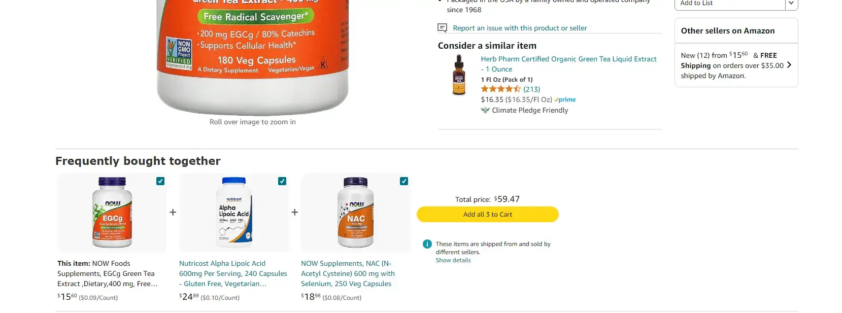
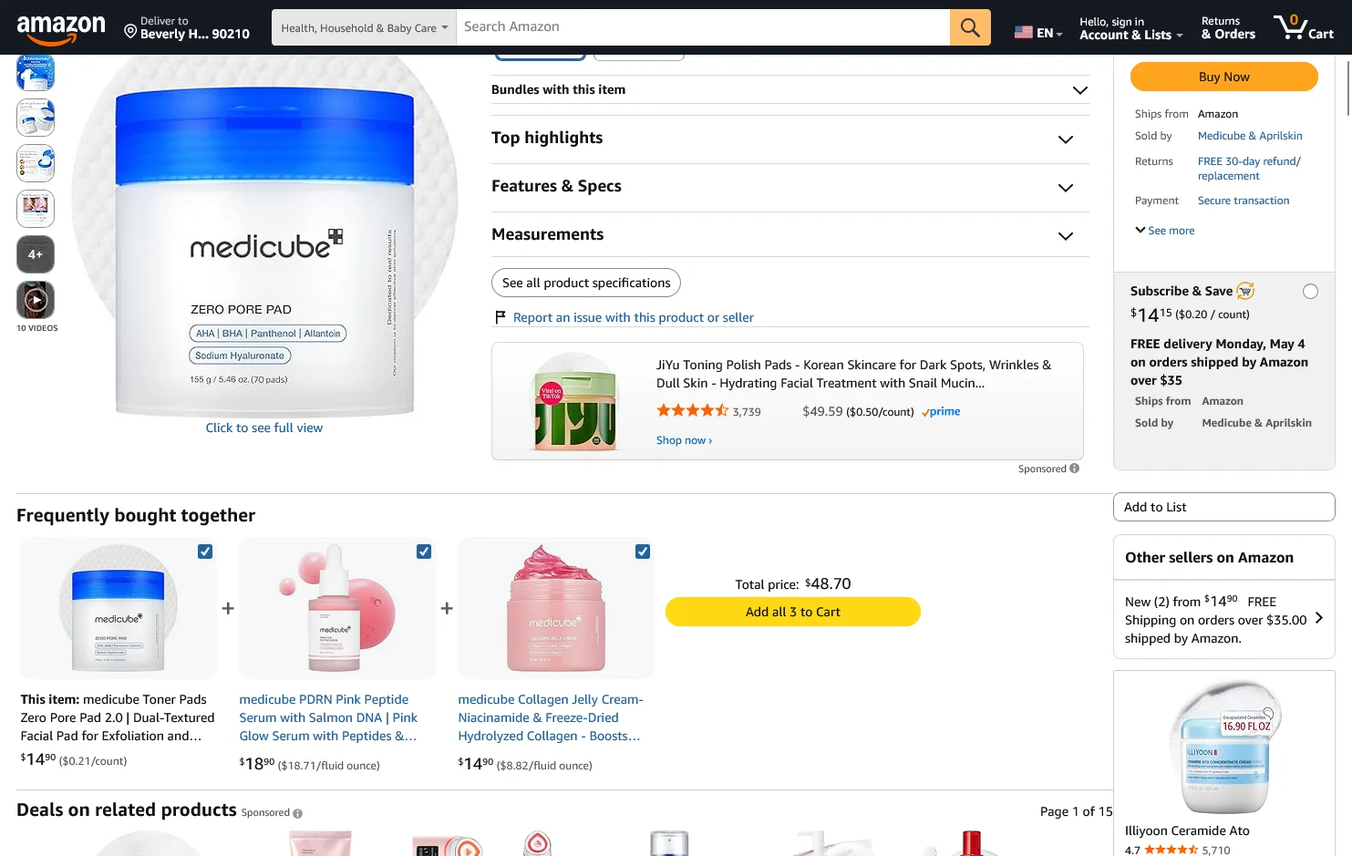
    A classic cross-sell is Amazon’s “Frequently Bought Together” and “Customers also bought” sections, a strategy so effective that a McKinsey report estimated 35% of Amazon’s sales come from recommendations like these.

    __wf_reserved_inherit

    Product Bundling

    Product bundling means selling multiple related items as a package, often at a slight discount or with added convenience, to encourage a larger total purchase.

    Bundles can take many forms: a bundle of complementary items (e.g., camera + lens + bag sold together), a “kit” or set of products that go well together (e.g., a skincare routine set with cleanser, toner, and moisturizer), or a bulk pack of the same product.

    The idea is to increase the units per transaction, thereby increasing the order value. Bundles create a sense of value and savings, the customer feels they’re getting more for a good price. They also simplify decision-making.

    Loyalty and Rewards Programs

    A loyalty or rewards program can elevate AOV by incentivizing customers to spend more to earn rewards or reach the next tier of benefits.

    Customers will usually add extra to their cart if they know it earns them something tangible in return. “Spend $100 to get 100 points and a $10 reward” can prompt a $90 cart to creep over the $100 mark.

    Data supports this; one study found that customers who redeem points when purchasing spend 39% more on that purchase, on average.

    A great example is Sephora’s Beauty Insider program. Sephora’s loyalty members tend to have higher average spend; they are often tempted to add one more item to get the next 100-point perk or to use a promotional code that requires a minimum spend.

    Dynamic Free Shipping Thresholds

    Offering free shipping above a certain cart value is one of the oldest and most effective tactics to increase average order value.

    People hate paying for shipping. So when you present a threshold (e.g., “Free shipping on orders over $50”), many will add extra items to avoid the fee.

    The key is to set the threshold strategically just above your current AOV or target AOV. For example, if your typical order is $45, you might set free shipping at $60. Customers with $45 in their cart see that they’re close to free shipping and often will find something to add to reach $60.

    A study by Salesforce in 2024 noted that your free shipping threshold should be roughly 30% higher than your current AOV, high enough to push customers, but not so high that it feels unreachable.

    Personalization and Product Recommendations

    Personalization involves tailoring the shopping experience to each user’s preferences and behavior. It’s a powerful driver of larger basket sizes when done correctly.

    Modern shoppers have come to expect some level of personalization. Surveys show that 80% of customers say the shopping experience should be better tailored given all the data companies collect, and 65% expect companies to adapt to their preferences.

    According to Salesforce’s data, personalized product recommendations now account for 26% of total ecommerce revenue on average, despite being a small fraction of the content shown. That underscores how effective relevant suggestions can be.

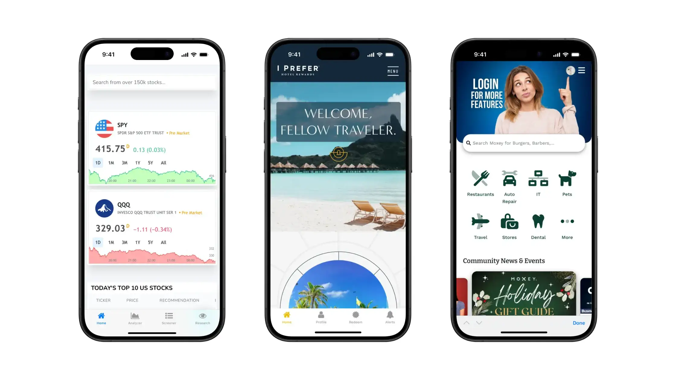
    How Can Mobile Apps Drive Higher AOV?

    Mobile apps consistently outperform desktop and mobile websites when it comes to AOV. The majority of brands see anywhere from 10-50% higher AOV from transactions in their mobile app.

    Here’s why.

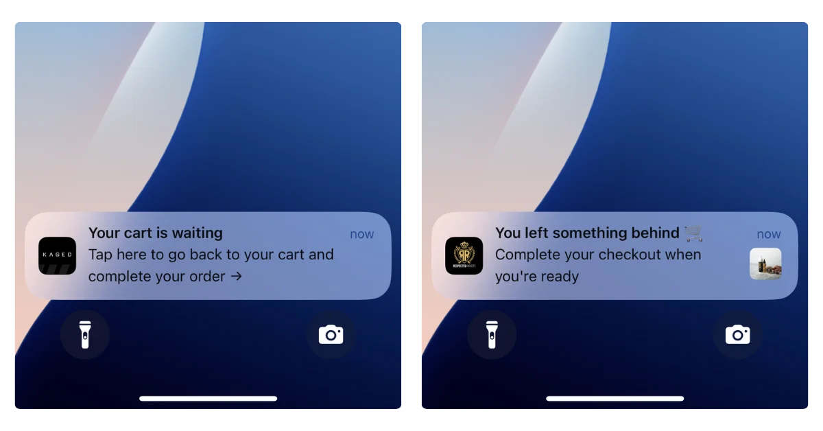
    App-Exclusive Offers and Features

    Many brands now offer mobile apps not just for convenience, but as a channel for VIP customers with exclusive perks. App-exclusive offers can significantly boost AOV by giving customers reasons to shop in the app and load up their cart.

    The psychology here is treating app users as an insider club. When customers feel they’re part of a privileged group, they often engage more deeply and spend more.

    One concrete example: BÉIS, a travel accessories brand founded by Shay Mitchell, leveraged its mobile app to create a VIP experience. They share behind-the-scenes content and product drops exclusively on the app. The result? App users of BÉIS have a 19% higher AOV compared to those on the mobile website.

    Mobile UX Improvements

    Improving the mobile user experience (UX) of your store whether in-app or mobile web, can indirectly but meaningfully raise AOV.

    A huge portion of ecommerce traffic is now on mobile devices (mobile commerce comprised about 35% of sales during Cyber Week 2024).

    If the mobile experience is clunky, customers may limit their browsing or stick to one item and checkout quickly (or abandon). A smooth, engaging mobile UX encourages users to view more products and complete multi-item purchases.

    Key areas of mobile UX that impact AOV include: navigation and discovery, site speed, and checkout ease. If your app or mobile site makes it easy to find related products (through intuitive menus, filters, or recommendation carousels), users are more likely to add those items.

    What Real-World Results Have Brands Achieved?

    Let’s look at some real-world examples of how direct-to-consumer (DTC) and ecommerce brands have implemented AOV-boosting strategies:

    BÉIS (Travel Goods)

    By funneling their most engaged customers to the app and offering app-exclusive content and early product access, they cultivated a community that shops more frequently and in higher amounts. The app saw a 19% higher AOV than the mobile website.

    Kopari Beauty (Personal Care)

    This brand implemented a “buy more, save more” upsell on product pages. For instance, on a product that normally sells as one unit, they offer a duo at a discounted rate. This kind of upsell led many customers to choose the 2-pack, effectively doubling the revenue from that order minus a small discount.

    John’s Crazy Socks (Apparel/Gifts)

    This brand’s gift wrap add-on is a simple cross-sell at checkout that adds $2 to the order. For a company that sells socks (low-priced items), getting an extra $2 is significant proportionally.

    La Roche-Posay (Beauty)

    La Roche-Posay implemented a free gift with purchase over $X promo, “Get a 4-piece sample kit on orders $70+”. This effectively increased their AOV as customers aimed for that $70 basket.

    MeUndies (Apparel)

    The underwear brand has a section called “Match Me” to encourage buying for couples, matching underwear sets for you and your partner. This is a clever cross-sell where they tap into a social/shared experience to increase AOV.

    How Can Your Brand Achieve Higher AOV?

    Many AOV-boosting tactics can be implemented incrementally and with modest resources, especially if you’re using modern ecommerce platforms like Shopify, WooCommerce, or BigCommerce.

    Start with the Low-Hanging Fruit

    Some changes require just a small tweak or addition. For example, setting a free shipping threshold is usually a basic setting in your store’s shipping options, decide on a threshold (use your current AOV + ~10-20% as a guideline to start), and update your shipping settings.

    Similarly, creating a few product bundles can be as easy as adding new bundle products in your catalog (or using a bundling app). You don’t need a fancy algorithm to pick a couple of complementary products and sell them together at a discount.

    Leverage Apps and Integrations

    You don’t have to custom-build everything. There are one-click upsell apps, cross-sell recommendation apps, loyalty program apps, etc. For instance, on Shopify, apps like ReConvert or Candy Rack handle post-purchase and in-cart upsells; Smile.io or LoyaltyLion can launch a basic loyalty points program quickly.

    Evaluate which tactic might yield the best ROI for you and try an app in that category. (Pro tip: implement one major app at a time and measure results, rather than 5 at once, to know what’s moving the needle.)

    Use Your Existing Content and Channels

    If building personalization algorithms is out of reach, you can still personalize in simpler ways. For example, manually create “Recommended” collections on your site and promote those in your marketing emails or homepage.

    Use your email newsletter or SMS to encourage larger baskets: send an email saying “Our top picks to complete your skincare routine” highlighting items that go well together.

    Focus on Customer Value (Not Just Your Revenue)

    AOV tactics should ideally create a better experience for the customer. Brainstorm from the customer’s perspective: “What would I find useful or delightful that might also make me spend more?”

    If you approach AOV increases through the lens of adding customer value, you’re more likely to succeed and not face backlash. Plus, satisfied customers tell friends and come back (long-term benefits beyond one order).

    What Pitfalls Should You Avoid?

    Watch out for these things as you strive to boost AOV in your online store:

    Over-emphasis on AOV vs. Other Metrics

    Chasing AOV in isolation can lead to decisions that hurt other parts of the business. For example, you might push an upsell that indeed raises AOV but annoys customers, causing a drop in customer satisfaction or conversion rate.

    Is it better to have a higher AOV or a higher conversion rate? Ideally both, but sometimes there’s a trade-off. If upsell prompts are too aggressive, some customers might abandon carts. AOV of completed orders might rise, but overall sales could fall if conversion tanks.

    Many experts stress balancing AOV with metrics like conversion rate, lifetime value (LTV), and customer retention. A holistic view is needed: it’s the long-term revenue and profit per customer that matter, not just squeezing out one big order.

    Customer Experience Backlash

    Some AOV tactics can feel like nickel-and-diming. For instance, if a site bombards users with add-on offers at every click, it can degrade the experience.

    Similarly, setting a free shipping threshold too high above typical order value might frustrate customers who feel it’s unattainable, potentially driving them to competitors.

    The strategic debate here is short-term AOV vs. long-term loyalty. As one source pointed out, fostering loyalty tends to have higher long-term ROI than single-mindedly boosting AOV at the expense of customer satisfaction.

    Discount Dependency

    Relying too heavily on discounts or promotions to drive up AOV can train customers to only buy when there’s a deal. This can erode margins and brand premium over time.

    There’s also the pitfall of margin impact: If you raise AOV by giving large volume discounts, ensure you’re not sacrificing so much margin that the higher revenue doesn’t translate into higher profit.

    How Vendrux Helps You Drive Higher AOV

    Want a proven way to raise your AOV while delighting your best customers? Launch a mobile app, with Vendrux.

    __wf_reserved_inherit

    Vendrux transforms your existing website into a fully branded iOS and Android app, without needing to rebuild or manage anything separately.

    Your app mirrors your current site and tech stack, but adds the mobile-native elements that boost engagement, conversions, and importantly, order value.

    Here’s how a Vendrux-powered app helps lift AOV:

    • Larger carts, consistently: Brands using Vendrux typically report 30% higher AOV from app users. Mobile apps create a smoother, distraction-free experience that keeps customers browsing and buying more.
    • Built-in loyalty and retention: The app becomes a hub for loyalty programs, app-only offers, and personalized perks, giving customers more reason to hit higher cart values.
    • Push notifications that convert: Tap into the most effective channel for re-engagement. Vendrux helps you run high-performing push campaigns that drive users back in with personalized, time-sensitive offers that increase basket size.
    • One-tap upsells and frictionless UX: Your app offers an Amazon-like UX with one-click add-to-cart and checkout. It’s designed to maximize conversions and order volume on mobile – where the majority of ecommerce traffic happens.

    Most importantly, this isn’t another tool you need to figure out yourself. Vendrux is a done-for-you, service-driven solution.

    Our team handles everything, from setup, QA, and App Store submission to strategic support post-launch, to make sure your app actually drives meaningful ROI.

    Ready to see what your brand’s app could look like? Get a free preview and see how easy it is to turn your mobile traffic into higher revenue and repeat purchases.

    Final Thoughts: AOV as Your Growth Engine

    Unlike chasing new customers, boosting AOV means earning more from people already in the door. That’s higher profit, less spend. In a world where acquisition costs keep climbing, this is a strategy you can’t ignore.

    The best part? It’s not about tricks. It’s about enhancing the customer experience. Think:

    • Smart upsells and cross-sells
    • Loyalty perks
    • Personalized recommendations
    • Bundling or volume discounts

    Done right, it’s a win-win. Customers get more value, you get bigger checkouts.

    Want to lift AOV? Start here:

    • Personalize the path to purchase (think: “You might also like…”)
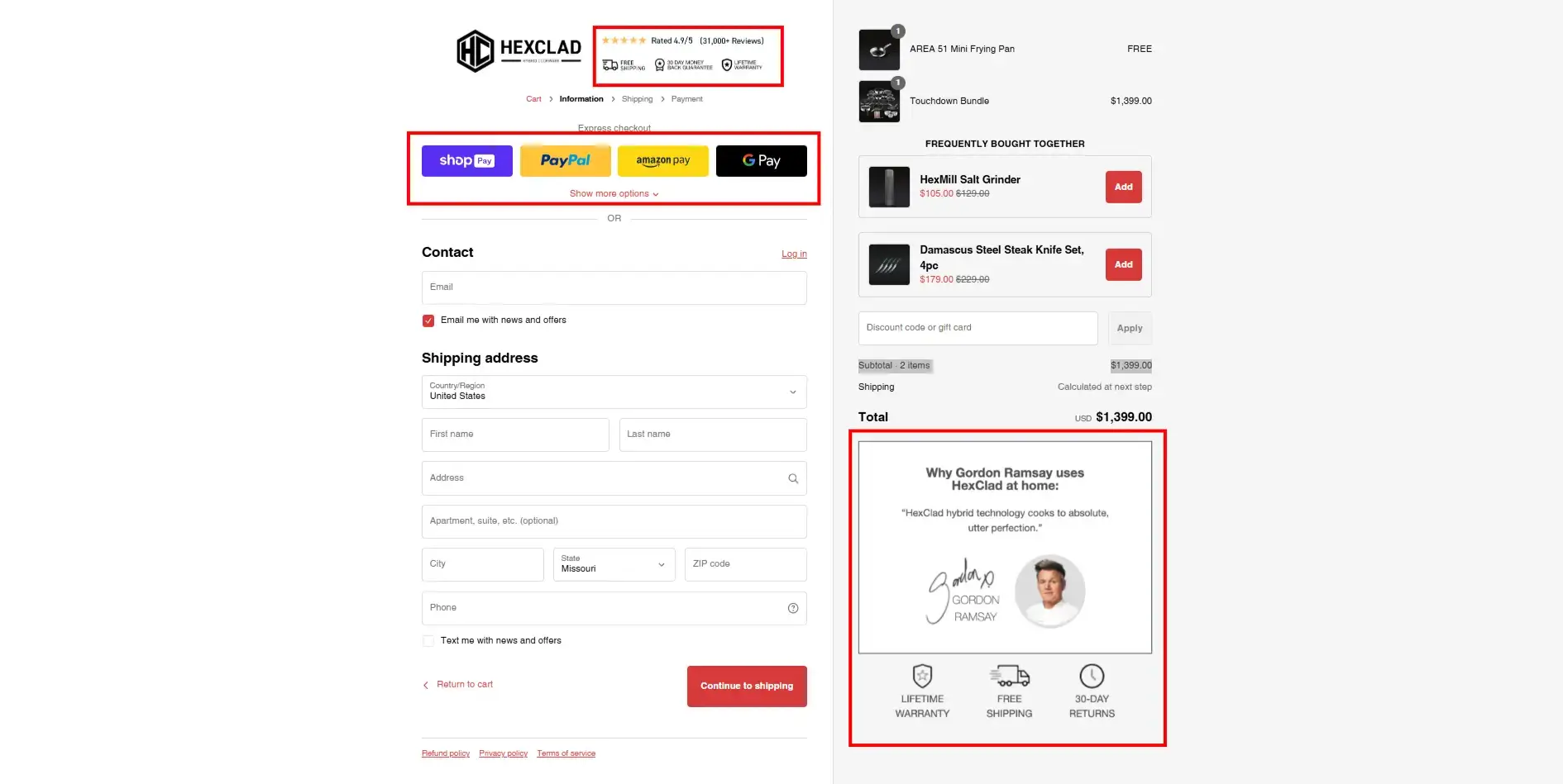
    • Make checkout frictionless (1-click, digital wallets)
    • Use incentives strategically (free shipping thresholds, bundle deals)
    • Highlight social proof to build trust on higher-ticket items

    The future of AOV optimization is all about personalization, tech that feels invisible, and authentic customer engagement. Brands that do this well will enjoy better margins and customer loyalty.

    Remember: AOV isn’t just a number. It’s a reflection of how well you’re delivering value – and how much trust your customers place in you to deliver more.

  • In-App Purchases: Everything You Need to Know

    In-App Purchases: Everything You Need to Know

    When you look into launching an app, the term in-app purchases (IAPs) will come up.

    Mobile app users spend over $380 billion on in-app purchases. This makes up approximately 48% of all mobile app revenue.

    Most apps are free, and instead monetize on selling digital services and products, subscriptions, premium content, or other things that come under this banner.

    Read on to learn all you need to know about in-app purchases, and how these work in your app.

    If you’re an ecommerce store owner, you don’t need to navigate the intricacies of app development and app store requirements on your own. Get Vendrux to convert your store into an app, and let us handle everything app-related. Click here to learn more about how we can help.

    What Are In-App Purchases?

    In-app purchases are digital goods and services sold inside of a mobile app. These are used to provide additional value or functionality within the app.

    An in-app purchase is essentially an upsell, or a premium upgrade to the regular version of the app (which is often free). Most of the time they are optional, giving users the choice whether to use the basic, free app features, or pay for more.

    For apps distributed via the App Store (for iOS) or Google Play Store (for Android), the marketplace takes a share of all revenue generated by in-app purchases. They’ll also make it clear to a user before they download an app if it contains in-app purchases, with a badge on the app store listing.

    What Can Be Sold With In-App Purchases

    Anything that provides additional value to an app can be made into an in-app purchase. These are particularly ubiquitous in mobile gaming apps, which often allow users to buy special items, features or upgrades to games that are initially free.

    Here are some examples of common in-app purchases:

    • Premium content
    • Downloading songs or audio
    • Removing ads from the app
    • Access to premium features or unlocking full access to the app
    • Digital items
    • Higher/unlimited usage limits
    • Bonus game levels
    • Allowing users to skip game levels
    • Extra lives in a game
    • Boosters or power-ups
    • In-app currency or in-game currency
    • Content upgrades or downloads (e.g. e-books or videos)

    Different Types of In-App Purchase

    We can group in-app purchases into four categories:

    • Consumable
    • Non-consumable
    • Renewable subscriptions
    • Non-renewable subscriptions

    Consumable purchases are most common in mobile games. A consumable in-app purchase includes things like in-game currency, credits, and boosters, which are consumed once used. These can generally be purchased multiple times.

    These might also be referred to as expendables. Expendable or consumable in app purchases are limited to the mobile device they were purchased on.

    Non-consumable purchases are usually permanently added to the user’s app or game. This is more common for unlocking extra features or content upgrades. We might also call these purchases unlockables.

    Renewing subscriptions are purchases that give you access to the app or to advanced features for a set period of time, and generally renew automatically at the end of each period (most often a month or a year).

    In-app subscriptions today are a staple of news apps, which offer users the choice to pay for unlimited or premium content.

    Non-renewing subscriptions are the same as the above, but don’t renew automatically. This could give elevated access for a set time frame (e.g. a season pass to a game), or it could be a one-time payment to get premium features.

    Examples of Apps with In-App Purchases

    Here are a few mobile applications using different kinds of in-app purchases:

    The Medium app uses in-app purchases in the form of auto-renewable subscriptions, which gives access to premium articles.

    Candy Crush offers in-app purchases for in-game consumable items, and options such as skipping levels or extended use once your free time has run out.

    The Way of Life app is free, but gives unlimited habit tracking for a one-time payment. This is an example of a non-renewable subscription.

    Do Ecommerce Stores Pay Fees for In-App Purchases?

    If you’re thinking of launching an app for your ecommerce store, you may be concerned about the prospect of Apple taking 15-30% of your margins on app sales.

    The good news is, ecommerce stores do not pay App Store or Google Play fees on the sale of physical products.

    Apple and Google’s in-app purchase rules apply strictly to digital goods and services: things like e-books, game currency, premium app features, or streaming subscriptions (as described above).

    If you’re selling clothing, beauty products, supplements, home goods, or any other tangible items through your app, you can keep using your existing checkout flow (Shopify, BigCommerce, WooCommerce, etc.) without going through Apple or Google’s billing systems.

    That means you keep 100% of the revenue you make through your app, minus your normal payment processor fees. There’s no additional cut to the app stores.

    For ecommerce brands, this is a critical distinction. The “app store tax” often talked about in the media doesn’t apply to your sales. You can safely build and launch a mobile app for your store without worrying about handing over a large slice of your revenue.

    In-App Purchases vs. Ecommerce App Sales
    Type of Sale Examples Subject to App Store IAP Fees?
    Digital Goods & Services Game currency, e-books, premium app features, streaming subscriptions ✅ Yes — must use Apple/Google in-app purchase systems (15–30% cut)
    Physical Goods & Services Clothing, beauty products, supplements, furniture, food delivery ❌ No — you can use your own checkout, no extra App Store fees

    iOS vs Android In-App Purchases

    In-app purchases work mostly the same between iOS and Android apps.

    For both platforms, purchases are charged to the user’s linked account – their Apple ID or Google Play account.

    And both iOS and Android apps have to display a badge on their app store listing to indicate they have in-app purchases (even if they’re completely optional).

    Each marketplace takes a cut on all in-app purchases. For single purchases, the Google Play Store charges 15% for the first $1 million USD in a year, and 30% on all earnings above $1 million. For automatically renewing subscriptions, it’s a flat 15%.

    The iOS App Store is very similar. App purchases and in-app purchases have a 30% commission – for subscriptions, this falls to 15% after the first year. If you make under $1 million USD per year, you can apply to their App Store Small Business Program, which reduces fees to 15%.

    Benefits of In-App Purchases

    In-app purchases have a lot of huge benefits for app publishers, which is why they’re so common today. Here’s a rundown on these benefits:

    • They allow you to offer your app for free, which will get considerably more downloads than a paid app.
    • It’s a low-risk and low-friction monetization method.
    • There’s huge revenue and profit potential, as digital products don’t require physical stock or overhead.
    • It allows you to charge relative to how much people use your app. You can extract more revenue from your power users.
    • You’re not limited to only using in-app purchases for monetization, and can combine this with other monetization strategies.

    Disadvantages of In-App Purchases

    There are some downsides to enabling additional purchases with your app. Let’s take a look at some of them:

    • A large percentage of users will never purchase something through your app. You need to account for this, and it can lead to unstable revenue.
    • Each marketplace takes a fairly significant fee on in-app purchases.
    • Many people have a negative view on in-app purchases, especially if they’re required for key app features, or targeted towards children.
    • There’s the potential for unauthorized purchases (such as a child on their parents’ phone), which can lead to refunds and chargebacks.

    Alternatives to In-App Purchases

    There are a number of other ways you can monetize your app, outside of relying solely on in-app purchases.

    Ads

    Many apps utilize in-app ads to make money. Often this is done in combination with, not as an alternative to, in-app purchases. You can use ads as an incentive for people to pay for the premium, ad-free version of your app, while still making revenue from free users.

    Paid Apps

    You can also make your app a paid app. Instead of being free to download, and look to extract revenue from your users later, you require them to pay up front to download it.

    This is a more predictable revenue model, since you know exactly how much you’ll make from each user. It also allows you to provide a cleaner, less cluttered UI, since you’re not showing ads or trying to push people towards a purchase.

    Paid apps, however, are much harder to sell than free ones (obviously), and don’t offer the long-term earning potential of apps with in-app purchases.

    Physical Products

    As mentioned earlier, sales on ecommerce apps don’t count as in-app purchases.

    Though the payment does happen in the app, the nature of the transaction (for physical goods, rather than something consumed through the app) means the app store fees don’t apply.

    Avoiding In-App Purchase Fees

    When you launch your app and start making money from it, you’re probably going to come hate the 15-30% fees coming out of every transaction. So is there a way to get around these fees?

    It’s possible to offer subscriptions that are paid and managed outside of the app, which will thus not incur the App Store’s commissions. This is only possible (in the iOS App Store) for “reader apps”.

    Reader apps are apps that allow users to view or access previously purchased material – such as books, audio and video.

    Examples of these types of apps include Netflix, Spotify and Kindle. These apps are able to offer purchases and subscriptions, but as they take place outside of the App Store, they aren’t charged commission.

    Apple is currently loosening regulations on how apps can contact users and facilitate payments outside of the App Store, as a result of a legal battle with Epic Games.

    However, it’s not quite a free-for-all just yet. You may get your app removed from the App Store if you try to circumvent the fees on in-app purchases.

    And while Apple may be loosening up, the Google Play Store is doing the opposite. They just began enforcing tighter rules on apps that use purchases outside of the Google Play Store, including the Amazon Kindle App.

    It’s best to think of in-app purchase fees as a cost of doing business. You get a ton of discoverability from being in app stores, so you should expect to pay something for this. In-app purchases remain an extremely lucrative revenue source for app publishers.

    Mobile app users spend more, shop more frequently, and are more loyal to your brand. Use our eCommerce App Revenue Calculator to see just how much you stand to gain by launching an app.

    Wrapping Up

    When you launch an app, you’ll have grand plans on how you’re going to market it. It’s crucial you know what kind of fees you’re in line to pay, or the smash hit idea you have for an app might deliver a lot less profit than you think.

    Apps can provide a lucrative income – but be prepared to pay a tax on the income you make.

    This doesn’t apply to ecommerce stores, though, as well as certain types of apps, where subscriptions or content is purchased outside of the app (like on your website).

    These exceptions are why it makes sense to convert your website into an app, with Vendrux.

    Vendrux will help you turn your existing site into a full-featured mobile app. And with over 12 years of experience dealing with the app stores, we can help you navigate in-app purchases, and understand whether these fees will apply to your app.

    Want to explore further? Book a free consultation to discuss your project with our app experts.

  • How to Craft High-Impact Welcome Emails and Push Notifications

    How to Craft High-Impact Welcome Emails and Push Notifications

    For most brands, the welcome message is an afterthought. A generic “Thanks for signing up!” followed by… nothing exciting. 

    But for the brands that get it right, this single message can be a revenue machine.

    Your welcome email or push notification is your first and best shot at turning a casual subscriber into a paying customer. It gets 3x more engagement than your average marketing email, and push notifications see double the open rates of email when done right​. 

    That’s a massive opportunity most brands completely waste.

    In this guide, we’ll break down exactly how to craft high-impact welcome messages that drive clicks, conversions, and long-term loyalty. Let’s dive in.

    Want more insights into what 8 and 9 figure brands are doing to boost retention and LTV? Check out our new podcast and newsletter, The Retention Edge.

    Why the Welcome Message is Critical 

    For ecommerce brands, the welcome message you send to new subscribers is one of the most critical touchpoints in the entire customer journey.

    You’re at the stage where the customer has shown interest, but the relationship is not cemented yet.

    They’re interested enough to have signed up for your list, whether it’s to claim a discount, or because they’re just keen on what your brand has to offer.

    But there’s still work to do. This is a crucial touchpoint where you can either create a new fan of your brand, or give a forgettable first impression that leads to your brand being forgotten.

    Retention Starts Here 

    Customers are more skeptical, more likely to jump ship at this stage.

    With apps, up to 80% of new subscribers churn within the first week if they don’t engage.

    With emails, generating engagement early is key, before your emails get buried in a hundred other promotional emails in the customer’s secondary inbox.

    Yet while you can lose the customer at the welcome stage, you also have their attention. You’re fresh in their mind. And a good first impression can turn a new subscriber into a fan in no time.

    Welcome Messages Draw Naturally High Engagement

    Welcome emails get up to 3x higher engagement than standard promotional emails.

    Consistently higher open rates, click-through rates and conversion rates.

    Click-to-conversion rates for welcome emails can be as high as 56.8%! That means over half of the people who click from this email make a purchase.

    The welcome message is a fantastic opportunity to drive sales. Don’t pass it up.

    Driving the First Purchase

    Customers who engage with a welcome message are far more likely to convert—and once they do, their value skyrockets.

    A returning customer isn’t just more loyal – they’re up to 12X more likely to convert, and spend significantly more per order. 

    The hardest part? Getting them to buy the first time.

    Data proves that once a customer experiences your product and trusts your brand, repeat purchases come much easier. 

    That’s why your welcome message is prime real estate. With the highest engagement rates of any marketing email or push, it’s your best shot at getting them over that first-sale hurdle.

    Warming the Contact

    Even if your welcome email or push notification doesn’t drive an immediate sale, it sets the stage for future conversions.

    When someone signs up, your brand is fresh in their mind. A timely message feels familiar, reinforcing their decision to subscribe. But if you wait a week to reach out? They’ve likely forgotten who you are.

    Now, your email looks like spam, increasing the chances of an unsubscribe. Your push notification feels intrusive, prompting them to turn off notifications entirely – killing future engagement.

    A well-crafted welcome message conditions subscribers to expect future communication, making them more receptive when you follow up with promotions later. Ignore this step, and you risk becoming just another brand lost in the inbox (or worse, in the notification settings).

    The 3 Jobs of a Killer Welcome Message

    What makes a great welcome message?

    To be effective, your first message to new subscribers needs to accomplish three key things:  

    Acknowledge & Affirm 

    Your welcome message should reinforce their decision to sign up and make them feel good about joining your brand community. 

    A simple “Welcome to [Brand]! Here’s what’s next…” goes a long way in building rapport.

    __wf_reserved_inherit
    Obvi, along with offering a discount, makes the customer feel part of a community – not just the recipient of a marketing email
    __wf_reserved_inherit
    Mytheresa’s welcome email features a personal thank you message from the CEO – not just a sales pitch
    __wf_reserved_inherit
    Solo Stove bluntly explains the purpose of the welcome email, in a way that fits their brand’s voice

    Deliver Immediate Value

    Subscribers opted in for a reason. They’re hoping to get something valuable from your brand. 

    Your welcome message needs to deliver on that expectation with a discount, exclusive access, personalized recommendations, or some other meaningful perk.

    __wf_reserved_inherit
    Common practice is to offer a discount on the customer’s first purchase, as Comfrt does
    __wf_reserved_inherit
    David Protein delivers an educational guide to new subscribers

    Drive a Specific Action

    A welcome message isn’t just about introduction; it should actively guide subscribers toward their first purchase, social engagement, or another important milestone (such as downloading your app).

    Include a clear CTA that tells them the next step you want them to take.

    __wf_reserved_inherit
    Farfetch prompts new subscribers to create an account, and to download their app, both actions that further increase retention
    __wf_reserved_inherit
    Bugaboo asks new subscribers for their shopping preferences – valuable first-party data they can use to personalize future emails and recommendations

    When your welcome email or push notification serves these three key functions – acknowledge, deliver value, and drive action – it sets the stage for an engaged and profitable customer relationship.

    The Anatomy of High-Converting Welcome Emails

    While welcome emails (longer-form) and push notifications (shorter-form) share similar objectives, they each have unique considerations in terms of structure and content. 

    We’ll look at how to piece together each form of welcome message; starting with email.

    Subject Line: The Hook That Drives Opens

    Your email subject line is the gateway to engagement. It needs to stand out in a crowded inbox and compel subscribers to open. 

    Approximately half of all recipients decide whether or not to open an email based on the subject line.

    Some effective approaches:

    • Highlight their exclusive welcome offer (“Your 15% Off Code is Inside (Expires Soon!)”)
    • Tease the benefits of engaging (“You’re in! Now, Here’s What’s Waiting for You…”) 
    • Reinforce their membership in your brand community (“Welcome to [Brand] – Here’s Your Exclusive Perk”)
    __wf_reserved_inherit
    Dbrand uses clickbait in a creative way – calling it out, and encouraging engagement, boosting deliverability for future emails

    Header: Reinforce Excitement

    The top of your email is prime real estate for a bold branded message that gets subscribers excited. 

    Use a strong visual and copy like “You’ve Unlocked Exclusive Access” to reaffirm their decision to sign up. 

    Keep the branding here consistent with your typical fonts, colors, and tone.

    Body Copy: Short, Punchy & Benefit-Driven

    Welcome email body copy should be brief, scannable, and focused on value. 

    Dedicate a short paragraph to reaffirming your brand promise (“We make [product] so you can [benefit]”), then follow with snappy benefit-driven bullet points or a succinct explanation of their welcome offer. 

    This isn’t the place for your full brand story or an overload of product details. Stick to punchy highlights and save the deeper dive for later in your email flow. 

    Social proof elements like a glowing testimonial, press mention, or UGC image can work well to build credibility without overwhelming.

    Call-to-Action: Guide Them to the Next Step

    Include a prominent, action-driven CTA button to direct their next steps. Examples include:

    • “Shop Now” → Directs them to a curated collection or bestsellers page
    • “Claim Your Offer”→ Reinforces a welcome discount or exclusive access 
    • “Take Our Quiz” → For brands that offer product personalization

    Place your CTA above the fold for maximum visibility, and consider repeating it at the bottom of your email for those who read all the way through.

    Optional Add-Ons (Engagement Boosters)

    If you have space, consider secondary elements that can enhance engagement without overloading:

    • Links to follow on social for exclusive content/offers
    • A referral offer (e.g. “Get $10 when you refer a friend”)
    • An urgency message (e.g. “Redeem your code in the next 48 hours”)

    Keep these brief so they don’t distract from your main CTA.

    The Anatomy of High-Converting Welcome Push Notifications

    Here’s how to craft the first push notification, to sow the seeds for a fruitful relationship with your app user.

    Push Copy: Short, Sweet & Actionable

    With push notifications, you have even less real estate to work with than email. Your message needs to be hyper-focused on driving that first engagement. 

    Best practices for welcome push copy:

    • Lead with their exclusive offer or membership benefits
    • Use punchy, action-driven language (“Tap to Unlock”, “See What’s Waiting”)
    • Personalize when possible (“[Name], your VIP code is inside…” )
    • Keep it very concise
    __wf_reserved_inherit
    Anatomie’s app – straight to the point

    Effective Push Copy Examples:

    “🎉 Welcome to [Brand]! Tap to unlock your exclusive 15% off.”

    “You’re officially part of the [Brand] fam! Your reward is inside 🎁” 

    “🚀 Ready to shop? Your VIP discount is waiting.”

    __wf_reserved_inherit
    Chebeauty’s app – a quick thank you, plus a discount offer
    __wf_reserved_inherit
    Art of Tea – the longer copy gets cut off, but they do a good job explaining why the user should keep notifications enabled
    __wf_reserved_inherit
    Hobbiesville does the same, and shows not every welcome message needs a discount attached

    CTA: Make Every Tap Count

    With push notifications, taps are your primary engagement metric. Your push CTA should be crystal clear on the action you want the subscriber to take. Some options include:

    “🔗 Tap to Shop Bestsellers”

    “🎁 Claim Your 15% Off – Limited Time!” 

    “👀 See What’s Trending Now”

    Optimizing for Maximum Impact

    To get the most out of your welcome messages, commit to continuous testing and iteration.

    A/B test these elements:

    • Subject lines → Try framing your offer as “Exclusive” vs a “First-time discount”  
    • CTA wording → Test “Shop Now” vs “Unlock Your Perk”
    • Offer presentation → Does a % discount or $ amount savings drive more clicks?
    • Push timing → See if immediate or slightly delayed pushes perform best

    Tracking the right metrics is key as well, to ensure you understand the impact of your welcome sequences, and whether there’s room for improvement.

    For Email:

    • Open Rate → 35%+ indicates strong subject line/preview text
    • Click-Through Rate → Aim for 10%+ unique clicks with a compelling CTA
    • Conversion Rate → Top welcome emails drive 5%+ first purchase conversion

    For Push:

    • Opt-In Rate → Note what % of users allow push notifications 
    • Direct Open Rate → 10-20% is a strong push engagement rate
    • Tap-Through Rate → 5-15% TTR shows your CTA is resonating

    By tracking these metrics over time, you can pinpoint top opportunities to improve your welcome messaging performance.

    What About SMS?

    So far, we’ve focused on welcome emails and push notifications – but what about SMS?

    Many brands now collect SMS opt-ins alongside email, and when used strategically, it can be a powerful retention channel. If you plan to engage subscribers regularly via SMS, a welcome message makes sense.

    However, SMS comes with higher costs per send, so brands typically use it more sparingly than email or push (both of which are essentially free). But if you’re investing in SMS welcomes, the same principles apply:

    • Keep it concise like a push notification.
    • Acknowledge their signup & set expectations, like an email.
    • Remember, they may be new to your brand, unlike app users, who already have some level of familiarity.

    If you’re using SMS, make sure your welcome message is short, clear, and valuable. It’s a high-cost, high-impact channel, so every word counts.

    Bringing It All Together

    Your welcome message is hands down your most impactful touchpoint for turning new subscribers into loyal customers. It’s a can’t-miss opportunity to:

    • Make a strong first impression that sets the tone for your entire brand relationship 
    • Drive key actions like first purchase, social engagement, and referral
    • Learn critical insights about what kind of messaging resonates with your audience

    Whether you’re welcoming new folks via email, push notification, or both, keep these fundamentals in mind:

    • Get them engaged immediately with a clear hook and direct CTA
    • Offer real value with a welcome discount, exclusive access, or personalized recs
    • Keep it compelling but concise, especially for push notifications 
    • Commit to ongoing optimization – small tweaks can yield big gains

    Not sure if your current welcome message is working hard enough? Now’s the perfect time to audit what you have and try a few experiments to boost performance. 

    Every new subscriber is an opportunity. Make that first impression count!

  • Web Push vs Native App Push Notifications: The Differences You Need to Know About

    Web Push vs Native App Push Notifications: The Differences You Need to Know About

    Quick Summary

    • Web push notifications and native app push notifications use completely different infrastructure, and the differences matter for ecommerce
    • Web push delivers roughly 33% of sent notifications on average; native app push delivers 95%+
    • Web push on iOS requires users to install a PWA to their home screen first, a step very few will take, meaning you’re effectively invisible to iPhone users
    • Web push can’t collect subscribers from in-app browsers (Facebook, Instagram, TikTok), so your social media traffic is a blind spot
    • Shopify push notification apps like PushOwl and Firepush send web push only, not native app notifications
    • Push notifications drive 15% of attributed ecommerce revenue from just 3% of message volume (Omnisend 2025), making them the most efficient marketing channel per send
    • To unlock native push, you need a native mobile app. Vendrux builds native iOS and Android apps on top of your existing store, with unlimited push notifications included

    In this article, we’re going to break down the biggest misconception I see in online marketing for ecommerce – web vs native app push notifications.

    They’re often lumped together, mixed up, treated as the same thing: when, in reality, they should be seen as two completely different channels.

    Let’s explain.

    What’s the Difference Between Web Push and Native App Push Notifications?

    The term “push notification” covers two fundamentally different channels. Understanding the difference is critical, because choosing the wrong one means leaving most of the channel’s value on the table.

    How Web Push Notifications Work

    Web push notifications are sent through the browser. 

    When a visitor lands on your site, a permission prompt asks if they’d like to receive notifications. 

    If they opt in, you can send messages that appear on their device, even when they’re not on your site, as long as their browser is running.

    Popular web push tools for ecommerce brands include PushOwl (now Brevo), Firepush, PushEngage, PushWoosh and OneSignal. These are easy to set up: just install the app, configure a prompt, and start sending.

    The catch: if you’re expecting these tools to send the kind of notifications that flash up on your lock screen, you may be disappointed – because that’s not what this channel does.

    How Native App Push Notifications Work

    Native app push notifications are sent through a mobile app installed from the App Store or Google Play. 

    They use the operating system’s built-in notification infrastructure: Apple Push Notification service (APNs) on iOS and Firebase Cloud Messaging (FCM) on Android.

    Because they’re delivered at the OS level, native push notifications can include rich media, deep links directly into specific product pages, and behavioral triggers based on in-app activity. They’re not dependent on a browser session and can reach users at any time.

    Web Push vs Native App Push: Side-by-Side Comparison

    Web Push Native App Push
    Delivery rate ~33% average 95%+
    iOS support Requires PWA home screen install Full native support via App Store
    Rich media Limited (text + small image) Full (images, video, interactive buttons)
    Deep linking Limited Direct to any screen in the app
    Personalization Basic (segments, some behavior) Advanced (in-app behavior, purchase history, location)
    Abandoned cart automation Basic (requires user to be cookied) Full (detects in-app cart state automatically)
    Works when browser is closed No (mobile); partially (desktop) Yes, always
    Analytics Basic click/delivery tracking Full funnel: open, click, conversion, revenue
    Cost to send Free Free
    Setup required Install an app/plugin on your site Build or launch a native mobile app

    The Practical Comparison: Performance & ROI of Web Push and Native App Push

    We’ve covered the technical differences between web push and native app push.

    But what really matters is how these channels actually perform in practice, and the business impact (cost & return) of each channel.

    That’s what we’re going to look at now.

    Visibility: Native Push Gets Seen

    Native app push notifications appear instantly on your customer’s lock screen, notification center, and as banners. 

    They’re delivered through the operating system itself, so they show up whether the customer is actively using their phone or not. You can reach them at any time.

    Web push, by contrast, depends on the browser. If the customer’s browser is closed, the notification doesn’t arrive. 

    According to PushPushGo’s 2025 benchmark data, web push notifications have an average deliverability rate of about 33%. That means two out of three notifications you send never reach the user.

    Web Push Is a Desktop Channel, Not a Mobile One

    This is the thing most people get wrong. We think of push notifications as a mobile channel – we compare it to SMS, we think of it as reaching customers on the go.

    Native app push, yes. Web push? No.

    On iOS, web push barely works. Apple requires users to manually add your site to their home screen as a PWA before you can even ask for notification permission (and most won’t).

    For US ecommerce brands, iOS matters the most – roughly 58% of mobile users are on iPhone, so that’s more than half your mobile audience you simply can’t reach.

    On Android, web push works better, but it still requires the browser to be running. And only about 6% of mobile usage time is spent in browsers. The rest is in apps. 

    So even on Android, the window for web push delivery is narrow.

    There’s a place for web push notifications. But it’s not as a mobile engagement channel.

    Reach: Web Push Has Lower Friction (But Lower Results)

    Web push has one clear advantage: reach potential. 

    Getting someone to opt in to web push is easier, from a practical perspective. You can get opt-ins with one click – no app download, no account creation.

    To send someone native push notifications, they need to go to the App Store, install the app, open it, and then allow notifications. 

    That’s objectively a longer path.

    So in theory, web push can reach a broader audience. In practice, though, not many people opt in. 

    Think about your own habits: how often do you click “Allow” when a random website asks to send you notifications? 

    For most people, the answer is almost never. Web push opt-in rates for ecommerce sites average around 5-6% of visitors.

    It’s also worth mentioning that app push subscribers are, by the nature of the longer path to opt-in, much stronger, higher intent, more engaged. They’re your best customers. So they’re also more likely to respond to your pushes.

    Realistically, one native app push subscriber could be worth 10 subscribers to web push.

    Barrier to Entry: Web Push Is Easier to Start

    Web push is much simpler to set up. 

    Install a Shopify push notification app, configure a prompt, and you’re live. You can be building your subscriber list and sending notifications within an hour.

    Native push requires a mobile app. That’s a bigger investment. But the revenue potential is proportionally bigger too. Push notifications drive 15% of attributed ecommerce revenue from just 3% of message volume (Omnisend 2025), and that stat comes from native app push. 

    Vendrux customers have reported $200-300K per month in push notification revenue – we have brands getting $200K+ per month from abandoned cart push notifications alone.

    However, if you want to know which channel is easiest to just dip your toes in and try out – that’s web push, without a doubt.

    The Bottom Line

    Web push is easier to set up, has lower opt-in friction, and theoretically can reach a lot more people. Performance-wise, native push is fundamentally better – higher visibility rates, more brands reporting strong revenue through this channel.

    But the main takeaway shouldn’t be that native app push is “better”. It should be that they’re two completely different channels. They’re not taking away from, or realistically competing with each other.

    It’s really an apples to oranges (or mangoes – let’s say mangoes) comparison.

    Setting Up Web Push Notifications

    Setting up web push notifications for your site is straightforward. Like, very straightforward.

    Here’s the broad overview.

    The most popular push notification apps on the Shopify App Store include PushOwl (now Brevo), Firepush, PushEngage, and Hextom. Most offer a free tier to get started, with paid plans starting around $19/month for more features.

    The basic process goes like:

    1. Install a push notification app from the Shopify App Store.
    2. Configure your opt-in prompt. Most apps let you customize the timing and appearance of the browser permission dialog.
    3. Set up your campaigns. Start with the basics: abandoned cart recovery, back-in-stock alerts, and promotional broadcasts.
    4. Build your subscriber list over time as visitors opt in.

    (Many of these tools also work if you’re not on Shopify as well)

    These tools are genuinely useful. PushOwl, for example, supports abandoned cart recovery, back-in-stock alerts, segmentation, and A/B testing. There’s little to no technical work to set them up, and the cost is minimal.

    How to Set Up and Send Native Push Notifications

    To send native push notifications, you need a native mobile app in the App Store and Google Play. 

    There’s no way around this: native push uses the operating system’s notification infrastructure (APNs on iOS, FCM on Android), which only works through installed apps.

    You can’t install a Shopify app and start sending native push notifications from your site, or turn your site into a PWA and send native push (PWAs send web push notifications).

    So does that mean you need an investment of $100K+, and a 6-12 month dev project to start sending native push notifications?

    No – it does not.

    The Easiest Way to Unlock Native Push: Turn Your Existing Site into a Native App

    Vendrux extends your existing website into a native iOS and Android app. Your app is your website – converted to a native app, with native capabilities. 

    Everything that works on your site (every page, every integration, every checkout flow) works in the app, with no rebuilding required.

    This means you can unlock the full power of native push notifications without spending six figures on custom app development:

    • Unlimited push notifications
    • Automated abandoned cart notifications that detect when a customer leaves with items in their cart and trigger a recovery sequence automatically
    • Integration with OneSignal/Klaviyo to for segmentation, and building powerful automations and personalized sequences
    • Done-for-you setup: Vendrux’s team handles configuration, CRO optimization, and ongoing management

    Vendrux’s approach essentially lets you send mobile push notifications from your website. It’s the closest you can come to this; you don’t need a new codebase to manage, a mobile app development team, or a separate storefront.

    You could go live with your app within weeks. Vendrux has helped thousands of brands launch their own mobile apps, from small DTC startups to large enterprise retailers.

    “The power of push notifications is so strong. In a world where people open email less and less each day, everyone is jumping into SMS which is crazy expensive, and people are starting to tune these out too, being able to do push notifications is the reason you do an app.”
    — David Cost, VP of Ecommerce at Rainbow Shops

    Book a free consultation to see how Vendrux can help you launch your own mobile app, and unlock your next top revenue channel in native push notifications.

  • Web App vs Website: What’s the Difference?

    Web App vs Website: What’s the Difference?

    The terms “web app” and “website” are often used interchangeably, and it can be hard to pinpoint what the difference is.

    While the terminology doesn’t matter to the end user, if you’re planning to build a web-based project, it’s helpful to understand the difference in order to figure out the best development approach to go with.

    Read on to learn more about websites and web applications, and what makes a website and web application different.

    What is a Website?

    In simplest terms, a website is a collection of web pages that can be accessed by entering a URL into a web browser like Safari or Firefox.

    Websites are made up of files hosted by a web server. When a web user puts a specific URL into their browser, the browser communicates with the web server to retrieve the necessary files and serve it to the user in a visual format.

    __wf_reserved_inherit
    Healthline is a prime example of a static website

    These files are mostly HTML and CSS files, along with some JavaScript.

    Generally, when we talk about websites, we’re talking about static websites. Static websites serve the same content and the same experience to each visitor, largely unchanging throughout the length of time the user is on the site.

    But dynamic websites are becoming more common today, which serve a more interactive experience, changing depending on the user’s actions, and utilizing more JavaScript code than a static website does.

    It’s up for debate whether dynamic websites should actually be defined as web applications – and it’s unclear where exactly the line should be drawn, as the distinction between a website and a web app is largely subjective.

    Examples of Websites

    Traditional websites are everywhere.

    vendrux.com (where you are now) is a website. So are:

    Some would argue that social media sites like Facebook and LinkedIn and video sites like YouTube and Twitch are websites, some would argue that their interactive nature means that they should actually be classified as web applications.

    Some would also say that an ecommerce site is actually a web app, since it relies strongly on a user’s input and interaction.

    When it comes down to it, every property that’s accessed through a URL in a web browser is technically a website, including all web apps. But if we’re forced to make a distinction between a “website” and a “web app”, there’s no clear consensus for where to draw the line.

    What is a Web Application? (Web App)

    A web application, or web app, is a software application that’s accessible by entering a URL into a web browser.

    Web applications are fundamentally the same as websites in many ways – and most would agree that web apps are a subset of websites (i.e. all web apps are websites, but not all websites are web apps).

    However, web apps are generally designed to be complex and interactive, and offer a dynamic experience to each user. Instead of delivering static content, web apps take user input and process that input to perform higher-level functions and tasks.

    __wf_reserved_inherit
    Chat GPT is a clear example of a web application

    Examples of Web Apps

    Some notable and popular web applications include:

    • Google Workspace tools (e.g. Google Docs, Google Sheets, Gmail)
    • Canva
    • Notion
    • Trello
    • Discord
    • Chat GPT

    It’s important to note that many businesses operate with both a web app and website, often from a single domain.

    For example, if you go to canva.com or notion.com and you’re not a user, you’ll see a static website marketing their product.

    But if you log in, you’ll see a dynamic and interactive web app, often hosted at the same domain (though a lot of SaaS tools separate the app and website by using a subdomain, such as app.domain.com).

    As we mentioned in the section on websites, most would consider sites like Facebook, YouTube, TikTok, LinkedIn and Twitch to be web apps, as well as web forums, like Reddit and Stack Overflow.

    Similarities Between a Web App and Website

    There’s a lot of overlap between web apps and websites:

    • Both require an internet connection to view, and are accessed by entering a URL into a web browser.
    • Both have cross-platform functionality, able to be used on different devices (e.g. mobile and desktop), operating systems (e.g. Windows, Android, iOS) and browsers (e.g. Safari, Firefox).
    • The core programming languages used to build websites and web applications are generally the same (unlike web apps and mobile apps, for example, which use completely different languages).

    In fact we’d argue that, when comparing a web app vs website, most details are actually the same, and the differences are relatively minor or subjective.

    What’s the Difference Between a Website and a Web Application?

    So what is the difference between the two?

    Realistically, the difference is just semantics, and not actually that important. You’ll find each person has their own definition of where a website becomes a web app.

    For example, let’s look at replies on Stack Overflow to the question “What’s the difference between a web site and a web application?” to see the range of opinions you’ll receive:

    • “A couple of thousand dollars.”
    • “The same as the difference between a cell phone and a smartphone.”
    • “So basically a web application is a subset of the other?”
    • “I think it is more like a website is a subset of a web application.”
    • “Stackoverflow.com is a website. Facebook notification system is a web application.”
    • “I would consider stackoverflow.com to be an application because it relies on the input of the users to do a specific task (provide answers to programming questions), not the input of one entity to control its content.”
    • “This is totally personal and subjective. A website consists of most and purely static operations. Whereas an App is a set of functions that provide advanced functionality to a sites content.”

    Providing a clear answer is not easy. But let’s look at a few commonly accepted differences between a traditional website and a web application.

    Functionality

    Web applications usually provide more functionality than a website.

    Traditional websites serve static content, which the user passively consumes. Web apps are built to provide a functional purpose, such as data processing, storage and manipulation, peer to peer communication, generating and editing visual content, or providing interactive experiences (like games).

    Think of it this way; a website is like a book, while a web app is more like a machine, which performs functions and tasks based on the user’s actions.

    User Interaction

    The most obvious difference between a web app vs website is in user engagement.

    A user can generally interact with a web app, whereas a traditional static website is mostly read-only (outside of some small interactive features, like a button or a form).

    Web apps take an input and provide a dynamic output based on the user’s actions. In some cases, a web application might not do anything without a user’s input (think of a blank Google doc – nothing happens until the user types something).

    __wf_reserved_inherit
    Google docs is a classic example of a web app

    Websites, on the other hand, are usually purely informational. They provide content that users can read, but it’s a one-way street; the user can’t directly change what they’re seeing on the screen.

    Programming Languages

    Websites are almost always written in HTML and CSS, with JavaScript to add some more dynamic elements to web pages.

    In web application development, HTML and CSS are still used as a foundation, but developers may use a wider range of programming languages to create dynamic web applications with more complex functionality.

    They may do all of this with JavaScript, in which case the backend code may not differ drastically from a traditional website.

    However, web apps may also utilize languages like Python, PHP, C#, TypeScript, Ruby and Java, depending on the level and type of functionality required.

    Additional Tools and Frameworks Used

    Both web apps and websites are often built with the help of other tools beyond their base programming languages.

    Many websites use a content management system, or CMS, that enables publishing and editing of content without directly interacting with the website’s code.

    Popular content management systems include:

    Web apps might use frameworks and libraries that extend the functionality of certain programming languages, or simplify building and deploying of certain elements.

    Common web app frameworks include:

    • JavaScript frameworks (e.g. React, Vue, Angular)
    • PHP frameworks (e.g. Laravel)
    • Python frameworks (Django, Flask)
    • Ruby on Rails (an extension of the Ruby programming language)

    Have a web app built with one of these frameworks? Click here to see how your web app can be converted to a mobile app in under two weeks.

    Cost & Time to Launch

    Websites are usually simpler under the hood, and thus cheaper and quicker to launch.

    HTML and CSS are two of the easiest and most widely known programming languages, making it fairly easy to code a simple static website.

    It’s even quicker and cheaper using a CMS; you could feasibly get a website up and running, from scratch, in a matter of hours.

    Web apps (depending on the level of functionality) are likely to take more work and more specific expertise to build.

    Thus it will usually take longer to launch, and require more skilled developers, which will mean a higher cost.

    Security

    The interactive nature of web apps mean they can be more open to security breaches and vulnerabilities.

    With a higher level of user interaction, there’s a higher chance for users to gain access to sensitive data, or feed code that harms the site or other users.

    On the other hand, websites have fewer opportunities for bad actors to inject malicious code, especially if they use a secure HTTPS server connection.

    This doesn’t mean that all web apps are open to hacking and manipulation, but just that you need to pay closer attention to security when building an interactive web app.

    Discoverability

    A traditional static website is usually easier to rank in Google, since a simple HTML page structure is easier for Google to crawl and understand.

    Web apps (particularly more dynamic and interactive apps) tend to be less discoverable in search engines. Single-Page Applications (SPAs), for example, are very hard for a search engine like Google to read, due to the way in which they use JavaScript to dynamically serve content.

    That’s not to say that web apps are not at all discoverable. Static web applications are easy to rank just like regular websites.

    Progressive Web Apps (a more enhanced, more functional version of a typical website) can be SEO-optimized, and they can also (in some cases) be published to major app stores, which is an acquisition channel that is not possible with a simple static website.

    Website vs Web App: Which One is Right for Your Project?

    Let’s look at how you should approach this if you’re looking to build a web-based project.

    Should your project be a website? Or a web app? Here’s a general guideline to work from.

    Create a website if:

    • Your project largely consists of static content, passively consumed.
    • You want to launch with lower cost and in less time.
    • You don’t need any majorly complex features.
    • You anticipate SEO as a major discovery channel for your project.

    Build a web app if:

    • Your project is more interactive in nature.
    • You have the budget or expertise to build features with more specialized languages/frameworks.
    • You’re ready to use channels other than Google SEO to get users.

    However, with this in mind, you’re not necessarily deciding between a web app and a website. The decision should be more in what kind of programming languages, frameworks and other tools you use to construct your site or app.

    There’s no point where you’ll need to label it as a “website” or a “web app”. Your users don’t care. They only care about the experience they have with your site/app.

    Web App vs Website vs Mobile App

    A more relevant question is deciding between a web app (or website) and a mobile app.

    These two platforms are much more distinct, and have a real effect on your users’ experience.

    However, Vendrux means you have no need to choose one or the other. We let you convert your website or web app, complete with all its original content, design and features, into mobile apps that look and feel like million-dollar, custom-built apps.

    __wf_reserved_inherit
    Examples of mobile apps built with Vendrux

    Once you’ve built your website or app, get in touch with us to learn how we can help you turn your website into a native mobile app, for little cost, in as little as two weeks.

    Get a free preview of your app, or schedule a free, personalized demo and get a first-hand look at the platform’s possibilities with one of our app experts.

  • The Shopify Upsell Playbook: How to Build Flows That Lift AOV by 10-20%

    The Shopify Upsell Playbook: How to Build Flows That Lift AOV by 10-20%

    An effective upsell strategy can be the difference between a Shopify store with the profits and cashflow needed to scale, and one just scraping by.

    This is one of the most effective areas to leverage for increased revenue. A well-designed upsell flow converts at 10-20% post-purchase, with a documented 9.74% average AOV lift.

    That’s free money – no new ad spend, no new channels, just additional revenue from people who you’ve already converted.

    The brands seeing those numbers aren’t running a single offer in a single place. They’re running a coordinated set of offers across the customer journey, each tuned for the moment it appears in.

    This guide covers how to build that system: the five moments where upsells work, the four levers that decide whether they convert, the mistakes that quietly tank performance, and the tech stack top Shopify brands use to run their upsell flows, in both website and app.

    Want the latest insights into how 7, 8 and 9-figure brands are driving sustainable growth? That’s what you get with our weekly newsletter, The Retention Edge. Subscribe for free today.

    The Five Moments Where Shopify Upsells Convert

    The first part to getting an upsell right is choosing the right moment to sell.

    Every offer lives at a specific moment in the customer journey, and what works at one moment could fall flat at another.

    Each moment has its own buyer mindset, its own constraints, and its own conversion ceiling. Your goal is to match the right offer to the right moment. Do that, and you’ll see a meaningful lift in conversions.

    Here are the key moments to look at.

    On the product page (PDP)

    The buyer is researching. They’ve narrowed in on a product but haven’t committed. This is the highest-relevance moment in the entire flow, because everything you suggest can be tied directly to the product they’re already looking at.

    What works here: bundles (“buy this with X for $Y off”), frequently bought together recommendations, product variants and upgrades (size, warranty, gift wrap), and complementary add-ons.

    This is the moment that’s likely made billions in revenue for Amazon over the years.

    What doesn’t work here: discount-led offers (you’re undercutting the buyer’s commitment to the main product) or unrelated cross-sells (you’ll fragment their attention).

    PDP upsells are the foundation of the flow. If you do nothing else, build these.

    In the cart or cart drawer

    The buyer has committed. They’ve crossed the line from “researching” to “buying.” That mindset shift is exactly why cart upsells convert: there’s no more deliberation, just optimization.

    This is the right moment for low-friction add-ons (one click to add), free-shipping threshold nudges (“you’re $12 away from free shipping”), volume discounts (“add one more, save 20%”), and last-minute related items.

    The risk in cart upsells is friction. A pop-up that interrupts checkout costs you orders. A slide-cart drawer with one or two relevant offers built in does not. Design accordingly.

    At checkout

    Shopify’s Checkout Extensibility, as well as various upsell apps, lets you show a single, tightly-relevant offer between cart and payment without breaking your conversion flow flow.

    The keyword is single. Checkout is not the place for multiple offers. The buyer is one click from completing the order. One offer, one click to add, no friction. If you can’t keep it that clean, skip the moment entirely.

    Post-purchase

    This is where most of the headline AOV lift comes from. The order is placed, the payment is processed, and you can show an offer that adds to the same order with a single tap, no re-entry of payment info.

    Because the friction is essentially zero and the buyer is in peak post-purchase mood, conversion rates here are dramatically higher than at any other moment. The 10-20% conversion stat almost always refers to this specific surface.

    What works: an add-on directly relevant to the product they just bought, ideally with a “won’t see this again” framing. What doesn’t: a discount on a future order (that belongs in email), a generic “you might also like,” or anything that requires more than one tap.

    On the thank you page

    The order is complete. The job here isn’t to extract another order on the spot. It’s to set up the next one.

    Thank you page slots that earn their keep: subscription opt-ins (“ship this every 30 days, save 15%”), referral program prompts, review collection, account creation, and SMS opt-in. These don’t show up in upsell conversion stats, but they’re the highest-leverage real estate in the entire flow for LTV.

    The Four Levers That Decide Whether Your Upsells Convert

    Across all five moments, conversion is decided by the same four levers. Most “the app didn’t work” stories are really one or more of these getting pulled wrong.

    Relevance

    The offer has to belong to the same outcome as the main purchase. Buying a tent? Offer a footprint, not socks. The closer the conceptual link, the higher the conversion rate. Random “you might also like” suggestions trained by a generic recommendation engine are noise.

    Timing

    Each moment has its own offer type, as covered above. Showing a post-purchase-style discount on the PDP cheapens the main product. Showing a PDP-style bundle at checkout adds friction. Match the offer to the moment.

    Friction

    Every additional click costs roughly 30% of conversions. One-click is the standard. If your post-purchase upsell makes the buyer re-enter payment details, you’ve already lost. If your cart upsell opens a modal that hides the checkout button, you’ve lost.

    Perceived value

    “Add this for $9.99” is weaker than “save $12 by adding this now,” which is weaker than “87% of customers also buy this.” Stack the value framing: discount + scarcity + social proof beats any single one alone.

    Five Mistakes That Kill Conversions on Upsells

    Unfortunately, successful upsells aren’t as easy as just saying “would you like fries with that” to every customer.

    Most brands running low-converting upsell flows are making a few common mistakes (which, luckily, are easy to right).

    These are the patterns we see most often when brands tell us their upsell app isn’t working.

    1. Same offer everywhere. The same “add a warranty” pitch on the PDP, in the cart, at checkout, and post-purchase. By the fourth time, it reads as desperation. Customers tune out the entire flow.
    2. Irrelevant cross-sells. The recommendation engine isn’t tuned, no manual override exists, and the “frequently bought together” widget is suggesting items nobody actually buys together. Audit the actual outputs, not just the install.
    3. Discounting too early. Offering 10% off in the cart before the buyer has even checked out trains them to expect a discount on every order. Save the discount lever for post-purchase or future-order moments.
    4. Stacking too many offers. Three upsell pop-ups in one session is zero conversions. Pick two moments to start. Add more once those are tuned.
    5. Ignoring mobile. Most Shopify orders happen on phones. If your cart-drawer upsell is hidden behind a button on mobile, or your post-purchase offer renders as a fullscreen modal that’s hard to dismiss, your data is going to look terrible. Test the flow on a phone before you ship.

    A note on attribution

    Most upsell apps over-attribute. They count any incremental order or higher AOV as theirs, even when other factors moved it. Don’t trust the in-app dashboard alone. Look at store-wide AOV before and after a flow change, segmented by the moment you actually changed. That’s the number that matters.

    The Tactical Upsell Playbook: Designing Your Flow

    Theory aside, here’s the sequence we’d recommend a Shopify brand follow when building an upsell system from scratch.

    Step 1: Map your highest-AOV products to natural pairings

    Before you install anything, pull a spreadsheet. List your top 20 products by revenue. For each one, write down the two or three items that genuinely complement it.

    If you can’t think of a natural pairing, that product probably doesn’t belong in your upsell flow yet. Skip it.

    This is the work most brands skip, and it’s the reason their upsell app underperforms. The app can only suggest what you’ve told it to suggest.

    Step 2: Pick two moments, not five

    Don’t try to cover the full journey on day one. Start with the two moments that have the highest leverage for most Shopify stores:

    • PDP bundles (capture buyers while they’re researching)
    • Post-purchase one-click upsells (capture the highest-converting moment in the flow)

    Get those two working at a meaningful conversion rate before you add cart upsells, checkout offers, or thank you page flows. Layering moments on top of an unproven base just multiplies the noise.

    Step 3: Set guardrails before you launch

    Three rules that prevent most upsell failures:

    • Minimum cart value before any cart upsell triggers (avoids upselling on tiny orders)
    • Exclusion rules for SKUs already on sale (no double-discounting)
    • Frequency cap per session (one upsell pop-up per visit, max)

    Most apps support all three. Most stores don’t bother configuring them.

    Step 4: Test the offer, not just the app

    When something underperforms, the instinct is to swap apps. Almost every time, the problem is the offer, not the app.

    A/B test the copy (“save $12” vs “free with order”), the discount depth (5% vs 15% vs no discount), and the product pairing itself. Most upsell apps include at least basic A/B testing now. Use it.

    Step 5: Measure flow-level AOV, not app-level revenue

    App dashboards report “revenue from upsells.” Store dashboards report AOV. Always trust the second one.

    Look at AOV for the segment exposed to the new flow vs a control segment, before and after. That tells you whether the flow actually moved your business. App-attributed revenue tells you whether the app is justifying its monthly fee, which is a different and less interesting question.

    Extending Your Upsell Flow Into Your Mobile App

    Here’s something that catches most Shopify brands by surprise. You build a strong upsell flow on the web, it starts moving AOV, and then you launch a mobile app and that flow disappears.

    That’s a huge miss. Your app users are your best customers. They’re the easiest to sell to, the easiest to push an upsell in front of. Stripping away your AOV upsells means losing money.

    The reason this happens is simple: most Shopify mobile app builders don’t carry over all your third-party Shopify apps

    If your upsell stack is ReConvert + iCart + AfterSell, your mobile app probably runs none of them. You’ve got a dialed-in upsell flow on the web, but vanilla checkout in your app.

    Vendrux takes a different approach. Vendrux extends your existing Shopify website into a native mobile app, with every third-party app on your store working exactly the same in your app.

    The same ReConvert post-purchase offer that converts at 12% on web carries over to your app, with no re-implementation, no custom development, no feature gaps.

    You get all your AOV-driving upsells working in front of your most engaged users – where they’re likely going to drive an even bigger lift than they do on the web.

    Elevate your upsells and drive a stronger AOV lift.

    Your team has tuned the flows, picked the apps, and ironed out the offers. The hard work is done. The question is whether all of that carries over to the channel where your best customers shop.

    Vendrux extends your Shopify website into a native mobile app, with every upsell app you already use working out of the box, plus push notifications as a brand-new upsell surface.

    Get a Free App Preview

    The Tech Stack Top Shopify Brands Use to Run Upsell Flows

    Part of what makes upsells such a low-hanging fruit opportunity is Shopify’s app ecosystem, and how many tools there are that make it easy to build cart drawer upsells, PDP recommendations, post-purchase upsells and more.

    Here are some examples of apps powering the upsell flows of brands we work with:

    • ReConvert – A drag-and-drop post-purchase and thank you page builder. The most installed app in the post-purchase category, it also has a 4.9/5 rating and works for both Shopify and Shopify Plus. Website | Shopify App Store
    • Instant Section & Page Builder – Visual builder for custom PDPs, bundle layouts, and cart-drawer experiences when you want full design control. Website | Shopify App Store 
    • AfterSell – Post-purchase upsells and thank you page customization, with a focus on one-click offers. Website | Shopify App Store 
    • Zipify OneClickUpsell – Pre and post-purchase one-click funnels with built-in A/B testing, built specifically for AOV optimization. Website | Shopify App Store 
    • iCart Cart Drawer – Slide-cart drawer with built-in upsells, free-shipping bars, and volume tiers. Website | Shopify App Store 

    Most brands don’t need all of these. A practical starting stack is one PDP/cart tool plus one post-purchase tool.

    On top of these apps, Vendrux is the last piece of your upsell tech stack. Vendrux lets you extend your high-converting upsells to an app, where customers naturally convert higher and spend more already.

    A Vendrux-powered app, running an optimized storefront with ReConvert/AfterSell/Zipify upsells, is the secret sauce behind an explosive boost in AOV.

    Final Thoughts: Dialing In Your Upsell Strategy

    The brands lifting AOV by 15% or more aren’t necessarily using better apps than anyone else, or doing anything magical.

    They’re just running better flows, on more moments, on every device their customers shop on.

    Your upsell stack should follow that order:

    1. Map the moments. Five exist; pick two to start.
    2. Build offers tuned to each moment, with relevance, timing, low friction, and stacked value.
    3. Set guardrails so the system doesn’t fight itself.
    4. Pick the apps that fit the moments you’ve chosen, not the other way around.
    5. Carry the entire system across to mobile, where most of your orders are coming from.

    If you do all five, the AOV lift compounds, and starts delivering the kind of growth you need to really scale your store.

  • Should You Turn Your Website into a Native App or a PWA? Pros & Cons

    Should You Turn Your Website into a Native App or a PWA? Pros & Cons

    In the 2020s, mobile is the most critical channel for growth for businesses operating online.

    Mobile internet usage continues to grow, as does the mobile commerce market, with more than 70% of all traffic to online stores coming on mobile.

    Modern businesses absolutely have to think about how best to engage customers on mobile. In here is a choice – invest in a native app, or go the Progressive Web App (PWA) route.

    Both have pros and cons, and each business has their own criteria that impacts their decision in going from website to app.

    In this article, we’ll help you decide, by breaking down the case for each, and finishing up with a recommendation on the most effective way to boost mobile engagement for your business.

    The Core Difference Between Native Apps and PWAs

    First, let’s clarify the difference between a native app and a Progressive Web App.

    Native apps are built specifically for iOS or Android platforms, distributed through app stores, and installed on users’ devices. They can fully access device features like cameras, GPS, and push notifications.

    Progressive Web Apps (aka PWAs) are enhanced websites that provide app-like experiences without requiring installation. Users access them through browsers, can add them to home screens, and can even use them offline.

    In short – a native app runs directly on the user’s device, while a PWA runs in the browser.

    To read more, check out our deep dive on the topic: Progressive Web Apps vs Native Apps

    The Case for Native Apps vs PWAs

    Now we’re going to look at the case for each option, broken down by several key categories.

    User Engagement and Retention

    A successful mobile strategy ultimately hinges on how well it keeps users engaged and coming back.

    Native apps excel at engaging users who have already installed them. The app icon on a home screen serves as a constant reminder, and push notifications reliably bring users back. When users commit to installing your app, they typically become your most valuable customers.

    The challenge? Getting users to install in the first place.

    Research shows 51% of consumers download zero new apps in an average month. Even when installed, 71% of app users churn within three months.

    PWAs have a clearer path to boosting engagement, with no installation required. However, the benefits aren’t as deep, especially when it comes to retention.

    When someone downloads your native app, there’s a deep connection built that leads them to come back. PWAs don’t have the same stickiness.

    Bottom line: Native apps offer greater benefits for engagement and retention; assuming you can get people to download your apps.

    Discoverability and Acquisition

    How customers find you significantly impacts which approach works best.

    Native apps rely on app stores for distribution, or the brand’s own channels.

    While app stores provide a discovery channel, competition is fierce among 2.5+ million apps. Unless your app ranks highly or gets featured, organic discovery remains limited. 

    However, app store acquisition is less of a factor when it comes to converting your website into an app. Since you already have an audience, via your website (as well as other channels, like email), you can leverage these channels to get app users a lot easier than someone launching an app at square one.

    PWAs are certainly more discoverable. They are, for all intents and purposes, websites, and are indexed and discovered via search just as a typical website is, making acquisition more straightforward.

    Bottom line: PWAs are more widely discoverable than native apps, and acquisition is easier (with no download required).

    Performance and Capabilities

    Native apps are known for optimized performance and smooth experiences, especially for graphics-intensive tasks. They can integrate deeply with device features and other apps installed on the device.

    PWAs have made significant strides in performance capabilities. A well-optimized PWA can outperform a poorly coded native app.

    While PWAs continue gaining access to more device features, some capabilities remain limited. 

    If your business requires deep device integration or specialized features, native apps may hold the advantage.

    Bottom line: Native apps will typically outperform Progressive Web Apps (though web technologies are closing the gap).

    Revenue Potential and Monetization

    PWAs show intriguing benefits for conversions, particularly for ecommerce brands. 

    • AliExpress built a PWA and saw a 104% increase in conversion rates for new users. 
    • Lancôme opted against a native app in favor of a PWA and achieved a 17% increase in overall conversions. 
    • Debenhams’ PWA resulted in mobile revenue rising by 40%.

    However, native mobile apps provide similar results, with better LTV potential due to increase retention rates.

    Bottom line: Both PWAs and native apps are great ways to drive more business revenue. PWAs may drive more revenue short-term, due to higher discoverability, but long-term revenue is in favor of native apps.

    Development Costs and ROI

    Native app development typically means building separate codebases for iOS and Android, or using cross-platform frameworks like React Native or Flutter – all of which take significant development resources.

    You’ll still maintain a website in most cases, effectively managing three separate platforms.

    A PWA represents an upgrade of your existing web application using a single codebase that serves all platforms. 

    Development time for a PWA is often a fraction of that for a native app – studies found creating a PWA can be 3-8 times cheaper than a native app. Maintenance is unified, with bug fixes and feature additions happening once for all users.

    So, on the surface, PWAs are a LOT cheaper and faster and easier to manage.

    However, with services like Vendrux, the website to app process is much, much cheaper than traditional development, while allowing you to maintain just one codebase, as with PWAs.

    Bottom line: Traditional app development is extremely expensive, but modern solutions like MoibLoud make website to native app conversion only a little more expensive than PWA (and overhead is roughly equal). With that in mind, ROI is likely to be higher with a native app, with higher LTV potential.

    When to Choose Each Approach

    Based on these considerations, here’s guidance for different business types:

    For online businesses (such as ecommerce stores), a PWA often represents the logical first step. 

    It improves the experience for the majority of users who find you via web search or ads, leading to higher conversions and revenue. 

    A native app might serve as a second-phase investment to engage your most loyal customers with features like loyalty rewards and personalized offers.

    For digital publishers, a robust PWA is essential. 

    Your growth and ad revenue depend on capturing visitors from search or social and encouraging them to read more content. A native app may play a role for premium subscribers who want curated, ad-free, or offline reading experiences.

    For SaaS companies, if your product is primarily desktop-based with mobile as a “nice-to-have” for quick checks, a PWA can perfectly fill that gap. 

    However, if mobile usage represents a core part of your service’s value, investing in a native app can significantly enhance user satisfaction.

    The Combined Approach (Native App + PWA)

    Realistically, there’s no need to choose just one or the other. Many successful businesses use both channels to maximize reach and engagement.

    Start by ensuring your mobile web experience is top-notch (PWA) as the foundation. This immediately improves engagement and conversion across all users.

    From there, you can turn your Progressive Web App into a native app, and enjoy all the benefits of both assets.

    Users who visit you via the web will get the PWA experience; while your most loyal, engaged users can download your native app.

    This is a fantastic approach for ecommerce stores, digital publishers, and any other web-first businesses that have a significant amount of mobile traffic, and are looking to increase engagement from new users, while at the same time driving more long-term revenue from their top customer segments.

    Bottom Line: PWA is Nice – But Native is Better (and Both is an Option)

    Building a Progressive Web App is a smart move for improving mobile web performance and boosting conversions from search and ad traffic. 

    But they still have limitations. PWAs can’t fully match the visibility, engagement, and retention power of a true native app.

    It’s a great start – and the best approach is to build a PWA, then turn it into a native app.

    That’s where Vendrux comes in. We help you go beyond the browser by turning your existing website (or PWA) into fully functional iOS and Android apps – without a rebuild, extra code, or added maintenance. 

    __wf_reserved_inherit
    A few examples of apps built with Vendrux

    With Vendrux, you unlock an app store presence, home screen visibility, and the ability to send high-converting push notifications that actually get seen. 

    Many businesses start with a PWA to improve mobile UX, then level up with a native app to capture loyal users and boost repeat revenue. 

    With Vendrux’s done-for-you service, you don’t have to choose. Your website powers both experiences, and we handle the rest.

    All this comes for a fraction of the cost of traditional native development – leveling the playing field between native apps and PWAs.

    If you want to see what’s possible, get a free preview of your app now, and we’ll show you just how easy it is to turn your mobile-optimized website into a high-converting native app.

  • The Role of Trust Signals in Reducing Cart Abandonment

    The Role of Trust Signals in Reducing Cart Abandonment

    Cart abandonment is bleeding revenue from your business – more than 70% of online shoppers bail before checkout. 

    In most cases, it’s not about price or interest or their internet cutting out. It’s about trust. 

    Shoppers hesitate because they’re unsure about security, product quality, customer service, or whether their order will even show up.

    The good news? Trust isn’t just a vague concept. It’s a conversion lever. The right trust signals, placed strategically, will turn hesitation into confidence and recover lost revenue.

    In this article, we’ll break down:

    • Why trust makes or breaks conversions (and what’s really driving cart abandonment).
    • The most effective trust signals top brands use to increase checkout rates.
    • Real-world examples of trust-building tactics that work.
    • How to measure, test, and optimize trust signals to drive long-term sales.

    Let’s get into it.

    Want more insights from what 8 and 9 figure brands are doing to boost retention, LTV, and build sustainable revenue streams? Check out our free weekly newsletter, The Retention Edge.

    Why Trust is the Difference Between a Conversion and an Abandoned Cart

    Trust isn’t just a vague concept – it’s a hardwired psychological trigger that decides whether a shopper checks out or walks away.

    The Psychology of Consumer Trust

    Online shopping strips away the physical touchpoints that help customers evaluate products in-store. 

    Without the ability to see, feel, or test an item, shoppers rely on digital trust markers to decide if a brand is legit, high-quality, and worth their money.

    And the data backs this up. Baymard Institute’s research confirms that trust perception directly impacts checkout completion rates. 

    Their large-scale user testing shows that any element that creates doubt – unpolished design, missing reviews, vague product descriptions, or absent security badges – dramatically increases cart abandonment.

    This problem escalates with:

    • First-time buyers (no prior brand relationship).
    • Lesser-known brands (fewer external trust signals).
    • High-ticket items (greater perceived risk).

    Think about it: Buying a $20 t-shirt from Gap requires little trust. But dropping $2,000 on a sofa from a brand you just found on Google? That’s a whole different level of risk.

    The bigger the purchase, the higher the trust bar.

    __wf_reserved_inherit
    A ~$1,400 purchase requires a significant amount of trust. See how many trust signals are featured on HexClad‘s checkout

    How Lack of Trust Kills Conversions

    Fear of Fraud

    Customers won’t hand over sensitive payment details if they sense even a hint of risk. 

    Concerns about credit card scams, phishing, and identity theft make secure checkout experiences and trusted payment methods non-negotiable.

    Doubts About Product Quality

    Shoppers can’t hold, feel, or test your product, so your product page has to do the selling. 

    Missing reviews, low-quality images, weak descriptions, or inconsistent product details make customers question if what they’re seeing is what they’ll actually get.

    Concerns About Customer Service

    People hate bad customer service. If your site hides shipping timelines, has a vague return policy, or lacks clear contact options, customers assume the worst. 

    And if they’ve been burned before by slow shipping or difficult returns, they’ll bounce fast.

    The bottom line? A lack of trust doesn’t just slow sales – it actively repels customers. If you’re not addressing trust issues, you’re leaving money on the table.

    The Most Effective Trust Signals for Reducing Cart Abandonment

    So how do you proactively build trust and turn hesitation into high-converting confidence?

    By embedding the right trust signals and reducing perceived risk at every step of the customer experience.

    Here’s where you’ll get the biggest impact:

    Security & Payment Trust Signals

    Even small amounts of friction or uncertainty around payment security can derail potential purchases. 

    Implement visual cues like:

    • SSL certificate and “https://” in front of your URL to show you have a secure, encrypted checkout process. Make sure your SSL is from a trusted provider.
    • Trusted payment options: Prominently display logos of major credit cards, PayPal, Apple Pay, Google Pay, Klarna, and other payment methods shoppers know and trust.
    • PCI DSS compliance badge (if applicable): Shows that customer data is handled according to rigorous security standards.
    • Fraud protection messaging: Add microcopy like “100% secure checkout”, “Your payment information is protected by industry-leading encryption”, etc.
    __wf_reserved_inherit
    Trusted payment services are not only convenient for customers, they also improve trust and reduce the fear of handing over your card details to an unknown website (via Everyday Dose)

    A study of 130 online sellers in Europe and Latin America found that adopting third-party assurance seals led to increased online sales for 66% of those companies.

    If you’re struggling with low conversions or high abandonment rates, this is definitely something to test.

    Social Proof & Reviews

    The power of social proof for building trust and driving sales cannot be overstated.

    • Star ratings on product pages: Include the number of reviews to increase perceived credibility.
    • Detailed customer reviews: Allow customers to leave in-depth feedback, include photos/videos, and respond to questions.
    • Customer photos and videos: Featuring real customer-generated content demonstrates authenticity.
    • Social proof pop-ups: Display recent purchases or product reviews as unobtrusive notifications, sparking interest and FOMO.
    • Third-party review widgets: Aggregate reviews from sites like Trustpilot, Google, Facebook, and the BBB to provide external validation.

    Virtually all online shoppers rely on reviews. A 2021 consumer survey found 99.9% of consumers read reviews and 98% consider them an essential step in their purchase decision process​. 

    86% of shoppers won’t buy a product at all without reading reviews first​. And a product with just 5 reviews has a purchase likelihood 270% higher than a product with no reviews at all​, according to analysis of purchase behavior from Northwestern University’s Spiegel Research Center.

    Showcase positive customer sentiment and opinions from real people wherever possible.

    __wf_reserved_inherit
    &Collar displays vital trust signals such as social proof on their checkout page

    Return & Refund Policies

    Worry about the potential hassle and cost of returns keeps many shoppers from completing their orders.

    Boost confidence with:

    • Generous, easy-to-find return policies: Offer at least 30 days and make the terms clear – “Free 30-day returns, no questions asked.”
    • Money-back guarantees: Put shoppers’ minds at ease with “100% satisfaction guaranteed or your money back.”
    • Prepaid return labels: Cover the return shipping yourself to remove friction.

    According to a UPS consumer survey, 88% of online shoppers review a retailer’s return policy at some point during their shopping journey, and 66% specifically check the returns policy before committing to a purchase. 

    15% of shoppers abandon their shopping cart altogether due to an unclear or unsatisfactory return policy. Returns are an extra cost, but making it easier for the customer is also a proven way to increase conversions.

    __wf_reserved_inherit
    Caraway builds trust on their checkout page with shipping transparency, free returns, package protection, social proof and more

    Shipping & Fulfillment Transparency

    Unexpected shipping costs are the #1 reason for cart abandonment. And with retail giants like Amazon normalizing free and fast delivery, shoppers won’t settle for less.

    Display things like:

    • Estimated delivery dates: Display a dynamic estimated arrival date at checkout based on the shopper’s location and chosen shipping speed.
    • Free shipping thresholds: Incentivize larger orders by offering free shipping on purchases over a certain amount. Clearly display the free shipping cutoff in the cart.
    • Order tracking: Send proactive updates and let customers check their order status online. Transparency reinforces trust post-purchase.
    __wf_reserved_inherit
    Skims offers transparency over shipping and processing times, and also explains how customers can get free returns and faster processing times (by downloading their app)

    Brand Credibility Indicators

    The best trust signal is a well-known brand.

    Notice how Apple doesn’t have reviews on their product pages? They don’t need them. The Apple brand conveys far more trust than any customer review.

    The more trust and familiarity you build in your brand, the less you’ll rely on trust signals like reviews and badges.

    Do this through:

    • Press mentions or industry awards: “Featured in Vogue, GQ, and Men’s Health.”
    • Founder’s story and brand mission: Putting a human face to the brand through an authentic About Us page builds emotional investment.
    • Value-add trust badges: “Cruelty-free”, “Sustainably made”, “Veteran-owned”, etc.
    • Mobile apps: A brand with a mobile app feels more legitimate. “Get It On Google Play”, “Download On The App Store” – leverages the trust that comes with these brand names.
    __wf_reserved_inherit
    An app is a great way for any brand to boost credibility and trust

    Don’t have an app yet? If you have a mobile-friendly website, you’ve done 90% of the work already. Click here to see how you can launch your own app with zero effort and the cost of less than a day’s sales.

    Measuring & Optimizing for Trust-Driven Conversions

    Adding trust signals is an ongoing process, not a one-and-done initiative.

    Crucially, while the lessons in this article represent research-backed best practices, they won’t apply to every brand and every audience.

    You may find that certain trust signals work less effectively, or even have a negative impact on conversions.

    For example, a Streetwear brand putting a Norton/McAfee Secure trust seal next to their checkout button would likely hurt conversions – but the same badge on Best Buy might have a positive impact.

    You should test everything, compile the most important metrics, and see what moves the needle for your brand.

    Key Metrics to Track

    These metrics will tell you whether your trust signals are having the desired effect:

    • Cart abandonment rate: Monitor how new trust signals affect the percentage of carts that convert into sales.
    • Exit rate at each checkout step: Identify where trust barriers are causing shoppers to drop off mid-purchase. Focus on the pages with the highest exit rates first.
    • A/B test variations: Use split tests to see which trust signal placements, anchor text, badge designs, and review widgets perform best.
    • Post-purchase surveys: Ask “What almost stopped you from completing your purchase today?” to surface lingering trust issues.

    Iterative Improvements for Long-Term Trust

    Try the following initiatives, alongside adding the trust signals mentioned above, to improve conversion rate and reduce cart abandons.

    • Heatmaps and session recordings to see where shoppers are getting stuck, rage clicking, or u-turning.
    • Exit-intent pop-ups and surveys to capture last-minute objections and uncertainties.
    • Live chat and chatbots to proactively intervene when shoppers are wavering.

    By continuously monitoring, testing, and optimizing your site’s trust experience, you’ll be able to plug leaks in your conversion funnel and create a smoother path to purchase.

    Learn more: How to Optimize Your Checkout to Reduce Abandoned Carts

    Final Takeaways: More Trust, More Revenue

    Trust isn’t a nice-to-have – it’s a revenue multiplier. The brands that actively eliminate doubt at every step of the journey turn abandoned carts into conversions and one-time buyers into repeat customers.

    But here’s the key: trust isn’t just about the checkout page. It’s built (or lost) long before a shopper reaches the cart and continues well after they’ve made a purchase. 

    Every touchpoint – your homepage, product pages, customer reviews, checkout flow, and post-purchase experience – either reinforces confidence or creates friction.

    The brands that win don’t just optimize for conversions. They optimize for trust at every stage. Do that, and you’re not just closing more sales… you’re building a brand customers believe in, come back to, and tell their friends about.

  • Transactional Push Notifications for Ecommerce

    Transactional Push Notifications for Ecommerce

    One of the top reasons to create a mobile app for your store is to get access to native mobile push notifications, and the possibilities these notifications open up for your marketing and retention strategy.

    Regularly contacting your customers via push is a winning strategy for ecommerce brands. Data shows that brands who send weekly push notifications to their app users have 2-5x higher retention rates, while brands who send daily push notifications get 3-6x higher retention rates.

    Many of the most common, and most effective push notifications are transactional push notifications. If you’re wondering what these notifications are, why they’re so effective, and how you can start setting up transactional push notifications for your brand, read on and we’ll explain everything you need to know.

    Dive deeper: Push Notifications for Ecommerce (A-Z Guide)

    What Are Transactional Push Notifications?

    Transactional push notifications are automated push notifications, sent in response to a user action.

    They’re usually used to send time-sensitive information related to the trigger event, or to act as a confirmation or a reminder.

    An order confirmation is one example of a transactional notification. The notification is triggered when a customer completes their order, sending them a message confirming that their order has been successfully received, and their product is one the way.

    Transactional notifications are often updated like the example above, but not always. They can be promotional, they can be designed to elicit a response or action from the recipient (like opening your app, or making a purchase), or they can simply convey information.

    We’ll look at more of the wide range of different transactional push notifications in the section below.

    12 Examples of Transactional Push Notifications

    Now let’s take a look at some of the most common types of transactional push notifications used by ecommerce brands.

    Welcome Message

    A welcome message is a simple way to start building a relationship with your customer.

    This message would be sent after the user first downloads the app, sending a friendly welcome (and potentially a one-time discount code as a thanks).

    Research shows that app retention rates are nearly 3x higher when a user receives at least one push notification during their first 90 days using an app, so setting up a simple message like this can go a long way to keeping your users engaged long-term.

    Order Confirmation

    This notification is triggered when a user completes an order. It’s a simple message to let them know that everything was successful, and could also remind them of the estimated delivery timeline.

    Shipping Update

    Shipping update notifications update the customer on the status of their delivery.

    You could send them a notification when the item is out for delivery, or even multiple notifications keeping them in the loop with where their package is and how long it will take to get to them.

    Delivery Confirmation

    A delivery confirmation would be sent after the item has been marked as delivered to the customer, again keeping them informed and in the loop.

    Abandoned Cart Notification

    These notifications are sent when a user has added a product (or products) to their cart, and has not completed their checkout after a certain period of time.

    Abandoned cart notifications are a super-effective way to generate more revenue from your existing store traffic.

    Statistics show more than 86% of mobile shopping carts are left abandoned – if you can recover just a small percentage of these with an automated notification, you can significantly increase your revenue and profit margins.

    Restock Notification

    If a customer showed interest in a product that was out of stock (i.e. added to their cart, or requested to be notified about it), you could send them a push notification when the product is back in stock.

    Wishlist Item Notification

    This notification sends a message to users who have saved a product to their wishlist, updating them about the status of the product.

    You could notify them if stock levels of the product are running low, or (like Steam does via email), notify shoppers when a product in their wishlist goes on sale.

    Loyalty Program Update

    This notification updates users on their status of their loyalty account, such as the number of points they’ve earned and can redeem.

    This gives customers a jolt of positive energy when they make a purchase and earn points, and adds an element of gamification that’s generally a great way to drive long-term engagement.

    Review/Feedback Request

    Many brands send emails after a customer has made a purchase and their product has arrived, asking them to leave a review or provide feedback on their purchase.

    Push notifications can be even more effective than emails for this – especially if the user can leave a review within the app, as it’s low-friction and makes leaving a review quick and easy for the customer.

    Customer Service Update

    If you do customer service within your app, you can send push notifications to keep the customer updated with their inquiries, like notifying them when there’s a reply to their support ticket, or that their support request has been resolved/closed.

    Refund Confirmation

    Like an order confirmation, when a customer requests a refund, you might use push notifications to confirm to them that the refund has been processed, and update them on the expected timeline for the money to be in their account.

    Security Check

    Another common push notification is when there’s a new sign on to the customer’s account (e.g. a sign on from an unrecognized browser). This helps ensure that the user’s account is secure, and lets them protect themselves if someone happens to get access to their account.

    Best Practices for Transactional Push Notifications

    Now we know some of the most common examples of transactional push notifications, here are some best practices to follow when setting up these notifications for your brand.

    Personalize

    Small touches of personalization – like mentioning the customer’s name in the message – can go a long way, making your customers feel unique, and not the recipient of a generic automated message.

    (Read more about using personalization with push notifications here).

    Ensure relevance and timeliness

    You want to ensure your notifications are always relevant, and sent at the right time.

    Customers don’t want to see a restock notification for an item they have no interest in. And they don’t want to see an order confirmation email three days after they made their purchase, or a welcome message after they’ve been using the app for a month already.

    If your customers start to feel your notifications are irrelevant or unimportant, they’re highly likely to turn off notifications, and you’ll lose this channel with this customer forever.

    Keep it brief and to the point

    Push notifications, as a medium, give you very little space to get your point across. It’s important to capture your customers’ attention quickly, and deliver any important information (or provide a strong hook to get them to tap on the notification and learn more).

    If it’s an update, like a delivery confirmation or shipping update, get right to the point. 

    Otherwise, say what you have to say in as few words as possible – research shows that push notifications with 10 words or less have nearly twice the click rate as messages with 11-20 words, and nearly 3x the click rate of messages with over 20 words.

    Provide actionable information

    Don’t be vague. Convey any important information (such as shipping/delivery information) upfront, and if the notification requires an action, let the customer know with a clear CTA.

    Use rich media/emojis (where appropriate)

    Push notifications with rich media (e.g. images, gifs or videos) have a 56% higher open rate than plain text notifications.

    Nearly 30% of push notification campaigns use emojis, and messages with emojis have 20% higher reaction rates 😲

    This won’t be appropriate, or necessary, for all types of push notifications (you don’t need to send a picture of a truck with every shipping update), but if you’re trying to catch the user’s attention, rich media and emojis are a great way to do it.

    A/B test and track performance

    While many transactional push notifications are “set and forget” type campaigns, where you set them up once and don’t need to touch them again, you should consistently test and optimize any push campaigns with a desired outcome, such as purchase.

    If you’re running abandoned cart notifications, wishlist updates or restock notifications, for example, test different approaches to copy to figure out what performs best.

    Don’t overdo it

    Push notifications are a balancing act. While brands that regularly contact their customers with push notifications tend to get higher engagement and retention, customers will turn off notifications fast if they feel like they’re being bombarded.

    Most brands are more guilty of underusing push notifications than overusing, but just be careful that you’re not updating users with a notification every quarter-mile of the delivery truck’s journey.

    When to Use Push vs Email or SMS

    Push is just one way to send transaction notifications or messages to your customers.

    With the cost of push notifications, and their proven effectiveness at generating visibility and reactions from customers, this is the best way to send many types of transactional messages.

    However, there are some cases where email or SMS may be more appropriate. Let’s take a look at a few now.

    Email

    Emails are more permanent than push notifications, and make it easier for customers to search for messages they received in the past. This makes them better for anything the customer might need to find later, such as receipts.

    Email is also better for long-form content, such as messages featuring detailed instructions, and for messages that might need a reply from the customer.

    (Read more about push notifications vs email and when to use each medium here.)

    SMS

    SMS (text messages) and push notifications are a lot more similar than push and email – both are short, direct mediums, which are good for sending timely messages and generating a high visibility rate.

    SMS may be a better fit for messages that require a response, or for urgent or particularly time-sensitive messages, as they’re more likely to be delivered and seen right away than push notifications.

    (Check out this article for more about push notifications vs SMS.)

    Other than that, if you have the ability to send push notifications, we recommend you use them.

    How to Set Up Transactional Push Notifications in Your App

    With a push notification service like OneSignal or Klaviyo, setting up automatic push notifications with custom triggers is easy. These platforms take almost all of the technical work and coding out of it, and all you need to do is define the logic and compose your messages.

    Vendrux apps come with native integrations for both OneSignal and Klaviyo, making it even easier to set up and manage transactional push notifications.

    If your brand doesn’t have an app, Vendrux is a great way to build one.

    Our done for you website to app service takes care of all the technical aspects of building high-quality iOS and Android apps.

    We replicate everything that already works on your website, adding native mobile features like push notifications to deliver a true native experience.

    Once live, your apps and website will be completely in sync, meaning there’s very little for you to do to update and maintain your apps (any changes you make to your website will be reflected in the apps automatically).

    __wf_reserved_inherit

    Just look at some of the amazing apps we’ve delivered for high-revenue brands like John Varvatos, Rainbow Shops, Sleefs, and many more.

    To see how easy it is to build an app, with push notifications integrated from the start, get a free demo of your app now.

  • Top Reasons for Cart Abandonment on Ecommerce Sites (And How to Avoid)

    Top Reasons for Cart Abandonment on Ecommerce Sites (And How to Avoid)

    You can burn yourself out trying to understand why your shoppers leave without completing their purchase, leaving their cart abandoned. You ask yourself, is there something wrong with my product? Do visitors feel like they can’t trust my brand? Or does my website have a problem?

    You’re not alone in this battle. Data shows that for all ecommerce businesses, the shopping cart abandonment rate is around 70.19%. This means that only 3 out of 10 visitors will convert!

    To help you with that, in this article, I’ll go over the most common reasons for cart abandonment on ecommerce stores, giving you the knowledge you need to optimize your checkout and increase conversions and revenue.

    The 11 Most Common Top Cart Abandonment Reasons

    Lowering the cart abandonment rate on your site is one of the quickest and easiest ways to boost revenue. These people are already on your site, they’re showing a clear interest in your products, yet something is holding them back from becoming paying customers.

    To fix this, we need to understand why these shoppers are leaving without checking out. Luckily there’s a wealth of data and experience we can take and learn from.

    Here are ten common cart abandonment reasons, and some insights on what you can do to avoid them.

    1. Unexpected Additional Costs

    Unexpected costs, like taxes, shipping, and other fees, are some of the top reasons for cart abandonment because they make the customer rethink their purchase. No one likes getting to the end of a checkout flow only to find a higher total amount than expected.

    In ecommerce, price is an important factor for buyers. Especially when you consider that comparing prices among competitors is very easy. You can simply screenshot a product image and search for it using a Google Image search.

    There, you will see all the stores and retailers that offer the same product, each with its own pricing range.

    Nowadays, customers like to compare options and costs, until they come to a final decision. So any additional costs they didn’t consider beforehand will disappoint or irritate them. The biggest downside to that isn’t only losing sales, but leaving visitors with a negative opinion of your business.

    2. Limited Shipping Options

    Delivery is a crucial part of the ecommerce experience. Customers expect convenient shipping options that suit their needs and offer on-time delivery. Letting them personalize delivery details and choose between shipping providers can reduce shopping cart abandonment and improve your website’s user experience.

    Important purchases for dates like anniversaries and birthdays are often time-constrained, and if your store is unable to deliver the goods on time, customers will be forced to cancel their order.

    And to make it worse, customers are often willing to spend more for quicker deliveries. So make sure to give customers a variety of shipping options—even if you need to charge more for it.

    3. Website Performance Issues

    It’s not news that a poor user experience will lead to high abandonment rates. Technical issues frustrate visitors, and in the worst-case scenario, these issues can erode their trust in your business and put them off ever trying again.

    Issues like slow load speeds, missing content, photos that don’t load correctly, and bugs will drive away customers. And if you don’t identify the UX issue that is causing cart abandonment, you could be losing sales for days, weeks, or even months.

    Oftentimes, changes on a website can have the craziest consequences for other parts of the store. So test and analyze the performance of your checkout regularly to make sure there aren’t any weak points.

    4. Your Website is Poorly Optimized for Mobile

    Taking into consideration that more than 38% of ecommerce sales are mobile in the US, a poor mobile design is definitely one of the top reasons for cart abandonment. And it’s more common than you may think.

    Many stores fail to consider that the shopping and checkout experience can look very different on mobile than on desktop. It’s important to see the user experience from their point of view and understand how user behavior changes by device to reduce cart abandonment.

    There are many tools today that can help you with that, like heat maps and session recordings. With them, you can identify the places on the customers’ journey where users tend to struggle and optimize them to create a user-friendly interface across platforms. 

    5. Overcomplicated, Time-Consuming Checkout Flow

    A long, complex checkout process can easily result in abandoned carts. Ecommerce is built for convenience, and if there are too many hoops to jump through in order to complete a purchase, many customers will simply give up.

    Try to minimize form elements and data entry to make your payment process streamlined and straightforward. It’s tempting to gather contact info to add to your database for remarketing purposes, but it’s not worth losing sales.

    Instead, you should ask only for the necessary information, and always try to justify yourself to your customers. For example, you can say you need the email to send out the payment data later or ask for their birth date for security reasons.

    Any extra data you’d like to collect you can ask for after the purchase is complete—you just need to make sure to offer an interesting deal for customers to be willing to share it with you.

    6. Forcing Customers to Create an Account

    Following the previous line of thought, forcing users to create an account or register to add items to their virtual cart is generally going to reduce conversions. It adds extra friction, and the more friction involved in your checkout flow, the more likely it is that customers will drop off.

    To increase conversions, you can offer guest checkout, speeding up the process, and auto-save options so they can have their personal information completed automatically even without an account.

    7. Lack of Trust

    Buying from an unfamiliar ecommerce brand is scary, especially when it comes time to type in your credit card details.

    Customers will only provide their credit card details after you’ve earned their trust. And it goes beyond financial data: today, personal information protection is a growing concern among users.

    There are many signals your visitors will look for to decipher if you’re trustworthy: a well-known brand, SSL certificates, clear return policies, user reviews, and other signs that you’re a brand that they can trust.

    Want to know one of the most underrated trust and authority signals for ecommerce stores? A mobile app.

    Those “Available on the App Store” badges instantly add credibility to your website and can increase conversions all on their own.

    Click here to learn how you can turn your store into a mobile app and enter the app stores for a minimal investment, in as little as two weeks.

    8. Lack of Social Proof

    Poor social proof is another of the top reasons for cart abandonment. Especially when it comes to unique goods or ones that have a higher price range.

    In these cases, customers need a last push to be convinced that your product is worth it. Reviews, star ratings, and a clear description of the product’s unique value can make visitors go beyond the ‘adding to cart’.

    Another popular resource today is adding User Generated Content. Besides being proof that others have bought your product and benefited from it, UGC allows visitors to see it in action and understand how it differentiates from the competition.

    9. Lack of Payment Options

    Most people have a preferred way to pay when shopping online, beyond the standard Visa/Mastercard.

    This includes payment methods like PayPal, mobile shopping wallets (e.g. Google Pay, Apple Pay), and Buy Now Pay Later services.

    The more options you offer, the less likely it is that you’ll lose a sale because you don’t offer someone’s preferred method of payment.

    Make sure you consider your ideal customer profile, and think about how that kind of person is likely to pay for things online.

    For example, NewEgg, a leading ecommerce store for computer parts, lets its customers pay with cryptocurrency.

    10. Visitors Are Just Browsing

    Keep in mind that many of your site visitors don’t actually have the intention of making a purchase.

    It’s free to look around. These people may even add products to their cart and peek at the checkout to see what the final price will be, what shipping options are available, etc.

    You can see this as an opportunity to turn some of these visitors into repeat customers.

    For instance, you can set up a wish list or ‘save for later’ option to prevent people from adding items to their cart when they’re just browsing. This will also give you interesting insights into your audience, which you can build up and use as part of your remarketing efforts.

    11. Waiting for a Discount Email

    Abandoned cart emails are common practice today, and there will be crafty shoppers who know that if they leave without checking out, the store is likely to contact them with a sweetener to help them complete their purchase.

    Are these people trying to game the system? Perhaps, but it also shows how effective abandoned cart follow-ups are.

    Consider this as part of your customer acquisition cost – if you can fit it into your margins, a follow-up with an additional discount will convert a lot of would-be abandoned carts into purchases.

    How to Help Abandoned Carts Find Their Way Home

    So we have a better understanding of why people leave their carts abandoned. But what can you do about it?

    Start by ensuring you provide a smooth, user-friendly shopping experience, optimized for mobile, with as little unnecessary friction as possible in the checkout process.

    Make sure your site looks trustworthy, with social proof and UGC to back it up.

    But most abandoned carts aren’t because of usability or trust issues. They’re simply people who forgot to check out, got distracted, or got cold feet.

    You can re-engage a lot of these shoppers and get them to follow through with a simple follow-up message.

    Abandoned cart emails are one easy and effective way to follow up. But abandoned cart push notifications are even better.

    Push notifications are cheap, personal and direct. If you follow up with every abandoned cart with a push notification reminding them that their cart is still there, ready to be paid for, you’ll almost certainly recapture some of those lost sales.

    For push notifications to work, you need a mobile app. An app lets you send native mobile push notifications on all operating systems, and gives you extensive options for customization and building personalized push workflows.

    Vendrux makes it easy for you to create an app for your site. You can go live in as little as two weeks, for a minimal cost, with no coding or technical knowledge required.

    Ecommerce apps built with Vendrux

    We do everything for you, simply converting your existing website into high-quality mobile apps. It’s as risk-free as it gets.

    If you want to hear more about how some of our clients deal with the top reasons for cart abandonment, take a look at some of our case studies –  a small collection of the 2,000+ businesses who used Vendrux to convert their website to mobile apps.

    Launch Your Own App and Reduce Abandoned Carts Today

    Following up with abandoned carts via push notifications and emails will easily help you recapture lost revenue.

    An app gives you the best way to do this, as well as providing a more optimized mobile shopping experience, free from the distractions of other browser tabs, which will help boost conversion rate too.

    You can boost average order value, increase abandoned cart recovery, and boost revenue in a number of ways. With the low cost and overhead that comes when you build an app with Vendrux, it’s hard to see a scenario where you don’t get a positive ROI.

    Get a free preview of your app and learn how you can elevate your store to new heights.