Category: Blog

  • The Top Ecommerce Categories Fueling US Online Shopping Growth

    The Top Ecommerce Categories Fueling US Online Shopping Growth

    In this article we’ll share the latest data on the top eCommerce categories in the United States.

    By the end, you’ll have a firmer knowledge of the consumer habits of online shoppers; knowledge you can use to grow your own eCommerce business.

    Along with the top online shopping categories, we’ll show you which product categories are trending up or down, how the top categories differ in other countries and which are particularly popular online compared to physical retail.

    Want weekly insights into how 7, 8 and 9-figure brands are driving sustainable growth? That’s what you get with our value-packed newsletter, The Retention Edge. Subscribe for free today.

    What is the Top Online Shopping Category in the US?

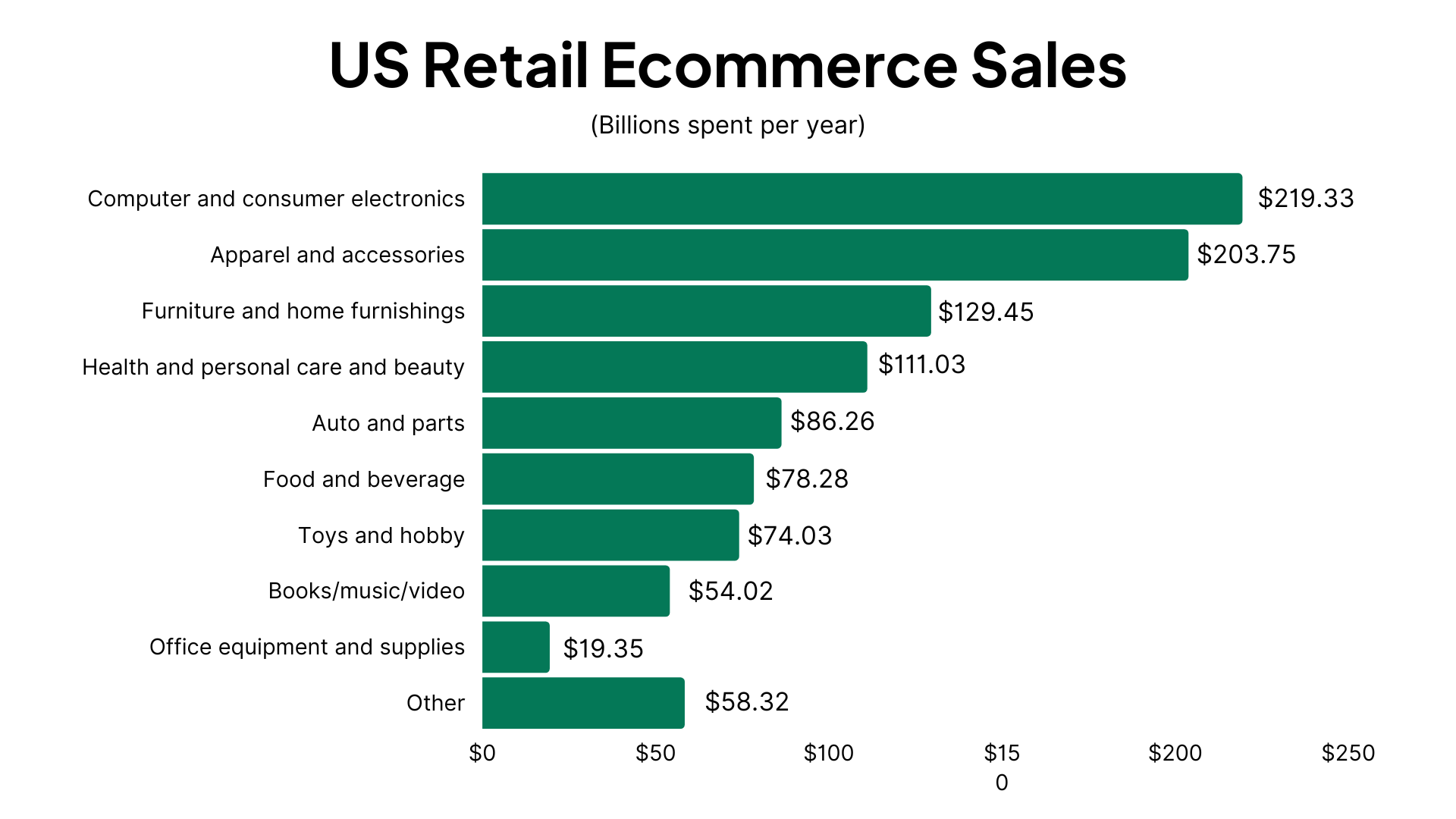
    According to data from eMarketer, the top online shopping category in the US is the Computer and consumer electronics category, which is responsible for $219.33 billion in retail eCommerce sales over the last year.

    This makes up 21.2% of all retail eCommerce sales in the US.

    All those iPhones, AirPods, Samsung Galaxies, Smart Watches and Smart TVs add up. With the price tag on all the latest electronics, it’s no surprise that this is the product category responsible for 1 in 5 dollars spent in the US eCommerce industry.

    The Nine Top Online Shopping Categories in the US (By Revenue)

    Let’s round out the full list of the top online shopping categories in the US.

    1. Computer and consumer electronics: $219.33 billion (21.2% of total sales in the US market)
    2. Apparel and accessories: $203.75 billion (19.7%)
    3. Furniture and home furnishings: $129.45 billion (12.5%)
    4. Health and personal care and beauty: $111.03 billion (10.7%)
    5. Auto and parts : $86.26 billion (8.3%)
    6. Food and beverage: $78.28 billion (7.6%)
    7. Toys and hobby: $74.03 billion (7.2%)
    8. Books/music/video: $54.02 billion (5.2%)
    9. Office equipment and supplies: $19.35 billion (1.9%)

    All other product categories account for $58.32 billion in revenue (5.6% of the total retail eCommerce market).

    E-Commerce Categories: Rising vs Falling

    Which product categories are on the way up, and which are in decline?

    Trick question – all of the top online shopping categories are increasing year over year. The US eCommerce market as a whole grew by 14.1% in 2022, which means there was plenty of growth to go around.

    The fastest growing eCommerce category is Auto and parts, which grew 30.1% YoY in 2022.

    Only sales in “other” categories declined by 4.5%. The other nine categories above all saw positive growth.

    Some categories did grow more than others. And using the total market growth as a benchmark, we can pinpoint which categories are rising or falling relative to other top eCommerce categories.

    Rising

    The following categories are growing faster than the eCommerce market as a whole, meaning they’re increasing in market share, with more people choosing to shop online for products in these categories.

    • Auto and parts (30.10% growth vs 14.1% total eCommerce growth)
    • Food and beverage (20.70%)
    • Apparel and accessories (15.40%)
    • Health and personal care and beauty (15.10%)
    • Computer and consumer electronics (15.00%)

    Falling

    These categories are still growing, but at a slower rate, meaning their market share is decreasing.

    • Office equipment and supplies (14.00%)
    • Toys and hobby (12.00%)
    • Furniture and home furnishings (10.30%)
    • Books/music/video (8.40%)

    Projections

    Total eCommerce growth YoY for this year is projected to be 13.8% – slightly less than the year before.

    This is broken down into the following numbers for each of the most popular categories:

    • Auto and parts : 22.70%
    • Food and beverage: 19.60%
    • Health and personal care and beauty: 14.70%
    • Apparel and accessories: 14.60%
    • Computer and consumer electronics: 14.10%
    • Office equipment and supplies: 13.60%
    • Toys and hobby: 11.40%
    • Books/music/video: 9.90%
    • Furniture and home furnishings: 9.30%
    • Other: 4.10%

    Overall eCommerce growth is expected to slow to 12.1% by 2026. This is understandable, as eCommerce by now is already a fixture in our lives, leaving less room for growth every year.

    Instead, expect mobile commerce to rise over the coming years as one of the hottest new trends in the retail industry. Each year, more products purchased online are purchased on mobile devices, as many consumers opt for the increased convenience of mobile (particularly shopping apps).

    Looking to build your own shopping app? Vendrux gives you a way to turn your existing eCommerce store into apps, for minimal lift and expense, with little to no overhead. Click here to learn more.

    eCommerce vs Physical Retail Share for Top Product Categories

    Let’s look at how today’s market is split between eCommerce and physical retail, and where the sales come for the top product categories.

    The total retail market in the US is split largely in the favor of brick and mortar, with 83.2% market share vs eCommerce’s 16.8%.

    With those numbers in mind, you’ll see that many of the top eCommerce categories are significantly above average in terms of eCommerce vs physical market share.

    Categories with Above Average eCommerce Penetration

    These two product categories are particularly popular online, with more than 50% of product sales coming via online shopping:

    • Books/music/video (68.40% eCommerce vs 31.60% physical)
    • Computer and consumer electronics (56.30% eCommerce vs 43.70% physical)

    The following five categories also have a relatively high popularity online. Though each category still has more sales from brick and mortar than online, the share of eCommerce revenue vs physical retail is higher than the overall online vs brick and mortar market share.

    • Toys and hobby (42.40% eCommerce vs 57.60% physical)
    • Office equipment and supplies (39.90% eCommerce vs 60.20% physical)
    • Apparel and accessories (37.00% eCommerce vs 63.00% physical)
    • Furniture and home furnishings (32.60% eCommerce vs 67.40% physical)
    • Health and personal care and beauty (17.20% eCommerce vs 82.80% physical)

    Physical-Dominant Categories

    On the flip side, these categories have a higher than average share of sales in physical retail, showing that relatively few shoppers have made the jump to buying online.

    • Food and beverage (6.40% eCommerce vs 93.60% physical)
    • Auto and parts (5.20% eCommerce vs 94.80% physical)
    • Other (3.60% eCommerce vs 96.40% physical)

    Top Online Shopping Categories Around the World

    Finally, let’s compare the top eCommerce categories worldwide to those in the US.

    The top online shopping categories around the world in terms of total revenue are:

    1. Fashion: $990 billion
    2. Electronics: $910 billion
    3. Toys, hobby and DIY: $780 billion
    4. Beauty, health, personal and household care: $400 billion
    5. Food: $350 billion

    Data from Statista.

    Fashion and electronics are among the top selling product categories both in the US and around the world. Health, personal care and beauty products are also in the top five for both segments.

    Food and Toys/Hobbies are more dominant in worldwide eCommerce than they are in the US, while US shoppers have a higher relative spend on Furniture and Auto products.

    Most Popular Online Shopping Categories

    When we’re talking about the top eCommerce categories, “top” can mean a few different things.

    We’ve mostly been talking about revenue. But another angle is to look at the most popular product categories – the kind of products that people buy most often.

    According to data from Statista, the most popular category worldwide is Clothing, with 57% of internet users responding that they’ve bought a product online in this category in the last 12 months.

    This is followed by Shoes, Consumer electronics, Books, Movies & Games, and Cosmetics & body care.

    Here’s the full list of the most popular online shopping categories worldwide with their purchase reach (percentage of internet users who have made a purchase in this category in the last 12 months)

    • Clothing: 57% purchase reach
    • Shoes: 47%
    • Consumer electronics: 40%
    • Books, movies, music & games: 36%
    • Cosmetics & body care: 32%
    • Bags & accessories: 29%
    • Food & drinks: 28%
    • Household appliances: 27%
    • Furniture & household goods: 19%
    • Sports & outdoor: 18%
    • Toys & baby products: 18%
    • Stationary & hobby supplies: 17%
    • DIY, garden & pets: 13%

    Clothing and Shoes are the two categories with the highest purchase reach in the US as well, with 44% and 34% reach respectively.

    In Summary

    The results are in; fashion and electronics are the two most dominant online shopping categories, both in the US and around the world. More than 40% of US eCommerce dollars go towards consumer electronics and apparel.

    Electronics are particularly popular with online shoppers, with slightly over half of the money spent in this category spent online; much higher than the overall online shopping market share of 16.8%.

    Both the top product categories are growing at rates in line with the overall growth of the US eCommerce market (13.8%). Auto and parts and Food and beverage are the fastest growing online shopping categories in the US, while Furniture and home furnishings and Books/music/video are those with the lowest growth (still positive, but below the overall market growth).

    At Vendrux, we’ve observed similar trends in our work with eCommerce brands, located in the US and around the world.

    We help these brands turn their successful eCommerce websites into mobile apps for a minimal expense and time investment. This is perfect for any business wanting to capitalize on the growth in popularity of mobile commerce, as the likes of Rainbow Apparel and John Varvatos have done.

    The John Varvatos app, built with Vendrux

    If you’re running an online store, you should definitely think about building your own app. You’ll be surprised at how easy and affordable it is to grow your business by entering the app stores, communicating with customers via push notifications and providing a contained, optimized mobile user experience.

    Get started with a free preview of your app when you schedule a free, personalized demo. We’ll show you how it works, and help you take the first steps to entering the eCommerce app market.

  • The Three Types of Push Notifications (And How to Balance Them Correctly)

    The Three Types of Push Notifications (And How to Balance Them Correctly)

    Push notifications are one of the most powerful communication tools for DTC ecommerce brands. They’re a high-visibility, zero-cost-per-send channel (more immediate than email and less intrusive than SMS). 

    But most brands get their push strategy wrong.

    They bombard customers with endless promotional blasts, driving opt-outs, uninstalls, and frustration. When used the right way, however, push notifications can drive long-term retention, build brand awareness, and boost sales… without alienating your audience.

    The key? Understanding, and balancing, the three core types of push notifications: Customer Experience (CX), Promotional, and Awareness.

    Let’s dive deeper, and help you build a push strategy that drives more revenue and fewer opt-outs.

    Want the latest insights into how 8 and 9-figure brands drive sustainable growth? Check out our weekly newsletter, The Retention Edge. Subscribe for free today.

    Why Push Notifications Matter More Than Ever

    Push notifications are a uniquely valuable channel:

    • Zero cost per send, unlike SMS which can cost 1-5 cents per message.
    • Higher visibility than email (appearing directly on lock screens).
    • Less intrusive than SMS (which many customers consider reserved for friends and family).
    • Immediate delivery that email can’t match.
    • Direct access to your most engaged customers (app users represent your most loyal segment).

    Given these advantages, why do so many brands struggle with their push strategies?

    Some brands claim that push (or apps, as a whole) are ineffective.

    But with the results we’re seeing from many brands using push, that’s just not true.

    The answer lies in how you’re utilizing (and balancing) different types of push notifications.

    Further Reading: The Economics of Push Notifications for DTC Brands

    The Three Types of Push Notifications

    All push notifications you send fall into one of three types.

    Most brands send too much of one type, which causes customers to ignore them, and eventually either turn off notifications, or uninstall the app altogether.

    Let’s take a closer look at each type now.

    1. Customer Experience Notifications

    These notifications reduce friction in the customer journey and provide essential updates that improve the buying experience (usually triggered by a specific event, such a purchase).

    Examples:

    • “Your order has shipped! Tap here to track your delivery.”
    • “Good news! The ‘Everyday Tote’ you’ve been waiting for is back in stock. Only 15 available.”
    • “Your subscription will renew in 3 days. Tap to modify or skip.”
    • “We’ve saved your cart! Don’t miss out on the 3 items you were considering.”
    __wf_reserved_inherit

    Why They Matter:

    • Customers expect these notifications, making them the least likely to trigger opt-outs.
    • They build trust and reduce anxiety in the buying process.

    Some CX notifications—like back-in-stock reminders and abandoned cart notifications—have exceptionally high conversion rates (20%+).

    However, many CX notifications are not meant to directly drive revenue. Notifications like shipping updates and order confirmations build the foundation for long-term customer retention, by building a customer experience that increases the chance of the customer buying again.

    Best Practices:

    • Automate these notifications as much as possible
    • Include actionable information, not just status updates
    • Personalize with product names, order numbers, and customer names
    • Time them appropriately (nobody wants a shipping update at 3 AM)

    2. Promotional Notifications

    Promotional push notifications are made to generate immediate sales by sharing offers, product launches, or time-sensitive promotions.

    Examples:

    • “24-HOUR FLASH SALE: 30% off our best sellers ends at midnight. Shop now!”
    • “Early access for VIPs only: Summer collection just dropped. Shop before it’s public.”
    • “Last chance! Your cart items are selling fast.”
    • “BFCM exclusive: Buy one, get one free on all skincare. Today only.”
    __wf_reserved_inherit

    Why They Matter:

    • High conversion potential, especially for engaged users (which most app users are).
    • Useful for urgency-driven promotions (e.g., BFCM, limited-time offers).
    • Typically have a higher conversion rate than email due to their immediacy and high visibility.

    Promotional notifications are a double-edged sword: They deliver the highest short-term ROI but also the highest unsubscribe rates when overused.

    If you only ever send promotional notifications (especially if you send them a lot), you’ll build push fatigue. Users will start to tune out your messages—or worse, they’ll get annoyed, and turn off notifications, or uninstall the app altogether.

    These notifications can be incredibly effective. But only if you manage the frequency with which they’re sent (and the mix of promotional notifications, and the third type, which we’ll discuss next).

    Best Practices:

    • Limit frequency to 1-2 promotional pushes per week maximum
    • Segment and personalize based on purchase history and interests
    • Reserve for truly compelling offers (not every small discount deserves a push)
    • Use sparingly during key selling periods (BFCM, seasonal peaks)

    3. Awareness Notifications

    “Awareness” notifications are the type of push notifications sent the most by the brands with the most impactful push strategies.

    They maintain consistent mindshare without being overtly promotional, creating multiple touchpoints that feel helpful rather than intrusive.

    Examples:

    • “Pro tip: Store your coffee beans in a cool, dark place to maintain freshness longer.”
    • “Happy Self-Care Sunday! Have you done your skincare routine today?”
    • “We love seeing your creative projects! Tag us in your photos using #BrandName.”
    • “Did you know? Your recent purchase helped us plant 5 trees. Learn more about our sustainability efforts.”
    __wf_reserved_inherit

    Why They Matter:

    • Builds long-term familiarity with your brand without annoying customers.
    • Unlike promotional messages, these increase engagement over time, making customers more receptive to future notifications.
    • Push notifications are cheap and high visibility, making them ideal for this approach—unlike SMS (too intrusive, high cost per send) and email (lower visibility and open rates).

    These notifications rarely get credit for conversions in attribution models, but they dramatically increase the effectiveness of your promotional messages (and overall push strategy) over time.

    They keep your brand top of mind, and train your customers to expect regular push notifications, without becoming an annoyance.

    They won’t (and don’t need to) always generate a reaction. But by sending less-pushy push notifications, you can send more, and ultimately drive more long-term engagement.

    These notifications act like a billboard or a display ad on your customer’s lock screen—not meant to drive immediate conversions but to build consistent mindshare.

    Best Practices:

    • Focus on education, community, or brand storytelling
    • Time them for moments when customers are likely to engage with your product category
    • Keep them brief, friendly, and conversational
    • Use them as daily touchpoints rather than conversion drivers

    Further reading: Do Push Notifications Work for Abandoned Carts?

    Finding Your Perfect Notification Balance

    Most brands make a critical mistake: they send almost exclusively promotional notifications, with some basic CX messages when necessary. 

    This approach might drive short-term revenue and decent per-message performance, but burns your list, and the chance to build powerful long-term relationships with a lot of your customers.

    The ideal push notification mix for sustainable growth is something like the following:

    • 70% Awareness notifications (builds long-term retention & brand recall)
    • 30% Promotional notifications (drives immediate revenue)
    • CX notifications when needed (these are typically event-driven)

    The Psychology Behind Why This Balance Works

    When customers only receive promotional messages, they become conditioned to either:

    • Ignore your notifications entirely.
    • Only engage when they’re in buying mode.
    • Unsubscribe to reduce notification noise.

    However, when awareness messages dominate your strategy:

    • Customers see value beyond discounts.
    • Your brand maintains presence without purchase pressure.
    • When promotional messages do arrive, they stand out and receive attention.
    • The perceived value of your app increases beyond just transactions.

    Key takeaway? Think display ads, not megaphones. Push notifications should feel like frequent, low-friction brand impressions that blend into your customer’s day.

    It may feel like you’re getting worse results, because the overall conversion rate is lower.

    But long-term, you’ll get more of what actually matters; repeat customers, LTV, and engaged app users supporting your brand.

    If you don’t have a mobile app yet to send push notifications, make this your priority.

    As long as you have a mobile-optimized website, you’re closer to having an app than you think. It’s fast, straightforward and affordable to turn your website into an app and unlock the benefits of push notifications.

    To see for yourself how easy it is, get a free preview of your site as an app, using just your website’s URL and a few details about your store.

    Final Thoughts: Treat Push Like an Always-On, Low-Cost Display Ad

    Unlike email or SMS, push notifications are essentially free, with high visibility.

    They don’t even need to be opened; customers get the entire message right there on their lock screen (which the average American looks at 262 times per day).

    Instead of treating push as just another promotional tool, use them to build brand familiarity and long-term engagement. Think of them as organic, native, high-frequency brand impressions.

    Brands that only send promos burn through their list. Smart brands mix in awareness & CX messages to extend the life of their push strategy and maximize retention.

    Actionable Next Steps:

    1. Audit your current push strategy—what’s the mix of CX, promo, and awareness?
    2. Build a push notification calendar balancing all three types.
    3. Test sending more awareness notifications and track engagement (overall app engagement—not just direct results such as CTRs and conversion rate from push) over 90 days.

    Remember that the goal is not necessarily to sell from every push. 

    People don’t swerve off the highway to get to a grocery store whenever they see a coke billboard. But the next time they are in a grocery store, they’re drawn to the Coca Cola display.

    If you craft your push mix correctly, you should see more sessions, higher session time, and more revenue from your app users.

    The best brands don’t just sell. They stay in their customers’ minds. Use push notifications to do both.

  • The Economics of Push Notifications for DTC Brands

    The Economics of Push Notifications for DTC Brands

    In DTC marketing every dollar counts.

    Few marketing channels offer the cost-to-impact ratio of push notifications. The combination of low cost, low effort, and significant, compounding returns makes this one of the most underutilized and underappreciated channels around.

    This combination of factors creates an almost guaranteed positive ROI that most DTC brands are still not fully leveraging.

    The problem is that most brands don’t fully grasp the economics of push notifications, and they either:

    • Don’t use the channel to its full potential
    • Take the wrong approach with push, label it ineffective, and then quit sending notifications

    We’re here to help you avoid making the same mistakes as those other brands.

    Here’s the truth about push notifications for ecommerce – and why it’s almost impossible not to get a positive ROI from this channel.

    Want the latest insights into how 8 and 9-figure brands are driving sustainable growth? That’s what you get with our weekly newsletter, The Retention Edge. Subscribe for free today.

    The Unique Economic Advantage of Push

    Push notifications stand out because of simple economic factors; low cost, high gain.

    Let’s break it down.

    Zero Cost per Message

    Push notifications are free to send once a user has opted in. 

    This fundamentally changes the economics of your marketing strategy. You can reach thousands of customers without spending a dime on the delivery itself.

    Minimal Creative Lift

    Push notifications don’t require elaborate designs, long-form copy, or production-heavy assets. 

    A typical push notification is just 10-15 words, which means your team can create and deploy messages quickly without the resource demands of other channels.

    Guaranteed Visibility

    Push notifications bypass crowded inboxes and go straight to the lock screen, meaning almost all of your notifications at least get seen.

    Email marketers would kill for that kind of visibility.

    Immediate Impact

    Messages are delivered and seen in real-time, making push ideal for urgency-driven, time-sensitive campaigns (such as flash sales and abandoned carts).

    High Intent Audience

    You’re only sending push notifications to people who’ve already downloaded your app.

    While this limits your reach, it also means your audience is warmer than any other channel.

    These customers have already demonstrated commitment to your brand by installing your app on their device. That makes it much more likely that advertising to these customers will have meaningful results.

    Compounding Results

    When you invest in a marketing channel, you don’t want to be putting blood, sweat and ad spend (and a few tears along the way) just to get someone who’s going to buy once and forget you.

    Because push subscribers are already much more qualified, they’re more likely to be the kind of high-value, loyal customers who contribute a significant LTV over time (if you nurture them the right way, early in their customer journey).

    Push vs Other Channels: The ROI Breakdown

    To better understand why the economics of push notifications are so compelling, let’s compare them to other key marketing channels:

    • SMS – High open rates (~98%) but costs per send add up, limiting frequency.
    • Email – Strong ROI but requires ongoing creative effort and risks inbox fatigue.
    • Paid Ads – Expensive, high-risk, but limitless reach.

    Push notifications, in contrast, always drive profit because the cost is fixed at close to zero. This opens up far more possibilities and viable use cases.

    Don’t get it twisted: Push is not a competitor to email/SMS/paid ads

    Comparing push to email, SMS and paid ads is not to say you should stop marketing on these channels and divert all your resources to push.

    They’re not competitors – they’re complements, each filling a specific niche in a holistic marketing strategy.

    • Paid ads are your growth engine.
    • Email is the catch-all, low-cost channel for nurturing people new to your brand, driving retention from existing customers, and building brand affinity. 
    • SMS is the high-impact channel for driving immediate sales.
    • Push is for nurturing your top 15% who contribute an outsized impact to your revenue.

    The best brands use each channel in concert, to meet their entire customer base at the right channel and at the right stage in their customer journey.

    Where Brands Fail with Push

    Brands that have a mobile app, but aren’t getting any meaningful return from push notifications are typically making the same mistakes we see over and over again.

    Mistake #1: Expecting Every Push to Convert

    The temptation is to expect every push to drive immediate revenue. But that’s the wrong mindset. 

    Because of the economics, as we learned, every message doesn’t have to drive an instant return on investment.

    You can afford to send 20 messages and only have 1 result in a reaction, and you’re still ahead.

    Think in terms of frequency and consistency rather than single-message performance. You don’t measure paid ads by one impression, so don’t measure push by one send.

    Mistake #2: Not Sending Enough

    Some brands hesitate, sending just one push every few weeks. 

    The economics don’t work so well without scale. 1 reaction in 20 messages doesn’t work out so well if those 20 messages come over 20 weeks.

    If you’re sending 1 or fewer notifications per week, up the cadence. Brands should typically send 2-5 per week.

    “But I don’t want to annoy my customers – they might unsubscribe.”

    That’s where the third mistake comes in.

    Mistake #3: Sending Irrelevant, Overly Salesy, or Annoying Messages

    Over-sending is not really the issue. The issue is over-sending push notifications that the customer doesn’t want.

    This comes from notifications that are always pushing a sale, irrelevant, impersonal, intrusive or annoying messages.

    If customers feel spammed, they’ll disable notifications, or worse, uninstall the app.

    But if your customers enjoy receiving your notifications, and you can message them daily without any issues.

    To fix, prioritize personalization and value-driven messaging. Keep them simple, positive, on-brand.

    __wf_reserved_inherit

    Action Steps: How to Start Winning with Push Notifications

    Want to turn push notifications into one of your most effective, pound-for-pound, marketing channels?

    The biggest change most brands need to make is to shift their focus from immediate results, to building awareness and mindshare.

    Most of your notifications should be aimed at keeping your brand top of mind, and building familiarity with your customers.

    You can include gentle reminders of what you sell, but you’re not blasting someone with a “buy this NOW” every day.

    Because of the low-cost, low-effort of push notifications, you don’t need an instant return.

    Think of push notifications more like a billboard, or a display ad on your customer’s phone.

    People don’t immediately swerve off the highway to get to a grocery store when they see a Coke billboard.

    But if they see that billboard every day, Coca Cola will be the first thing they think about when they’re thirsty for a soft drink.

    A long-term focus drives long-term results.

    Yet you should know when to turn from awareness to urgency.

    Some push notifications can drive excellent short-term results. New product launches, flash sales, abandoned cart reminders, browse abandonment reminders, personalized promotions… used strategically, these can drive a ton of sales.

    __wf_reserved_inherit

    Don’t ignore promotional push notifications, by any means. During BFCM, for example, go for it and make sure your app users know about your great deals.

    But make these messages the exception, not the norm.

    Vendrux’s Managed Push Notification Service

    If you’re still not sure where to start, or you just want to have your push notifications handled for you, we can help.

    All our plans come with an optional done-for-you push notification service, where we handle the strategy & planning, campaign management, analytics & reporting, and implementation of key automated flows like welcome messages and abandoned cart notifications.

    We’ll take care of strategy, creation, scheduling, and optimization, so you don’t have to.

    Our team of experts use the same playbook that numerous brands have followed to drive $10k+ in additional monthly revenue from push.

    Interested? Get a free consultation to discuss how Vendrux can help you manage your mobile app and push notifications for the highest return on your investment.

    Final Thoughts: Why You Should Double Down on Push Notifications

    If your brand has an app and you’re not fully utilizing push notifications, you’re leaving easy money on the table. 

    The economics are too strong to ignore; zero cost per send, minimal effort, and near-guaranteed visibility. 

    If you’re making one of the key mistakes we outlined above, take the steps required to solve it.

    Fix your cadence, focus on value, and push smarter. Your bottom line will thank you.

    If you’re not sending push notifications yet because you don’t have an app, the fix is even easier.

    Just get a free preview of your app now, with just your website URL and a few details about your store.

    We’ll show you how easy it is to convert your site into an app with Vendrux – and you’ll be halfway towards building yourself a powerful brand asset, and a new high-ROI marketing channel.

  • Are There Any Testflight Alternatives for Android? (Beta Testing Android Apps)

    Are There Any Testflight Alternatives for Android? (Beta Testing Android Apps)

    When you build a mobile app, whether it’s for iOS or Android, the testing phase is an important part of releasing a high-quality, successful app.

    iOS developers have a free, high-quality testing feature built into the Apple development ecosystem, in TestFlight. This is only suitable for iOS apps, however. So is there a TestFlight alternative for Android?

    Read on and we’ll let you know, along with sharing some tips on testing Android apps before you release to the public.

    Did you know that when you build an app with Vendrux, we handle all the QA and testing for you? You just sit back and wait for your app to go live. Click here to learn more using Vendrux to build your app.

    What is TestFlight?

    TestFlight is Apple’s native app testing platform. It’s a tool that lets developers make test builds available to internal and/or external beta testers, who can use these test builds on their own device.

    TestFlight is a great way to test how an app works on a real device, as opposed to testing within a controlled environment, like an emulator. This allows you to pick up on usability issues that otherwise would go unnoticed until full release, and fine-tune your app before release.

    How Beta Testing Works in TestFlight

    To begin testing, testers will need to download the TestFlight app.

    Within this app, they can open your beta app and test it as if it was the real thing.

    To invite people to test your apps, you’ll either invite them to your Apple Developer Account, or invite external testers via email or a public invite link to your beta test.

    You can have up to 100 internal testers, and up to 10,000 external testers with TestFlight.

    Once they accept the invitation and test the app, they’ll be able to provide feedback on the build directly within the app, which will be sent to you by email.

    For more on using TestFlight to test iOS apps, check out this post in our help center.

    Is There An Equivalent to TestFlight for Android?

    TestFlight is a great way to test iOS apps. But it’s only for the iOS ecosystem. How about for Android developers?

    There is – Google Play Console. Google Play Console is the Android equivalent of the iOS developer ecosystem.

    Play Console includes an internal testing tool, which lets you invite testers to use and test your app.

    You can add up to 100 internal testers to your account. These people will be able to test every build of your app once added, and are best used for the first round of testing.

    You can also do closed or open beta tests in the Play Console.

    For a Closed Beta, you’ll add a list of email addresses of the people who will participate in the beta. You can create up to 200 lists, and each list can have 2,000 users.

    Finally, you can allow open testing of your app. When you submit your app for open testing, users will be able to find your app on Google Play, in the “Apps in development” tab.

    You can allow unlimited testers, or set a limit to the number of people who can download the test version (minimum 1,000).

    Learn more about testing using Google Play Console here.

    Other TestFlight Alternatives for Testing Android Apps

    We suggest Google Play Console as the best TestFlight alternative for Android apps. But there’s also a number of third-party solutions for Android app testing.

    These include:

    These are not necessarily bad options, but they’re almost always more complicated, and more expensive, than Play Console.

    These platforms often double as an app distribution platform, allowing you to pass the APK file to certain people to download.

    This is good for a private, limited-use application. But it’s more than you need if you plan to launch on the App Store/Play Store.

    Unless you plan to release an app outside of the Google Play/iOS ecosystems, it’s best to use the official testing platforms – Google Play Console and TestFlight.

    The Importance of Testing Your Android App Before Release

    You might be tempted to skip past the testing process and get your app into the hands of real users as fast as possible.

    This would be a mistake. For both iOS and Android applications, it’s important to test thoroughly before release.

    Releasing an incomplete or buggy app can damage your brand’s reputation. Users who would otherwise have used your app may move on to a competitor instead.

    This could also result in bad reviews, which can doom your app from the start, showing it in a negative light even after you fix any issues.

    It doesn’t need to be perfect before you release. You’ll get a lot of feedback once you start getting real users, and you’ll use this feedback to improve the app. But it should at least feel like a complete app, not one that’s still in development.

    Benefits of the Testing Process

    Here’s a little more on the benefits you get from thoroughly testing mobile apps before moving forward to release.

    • You’ll resolve bugs or defects in the application early on, and prevent users from experiencing crashes, freezes, or other functionality problems.
    • Testing allows you to ensure that your mobile app provides a smooth and seamless user experience, preventing usability issues, navigation problems, and performance bottlenecks, to deliver a more satisfying and engaging app to your users.
    • Ensuring compatibility across devices and platforms, such as various models, operating systems, and screen sizes.
    • Maximizing security and data protection, by identifying vulnerabilities and security risks in your mobile app. This lets you safeguard user data, prevent unauthorized access, and ensure compliance with privacy regulations.

    How to Test Your Android App

    Here’s an overview of what the testing process should look like, and key points to note to ensure you’ve tested your app thoroughly enough.

    Define test objectives

    Clearly define the goals and objectives of your testing. Identify the critical functionalities, use cases, and user scenarios to focus on during testing. This helps prioritize your efforts and ensures that essential aspects of the app are thoroughly tested.

    Test on real devices

    Emulators and simulators can be useful for initial testing, but it’s crucial to perform testing on real devices as well. Real devices provide accurate results and allow you to evaluate the app’s performance, user interface, and device-specific features accurately.

    Test across various environments

    Mobile apps operate in diverse network conditions, such as Wi-Fi, 3G, 4G, or unstable connections. Test your app in different network environments to ensure it functions optimally and gracefully handles network disruptions.

    Test usability and user experience

    Pay attention to usability testing to ensure that your app is intuitive and easy to use. Conduct user experience testing to gather feedback on the app’s design, interface, and overall satisfaction. This helps identify areas for improvement and enhances user engagement.

    Conduct functional and non-functional testing

    Functional testing ensures that each feature of your mobile app functions correctly according to the specifications. Non-functional testing focuses on aspects such as performance, security, compatibility, and accessibility. Both types of testing are essential to deliver a robust and reliable app.

    Continuously iterate and retest

    Testing is an iterative process. As you address identified issues and make updates, retest your app to ensure that fixes did not introduce new bugs. Repeat this cycle until you are confident that the app is stable and ready for release.

    A comprehensive testing process will minimize the risk of your launch going wrong, and help you release a high-quality, successful mobile app.

    Wrapping Up

    TestFlight is a great tool for iOS app beta testing. The closest equivalent to TestFlight for Android apps is Google Play Console.

    We’d advise using Play Console to test your app over any third-party options. It’s the safest and most straightforward, and it’s also free.

    You can do internal testing, closed beta testing and open beta testing with Play Console. It offers all the features you need to do a thorough, comprehensive test process on the beta version of your app before you go ahead and launch on the Google Play Store.

    If you’re looking for a way to build an app (and you’ve already got a website), without the time-consuming rigor of testing and retesting, check out Vendrux. We handle everything for you, from converting your app into a website, to testing, to publishing to the app stores.

    Book a free demo now to learn more about how we can help speed up the app development process.

  • Temu Revenue, Growth, Usage and Downloads Statistics for 2025

    Temu Revenue, Growth, Usage and Downloads Statistics for 2025

    Only launched in 2022, Chinese-owned online retailer Temu has exploded on the scene to become one of the biggest online shopping platforms in the world today.

    To better understand Temu’s meteoric rise, their current standing in the eCommerce industry, and where they might be headed in the future, we’ve put together a packet of statistics that tell you all you need to know about Temu, the company looking to disrupt the shopping app market.

    Want weekly insights into how 7, 8 and 9-figure ecommerce brands are driving sustainable growth? That’s what you get with our value-packed newsletter, The Retention Edge. Subscribe for free today.

    What is Temu?

    Temu is an “everything” online shopping platform, selling virtually anything you can think of, from clothing to electronics to patio furniture.

    The platform operates on a marketplace model, like Amazon, where many products are sold by individual third-party sellers. Where Temu sets itself apart is in price, advertising products at ridiculously low prices, such as an $8.99 smart watch, a tank top for $4.47 and a $9.39 dress.

    Accompanying these products are advertisements for savings in excess of 90% off, limited-time deals, and a heavy focus on urgency and scarcity tactics.

    While the press around Temu of late has been more negative than positive, you can’t argue against the platform’s success, currently sitting as the top shopping app in the US for both iPhone and Android, ahead of massive names like Amazon, Walmart and Shein.

    Temu: Key Facts

    Read more: in this article, we take a deep dive into the tactics used by brands like Temu and Shein to keep users hooked, and why mobile apps are at the core of it all.

    Temu & Super Bowl 58

    Many people were introduced to Temu by their high-profile Super Bowl advertisement in February 2024, which is estimated to have cost them $21 million in ad spend alone.

    The company ran three 30-second ads during the most-watched television event since the moon landing. According to Business Insider, these ad spots cost $7 million each, putting their ad spend for 1:30 of airtime at a cool $21 million.

    The $21 million Super Bowl ad spend is not all though; Temu ran three more ads after the game ended, and a company spokesperson stated that the ads were part of a wide campaign that featured “more than $15 million in coupons and giveaways.”

    Key Temu Statistics in 2025

    Now let’s explore some of the most notable Temu statistics you need to know today.

    How Many People Use Temu?

    Temu was only launched in September 2022. In less than a year, the platform already eclipsed 100 million active users in the US.

    To put that in perspective, Shein has just 13.7 million users in the US (74.7 million worldwide – fewer than Temu’s user base in the US), while there are 112 million Amazon Prime users in the US.

    Temu Growth: 2022-23

    Obviously, to go from zero to 100 million users in less than a year requires a steep growth curve. Temu’s growth is certainly no exception, going from 5.8 million US users in October 2022 to 104.2 million in April 2023.

    Temu Revenue & Sales

    Temu’s monthly GMV in September 2022 was estimated to be $3 million, jumping to $192 million for January 2023.

    The platform’s revenue has since exploded further, reportedly doing $3 billion in revenue in the first half of 2023. With this figure, we can estimate Temu’s yearly revenue is at least $6 billion.

    For reference, competitor Shein’s annual revenue is $24 billion. Temu’s lower revenue, despite having a higher user base, can be attributed to their focus on low-priced discount items leading to a much lower average spend per customer.

    Both are still significantly behind Amazon, which generates nearly $700 billion globally in revenue per year, as the eCommerce leader in the American market.

    For one more comparison, Temu’s sister company Pinduoduo (owned by the same parent company, PDD Holdings), did the equivalent of US$19 billion revenue in 2022.

    Temu Net Worth

    As Temu is a privately held company, there’s no data available to the public about the company’s net worth.

    We do know that PDD Holdings, Temu’s parent company, has a net worth of $128.79 billion. As Temu makes up a minority of the assets owned by PDD Holdings, we can assume that Temu’s net worth is less than that of Shein ($100 billion), and far behind Amazon, which is worth nearly $1.5 trillion.

    Temu App Statistics

    As of July 2023, the Temu app had over 130 million downloads in the space of less than a year.

    As of the end of 2022, this was sitting at 15 million. The app was reportedly downloaded over 30 million times in the month of July.

    With these numbers, Temu sits as the #1 shopping app in the US in both the Google Play Store and Apple App Store.

    Most of Temu’s downloads come in the US, with a little over 42% of their total app downloads. Temu’s next most popular countries are the UK, France, Germany, Italy and Spain.

    According to Similarweb, the Temu app’s usage rate ranks #3 in the US for the “Shopping” category, and 43rd among all apps.

    Temu Traffic Statistics

    Similarweb estimates Temu.com receives 286.6 million visits per month.

    The site is ranked as the #6 marketplace website in the US, behind Amazon, eBay, Walmart, Etsy and Target.

    Overall, Temu.com ranks as the 72nd biggest website by traffic in the US, and 92nd globally.

    If you’re running an eCommerce store, and you don’t have an app, you’re missing out. Our eCommerce App Revenue Calculator shows just how much you can gain from launching your own app.

    How Did Temu Get So Big?

    Temu’s ability to source products directly from Chinese manufacturers is a big reason for the platform’s growth, enabling them to sell products at huge discounts and undercut the competition.

    Even though the quality of the products sold on Temu is often questionable, these low prices make consumers willing to take the risk.

    Temu also relies on quite aggressive marketing strategies, such as >90% discounts, gamification tactics, app-exclusive discounts and very persistent notifications.

    __wf_reserved_inherit
    __wf_reserved_inherit

    There are reports of Temu getting in touch with users over 100 times within the space of three weeks, through a variety of channels including push notifications, email and SMS.

    Temu also invests heavily in social media marketing, specifically using influencers to gain visibility on TikTok with younger customers. They also ran multiple advertisements during the 2023 Super Bowl, which was many US consumers’ first introduction to the Temu brand.

    Does Temu Make a Profit?

    It’s believed that Temu does not make a profit at this time. An article on WIRED suggests that the company loses an average of $30 per order, for overall losses of $588 million to $954 million per year.

    This is partly due to the low margins required to sell products at steep discounts, along with their aggressive marketing as the company tries to gain market share in the US, reportedly carrying a marketing budget of $1 billion per month.

    Learn more: see how Temu uses push notifications to drive repeat sales and build a habit of daily use, in this article.

    Will Temu Continue to Emerge as One of the World’s Biggest Shopping Apps?

    Temu carries significantly more controversy with its rise than Shein, another big new player in the eCommerce market.

    Most of what you read about Temu online is negative, from questions about the legitimacy of products for sale on the site, to worker exploitation and data privacy concerns.

    Their user acquisition and marketing strategy is also extremely aggressive, to the point where some may say it’s exploitative.

    Yet despite all this, Temu’s user base continues to grow, and it continues to hold the top spot for downloads in Google Play and the App Store.

    As it currently stands, Temu is unprofitable, and thus their current operating model is unsustainable. Their road to profitability is to build the Temu brand as a household name in the US market, along with bringing in more marketplace sellers to adopt a model similar to Amazon’s.

    However, as long as Temu relies on low-cost, low-quality goods from China, it will always carry a stigma that will prevent it from challenging Amazon as the marketplace eCommerce leader.

    Sources

    Statista | Business of Apps | Tech Buzz China | Macrotrends | AppFigures | Similarweb | WIRED

  • How to Promote Your App With Smart App Banners

    How to Promote Your App With Smart App Banners

    Driving traffic to your app from your mobile site is the smartest way to gain new app users and retain mobile visitors. To get these people to down load your app, you can use smart app banners.

    We highly recommend promoting your app using Apple’s smart app banners and the equivalent solution for Android – with these you’ll show a banner suggesting to install your app only to your website visitors using either an iOS or an Android device.

    Read on to learn more about smart banners, and how to implement a smart app banner on your site.

    What Are Smart App Banners?

    Smart app banners are banners that show up when someone lands on your mobile website, prompting them to get your app.

    Here’s an example:

    Here’s what Apple’s own help pages say about smart app banners:

    “Smart App Banners vastly improve users’ browsing experience compared to other promotional methods. Users will trust that tapping the banner will take them to the App Store and not a third-party advertisement. They will appreciate that banners are presented unobtrusively at the top of a webpage, instead of as a full-screen ad interrupting the web content. And with a large and prominent close button, a banner is easy for users to dismiss. When the user returns to the webpage, the banner won’t reappear.”

    Apple smart banners (like the one above) have the added benefit of automatically detecting if the user already has the app installed. If so, it will change the word “View” to “Open”. It will also only show the banner if the the app is available on the user’s device, and in the user’s location.

    An Android smart app banner works the same way, but will link to the Google Play Store instead of the Apple App Store.

    How Do I Add App Banners To My Site?

    Apple gives you a way to add iOS smart banners to your mobile website, by adding a line of code to your site.

    There are a few issues with this, though.

    • The smart app banners only work on iOS
    • They only work on Safari
    • They’re not customizable at all

    The best way to add smart app banners to your site, for both Apple and Android, is with our free plugin Smart App Banners.

    Activate the plugin, then go to Settings -> App Banners and enter your Apple App Store App ID and Google Play App ID, Author, App title and price (if you’re selling your app).

    This is the best way to add app banners if you’re on WordPress, and you want your app banners to show for both Android and Apple.

    How to Add App Banners Using Code

    If you don’t want to install a plugin, you’re only interested in the iOS smart app banners to show, and you’re happy with the limitations, you can do it with a line of code.

    Go to your WordPress dashboard and click on Appearance -> Editor, and select header.php on the right, or whatever file in your theme controls the

    section of your site’s HTML.

    In the

    section, add:

    [codesyntax lang=”php”][/codesyntax]

    Where 123456789 is your App Store ID (see below on how to find it).

    Save and you’re done.

    It’s just as easy to do it with our plugin, though. All you need are your Apple and Android App IDs.

    How to Find Your iOS App Store ID

    The easiest way to find your iTunesStoreID or AppId is by opening iTunes and copying the information directly from the App Store url.

    Please follow these steps:

    1. Open iTunes.
    2. Search for your app.
    3. Click your app’s name and copy the URL (In case of PC users, mouse right-click on App Name).
    4. App store URL’s will be in the following format:

    http://itunes.apple.com/[country]/app/[App–Name]/id[App Id or Store Id]?mt=8

    Here is an example url:

    https://itunes.apple.com/us/app/mobile-security-cloud-mdm/id567173760?mt=8

    How to Find Your Android App ID

    Visit Google Play and search for your app. The URL of your app will look like this: https://play.google.com/store/apps/details?id=com.vendrux.android.yourappname.

    You have to copy everything after “id=“, in this case: com.vendrux.android.yourappname – this is the app ID of your Android app.

    Benefits of Using Smart App Banners for Android & iOS

    Smart app banenrs are a powerful way to get people to download your app. Perhaps the most effective way you’ll get app users. You’re showing them an easy way to get a better experience than they’re currently getting (this is why 90% of our mobile time is spent on apps, rather than mobile browsers).

    More and more people today choose to browse the internet on mobile devices. Worldwide, more than 55% of people access the internet on their smartphones.

    That means there’s a good chance a lot of people will discover you on the mobile web. You want to get them out of the browser and into your app, to:

    • Provide a better user experience for your users
    • Boost retention
    • Get users to spend longer with you
    • Increase engagement
    • Increase revenue metrics

    Once these users download your app, they’ll be much more likely to come back to your site in the future. They’ll be able to get back in with one tap, instead of needing to open their browser and type the URL every time.

    They’re also more likely to spend more time and take more important actions (such as purchases for an ecommerce store) if they access your site via app, as opposed to the browser.

    This post goes more into detail on the benefits of mobile apps vs mobile websites. While you definitely need a well-optimized mobile website, your end goal should be to take these people and get them to download your app.

    Smart app banners for Apple and Android are the best way to do this.

    Final Thoughts

    Utilizing iOS and Android smart app banners is something all site/app owners should do. It’s simple to do – just download a plugin and away you go.

    Many people put in a lot of work to create an app, but don’t have a plan for how they’re going to get users for that app. If you have a mobile web presence, smart app banners are an easy, low-friction way to get users.

    Putting a smart banner on your site may result in a huge uptick in app downloads – which will, in turn, boost a lot of key metrics for your business.

  • How to Build a Successful Subscription Product on Shopify

    How to Build a Successful Subscription Product on Shopify

    Subscriptions are one of the most seductive ideas in ecommerce. Recurring revenue, predictable cash flow, customers who renew themselves while you sleep.

    The economics of subscriptions are hard to argue with. The issue is that they’re not as easy to get right as you think.

    Too many brands launch subscriptions, get strong sign-ups, then bleed customers faster than expected, and the recurring revenue line that looked like a hockey stick in the deck flattens by month four.

    The brands that build subscription programs that compound do a few things right that the others skip. They start with a product that genuinely fits the model. They design the offer so customers want to stay. They build the systems that keep churn low. And they treat subscriptions as a real product, not just a checkbox or a silver bullet.

    This guide walks the full playbook for doing subscriptions right: figuring out whether subscription is the right model for your product, designing the offer, controlling churn, the implementation work on your store, picking the right app, and how a mobile app complements the rest.

    Want the latest insights into how 8 and 9-figure brands drive sustainable growth? Check out our weekly newsletter, The Retention Edge. Subscribe for free today.

    Subscriptions Are Powerful, But Not a Silver Bullet

    The pitch for subscriptions writes itself. You acquire a customer once and they keep paying. 

    CAC amortizes across many orders instead of one. Cash flow gets predictable. Inventory and forecasting get easier. Customer lifetime value goes up.

    All of this can be true, when the underlying model is right. The problem is that “subscriptions” gets talked about as if it’s a feature you turn on, when it’s really a product decision that has to fit your category.

    The product-fit test

    Three questions decide whether subscriptions will work for what you sell:

    1. Will the customer need this again? Coffee, supplements, pet food, beauty refills, household consumables: yes. Fashion, durable goods, occasional gifts: rarely.
    2. On a predictable cadence? If consumption rate is roughly stable across customers, you can build frequency rules around it. If it varies wildly, your skip and pause volume will eat your operations team alive.
    3. Is recurring delivery genuinely easier than reordering? This is the underrated question. If reordering takes 30 seconds and the customer thinks about the brand fondly each time, you’re competing against an emotional repurchase you might not want to remove. If reordering is annoying and the customer would rather it be automatic, subscription wins.

    Categories where subscriptions consistently work are: 

    • Consumables (coffee, vitamins, pet food, household goods)
    • Beauty refills
    • Replenishment-driven personal care
    • Curated discovery boxes

    Subscriptions are a much larger struggle for categories like fashion (consumption is irregular and emotional), most durables (one purchase per year or per decade), pure gifting (one-off intent), and brands where the customer experience of choosing each time is part of the value.

    All this said, it is possible to get creative with subscriptions, and make them work in non-standard categories. It’s just a lot harder, and requires an audacious vision to get it right.

    The offer matters as much as the product

    A great product wrapped in the wrong offer can easily fail. In subscriptions, the offer is the bundle of incentives, terms, and flexibility you build around the recurring purchase, and getting it wrong has the same effect as shoehorning a subscription onto a product that’s not the right fit.

    Four elements of the offer need to be right:

    • Discount depth. Subscribe and save discounts of 10 to 15% are standard. Below 10%, the customer doesn’t feel a meaningful benefit. Above 20%, you’re training customers to subscribe purely for the discount, which inflates churn the moment they hit a payment failure or pause.
    • Frequency options. If you sell coffee and only offer monthly, customers who go through it in two weeks or six weeks won’t subscribe. Offer the cadences that match real consumption patterns, not the ones that are easiest to set up.
    • Lock-in vs flexibility. Annual prepaid plans look great on paper because they front-load revenue, but they also front-load expectations. Most successful programs lead with month-to-month and let the customer earn their way into annual, not the other way around.
    • Free shipping or gifts. Often the deciding factor for the marginal customer. Worth modeling: a free shipping offer can move conversion more than a deeper discount, with less long-term LTV erosion.

    A subscription lives or dies on its first 90 days. If the product is wrong or the offer is wrong, no amount of dunning logic or push notifications will save it.

    Athletic Brewing is a great example of a well-designed subscription offer

    The Real Game Is Churn

    Once the product and offer are right, the hard work of running a subscription product begins: keeping people subscribed.

    This is where most subscriptions fail. It’s far more common than trying to do subscribe and save for jeans, or getting the initial offer wrong.

    The truth is, many ecommerce brands are great at selling. But they’re not great at retention. They assume that subscriptions will handle this automatically, but they don’t.

    A successful subscription product requires smart churn management. And that starts with understanding why customers churn.

    Here are the different types of churn, and how to build a subscription that performs above average in each of these areas.

    Involuntary churn: payment failures

    The biggest churn category at most subscription brands isn’t customers leaving on purpose. It’s expired cards, declined transactions, and failed retries that quietly cancel customers who never wanted to leave.

    The fix is unglamorous but high-leverage:

    • Smart dunning. Multiple retry attempts at staggered intervals, on different days of the week, before any cancellation triggers.
    • Card updater. Most major payment processors offer automatic card updates when a customer’s bank issues a new card. Make sure it’s enabled.
    • Pre-charge notifications. Email or push the customer two or three days before the charge so they can update payment if needed, instead of finding out after the failure.
    • Recovery emails for failed payments. Don’t make the customer log in to fix it. Send a one-click update link.

    Brands with strong dunning recover a meaningful share of failed payments that would otherwise be lost. Brands without it cancel customers who would have happily kept subscribing.

    Early voluntary churn: didn’t fit

    Some customers cancel because the product or experience didn’t match what they expected. They’re hard to keep but easy to identify: they cancel within the first one to two billing cycles.

    The levers here aren’t retention tactics, they’re onboarding and expectation-setting:

    • Set realistic expectations on the PDP. Don’t promise outcomes you can’t deliver in the first 30 days.
    • Front-load value in the first shipment. A welcome bonus, a sample of a complementary product, a personalized note. Whatever signals “we noticed you joined.”
    • Onboard the customer to the brand, not only the product. Educational content, founder story, how to get the most out of the first delivery. If the only thing the customer experiences in week one is the box arriving, you’re under-investing.

    Fatigue churn: got too much

    The customer likes the product but is accumulating it faster than they can use it. They cancel because the cabinet is full and they don’t want another box.

    Fatigue churn is the most preventable category and the easiest to leave on the table. The fix is letting customers self-serve flexibility instead of forcing them to cancel:

    • Skip a delivery. One-click, no questions asked.
    • Pause for X weeks or months. Reactivates automatically.
    • Change frequency. Move from monthly to every six weeks. Keeps the relationship alive.
    • Swap products. Variety keeps fatigue down on its own.

    Brands that hide these options behind support tickets churn customers who would have stayed if they could have clicked “skip.”

    Planned churn: life event

    The customer’s circumstances changed. They moved, switched diets, had a baby, broke up, retired. Hardest to prevent.

    The savable cases get caught in the cancellation flow:

    • Offer pause, not only cancel. “Going on vacation? Pause for 4 weeks instead.”
    • Offer a frequency change. “Getting too much? Try every 8 weeks at the same discount.”
    • Offer a downgrade. Smaller pack size, lower-tier product.
    • Offer a discount or free shipping for the next order. Use sparingly: heavy discount-saves train future churn behavior.

    A well-designed cancellation flow recovers a meaningful percentage of customers who clicked “cancel.”

    Setting Up Subscriptions on Your Store

    Strategy is the most important part of a successful subscription product. The right product fit, the right offer, the right churn management strategy.

    Once the strategy is right, the implementation has more moving parts than most brands expect. Subscriptions touch the product page, the cart, the checkout, the customer account, and several backend integrations. 

    Each surface has decisions that quietly shape conversion and retention. Let’s take a look at how to implement this on your storefront now:

    The product page

    The product page is where most subscription decisions get made.

    • Subscribe vs one-time toggle. Default to subscribe and save selected, with one-time as the alternative. Defaulting to one-time leaves money on the table.
    • Frequency selector. Show the cadences that match real consumption patterns. If most customers go through one bag of coffee every three weeks, “every 3 weeks” should be a default option, not buried under “more frequencies.”
    • Discount display. Show the savings clearly. “Subscribe and save 15%” with the original price visibly struck out converts better than a single subscription price.
    • Trust signals. “Cancel anytime” near the subscribe button is one of the highest-impact micro-copy tweaks for first-time subscribers.
    • Build-a-box UI. If you’re doing curated boxes, the PDP becomes a configurator. Make sure the app you pick supports the configurator UX you want, not the one it ships with by default.
    Hunter Pure Air‘s subscription opt-in (built with Easy Subscriptions)

    Cart and checkout

    • Mixed cart handling. Decide whether customers can buy a one-time item alongside a subscription. Most apps support it, but not all checkouts handle it gracefully. Test the experience.
    • Subscription summary in the cart. Show what they’re subscribing to, the cadence, the next billing date, and the total. Surprise costs at the next charge are a leading driver of early cancellation.
    • Checkout integration. Modern subscription apps integrate with native Shopify Checkout. Older patterns that route through a separate checkout add friction and break Shop Pay flows. Make sure you’re on a current integration.

    The customer portal

    The customer portal is where retention is won or lost. It’s how customers manage their subscription post-purchase, and a bad one drives churn directly.

    A solid portal lets customers:

    • Skip the next delivery
    • Pause for a defined period
    • Change frequency
    • Swap or add products
    • Change payment method
    • Update shipping address
    • Reschedule the next charge date
    • Cancel (with a flow attached)

    Two specific things matter more than they sound. 

    Passwordless login is one (most subscription portal traffic comes from email links; making the customer remember a password kills self-service rates). 

    The other is a portal that’s branded to match your store. A generic third-party portal signals “this isn’t really your brand,” which subtly undermines trust.

    Backend integrations

    Subscriptions don’t run alone. A handful of integrations carry most of the weight:

    • Email/SMS lifecycle. Subscription-specific flows: welcome, pre-charge reminder, post-shipment, win-back, payment failure, milestone (3 months, 6 months, 1 year).
    • Helpdesk. Support agents need visibility into subscription status, upcoming charges, and history. Without it, every support ticket is a fact-finding mission.
    • Loyalty and referrals. If you run a loyalty program, subscription orders should still earn points and tier progress. If subscribers don’t accrue rewards, you’re missing one of the easiest retention levers available.
    • Reviews. Post-delivery review requests should fire on subscription orders, not only one-time orders.
    • Analytics. Most subscription apps have basic dashboards. The brands that scale layer on cohort analysis tools or pipe subscription data into a warehouse for proper LTV modeling.

    The integration story matters in app selection. An app with a thinner feature set but deep, tested integrations will often outperform a feature-rich app whose Klaviyo connector breaks under load.

    Communications

    Actively communicating with your subscription customers is crucial. Don’t make the mistake many brands do, of purposely under-communicating because you’re afraid you’ll “remind customers to cancel”.

    Proactive communication reduces churn, it doesn’t create it.

    You don’t need to be Hemingway here. Just get the basics right:

    • Welcome flow. Sets expectations for the first delivery and the relationship.
    • Pre-charge reminder. Two to three days before the charge. Reduces surprise cancellations and gives customers time to skip or update.
    • Post-shipment. Tracking, delivery, and a soft prompt to engage with the product.
    • Win-back. For canceled subscribers, a sequence over the following 30 to 90 days. Don’t write them off after one cancel.

    Running a brand with subscription products?

    If your portal, communications, and integrations are dialed in, you’ve already done the hard work for your storefront. Carrying that into mobile shouldn’t mean rebuilding it.

    Vendrux extends your existing Shopify store into a native iOS and Android app. Your subscription product pages, customer portal, checkout, and every integration you rely on work the same way in the app as they do on your site.

    Get a Free App Preview

    How Subscription Apps Help You Build a Thriving Subscription Product

    Shopify has native subscriptions built into the platform, but the feature set is bare-bones: monthly recurring billing, basic frequency options, and a thin customer portal. 

    Most serious subscription brands use a dedicated subscription app for the rest.

    A subscription app handles a lot beyond the basics:

    • Advanced billing logic (prepaid, pay-as-you-go, hybrid)
    • Smart dunning and payment retry
    • A real customer portal with skip, pause, swap, and frequency control
    • Build-a-box and bundle configurators
    • Tiered discounts, gift options, and loyalty integration
    • Cancellation flows with retention offers
    • Analytics and cohort reporting
    • Integrations with the broader stack

    A few criteria matter when picking one:

    • Dunning quality. Ask what the recovery rate looks like for failed payments. The differences between apps here are bigger than most merchants realize.
    • Portal UX. Spin up a test subscription and see what your customers will see. The portal is the retention surface. Don’t pick on screenshots.
    • Bundling and build-a-box support. If your offer needs a configurator, make sure the app supports the UI you want, not the one it defaults to.
    • Pricing structure. Some apps charge transaction fees on top of monthly pricing. Others are flat. At scale, the fee model usually only beats the flat model at the lowest order volumes.
    • Integration depth. Klaviyo, Gorgias, your loyalty app, your reviews app. Check that the integrations exist and are actively maintained, not listed once and abandoned.
    • Migration story. If you might switch later (and most brands do), check that the app supports clean export of customer and subscription data.

    Here are a few apps worth knowing about:

    • Easy Subscriptions is a strong choice for growing brands that want advanced subscription mechanics (build-a-box, prepaid, tiered discounts, upsells) without transaction fees. A good fit when you’ve outgrown the basics but don’t need enterprise scale.
    • Utterbond is a Shopify-native app that handles prepaid and pay-as-you-go billing, build-a-box, and dunning at a price point well below the enterprise apps. Often a sensible first move for brands launching their first subscription product.
    • ReCharge is the enterprise default. The deepest integration ecosystem, the largest install base among 8- and 9-figure subscription brands, and the most mature dunning and analytics. The trade-off is price (Standard at $99/month, Pro at $499/month) and complexity, neither of which is the right fit for early-stage stores.
    Subscription apps like Easy Subscriptions handle all the technical work required to set up and run successful subscription products.

    The right app depends on the stage of your business (startup vs SMB vs enterprise), and smooth integration with the rest of your store. 

    Mobile Apps and Subscriptions

    If you’re running a subscription product, you almost certainly need a mobile app as well.

    There’s natural synergy between mobile apps and subscriptions. They both excel for products with natural repeat purchase potential, like beauty, supplements or food and beverage. And they’re both built to drive stronger retention and LTV.

    Mobile apps also help elevate your subscription product in a number of ways your mobile website, emails and SMS don’t:

    • Push notifications are perfect for subscription reminders, order updates, small nudges, because they arrive instantly and are almost guaranteed to be seen.
    • The portal is one tap from the home screen. Skipping or pausing a delivery is a 10-second action instead of a hunt through inbox links.
    • Win-backs land easier. Email deliverability is fragile; a customer who installed your app gave you a more durable channel.
    • App users have higher repeat rates and AOV. That compounds with a subscription’s recurring nature.

    The full case for the pairing is in our deep dive on mobile apps for subscription brands, as well as the solution for a common issue that brands face when launching apps – their subscription experience breaking in the app.

    How to Build a Winning Subscription Product: Get the Foundations Right

    Subscriptions look simple from the outside. But they turn out to be one of the harder products in ecommerce to run well. 

    With the enticing nature of recurring subscription revenue comes a lot of competition, higher CACs, and as such, you need strong retention, or you end up losing money.

    Luckily, you can get ahead by simply doing what a lot of brands don’t: getting the basics right.

    Pick a product that’s a generally good fit for subscriptions. Craft a solid offer. Build the retention system that makes customers want to stay subscribed, making it more painful for them to miss out than to keep getting their orders.

    If you want to level your subscription game up even further, launch a mobile app.

    Subscriptions are a great business to be in, if you do it right. Just don’t cut corners or see it as a silver bullet. Craft your program the right way, and you’ll be rewarded.

  • 39 Shopify Statistics (Revenue, Merchants, Customers and More)

    39 Shopify Statistics (Revenue, Merchants, Customers and More)

    Shopify – you’ve probably heard of it.

    Just ten or so years ago, very few had. Yet now, this platform is behind around a quarter of all eCommerce websites, including more than 2.8 million in the US alone.

    It’s easy to argue that Shopify is largely responsible for the boom in eCommerce in the 21st century. Shopify was one of the first platforms to make it easy for anyone to launch an online store, without needing web development skills or a team of developers.

    In this article we dive deep into data behind the Shopify platform, with the most interesting and insightful Shopify Statistics and Shopify Facts to know about in 2026.

    Shopify Statistics: Highlights

    • There are more than 4.8 million currently live Shopify websites, and more than 7.3 million total websites that have used Shopify at some point.
    • Roughly 60% of Shopify websites are US-based, with more than 2.9 million sites.
    • Shopify processes more than $500 billion in GMV yearly, with 561 million unique customers coming through Shopify-powered stores.
    • Shopify has 26% of the eCommerce platform market share, making it the most popular technology for eCommerce websites today.
    • Shopify is also the third most popular online payment processing technology, behind PayPal and Stripe.

    Shopify User & Merchant Statistics

    In this article we’ll be breaking down our Shopify statistics by a few different categories. The first is Shopify statistics regarding Shopify users; merchants and online stores that use Shopify to power their businesses.

    In this section, we find that Shopify powers nearly 5 million websites worldwide. Most of these are in the US; in fact, the next most popular country for Shopify stores, the UK, has only 200,000 live websites, less than 5% of all Shopify stores.

    Nearly 25% of Shopify stores are in the Apparel category, with Home & Garden second at approximately 10%.

    In total, Shopify stores combine to drive over half a trillion – $500 billion – in GMV per year.

    Based on this figure, and depending on which source you take for the total number of Shopify stores, the average Shopify store’s revenue is between $104,000 – $235,000 per year, or $8,666 – $ 19,583 per month.

    Here are all the Shopify user statistics you need to know about:

    • More than 7.3 million websites have used Shopify at some point, with more than 4.8 million live websites using Shopify.
    • Shopify supports businesses in over 175 countries.
    • There are 2.9 million websites running on Shopify in the US, which accounts for 60% of all Shopify stores.
    • The next most popular country for Shopify users is the UK, with 200,000 sites, 4.26% of all Shopify sites.
    • The most popular product category for Shopify stores is Apparel, accounting for nearly 25% of all Shopify stores.
    • Shopify processed more than half a trillion dollars in GMV in 2022.
    • The average Shopify store does between $104,000 – $235,000 in yearly GMV.
    • Shopify Merchants around the world drove $9.3 billion in sales for Black Friday-Cyber Monday (BFCM) weekend in 2023, an increase of 24% on the previous year.

    Sources: BuiltWith | Shopify [1] [2] [3] | Statista

    Shopify Customer Statistics

    Now let’s look at customers – people who buy from Shopify-powered websites.

    Many of these consumers don’t know anything about the Shopify name or brand. All they know is the name of the website they’re buying from. And Shopify gives these brands the tools to provide an excellent user experience.

    For the millions of Shopify users, there are multitudes more who are buyers from Shopify-powered websites, 561 million, in fact, who came through Shopify stores in 2022 alone.

    During Black Friday-Cyber Monday in 2023, Shopify sites served 61 million shoppers, who spent an average of $108.12 in each transaction.

    This comes out a little higher than the average order value for Shopify stores, which came out at $85 per one study, with the average revenue per customer on Shopify sites at $92.

    The final point to note is that more and more customers are mobile first; mobile made up 69% of online sales on Shopify stores during a recent BFCM weekend.

    • 561 million unique online shoppers came through Shopify-powered stores in 2022.
    • 61 million consumers purchased from Shopify brands during BFCM 2023, with an average cart price of $108.12.
    • A 2022 study by LittleData found that the average order value (AOV) for Shopify stores was $85, with 60% of stores between $50 and $192 in AOV.
    • The same study found that Shopify stores have an average revenue per customer of $92, with 60% of stores between $53 and $209.
    • Mobile accounted for 69% of all online sales for Shopify Merchants during Black Friday-Cyber Monday 2022.

    Sources: Shopify [1] [2] [3] | Littledata [1] [2

    Shopify Market Share

    Shopify has carved out a space as the most popular platform for eCommerce businesses to build their website on.

    More than a quarter of all eCommerce websites run on Shopify. Including Shopify Plus, Shopify’s enterprise solution, they are also the market leader among the highest-traffic eCommerce websites in the world.

    • Shopify holds 26% market share among all eCommerce websites, beating out WooCommerce as the #2 eCommerce platform.
    • Among the top 1 million eCommerce websites by traffic, Shopify (including Shopify Plus) has 27% market share.
    • Shopify (including Shopify Plus) makes up 21% of the top 10,000 eCommerce websites by traffic in the world.

    Sources: BuiltWith [1] [2] [3]

    Shopify Revenue

    Earlier we showed you how much the average Shopify-powered website made in yearly/monthly revenue. Now we look at Shopify, the business.

    As you’d expect from the software powering nearly 5 million websites around the world, Shopify has established itself as an extremely valuable company. They do this through a number of avenues, including monthly subscription fees and taking a flat percentage fee from each transaction facilitated by Shopify merchants.

    • Worldwide, Shopify generates over $5.6 billion in total revenue yearly, an increase of more than $4 billion since 2015.
    • Shopify has a Monthly Recurring Revenue (MRR) of $107 million (revenue from subscriptions, not including transaction fees).

    Sources: Statista | Shopify

    Shopify Plus Statistics

    One of the fastest-growing elements of Shopify’s business is Shopify Plus. Shopify Plus supports enterprise-level brands, providing a scalable platform with increased security, deeper reporting and the ability to support higher transaction load and unlimited SKUs.

    Shopify Plus now powers nearly 50,000 websites around the world, the majority of which are based in the US. These include some of the world’s biggest brands and names, from Gymshark to Nestle to Eminem.

    • 48,000 websites currently run on Shopify Plus.
    • 27,000 of these websites are based in the US, making up 56% of all Shopify Plus stores.
    • Next highest countries by Shopify Plus usage are the UK (3,316 sites, 6.85% of total) and Australia (3,046 sites, 6.29%).
    • The average Shopify Plus store is built and launched within 90 days.
    • Shopify Plus merchants include Rebecca Minkoff, LeSportSac, Fashion Nova, Gymshark, Hawkers, Leesa, GE, Nestle, and Unilever and businesses from celebrity entrepreneurs Kylie Jenner, Eminem, Justin Bieber, and Kanye West.

    Sources: BuiltWith | Shopify

    Shopify App Store Statistics

    One reason Shopify is such a popular platform for eCommerce businesses is the vast ecosystem of third-party apps, plugins, integrations and service providers.

    Many of these come through the Shopify App Store, which has become one of the best ways for developers to earn a living building B2B software.

    The App Store features more than 11,000 apps, from more than 7,000 developers, who average nearly $100,000 per year in revenue.

    All up, Shopify app developers have earned more than a billion dollars over the App Store’s lifetime.

    • There are more than 11,000 apps in the Shopify App Store, from over 7,000 vendors.
    • 87% of Shopify merchants use apps from the App Store.
    • The average cost of a Shopify App is $19.14.
    • The average merchant spends approximately $120 per month on Shopify Apps.
    • The average Shopify App developer earns $93,000 per year in revenue, while the top 25% of Shopify App developers make revenue of around $167,000 per year.
    • Shopify App partners and developers have earned more than $1.5 billion since the Shopify App Store was launched.

    Sources: Store Leads | Shopify Theme Detector | Shopify

    More Shopify Facts & Statistics

    Wait – we’re not finished. Here are some more insightful Shopify facts and statistics that are sure to rouse your curiosity.

    Data shows that Shopify sites convert more than sites built on other platforms, and the scale at which Shopify processes transactions makes it one of the most popular payment processing technologies in the world.

    Then there’s the Shop App; Shopify’s customer-facing app, where consumers can shop from different brands running on Shopify, all in one place. This app has quietly become one of top 5 shopping apps in the world today.

    Here’s more to round out the article:

    • Shopify is the third most popular online payment processing technology today, with 14% market share, behind only PayPal and Stripe.
    • Shopify claims that Shopify checkouts convert 72% better than the average eCommerce checkout.
    • Shop Pay increases conversions by as much as 50% compared to guest checkout 
    • A study from a Big Three global consulting firm found Shopify Checkout converts 36% better overall and 15% better on average than other eCommerce platforms, including Salesforce Commerce Cloud, Magento and BigCommerce.
    • Shopify Payments currently supports merchants in 23 countries.
    • The Shopify Admin interface is available in 21 languages, from English to Czech, Thai, Norwegian and Vietnamese.
    • Shopify’s customer-facing Shop App has over 24 million total users.
    • The Shop App has over 10 million downloads and 514000 reviews on Google Play. 
    • The Shop App has more than 4.7 million ratings on the Apple App Store, and is ranked the #5 ranked shopping app for iOS.
    • 98% of orders delivered with Shopify Fulfillment are delivered on time in three days or less.
    • There are more than 760 Shopify service partners across the US, UK, Canada and Australia.

    Sources: Statista | Shopify [1] [2] [3] [4] [5] [6] [7] | Google Play | Apple

    Wrapping Up

    Doing more than $5 billion in yearly revenue, supporting more than a quarter of the world’s eCommerce websites and facilitating over $500 billion in yearly revenue, Shopify is without a doubt one of the biggest tech companies in the world today.

    The data in this article backs this up, and gives a look under the hood at how Shopify fits into (and in a large part, creates) the modern eCommerce ecosystem.

    If you’re a Shopify store owner, you’re on the right track by using Shopify as the tech stack to power your website. Your next step, to keep up with the rising wave that is mobile commerce, should be to launch your own app.

    That’s what Vendrux does for you. We’re the #1 way for eCommerce businesses (especially Shopify stores) to create a branded mobile app. We provide a full service that makes it easy, requires no foreknowledge of coding or mobile development, and is affordable for any store with consistent revenue.

    Learn more with the following resources:

    Building an app with Vendrux is the best way to increase your revenue and build a bigger Shopify brand, without adding huge amounts of overhead or complexity to your business. Get started with a free preview of your app, get in touch now and let’s talk.

  • The Shopify Referral Program Playbook: How to Design, Launch, and Scale Your Referral Channel

    The Shopify Referral Program Playbook: How to Design, Launch, and Scale Your Referral Channel

    Referral programs are one of the oldest acquisition channels in ecommerce, and one of the most under-used. 

    Across DTC, only about 30% of businesses have a formal referral program, despite 83% of customers being open to referring a brand after a successful purchase. That’s a gap you can close with a weekend of work and the right app.

    Launching a referral program is such a sound investment – and is becoming more so with AI and LLMs, and the value of people online recommending your brand and your products.

    If you’re running a Shopify store and not sure where to start with your referral program, this article answers all of that. We’ll cover the program design decisions first, then the launch steps, then the apps that help you put your program live.

    Why Referral Programs Work for Shopify Stores

    Referral programs work because people trust their friends more than they trust your ads. The ROI is high, and it’s the kind of channel that actually incentivizes people to talk about your brand.

    Here are a few numbers that make the case:

    There’s also a cost-curve advantage. Paid acquisition gets more expensive every year as CPMs rise and iOS privacy changes chip away at attribution. Referrals work the other way: the reward only fires after a purchase happens, with no ad spend in front of it, and the channel gets stronger as your customer base grows. More happy customers, more potential advocates.

    Referred customers also behave better after they buy. They convert at a higher rate than paid-acquired customers, and they tend to retain better, because they came in on social proof rather than a retargeted Meta ad.

    How a Shopify Referral Program Works

    Every referral program follows the same loop:

    1. A customer (the advocate) makes a purchase or signs up.
    2. They get a unique referral link or discount code to share.
    3. They share it to friends or followers.
    4. The friend clicks through, makes a qualified purchase, and gets their reward automatically.
    5. The advocate gets their reward, usually issued as a discount code or store credit.

    The reward itself can take several forms:

    • Percentage discount. “Give 15%, get 15%.” Most common for apparel and beauty.
    • Fixed-amount discount. “Give $10, get $10.” Cleaner math for higher-AOV stores.
    • Store credit. Keeps revenue in the store and drives a follow-up purchase. Slightly stickier than a one-off discount.
    • Loyalty points. Works best when referrals and loyalty run through the same platform.
    • Cash or gift card. Used by brands with very high AOV, or in affiliate-hybrid programs.
    • Free product. Strong emotional pull, but requires margin planning.

    Where the program lives on your store matters as much as the reward. Common placements include the post-purchase modal, thank-you page, account dashboard, transactional emails, a dedicated /refer landing page, homepage blocks, and SMS campaigns. 

    The strongest programs surface in several of these at once. A post-purchase modal alone fires once, and most customers close it without thinking about it again. If the program isn’t also in their email, account page, and the footer, you’ve effectively launched it to nobody.

    Types of Referral Programs (and When to Use Each)

    Picking the right program structure up front saves a lot of rework later.

    Double-sided

    Both the advocate and the friend get rewarded. This is the default, and it’s what 78% of brands use. Advocates feel like they’re giving their friends a real benefit, not just doing you a favor.

    Use when: You want a program that scales. This is the right starting point for almost every Shopify store.

    Cheers‘ referral program – $5 off for the referrer and the referree

    One-sided

    Only one party gets rewarded. Advocate-only works for brands with passionate communities where the friend doesn’t need an incentive (rare). Friend-only works as a pure acquisition play, functionally a “tell a friend” discount.

    Use when: You have enough brand pull that one side doesn’t need to be bribed, or you’re running a short-term acquisition campaign.

    Tiered or milestone

    Rewards escalate based on referral count. First referral gets 10% off, fifth gets $50 credit, tenth gets a free product. Tesla’s original referral program made this format famous.

    Use when: You have products with genuine recurring-share potential (supplements, coffee, fashion drops) and a customer base engaged enough to chase a bigger reward.

    Ambassador or VIP

    A separate, higher-tier program for your top advocates. Often invite-only, with custom rewards, early access, or a revenue share.

    Use when: A handful of customers drive a disproportionate share of your referrals, or you’ve got an organic community worth formalizing. Layer this on top of a standard double-sided program.

    Affiliate-hybrid

    Referral program that pays commission per sale instead of (or in addition to) a store credit. Blurs the line between customer referral and affiliate marketing, which is why most of the best apps handle both.

    Use when: You want to activate influencers or creators alongside your customer base without running two separate programs.

    How to Design a Referral Program That Drives Real Revenue

    Installing and setting up a referral program app takes a weekend. Getting the design of your program right pays back for years.

    The decisions below are where most programs succeed or fail. 

    Pick the right program type

    Default to double-sided unless you have a specific reason not to. Both sides getting something is what 65% of customers prefer, and it gives you the widest audience willing to participate.

    Set the advocate reward

    The advocate reward is effectively the CAC for the new customer they bring in. Treat it as acquisition cost, not discount margin, and work backwards from there.

    Most Shopify brands settle between 10% and 20% off (or $10-$25 in store credit). Below that range, advocates don’t bother sharing. Above it, the acquisition math starts to hurt.

    Store credit often outperforms a straight discount on the advocate side. A credit sitting in someone’s account feels like money they need to spend; a percentage-off coupon feels like an optional saving. The return rate is meaningfully higher.

    More Labs‘ referral program

    Set the friend reward

    This is the bigger conversion lever. The friend has no relationship with your brand yet, so the reward is what gets them to click through and try.

    Rule of thumb: make the friend’s reward at least as good as your best first-time-buyer offer. If you’re running “15% off your first order” on your site pop-up, the referral offer should match or beat it. Anything less is worse than your default, and advocates will notice.

    Choose the trigger point

    When does the reward actually fire? Three options:

    • On share. Advocate gets a reward as soon as they send the link. Easy to abuse.
    • On friend signup. Advocate gets rewarded when the friend creates an account. Better, but still leaves room for empty accounts.
    • On qualified purchase. Advocate gets rewarded only when the friend makes a purchase above a set threshold. This is the standard and every app below defaults to it.

    Go with qualified purchase. Layer on a minimum order value ($50+) to cut out low-ticket gaming.

    Set your fraud rules

    Fraud is the most common reason referral programs underperform. Three non-negotiable rules:

    • One-time-use codes per friend. No static, farmable codes that show up on Honey or Coupert. Most apps handle this automatically, but confirm before launch.
    • No self-referral. Block cases where the advocate and friend share an email, address, or device fingerprint.
    • Rate limits per advocate. Cap the referrals an advocate can earn rewards on per month. Prevents one person turning into a discount factory.

    A Reddit thread in r/shopify summed up the issue well: static codes get scraped, end up on discount aggregators, and then anyone can use them. Don’t let your referral program become a permanent promo code.

    Plan reward delivery

    Automatic beats manual every time. When the qualifying event fires, the reward should appear in the advocate’s email immediately, and ideally auto-apply in their cart if they’re logged in. Manual payout flows introduce delay, which kills the dopamine loop that makes referrals work.

    Put your referral program in front of your best advocates.

    Vendrux turns your existing Shopify store into native iOS and Android apps. Your referral program carries over, putting it in front of your best customers, your app users, the customers most likely to participate in your program and get the word out about your brand.

    Get a Free App Preview

    How to Set Up a Referral Program on Shopify (Step-by-Step)

    Once you’ve made the design decisions, the setup is fast. Most stores can go live in under a day.

    1. Pick a referral app that works with your store, and the type of referral program you want to launch.
    2. Install and connect to Shopify. Most apps install in a couple of minutes from the Shopify App Store and auto-detect your products, customers, and order data.
    3. Configure rewards. Plug in the advocate and friend rewards you designed above, plus your trigger point, minimum order threshold, and fraud rules.
    4. Build advocate touchpoints. Minimum: a post-purchase modal, a transactional email, and a dedicated landing page. Better: an account-page block, plus the referral offer in abandoned cart emails to existing customers.
    5. Promote the program. Email your existing customer base at launch (your biggest single pool of potential advocates). Add placements in the footer, homepage, and order confirmation emails. Plan a repeat-promotion cadence, not a one-time blast.
    6. Track and iterate. Watch participation rate, friend conversion rate, referred-customer AOV and LTV, and fraud rate. Every 90 days, tune one lever (reward size, placement, messaging) and measure the delta.

    Referral Program Best Practices

    Here are a few quick tips on launching a referral program that adds to your bottom line:

    • Make the reward worth sharing. $5 off a $100 order isn’t worth a text message. Default to percentages your advocates wouldn’t be embarrassed to send.
    • Make sharing frictionless. One-click share to SMS, WhatsApp, email, and copy-link at minimum. If an advocate has to log in, generate a code, then manually send it, you’ve lost most of them.
    • Surface the program at peak-satisfaction moments. Post-delivery. After a positive review. After a second purchase. These are the moments customers are most likely to refer, and the moments most brands miss.
    • Give advocates copy and creative. They’re customers, not marketers. Pre-written SMS and email templates lift share rates noticeably.
    • Match reward size to customer value. A VIP customer can unlock a better offer than a first-timer. Segmented rewards feel personal and reduce total reward spend.
    • Combine with loyalty where it fits. One program with a referral tier usually beats two disjointed programs competing for the same home-page real estate.
    Ogee integrates referrals with their loyalty program, providing extra points for each person referred

    Common Referral Program Mistakes to Avoid

    • Hiding the program. One launch email and nothing else. If existing customers don’t see the program in the account page, footer, post-purchase screen, and ongoing emails, most of them will never engage with it.
    • Under-incentivizing the friend. Brands spend all their reward budget on the advocate side and leave the friend a coupon worse than the homepage pop-up. The friend is the one converting. Spend there.
    • Allowing discount-farm abuse. No one-time codes, no device fingerprinting, no fraud rules. Your referral code ends up on Honey within weeks, and every new customer gets your best discount without ever being referred.
    • Not segmenting advocates. Not every customer should be promoted as a brand advocate. Customers who’ve returned products, left one-star reviews, or never repeat-purchased shouldn’t receive “refer a friend” emails.
    • Launching without a promotion plan. Installing the app isn’t launching. A real launch includes a dedicated email, SMS sequence, on-site placement, organic social, and a reason-to-refer moment (a product drop, a seasonal push).

    How to Choose the Right Referral App for Your Shopify Store

    Referral program apps are what make it such a no-brainer to add a referral program to your store.

    If you had to build and maintain a custom-built referral program for your store, the ROI would look a whole lot different than it does when there are sophisticated apps out there to help you set it up and run it (often with best practices built in).

    Some of the top rated apps in the Shopify App Store include:

    (many more available on the App Store too).

    To pick the app that fits best for you, look for these things:

    • Fit with your store size and budget (some tools are built for enterprise brands, others have entry-level options for smaller stores).
    • Integration with other areas of your business (like your loyalty program).
    • Support for the program structure you want to implement.
    • Design & UI that’s easy to use, fits with your branding and storefront design.

    Some key features to look for include:

    • Fraud controls built in: one-time-use codes per friend, self-referral blocking by email/address/device, minimum order thresholds, per-advocate caps.
    • Surface flexibility: post-purchase modal, account page widget, /refer landing page, transactional email blocks, SMS triggers.
    • Reporting that answers “how many sales did this drive last month” without exporting to a spreadsheet.
    • Klaviyo or ESP integration for referral follow-up flows.

    There’s no one “right” answer for the best app for your store. There are plenty of great options out there. Just find one that fits what you want to do, read the reviews and check out the case studies, and get to launching your program.

  • Shopify Mobile App Templates to Fast-Track Your Mobile App

    Shopify Mobile App Templates to Fast-Track Your Mobile App

    All top eCommerce brands today have their own mobile app. An app is an amazing tool to boost customer retention and loyalty, generate more engagement from mobile consumers, and to position your brand as an authority in your industry.

    But building an app is hard. Even before you get to the ins and outs of coding an app, you may have no idea where to start in terms of designing a mobile app. That’s why you might be looking for a Shopify mobile app template, to speed up the process.

    If you’re looking for a template for your mobile app, we’ve got you covered. In this article we’ll show you where to find Shopify mobile app templates, how to use them, some example templates you can use, and finally explain why you might not need a template in the first place.

    What Are Shopify Mobile App Templates & Where to Find Them

    A mobile app template can be many things.

    In its simplest form, a Shopify mobile app template could be a set of UI design templates for various pages of your app, such as product pages, collection pages, cart page and checkout.

    This saves the work of designing a professional and functional interface for your app, and also gives you an idea of which screens or pages you’ll need to build (simple apps may have as few as 3-5 screens, while more complex apps may have as many as 25 or more).

    UI templates are useful if you already know what you’re doing when it comes to coding, or you’re passing the designs off to an app developer or app development agency.

    But if you’re coding the app in-house, you might require a more in-depth template, that includes starter code for your app.

    Code templates essentially give you a shell of an app already built; you just customize it to fit your store, and integrate it with your Shopify admin backend.

    In either case, further development is required before you’re able to publish the app for your customers – but a template can give you a head start on the app development process, compared to starting completely from scratch.

    Where to Find Shopify Mobile App Templates

    You can find Shopify mobile app templates in a number of different places online.

    The best place depends on what kind of template you need.

    If you’re looking for a basic UI template, check out sites like:

    If you’re looking for starter code templates, you can find some options on sites like:

    These sites have code you can purchase for a one-off fee (usually quite cheap, somewhere between $30-$150), and thus use for your app.

    Alternatively you could look on GitHub, where some developers publish mobile app source code you can take and customize for your own project.

    7 Shopify Mobile App Templates to Try (Or Use for Inspiration)

    Ready to get a running start on developing your Shopify mobile app? Here are some templates to check out.

    Clothing App UI Template

    __wf_reserved_inherit

    This template on UIzard includes all the necessary pages for a basic clothing app, including:

    • Sign up 
    • Log in 
    • Homepage
    • Search 
    • Profile 
    • Product details 
    • Cart
    • Customer account and info
    • Delivery info
    • Checkout, payment and credit card page 

    These are only visual designs, and you’ll need to convert them into proper mockups and then again into code. 

    UIzard requires a paid subscription ($19 per month, or $12 per month annually) in order to access their templates, which is very minor, all things considered.

    You may find this a little basic, but it could provide a good starting point when designing your app’s UI.

    eCommerce App UI Kit

    __wf_reserved_inherit

    This extensive template includes 100 screens, giving a wide variety of options for many different types of page, from login pages, to customer profile pages, wishlist pages, tracking settings and more.

    The templates come in Figma/Adobe XD files, which is perfect for passing off to developers, with all the components, vectors and measurements done that developers need to start coding.

    You’ll need UI8’s all-access pass to download this template, which is a little costly – $294 per year, or $150 quarterly. But again, considering the overall cost of developing an app, a few hundred dollars for ready-made designs is not too bad.

    StoreMax Shopify Mobile eCommerce App Template

    __wf_reserved_inherit

    This template on CodeCanyon provides starter code for a Shopify mobile app written using Flutter, for just $49.

    Push notifications and multiple payment options are set up for you, as well as a number of key pages.

    You’ll need to customize it to fit your brand, as well as completing the integration with your Shopify backend. You’ll also need to be proficient in the Flutter app development framework to bring this template to life.

    Mstore React Native App Template

    __wf_reserved_inherit

    Another template on the CodeCanyon marketplace, this template comes with pre-built product detail pages, collection screens, checkout and payment flow, offline wishlist and more, built for React Native.

    At $79 for the regular license, it’s an extremely cheap way to get the starter code your developers need to build your mobile app quickly.

    Shopify App Template for Node/React

    __wf_reserved_inherit

    This template comes in the form of a codebase on GitHub.

    It utilizes a number of open-source tools, including Node, Express, React and SQL. It’s free – you just need to clone the template and start working on your own version.

    Be aware that this doesn’t include visual templates like those above, and instead is more akin to boilerplate or starter code for creating a Shopify app.

    You’ll need to design your UI, and then you’ll need to know what you’re doing with a few different development tools and frameworks in order to make use of this.

    Shopify Store App Template

    __wf_reserved_inherit

    This mobile app template comes with UI templates and boilerplate code for building iOS and Android apps with Swift and Kotlin.

    It includes more than 50 screens, from product pages to search to signup and OTP pages.

    You can get the code on its own to work with separately, or customize it with CodePlatform’s visual builder.

    You will need a CodePlatform subscription for this template, which costs $99 per month.

    Sellflow Open-Source Shopify Mobile App

    __wf_reserved_inherit

    This template is another starter codebase on GitHub, built with React Native, TypeScript and Expo.

    It comes with a number of comments already built, and all the starter code your app requires.

    This is a great resource for anyone looking to build a Shopify mobile app with React Native, with just some simple customization required to turn the template into a real app for your brand.

    Why You Probably Don’t Need a Template

    The templates we’ve shown you are all useful ways to speed up the development process if you’re designing and building an app from scratch.

    However, for most Shopify stores, a template is unnecessary.

    Why?

    Because your store is the template.

    As long as your website is responsive and mobile-optimized, there’s no need to design a brand new UI for your app.

    There are some small tweaks you’ll want to make, but ultimately, if your mobile website’s UI is good enough, it will be good enough for your app.

    If it’s not, go work on your website first. Build an app-like experience on the web, and then replicate that in your app.

    “In our experience, users break into two camps. There are users who prefer to buy on the app and users who prefer using the browser. Our apps never had any functionality or usability beyond the web experience. The reason to have an app is not to have something that isn’t on the website, but for people who prefer that way to access Rainbow content.”

    -David Cost, Rainbow Shops

    Besides, do you really want to use a template for your app?

    A template, by definition, means your app will likely look the same as tens, hundreds, or perhaps thousands of other apps.

    It’s better to give your customers something that feels unique and personal to your brand, rather than a templated solution that looks like it came off a production line.

    Launching a Shopify Mobile App with Vendrux

    There’s no need to use any templates, or mess around with customizing templates and finding someone to code them for you, if you simply convert your Shopify store to an app with Vendrux.

    __wf_reserved_inherit

    Vendrux is a full-service platform that turns any website into native apps. It’s perfect for Shopify stores, because you already have 90% of what you need from an app, in your existing website.

     We add a few small touches, such as native UI and push notifications, and do the coding required to bring your website to life as apps.

    You don’t need to code anything, you don’t need to design or rebuild anything, you don’t even need to worry about updates and maintenance after it’s built. We do all that for you.

    The apps will reflect everything your website does, including all apps, integrations, custom features, theme alterations and tiny tweaks and optimizations you’ve made to your website to boost conversions.

    It’s fully synchronized with your website, meaning you can update your mobile apps at any time, without having to touch any mobile app code.

    Vendrux has worked with many high-revenue Shopify merchants, and is a more flexible, more scalable, and ultimately simpler and more affordable option than any template.

    __wf_reserved_inherit
    Just a few of the amazing eCommerce apps we’ve built at Vendrux

    Book a demo now to learn more about how we can build the perfect app for your store.

    Ready to Build Your App?

    Start now, and you could have your own mobile app, live in the app stores, in less than a month.

    Shopify merchants are uniquely positioned to launch a mobile app fast, and with minimal expense. Your app just needs to replicate your mobile web experience, which Vendrux does (with the small touches that makes your app feel truly native).

    Book a demo now to get a sneak peek of your app, and start the process of building an app that costs next to nothing, adds virtually nothing to your workflow, and takes your brand to another level.